The Oil and Spice Shelf Nook Inside Your Range Hood Surround You Didn’t Know You Needed But You Absolutely Must Have

I’ve been getting some questions from concerned readers: “Where have we been???” They’re assuming we’ve been eaten by the half-finished kitchen. Well…. I’ve been sketching kitchen projects and my adorable Rainman has been fishing. It’s my fault that I approved the purchase of a small boat fixer upper (in addition to the larger boat we already have) and that all equates to FISHING and NOT WORKING INSIDE ON MY KITCHEN. But the Dewalt miter saw on the front porch makes it LOOK like we’re working, so that’s cool. “Sips wine.”  (Supply links at the end of the post!)

*This post may contain affiliate links. Please see full disclosure at the end of the post.

Anyway, that’s not preventing me from forging ahead and obsessively planning every detail, and occasionally threatening to hire a carpenter if he doesn’t get his rumpus back in the house and start throwing some kitchen together. It’s getting to the point where I may ACTUALLY consider a carpenter… or start wielding tools at opportune moments so he will catch me and feel compelled to intervene. So… the current project (that I have ordered materials for and am just WAITING FOR SOMEONE TO INSTALL): A shelf nook for the range surround.

A shelf nook? Yes, it’s absolutely a thing. Think: incredible use of wall space for storing daily use items like olive oils and favorite spices within EASY REACH of your cooking space. We are in the middle beginning of a kitchen renovation and the focal point of the room is a large hood with a surround that encapsulates the entire space (range, hood, and cabinetry). Having looked at ALL of the kitchens on Pinterest and Instagram, I feel well informed and confident that I have planned all of the details well.

Not sure what I’m talking about?  Here are two EXCELLENT representations of my idea by professional designers (and let me give a SHOUT OUT to these ladies/gents, because the amount of nit-noid planning that goes into designing these spaces is really next-level):
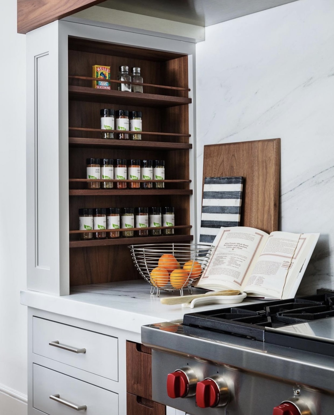
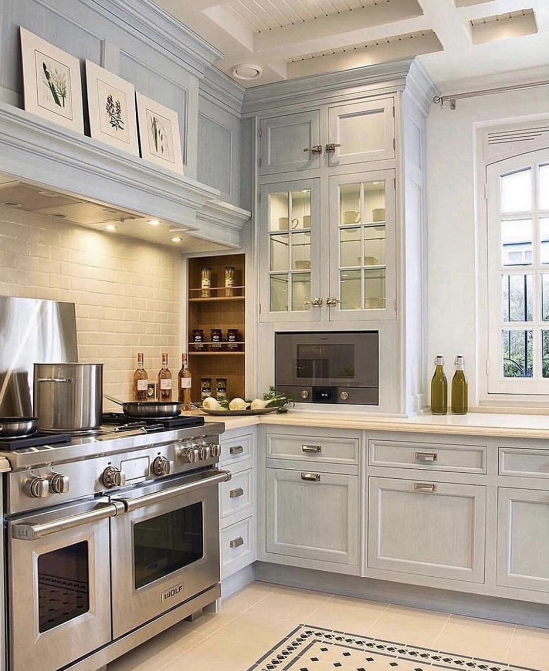
Gorgeous walnut shelving inside the hood surround by @studiodearborn on Instagram.


Gorgeous wooden shelving inside the hood surround by @christopherpeacock on Instagram.


Are you IN??? Yeah, me too!  Imagine wasting all of that space when you could have usable, adorable shelves (and trust me, you need the storage)!

So, here’s my sketch of the front of our range wall:
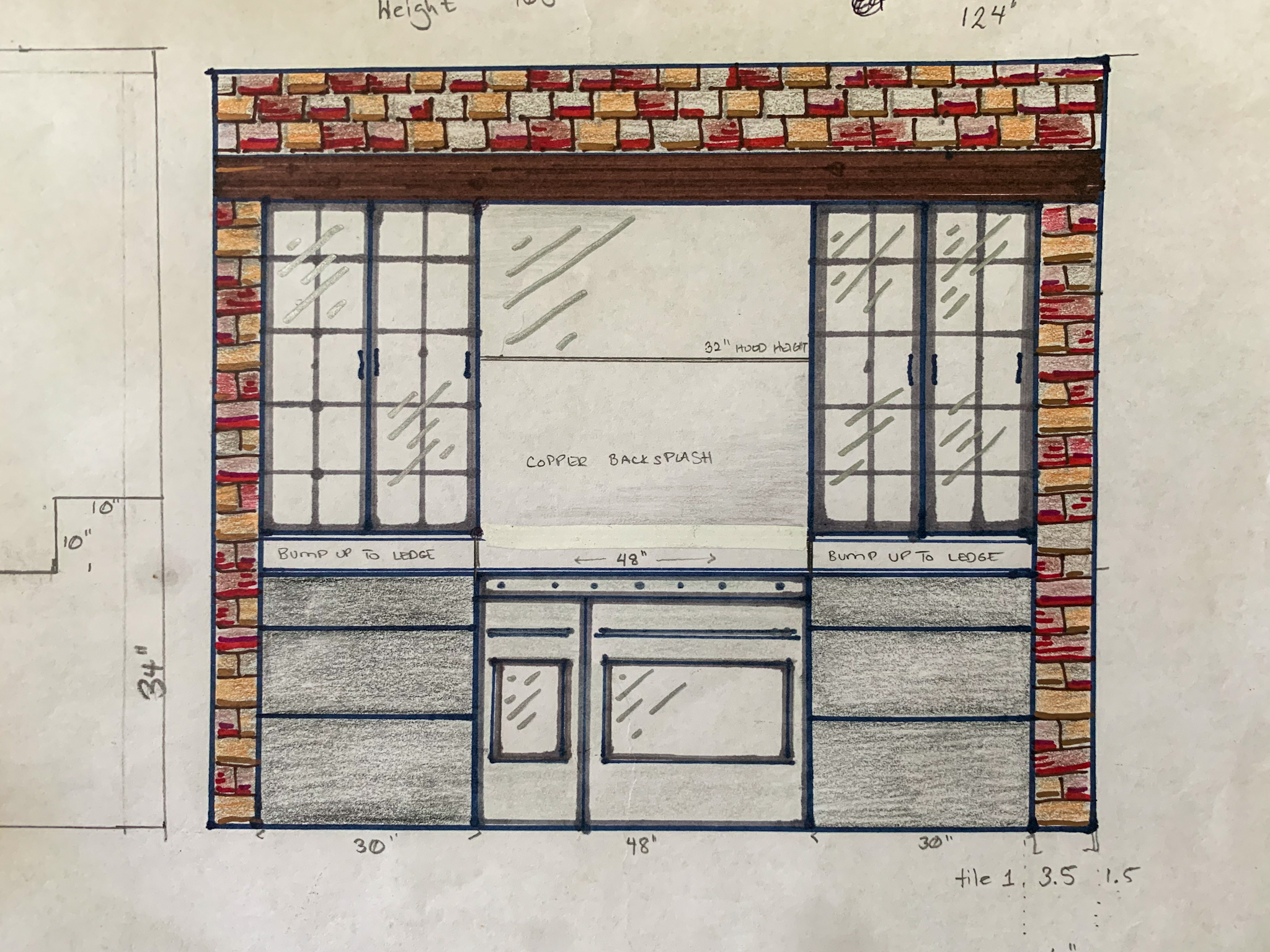
The Oil and Spice Shelf Nook Inside Your Range Hood Surround You Didn't Know You Needed But You Absolutely Have To Have
The Oil and Spice Shelf Nook Inside Your Range Hood Surround You Didn’t Know You Needed But You Absolutely Have To Have


And here is the sketch of the inside of the right-hand wall:
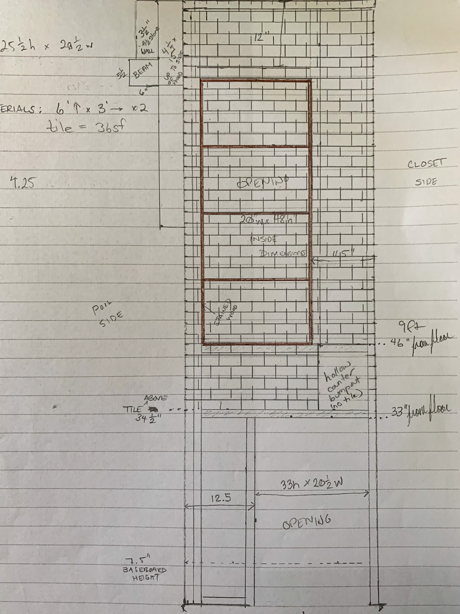
The Oil and Spice Shelf Nook Inside Your Range Hood Surround You Didn't Know You Needed But You Absolutely Have To Have
The Oil and Spice Shelf Nook Inside Your Range Hood Surround You Didn’t Know You Needed But You Absolutely Have To Have


No fancy design software here! It’s so much easier for me to visualize when I sketch.

One of the most important design elements of this space was functionality: an excellent space to cook where all of the cook’s tools are within easy reach. It’s also important that the space be very easy to clean and hardy. Everything near the stove is a solid surface and non-scorch-able (including the metal upper cabinets). I allowed myself a little leniency with the shelf materials because they are 33 inches from the side of the range and the back of the shelves are still tiled. I briefly considered a shelf OVER the stove (it looks so pretty with the copper pots hanging there) but remembered that I don’t want to clean grease spatter off utensils, pots, and spices every time I cook.

Anyhoo, after I actually threatened my husband with bodily harm for the lack of progress on the kitchen (i.e. fishing/casting on the boat instead of doing interior construction), this is the next project we came to in the build. One of the challenges was that walnut is really hard to find (read: expensive) right now, but since it wasn’t a lot square footage wise, I thought it would be fairly affordable. It was not. Not, to say that little detail changed my mind: I still got my walnut shelves. Just know that the species of wood you choose very much impacts the final cost.

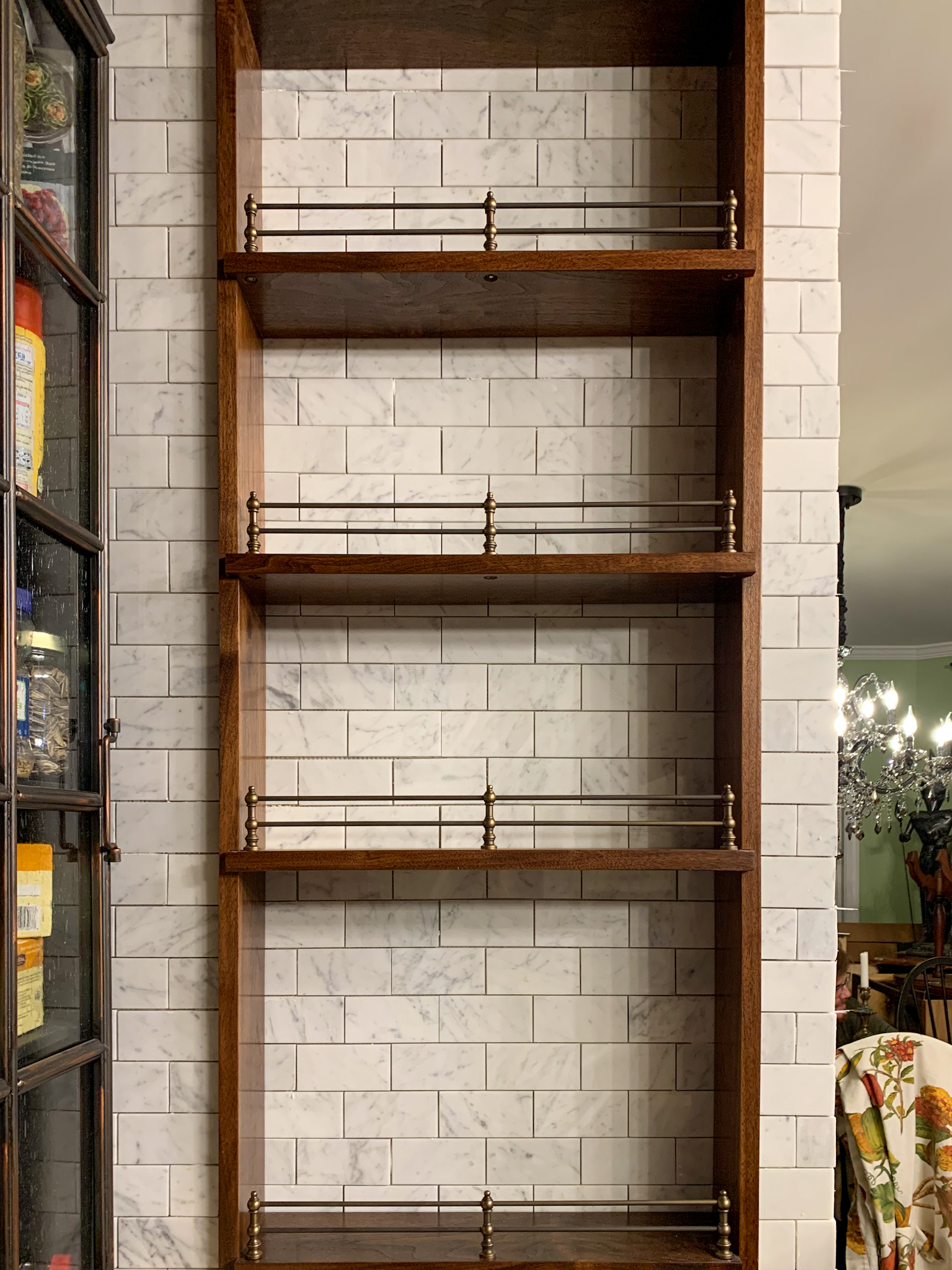
I also wanted some pretty gallery rails to prevent oil bottles from being knocked off and smashing into tiny pieces. Those were also not cheap, but they were necessary both from an aesthetic and functional standpoint. I had already purchased the Carrara marble subway tile for the interior range walls, and I have broken out the relative cost below.

Step one was framing the wall with the size I wanted and thinking about all the 3D things that could affect the functionality of the design.

Since we are doing one wall at a time… it is more difficult. I want to have a functional kitchen for as long as possible through the renovation, so there was an old peninsula with electrical and plumbing in the way on one side.
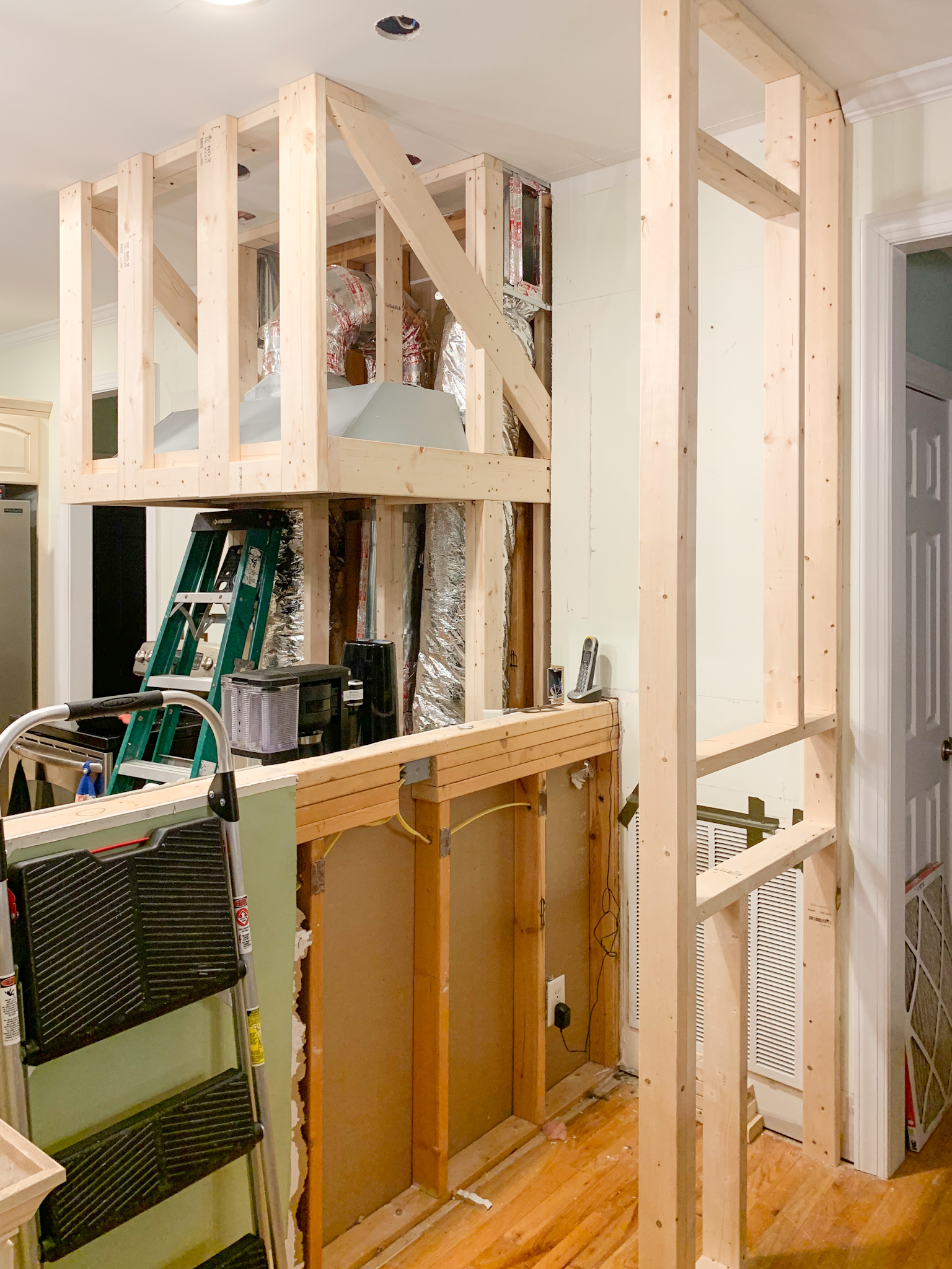
 

The Oil and Spice Shelf Nook Inside Your Range Hood Surround You Didn't Know You Needed But You Absolutely Have To Have
The Oil and Spice Shelf Nook Inside Your Range Hood Surround You Didn’t Know You Needed But You Absolutely Have To Have


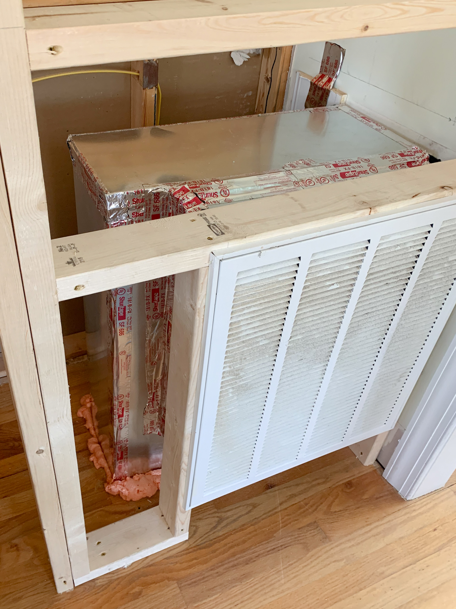
And then, of course, this little design treasure that I was feeling borderline homicidal about. Don’t worry, I fixed the look, but I’m still pretty torqued the HVAC crew couldn’t reroute the intake anywhere else. The worst part is it robbed me of half of my cabinet space on one side of the stove. NOT COOL. (It currently has a really pretty cover on it, and I ordered a false front for the cabinet so it will be invisible to anyone who doesn’t know).
 

The Oil and Spice Shelf Nook Inside Your Range Hood Surround You Didn't Know You Needed But You Absolutely Have To Have
The Oil and Spice Shelf Nook Inside Your Range Hood Surround You Didn’t Know You Needed But You Absolutely Have To Have


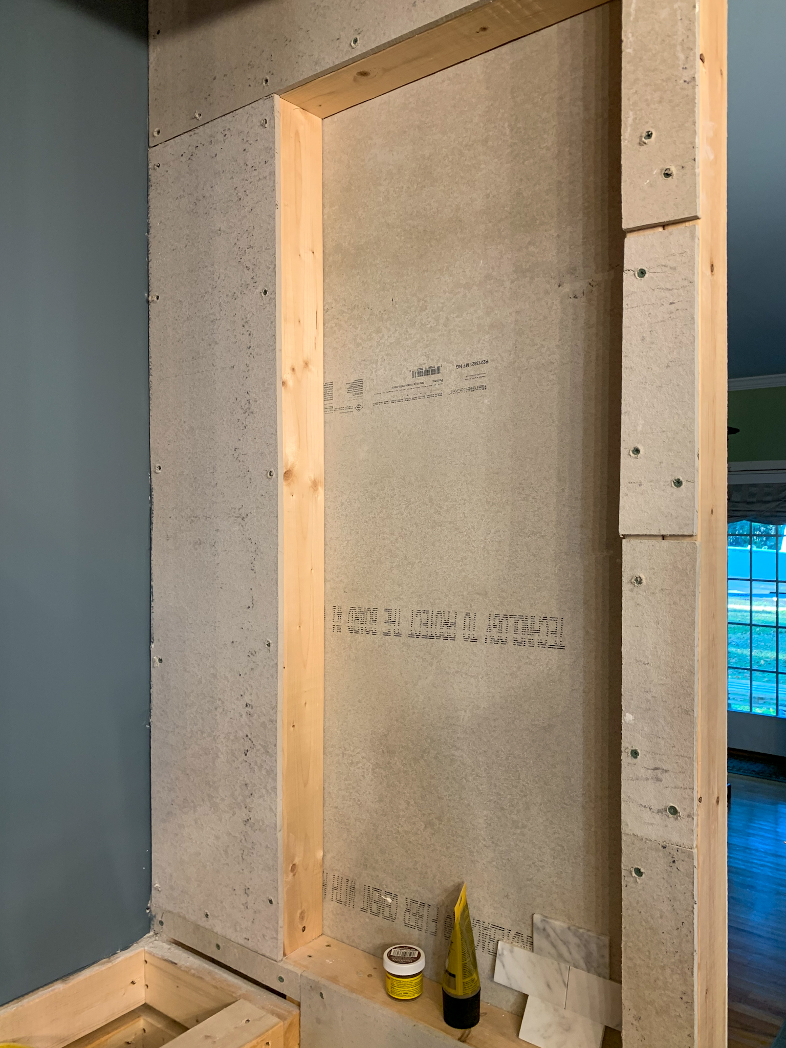
Step one: Install cement board for all tiled areas.
The Oil and Spice Shelf Nook Inside Your Range Hood Surround You Didn't Know You Needed But You Absolutely Have To Have
The Oil and Spice Shelf Nook Inside Your Range Hood Surround You Didn’t Know You Needed But You Absolutely Have To Have


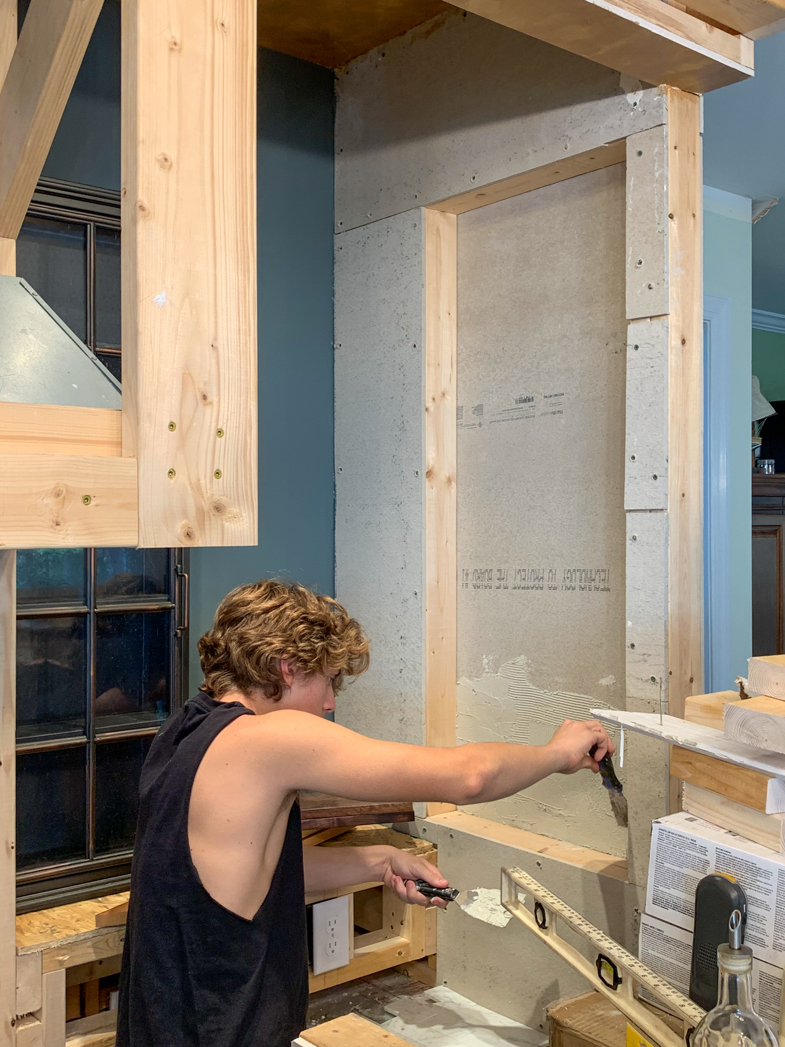
Step 2: Mortar.

The Oil and Spice Shelf Nook Inside Your Range Hood Surround You Didn't Know You Needed But You Absolutely Have To Have
The Oil and Spice Shelf Nook Inside Your Range Hood Surround You Didn’t Know You Needed But You Absolutely Have To Have


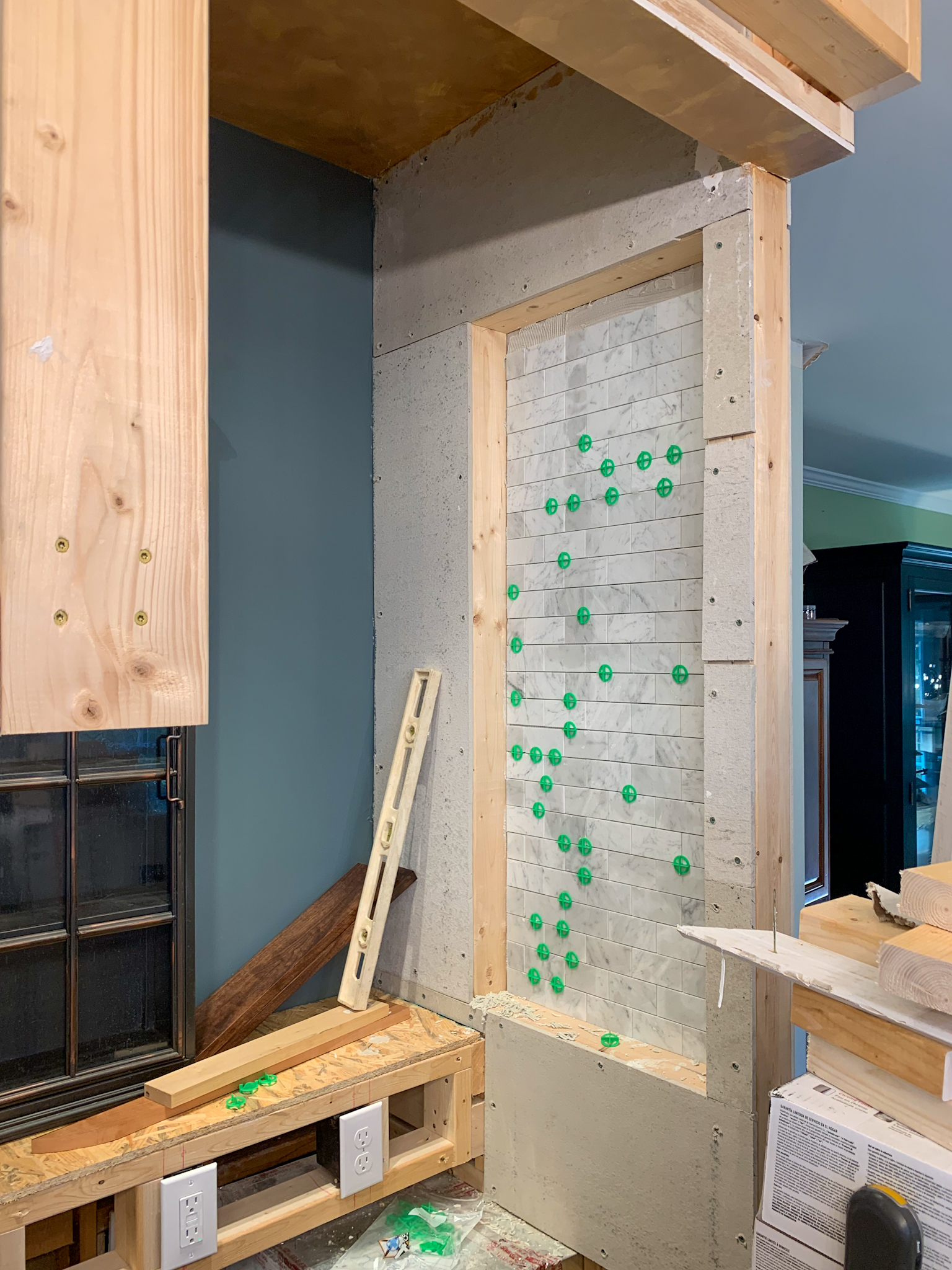
Step 3: Tile.

The Oil and Spice Shelf Nook Inside Your Range Hood Surround You Didn't Know You Needed But You Absolutely Have To Have
The Oil and Spice Shelf Nook Inside Your Range Hood Surround You Didn’t Know You Needed But You Absolutely Have To Have


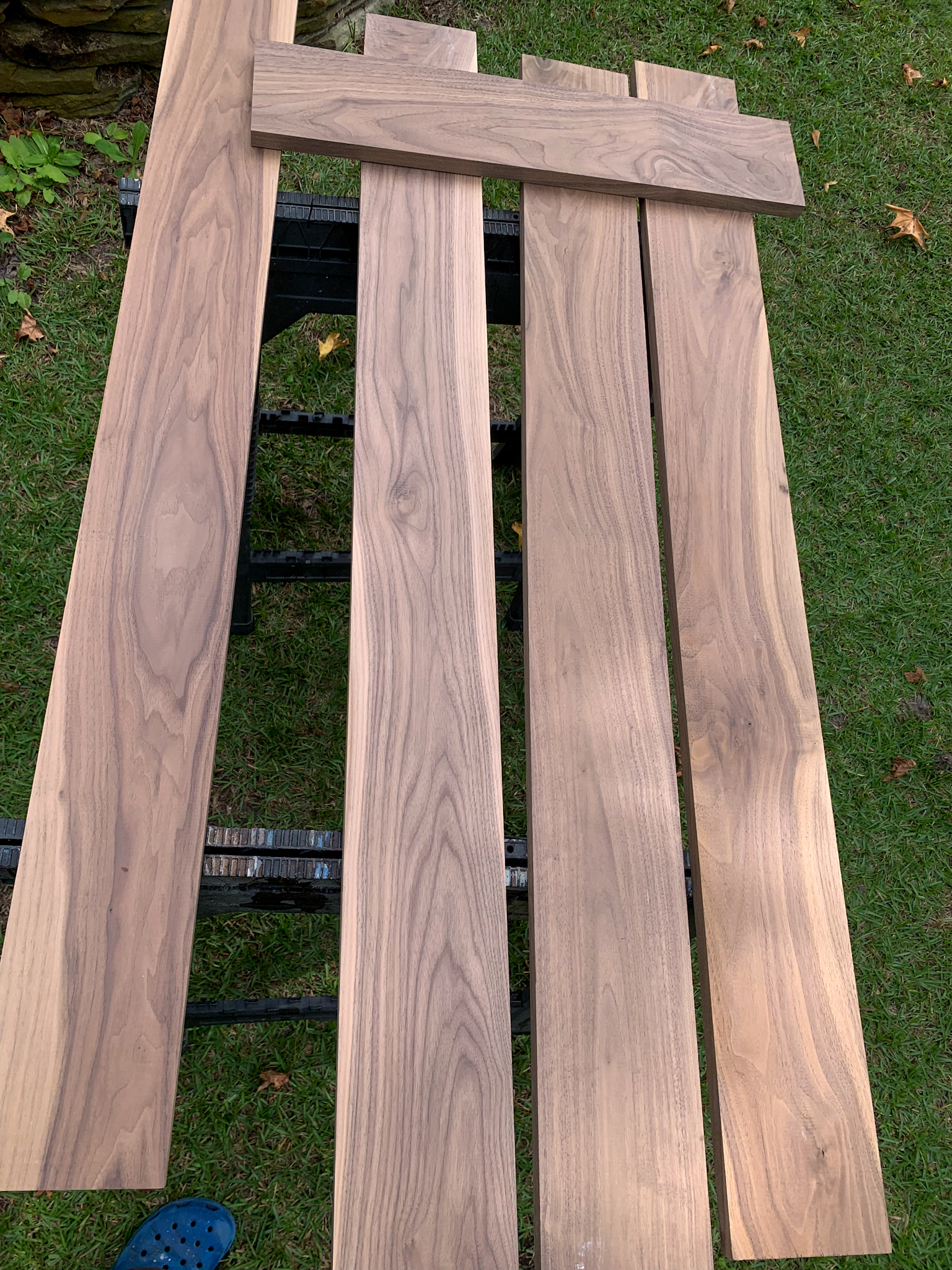
Step 4: Prefinish the walnut shelves prior to installation. I highly recommend lots of lacquer to prevent warping/staining from spills or drips.
The Oil and Spice Shelf Nook Inside Your Range Hood Surround You Didn't Know You Needed But You Absolutely Have To Have
The Oil and Spice Shelf Nook Inside Your Range Hood Surround You Didn’t Know You Needed But You Absolutely Have To Have


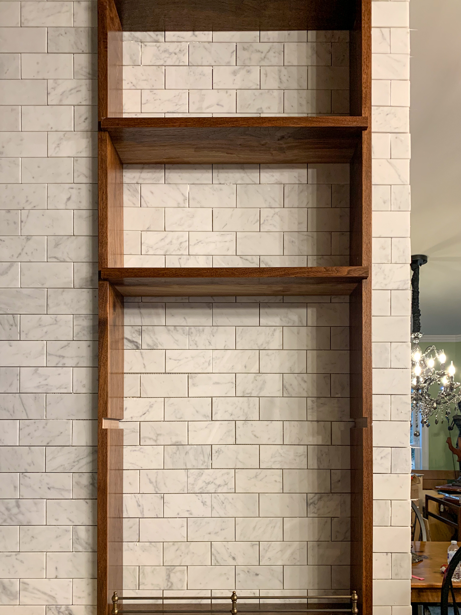
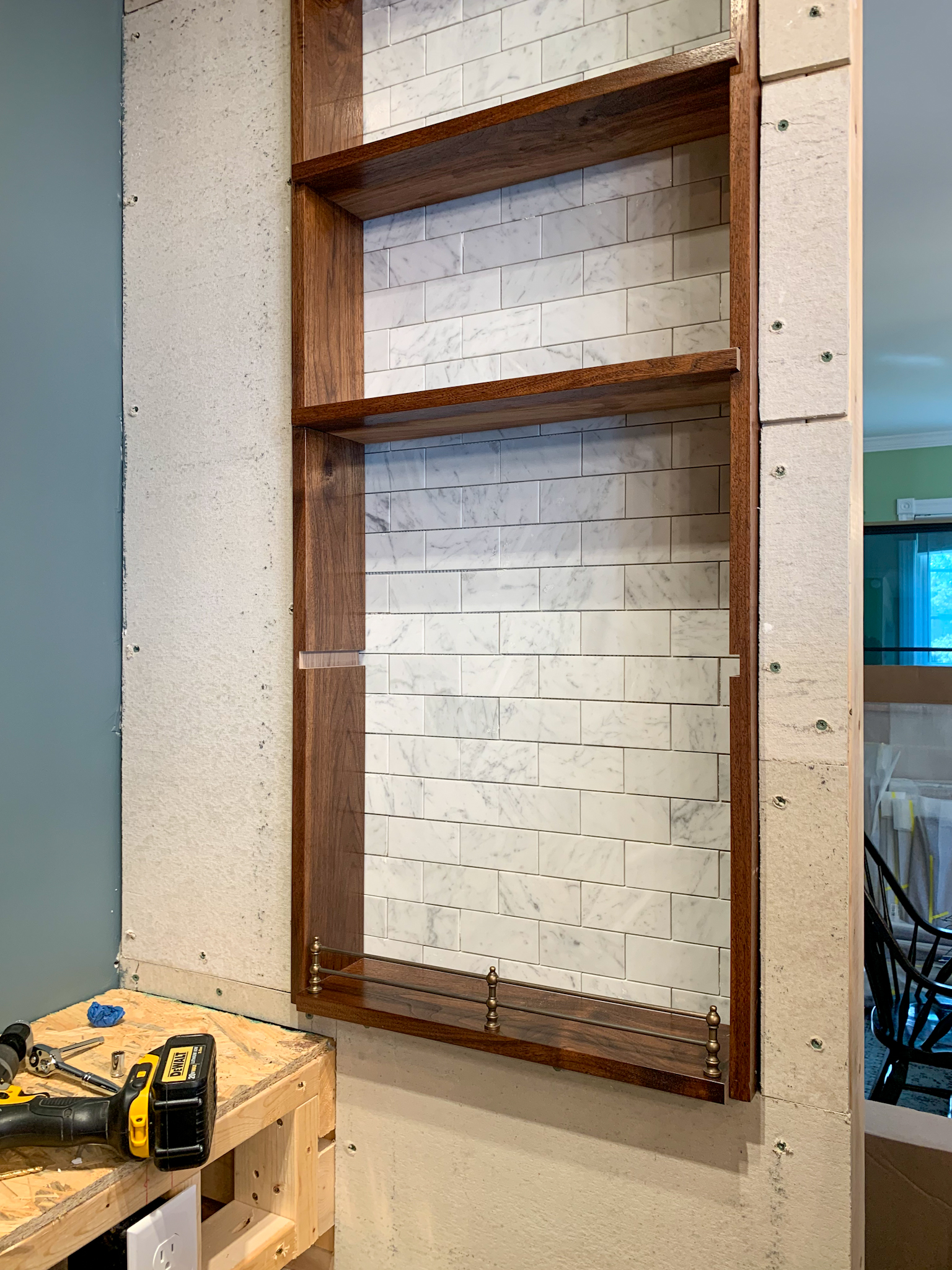
Step 5: Install wooden shelf surround (if you’re using gallery rails, I highly recommend attaching them to the shelves prior to installation). I recommend leaving the shelves unattached until you have completed the grouting process (it’s much easier to grout without the shelves in).
The Oil and Spice Shelf Nook Inside Your Range Hood Surround You Didn't Know You Needed But You Absolutely Have To Have
The Oil and Spice Shelf Nook Inside Your Range Hood Surround You Didn’t Know You Needed But You Absolutely Have To Have


Step 6: Install remaining tile surrounding shelves.
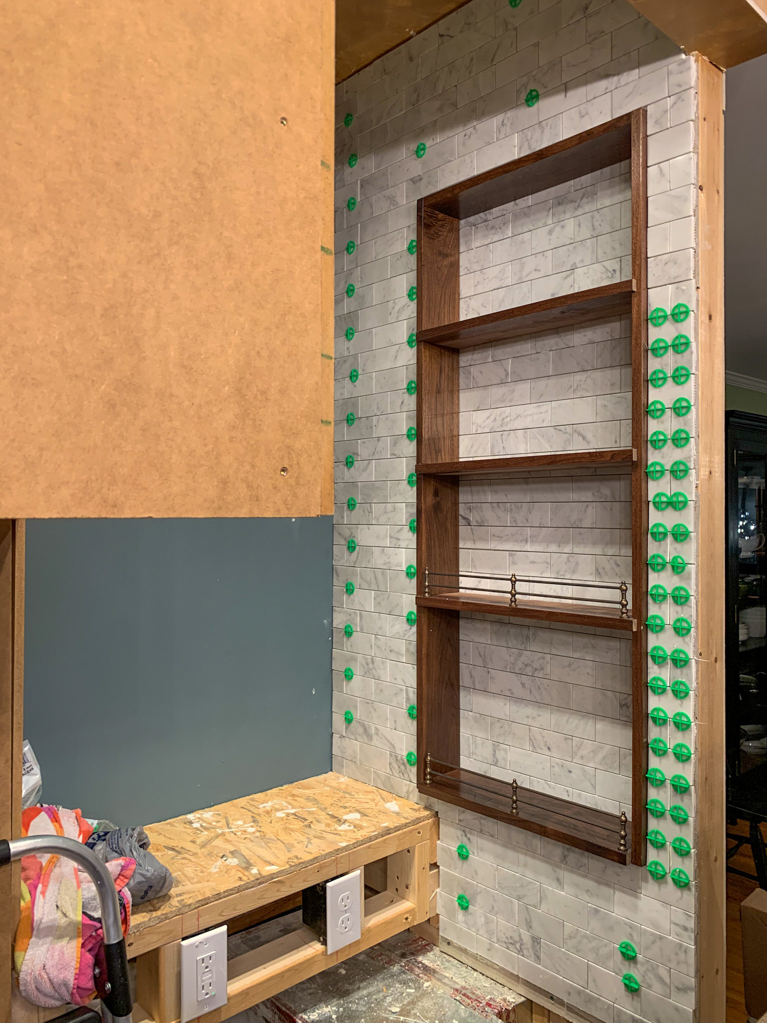
 

The Oil and Spice Shelf Nook Inside Your Range Hood Surround You Didn't Know You Needed But You Absolutely Have To Have
The Oil and Spice Shelf Nook Inside Your Range Hood Surround You Didn’t Know You Needed But You Absolutely Have To Have


The Oil and Spice Shelf Nook Inside Your Range Hood Surround You Didn't Know You Needed But You Absolutely Have To Have
The Oil and Spice Shelf Nook Inside Your Range Hood Surround You Didn’t Know You Needed But You Absolutely Need To Have


The Oil and Spice Shelf Nook Inside Your Range Hood Surround You Didn't Know You Needed But You Absolutely Need To Have
The Oil and Spice Shelf Nook Inside Your Range Hood Surround You Didn’t Know You Needed But You Absolutely Need To Have


Step 7: Grout and caulk (don’t skip the caulk, it prevents fluids from getting behind the shelves and warping them).
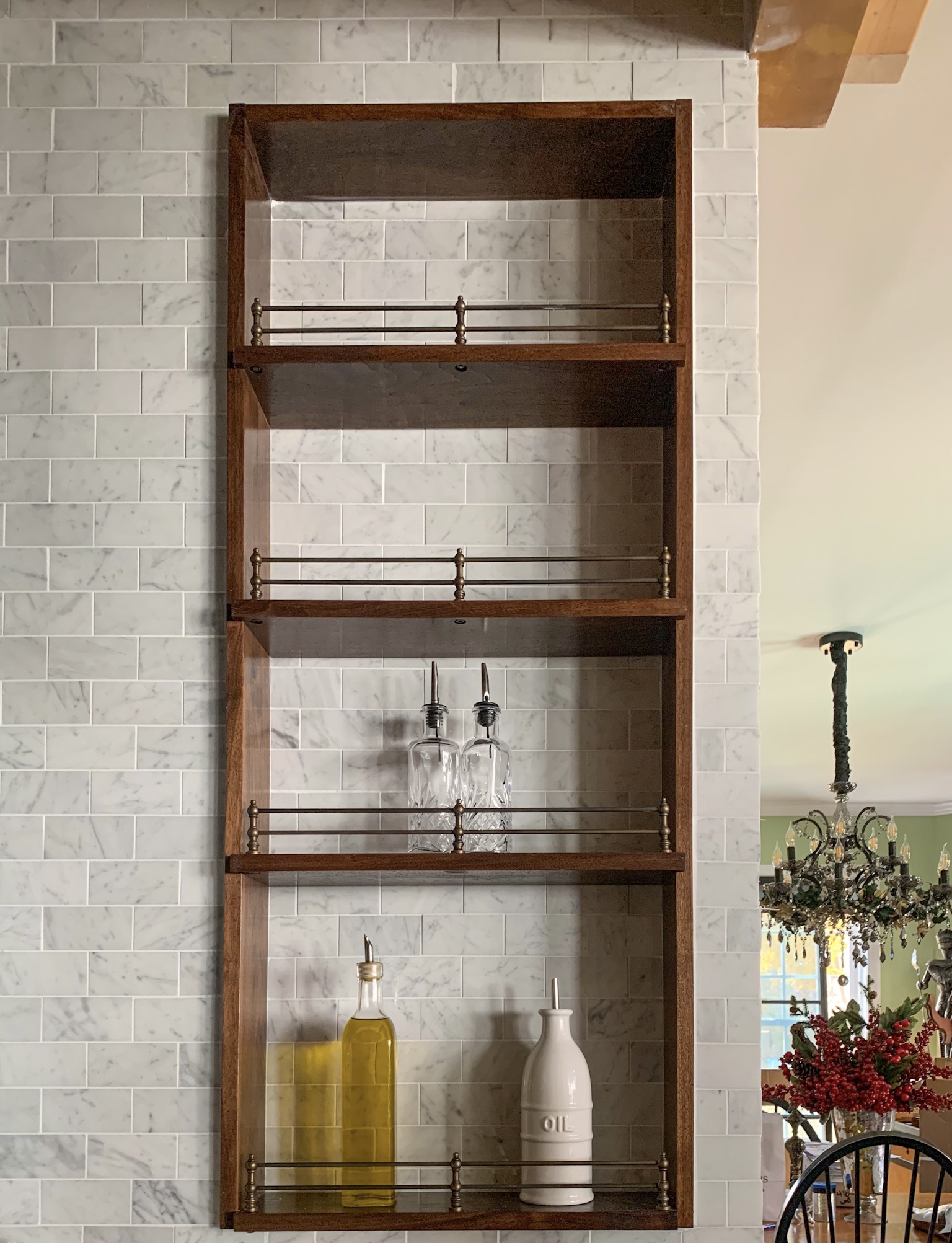
The Oil and Spice Shelf Nook Inside Your Range Hood Surround You Didn't Know You Needed But You Absolutely Must Have
The Oil and Spice Shelf Nook Inside Your Range Hood Surround You Didn’t Know You Needed But You Absolutely Must Have: Carrara Marble backed walnut shelves with antique brass gallery rails in the kitchen


Step 8: Style: Like everything else in the kitchen, this shelf should be both beautiful and functional. Keep your favorite oils, vinegars, Worcestershire sauce, etc. within reach.
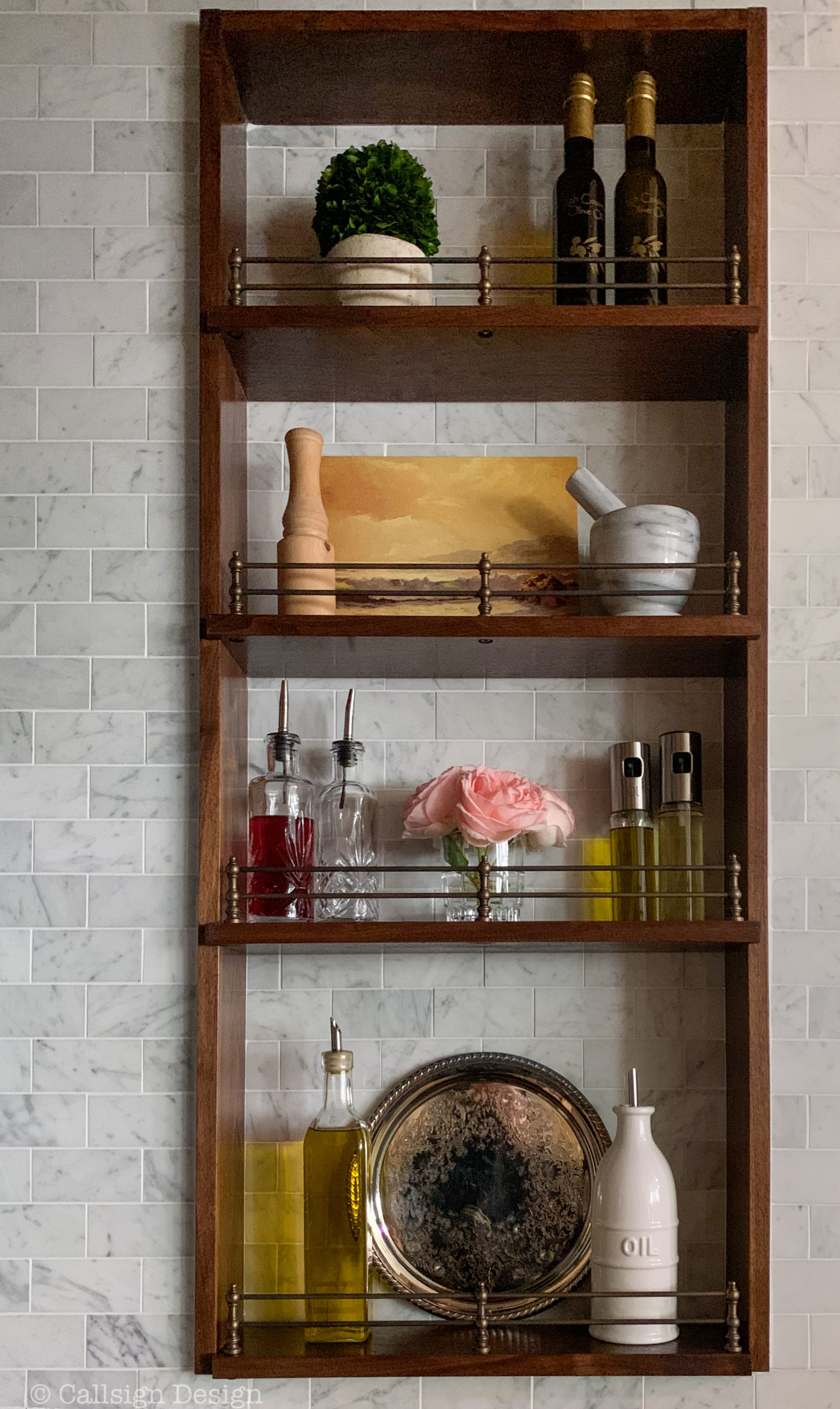
 

The Oil and Spice Shelf Nook Inside Your Range Hood Surround You Didn't Know You Needed But You Absolutely Must Have: Styled shelfie all ready to go with a small preserved boxwood, oils from High Country Olive Oil, a carrara marble mortar and pestle, a vintage landscape oil painting, oil carafes/dispensers, and a tiny votif of roses from our last bloom of the season
The Oil and Spice Shelf Nook Inside Your Range Hood Surround You Didn’t Know You Needed But You Absolutely Must Have: Styled shelfie all ready to go with a small preserved boxwood, oils from High Country Olive Oil, a Carrara marble mortar and pestle, a vintage landscape oil painting, oil carafes/dispensers, and a tiny votive of roses from our last bloom of the season


I don’t know if I mentioned this… but I LOVE my shelves!


Price breakdown: Shop This Project On Our LTK Store

Walnut shelves and lining $199.43

Double brass gallery rails: Vintage Hardware: $250.70

Carrara marble subway tiles behind shelves: Stone Center Online: About $100

Supplies for installing tile and shelves (mortar, grout, nails, stain, and lacquer): About $100

Total: $650.13 


If you’re planning your dream kitchen, I highly recommend these!


*Legal stuff:

I am honest about my experiences with different products and write because I enjoy it.  I do however, have the opportunity to earn money for my writing, also.

Slavetodiy.com is a participant in the Amazon Services LLC Associates Program, LTK, and other affiliate programs: affiliate advertising programs designed to provide a means for sites to earn advertising fees by advertising and linking to amazon.com and other sites.  These programs offer a small commission on products sold through their affiliate links.  Each of your purchases via our affiliation links supports our cause at no additional cost to you.

If a blogger links to a product (with a special code for affiliates embedded in the link), and a reader places an item in their “shopping cart” through that link within 24 hours of clicking the link, the blogger gets a small percentage of the sale.  These links are not “pay per click.”  If you click on the product link and stay around and purchase something else, however, I will get a commission on that sale.
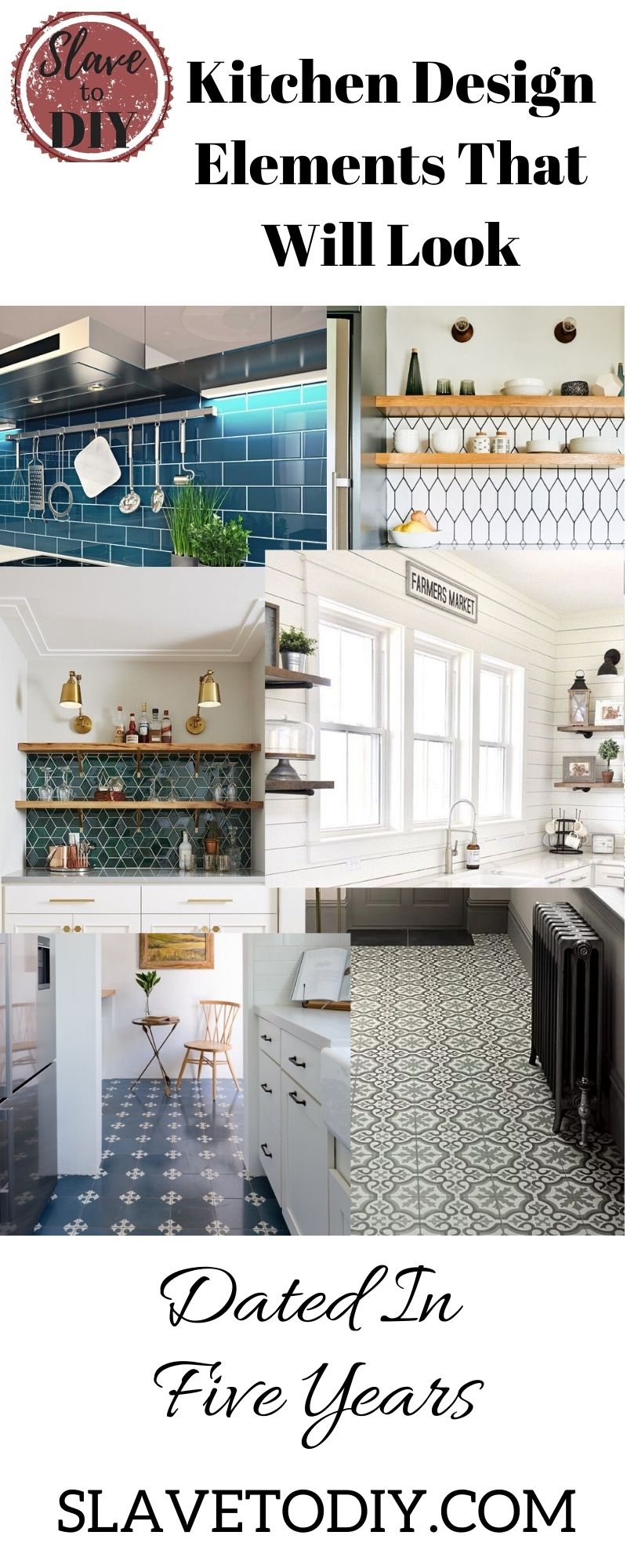


Kitchen Crush: Things That Will Make Your Kitchen Feel Dated in 5 Years Or Less

Are you planning a kitchen renovation? One of the fears many people have when they’re planning a big renovation is the concern that the kitchen will feel dated soon after they complete the renovation. It can be very daunting to lay out the money for an extensive renovation and then consider that you might be doing it again in just a few years.

*This post may contain affiliate links. Please see full disclosure at the end of the post.

ikea hack (1)

To help you in your planning and design process: Here are the top things that date your kitchen:

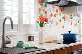
  1. A Trendy/Patterned Backsplash: Don’t follow backsplash trends (trust me here… this is THE FASTEST way to date your kitchen). Both material and pattern date the backsplash. Unless you’re flipping a house, skip the trendy stuff. Plain white subway tile is a safe choice, as is brick. Ignore me at your peril: if you do something trendy, you’ll be updating this every couple of years.
Kitchen Backsplash from Hawaiihomemag.com
Kitchen Crush: Things That Will Make Your Kitchen Feel Dated in 5 Years Or Less, Backsplash from Hawaiihomemag.com

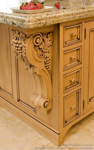
2. Arches and Busy Woodwork. If your thick, wood doors have an awful 80s/90s era arch on them, there is simply no fixing that. If there’s an arch/bridge over the kitchen sink, just take the whole thing down. As for the cabinets themselves: If you stick with basic rectangular doors you can always update those, but you can’t undo an arch. Also, if you MUST have fancy woodwork on your cabinets, adding appliques that can be removed later is your best bet (anyone who has those grape inlaid cabinets is giving me a silent high five right now).

Inlaid Grapes
Kitchen Crush: Things That Will Make Your Kitchen Feel Dated in 5 Years Or Less grapes from Kitchen-Design-Ideas.org

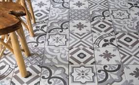
3. Trendy/Patterned Floors: You’ve seen it: The vinyl planks, the wood-look-alike tiles, etc. None of them stay in style very long. Instead, think of classic materials: travertine, limestone, brick, wideplank wood floors, terra cotta tiles. Any of these are classic choices that last! Try them in herringbone or antique formations (travertine) that will make them look as if they’ve always been there and are forever chic. As a rule of thumb, I avoid anything that has the word “faux” in front of it (remember the original Corian? It cracks and melts under abuse). If you go with authentic materials and shapes, you’ll be happier in the long run.

Busy Patterned Floors
Kitchen Crush: Things That Will Make Your Kitchen Feel Dated in 5 Years Or Less, Patterned Floors from Tileoutlets

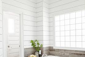
4. Shiplap. Skip it. (Trust me here, there are going to be oodles of ladies cursing Joanna Gaines in a few years when they have to undo all that faux shiplap they put up). Don’t get me wrong, even though we have VERY different design styles, Joanna Gaines is a design superstar, and if she’s anywhere close to as cool as she appears on her media, I’m a big fan of her as a person. I’m a little bummed that she singlehandedly ruined shiplap. Shiplap was a classic element in coastal homes (especially on the East Coast), with a white wash or watery white wash… it was beautiful. Now it is faux farmhouse and COMPLETELY overdone. It is dying a slow death from over-popularity. It’s going to be the 2010s equivalent of seventies porn panelling in a few years. Just trust me!

Shiplap from "This Old House"
Kitchen Crush: Things That Will Make Your Kitchen Feel Dated in 5 Years Or Less from “This Old House”

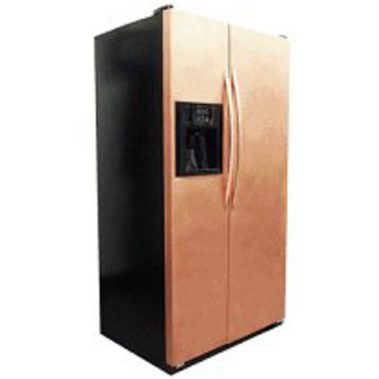
5. Trendy Appliance Finishes: This can be tricky, because we all remember when white appliances were the ONLY thing, then black came along, then stainless, dark stainless, copper, etc. If you can’t decide on a finish, choose a commercial-kitchen-looking option (stainless, stainless, stainless). Stainless was introduced to the residential arena a LONG time ago and the most expensive brands are still sporting the look. Why? It’s what commercial kitchens use, and when we’re designing kitchens, everyone’s a wannabe chef/foodie. We want what the pros use. (The exception: If you have a retro or mid-century house, the sky’s the limit… you can do colorful or plain, and it all works).

Copper finish from Kitchensource.com
Kitchen Crush: Things That Will Make Your Kitchen Feel Dated in 5 Years Or Less, Copper finish from Kitchensource.com

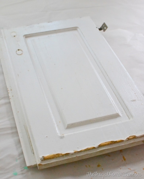
6. MDF Painted Cabinets. Do you remember when painted cabinets weren’t a thing? Solid wood cabinetry was very popular once (it was sort of the only game in town) and is still around. It’s very versatile… if you don’t like it you can paint it. Want it to be stained again? Strip the paint and stain it again. I know they’re cheaper, but, if you opt for MDF painted cabinets those can’t be stripped and stained. You’re going to have to replace the cabinets, or at least the doors if you tire of painted cabinets.

MDF Doors from Thefrugalhomemaker.com
Kitchen Crush: Things That Will Make Your Kitchen Feel Dated in 5 Years Or Less, MDF Doors from Thefrugalhomemaker.com

7. Any cabinet style that is not inset or full overlay. For all of you that painted your 80s or 90s cabinets, the appraiser can tell that you did a very “mini” flip on your kitchen. How? The cabinet style. If you can see the frame around the outside of the cabinet doors, the cabinets are old. Full overlay is the cheaper of the two timeless choices and you can get away with it… probably forever. For a pricier option: Inset cabinets were found in historic homes and have stayed in style for cottages and period homes for the duration. This is my choice for something that may NEVER be dated. Less expensive that completely replacing your cabinetry? Try a cabinet door company. With careful measurements they can help you build a full overlay look that will look like you’ve done a complete gut on your kitchen.

Traditional overlay from secondsandsurplus.com
Kitchen Crush: Things That Will Make Your Kitchen Feel Dated in 5 Years Or Less, Traditional overlay from secondsandsurplus.com

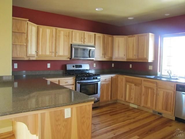
8. The Wall and Cabinet Colors. Seriously. Just paint it!  Is your kitchen still stuck in a deep red faux Tuscany phase? It’s time. Go on Pinterest and search for kitchen paint colors. There are some really talented ladies that will tell you which wall colors best complement your cabinetry (if you’re planning on painting your cabinets, skip the paint brush and check out our article on How To Use An Inexpensive Paint Sprayer For Painting Cabinets or Furniture).

Red walls in the kitchen from pinterest.com
Kitchen Crush: Things That Will Make Your Kitchen Feel Dated in 5 Years Or Less, Red walls in the kitchen from pinterest.com

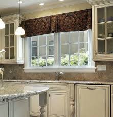
9. Your window treatments. If you’re looking at them right now and pondering, chances are they need to come down. Heavy, dark window treatments, broken blinds, vertical blinds, and valances (unless you live in a multi-million dollar home, take it down) need to come down. You can thank me later. Every one of your windows is better off naked than with outdated window dressings.

Dark Valance from Prioritywindowvalances.com
Kitchen Crush: Things That Will Make Your Kitchen Feel Dated in 5 Years Or Less, Dark Valance from Prioritywindowvalances.com

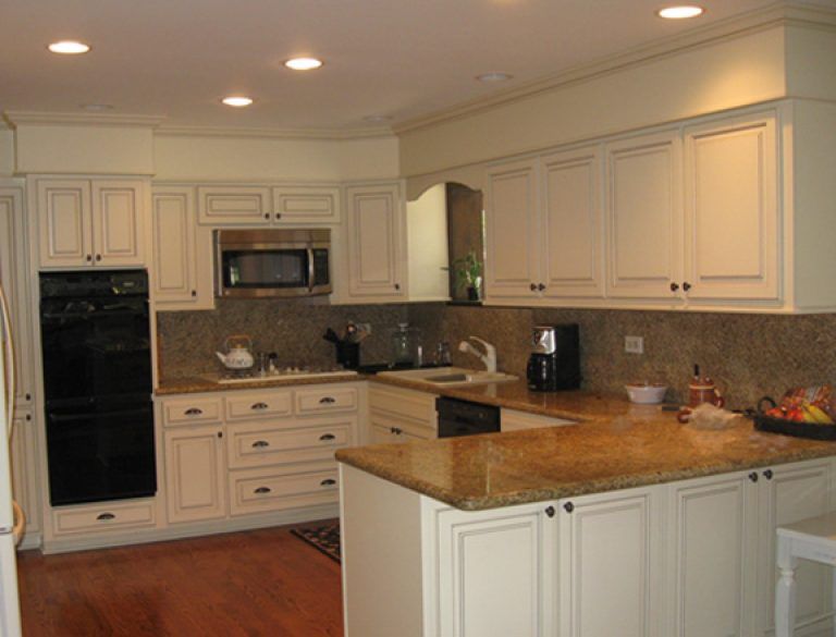
10. That weird soffit over the cabinets that serves no purpose whatsoever. First, please check to make sure that it’s not housing plumbing, venting, or electrical. Then, rip it out! For some great ideas of what to do in that newly opened up space, check out our post on The Best Ways To Transform An Outdated Kitchen On A Tiny Budget.

Soffit over cabinets from Pinterest.com
Kitchen Crush: Things That Will Make Your Kitchen Feel Dated in 5 Years Or Less, Soffit over cabinets from Pinterest.com

That doesn’t mean that your new kitchen has to be boring, it’s just that if you keep the bones of your kitchen neutral-ish and classic, you’ll avoid design mistakes that will end up costing you money again.

Trendy things you can purchase for your new kitchen (that are easier and inexpensive to swap out later):

  1. Kitchen faucets and fixtures
  2. Hardware
  3. Pendants/lighting

But, as for the rest of it… keep it classic, keep it in historic home color families, and you’ll never have to do a full renovation again.

What are some kitchen elements that date your kitchen?

Cheers and check out more of our great content over on the blog!


*Legal stuff:

I am honest about my experiences with different products and write because I enjoy it.  I do however, have the opportunity to earn money for my writing, also.

Slavetodiy.com is a participant in the Amazon Services LLC Associates Program, an affiliate advertising program designed to provide a means for sites to earn advertising fees by advertising and linking to amazon.com.  Amazon offers a small commission on products sold through their affiliate links.  Each of your purchases via our Amazon affiliation links supports our cause at no additional cost to you.

If a blogger links to an Amazon product (with a special code for affiliates embedded in the link), and a reader places an item in their “shopping cart” through that link within 24 hours of clicking the link, the blogger gets a small percentage of the sale.  Amazon links are not “pay per click.”  If you click on the product link and stay around Amazon and purchase something else, however, I will get a commission on that sale.
Slavetodiy.com is also a VigLink affiliate advertiser which works similarly.

House Porn: An Artist’s Masterpiece in Alabama

I have a confession to make: I’m bored to tears with white.  There was a time when texture and color were okay, and i desperately miss those days. I recently found a place where every surface: every wall, floor, fixture, and cabinet door has interest.  Like a breath of fresh air: hand carved details, custom wall finishes, hand hewn floors… I love it all. Check out the home tour in photos below.

The listing, at 2740 Abingdon Rd, Mountain Brook, AL is 4 bedrooms, 5.5 baths, and a sprawling 4337 sq. ft.  The listing photos are the property of the Realtor, Brooke Wahl, at ARC realty and can be reached at 855-822-3469 for anyone interested in purchasing.

*This post may contain affiliate links. Please see full disclosure at the end of the post.

The exterior:

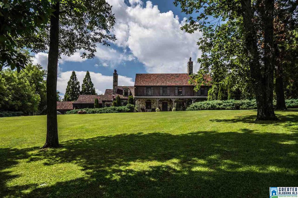
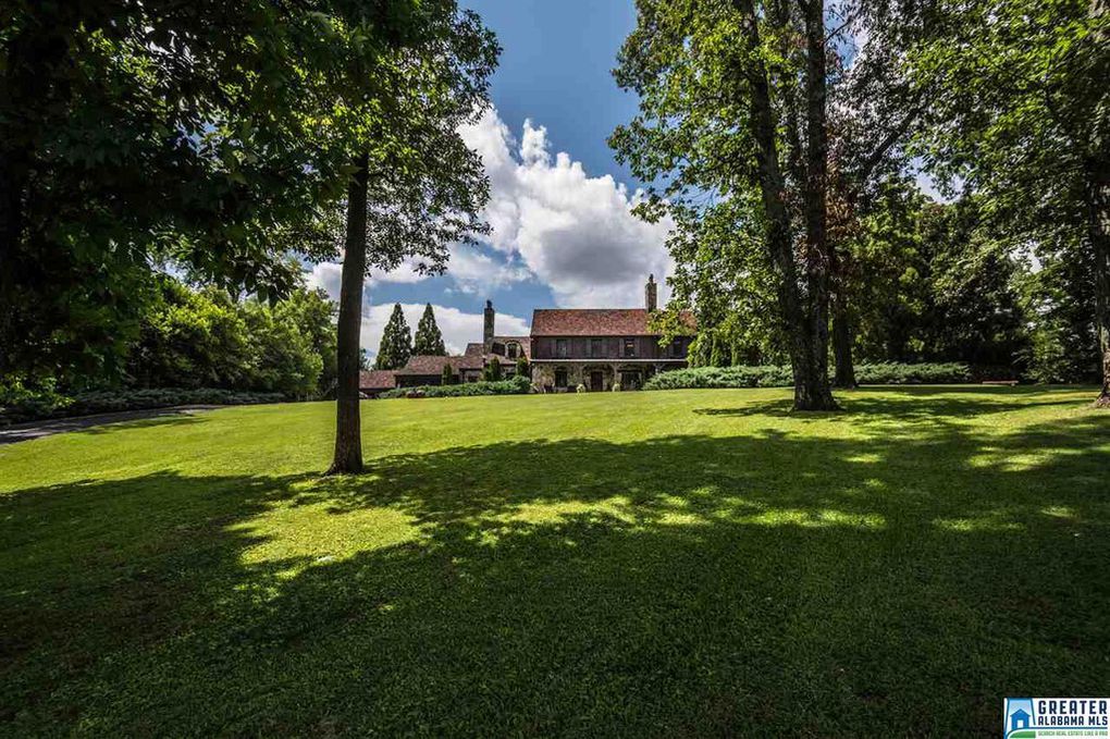
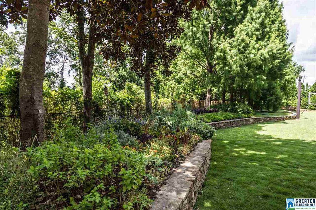
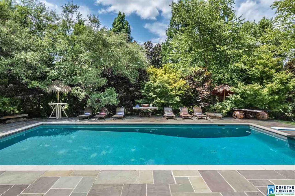
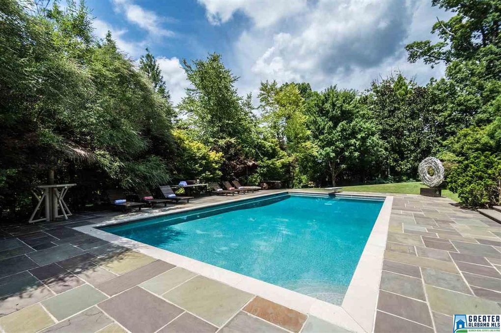
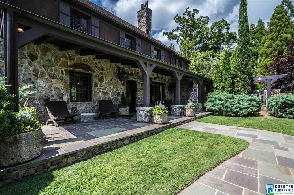
A two acre lot feels big and is beautifully manicured, perfect for outdoor entertaining and family time.  Sculptures are placed throughout the landscape, rolling hills, and stone gardens and patios.  The pool is a tasteful addition and blends with the rest of the exterior seamlessly.


Birmingham Alabama artist's home with incredible textures and finishes
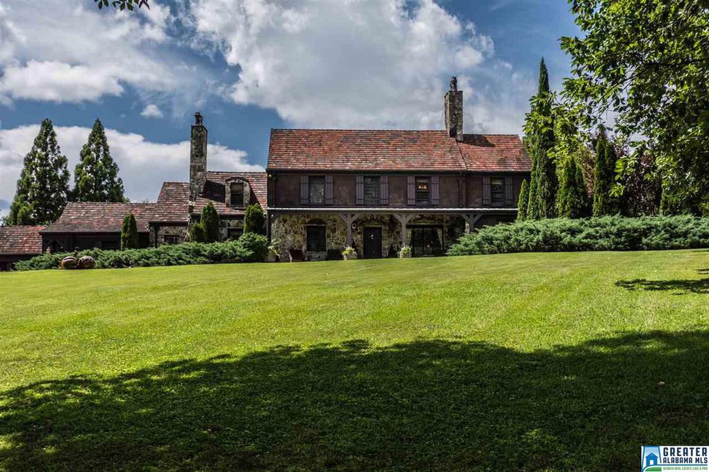
Exterior stone, chimneys, and descending rooflines
Birmingham Alabama artist's home with incredible textures and finishes
Incredible lush, sloping lawn with mature trees
Birmingham Alabama artist's home with incredible textures and finishes
Curb appeal, view of the exterior
Birmingham Alabama artist's home with incredible textures and finishes
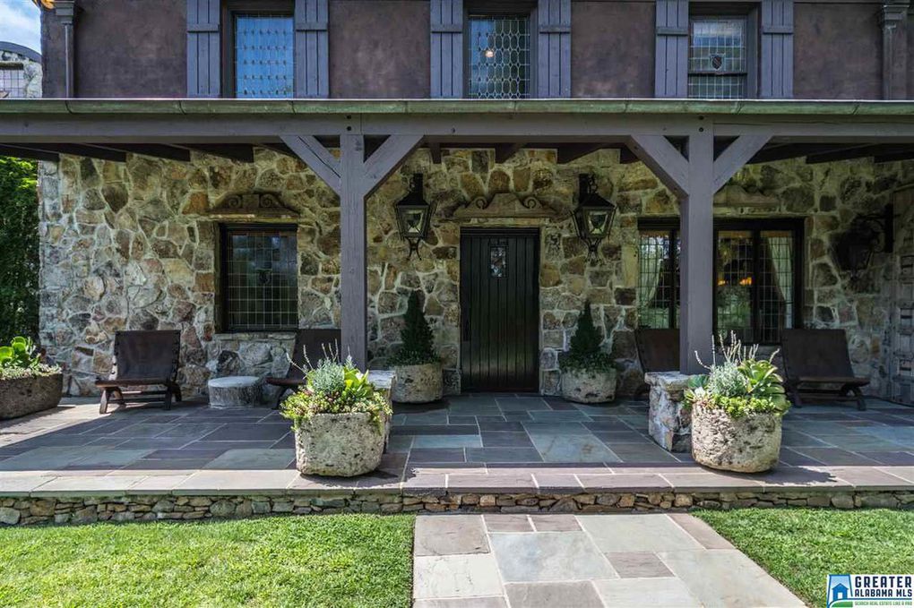
Leaded glass windows with stained glass inlays, sculptural detailed window crowns, blue stone patio, stone containers and wrought iron lanterns.
Birmingham Alabama artist's home with incredible textures and finishes
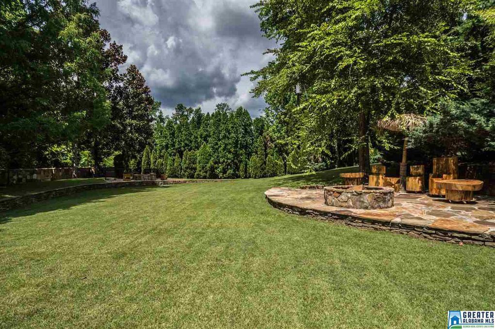
Sweeping stone patios with a firepit and custom hewn log furniture
Birmingham Alabama artist's home with incredible textures and finishes
Extensive stacked stone garden walls
Birmingham Alabama artist's home with incredible textures and finishes
View of the outdoor entertaining area with large sculptures flanking the pool
Birmingham Alabama artist's home with incredible textures and finishes
Large sculptures outside Birmingham home flanking pool
Birmingham Alabama artist's home with incredible textures and finishes
Incredible stone tiered outside patio terrace leading to incredible pool with bluestone pavers
Birmingham Alabama artist's home with incredible textures and finishes
Pool with sculptures and blue stone pavers
Birmingham Alabama artist's home with incredible textures and finishes
Beautiful pool with bluestone pavers
Birmingham Alabama artist's home with incredible textures and finishes
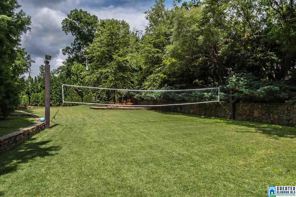
Outdoor volleyball court between stone walls
Birmingham Alabama artist's home with incredible textures and finishes
Entrance walk leading up to the house


Special spaces:

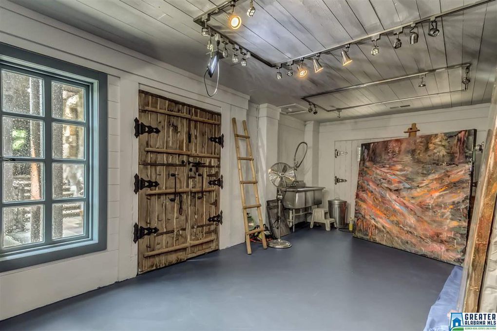
I felt like Alice in Wonderland exploring this place, and the details are incredible. One of my favorite places?  The art studio.

Birmingham Alabama artist's home with incredible textures and finishes
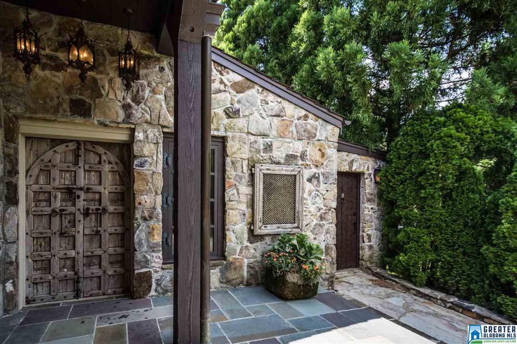
The side entrance leading to the art studio.
Birmingham Alabama artist's home with incredible textures and finishes
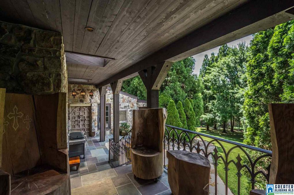
Side patio leading to art studio, with custom iron railings, tiered stone patio, and custom hewn log furniture
Birmingham Alabama artist's home with incredible textures and finishes
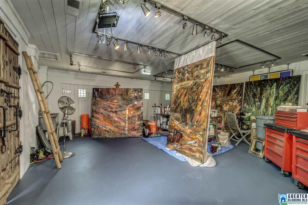
Interior art studio, light and bright with tons of space and track lighting
Birmingham Alabama artist's home with incredible textures and finishes
Interior shop and art studio


The interior:

Deep autumn hues wrap the entire interior in a warm, homey hug, yet it’s sophisticated and creative.  Extensive recessed lighting, and warm wrought iron fixtures and chandeliers, ensure that it’s still bright even with the maximalist style and textured walls, ceilings, and floors.

Birmingham Alabama artist's home with incredible textures and finishes
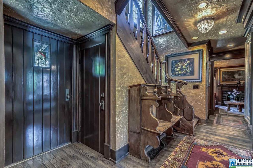
Front entrance with rustic wood doors and inlaid leaded glass, textured walls with a sheen to maintain cleanliness, crystal lighting, walnut floors, custom wooden railings, and stacked pews.
Birmingham Alabama artist's home with incredible textures and finishes
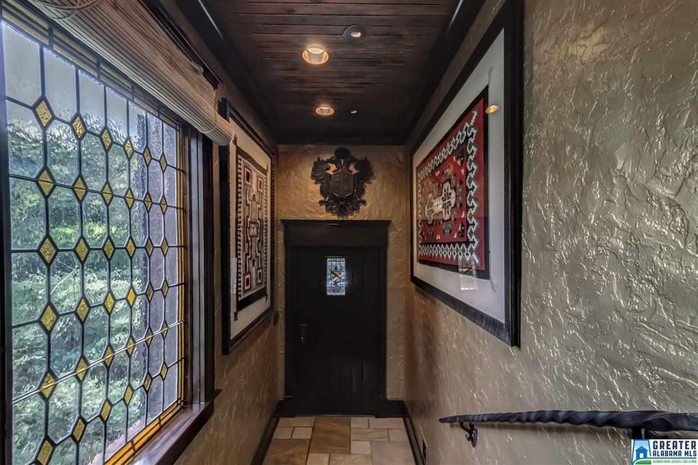
Custom leaded/stained glass windows, textured walls, wooden ceilings, stone floors, modern lighting, cast iron railing, and carved wooden crest
Birmingham Alabama artist's home with incredible textures and finishes
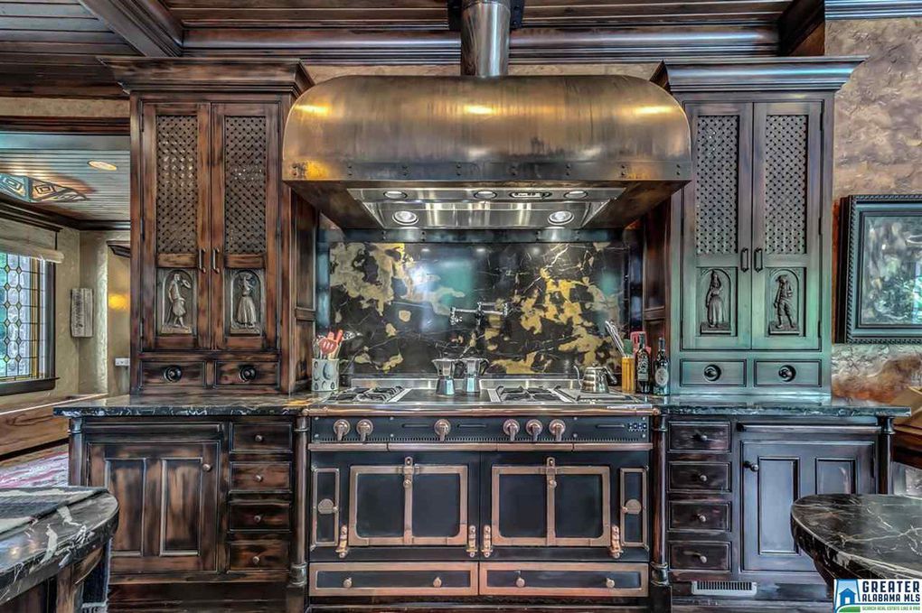
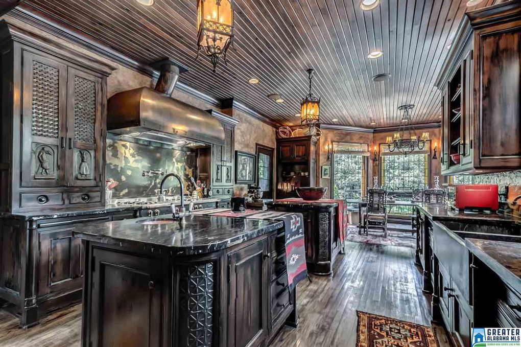
Properly scaled, massive metal hood with an aged patina over 60 inch gas stove, flanked by wooden cabinetry with hand carved doors
Birmingham Alabama artist's home with incredible textures and finishes
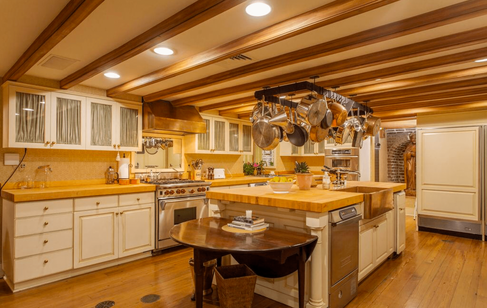
Two islands in a rich, multi-texture kitchen with modern and period lighting
Birmingham Alabama artist's home with incredible textures and finishes
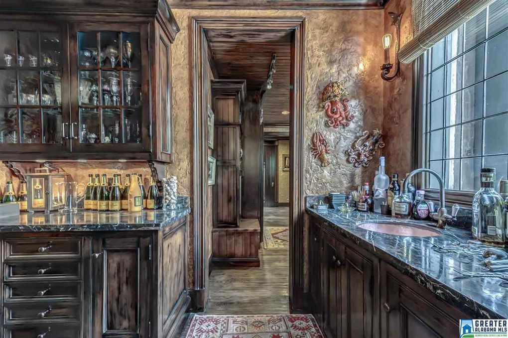
Kitchen details: antique glass in cabinet inset with electric sconces and leaded glass grid windows and marble
Birmingham Alabama artist's home with incredible textures and finishes
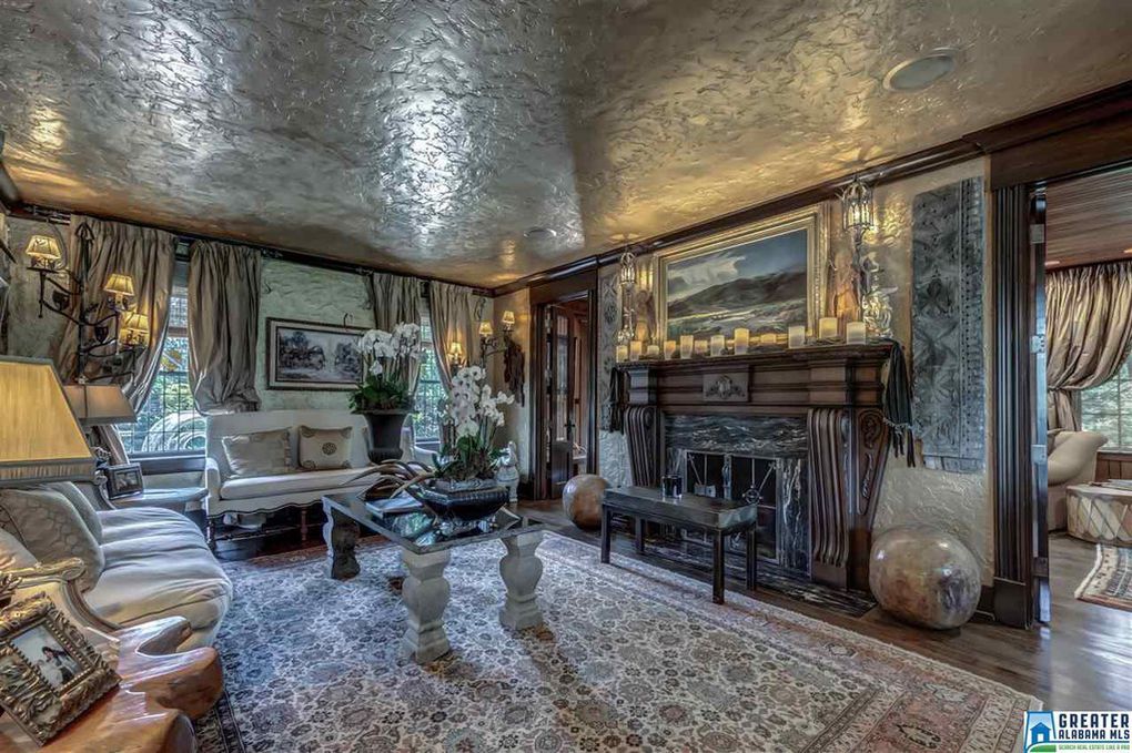
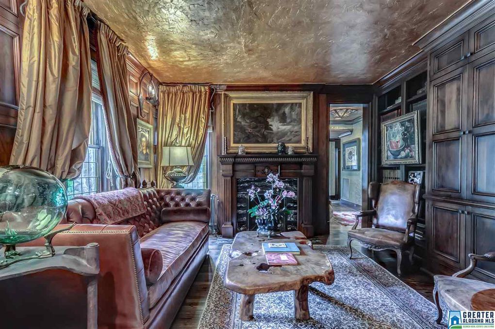
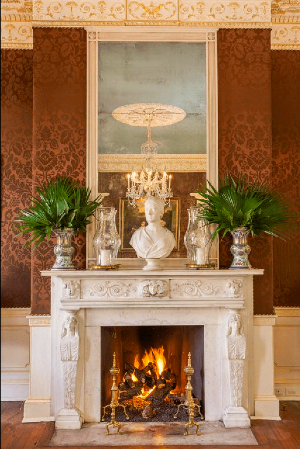
Rich drapes and sculptural details around a one of a kind wooden mantel
c2505216b535fd30653e6ae2d622f3b2l-m11xd-w1020_h770_q80
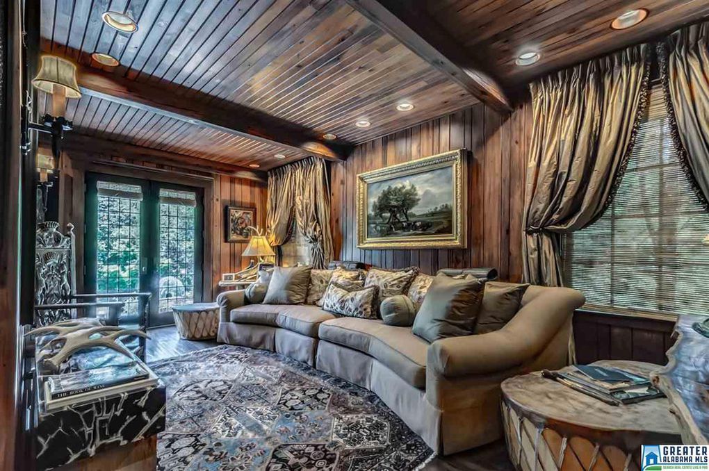
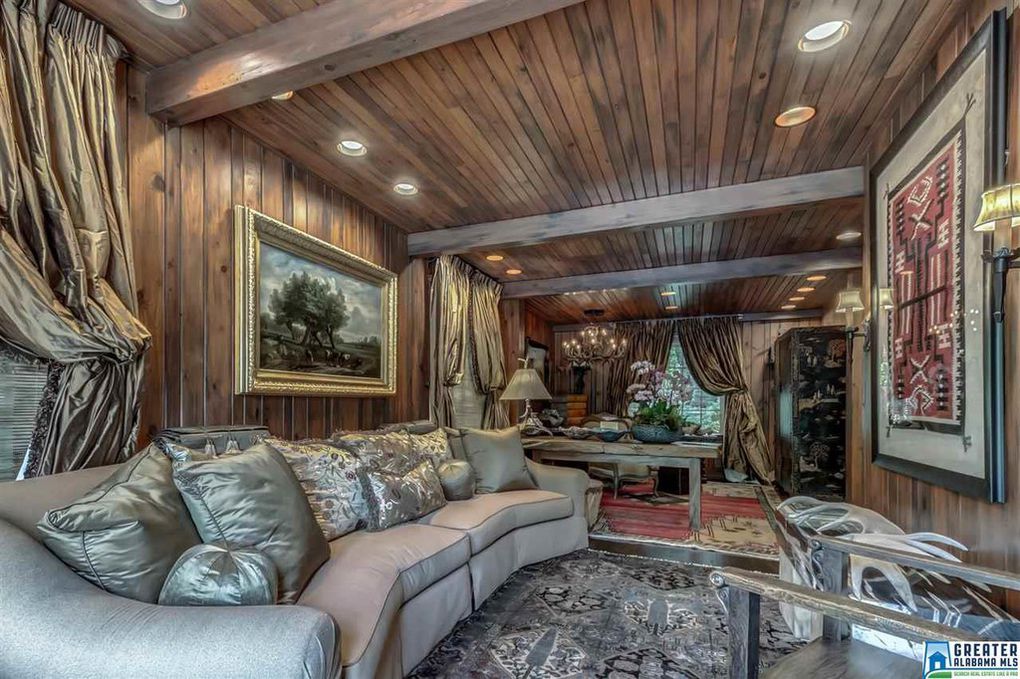
Living area with real wood paneling, beams, and modern lighting
Birmingham Alabama artist's home with incredible textures and finishes
Living space with wood walls and details
Birmingham Alabama artist's home with incredible textures and finishes
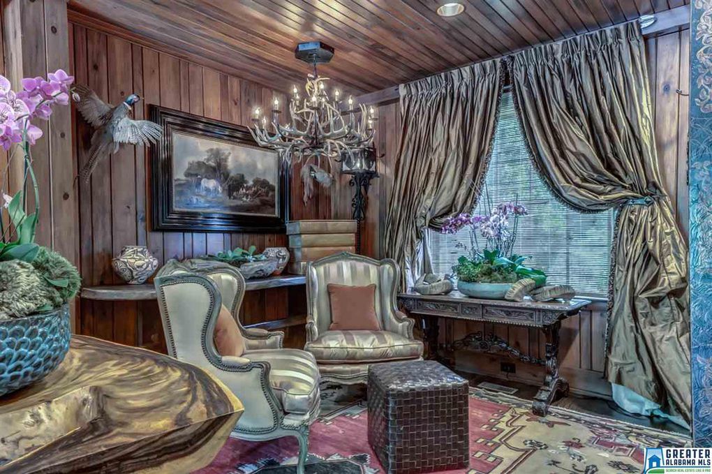
Incredible arrangements, unique light fixtures, and professionally done draperies
Birmingham Alabama artist's home with incredible textures and finishes
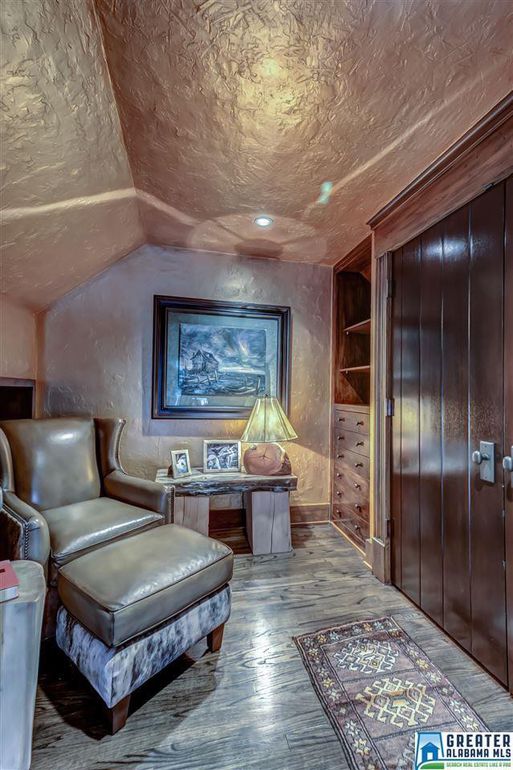
Cozy reading nook with textured walls and wooden builtins
Birmingham Alabama artist's home with incredible textures and finishes
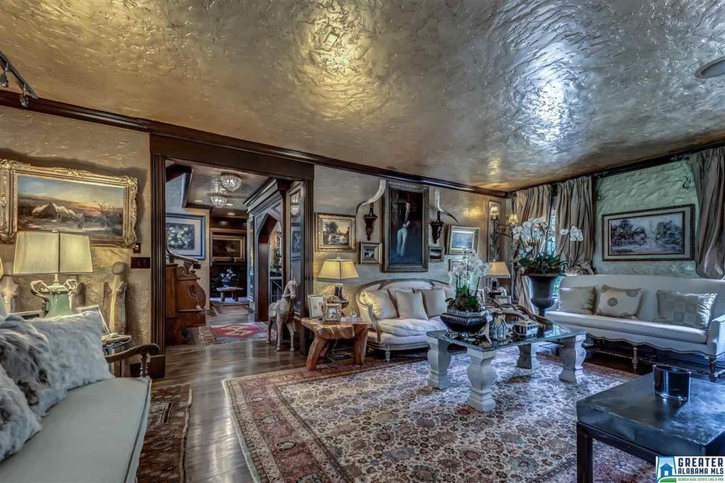
Living area looking through to the front hall
Birmingham Alabama artist's home with incredible textures and finishes
Study with walnut paneling, custom wood burning fireplace, textured ceilings, and soft golden lighting
Birmingham Alabama artist's home with incredible textures and finishes
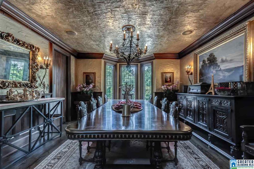
Majestic dining room with properly scaled art and furnishings and grand, tall leaded windows
Birmingham Alabama artist's home with incredible textures and finishes
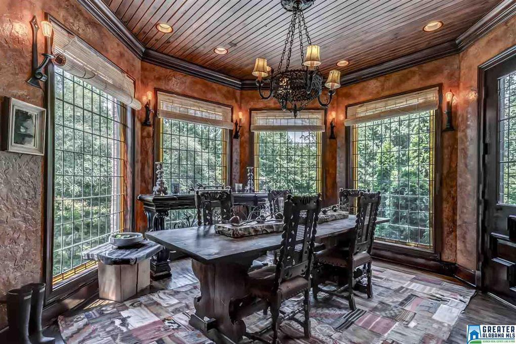
Large leaded grid windows surround an informal dining area, bathed in natural light
Birmingham Alabama artist's home with incredible textures and finishes
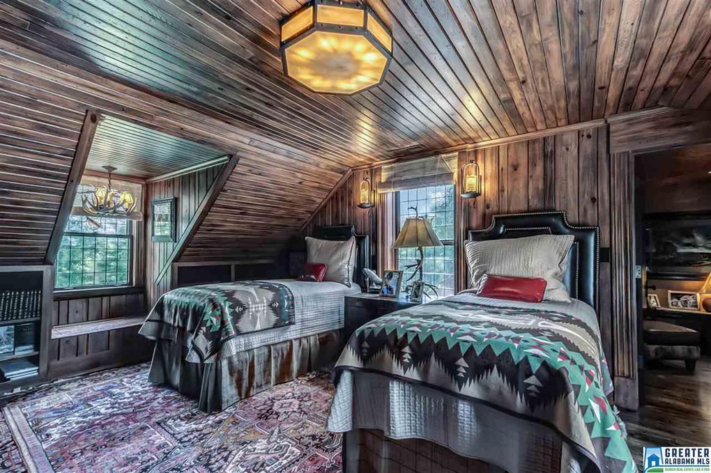
Twin beds upstairs in a guest bedroom
Birmingham Alabama artist's home with incredible textures and finishes
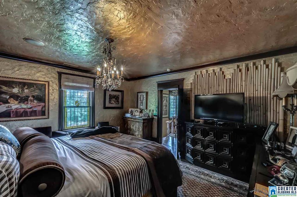
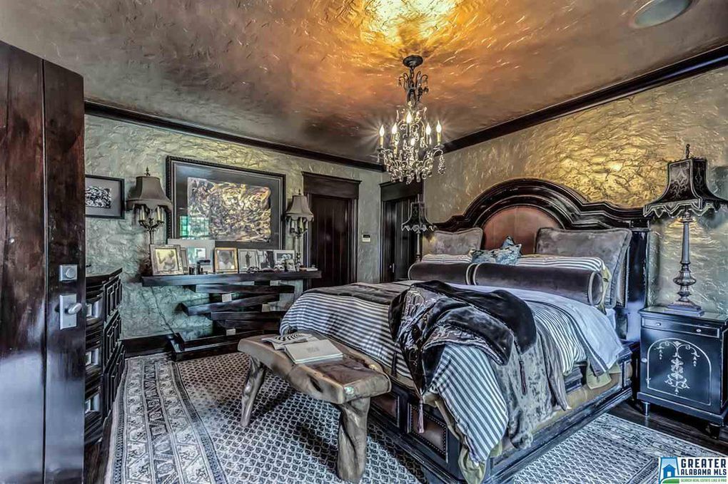
Master suite with crystal chandelier
Birmingham Alabama artist's home with incredible textures and finishes
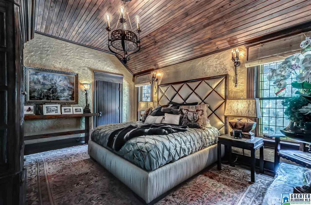
Rustic wrought iron chandelier and sconces, textured walls, and wooden ceiling paneling in an alternate guest bedroom
Birmingham Alabama artist's home with incredible textures and finishes
Guest bedroom with a view, out leaded windows
Birmingham Alabama artist's home with incredible textures and finishes
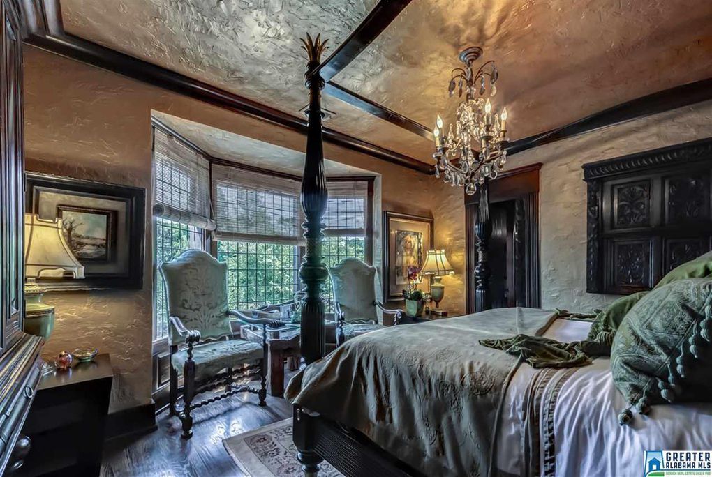
Another unique large scale bedroom
c2505216b535fd30653e6ae2d622f3b2l-m33xd-w1020_h770_q80
Guest bathroom with marble and glass shower, iron sconces, textured walls, and wood plank ceiling
Birmingham Alabama artist's home with incredible textures and finishes
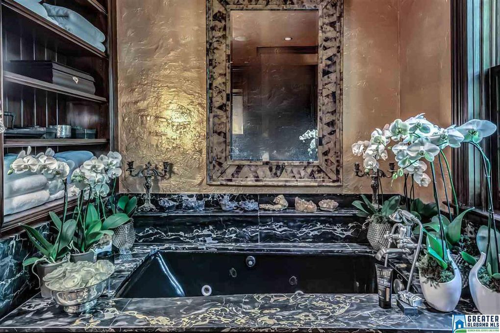
Marble tub surround with textured walls, built in shelves and window
Birmingham Alabama artist's home with incredible textures and finishes
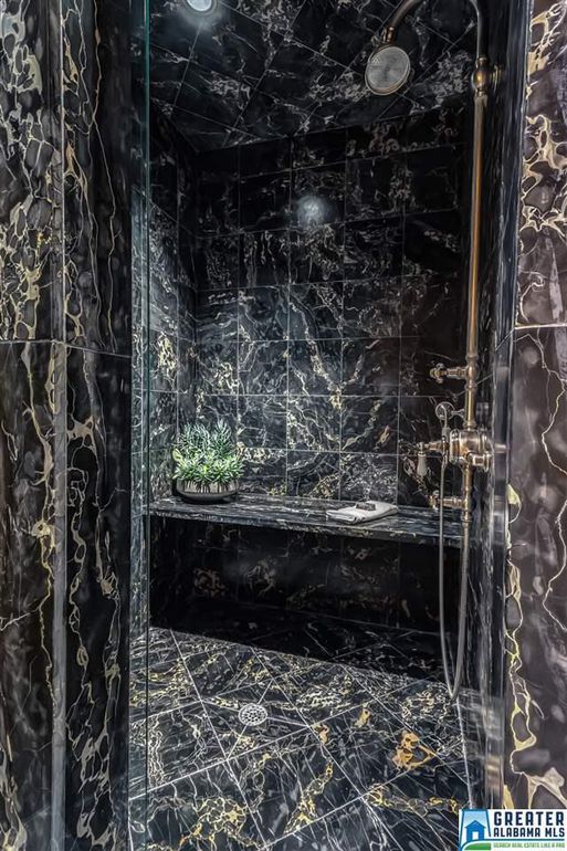
Marble shower with bench
Birmingham Alabama artist's home with incredible textures and finishes
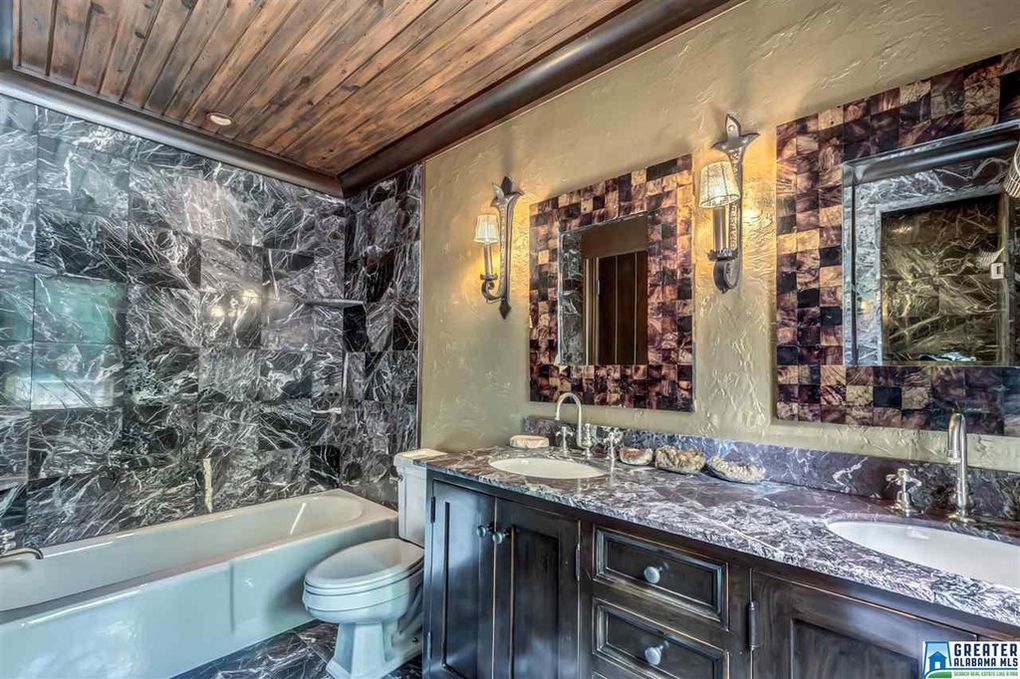
Additional bath with marble, planked ceiling, recessed lighting, textured walls, and iron sconces
Birmingham Alabama artist's home with incredible textures and finishes
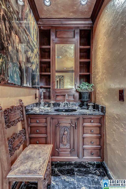
Half bath with custom carved vanity, textured walls, recessed lighting, and wooden builtins
Birmingham Alabama artist's home with incredible textures and finishes
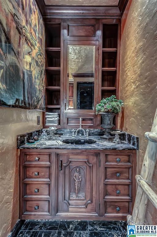
Custom, carved vanity
Birmingham Alabama artist's home with incredible textures and finishes
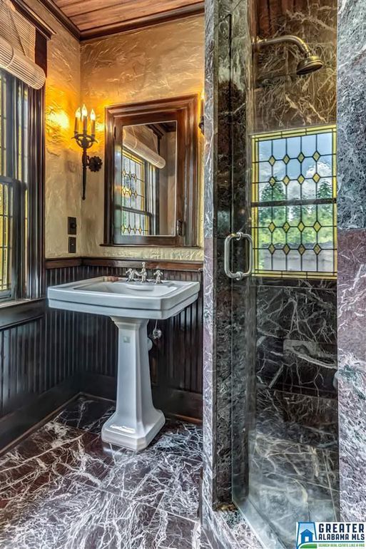
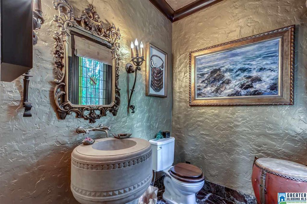
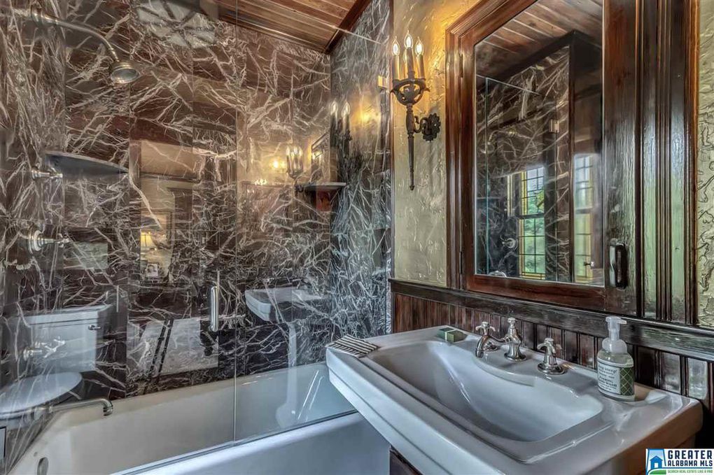
Half bath with stone pedestal sink, textured walls, gilded mirror, and iron sconces
Birmingham Alabama artist's home with incredible textures and finishes
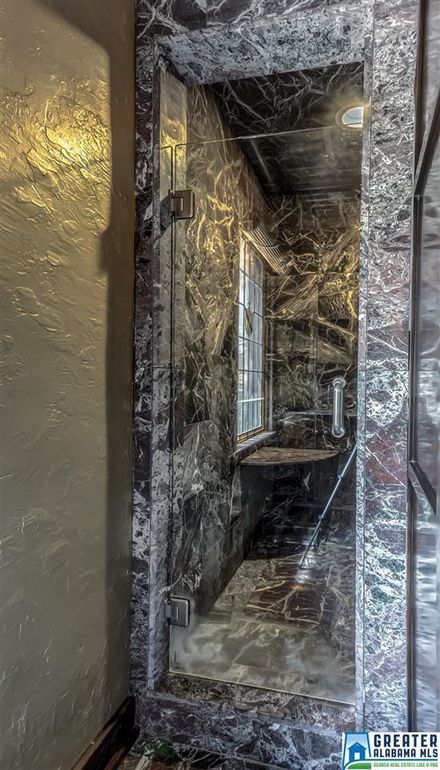
Marble shower with glass door and textured walls
Birmingham Alabama artist's home with incredible textures and finishes
Guest bath with marble, glass, wood molding, textured walls, plank wood ceiling, and iron sconces
Birmingham Alabama artist's home with incredible textures and finishes
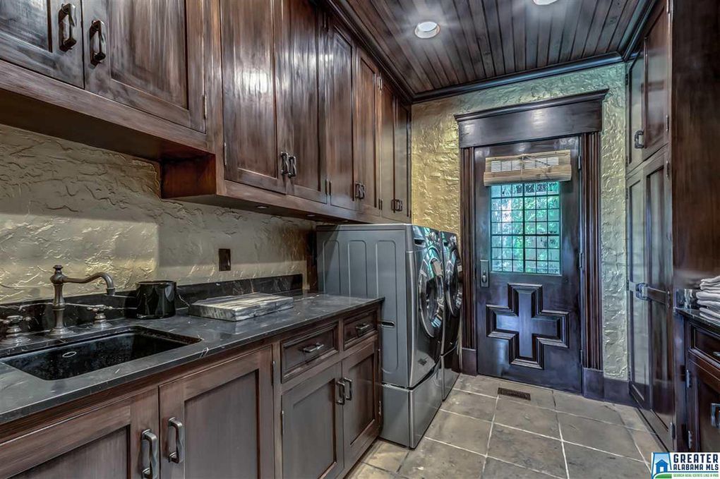
Laundry room with beautiful wood cabinetry, custom door, and marble counters
Birmingham Alabama artist's home with incredible textures and finishes
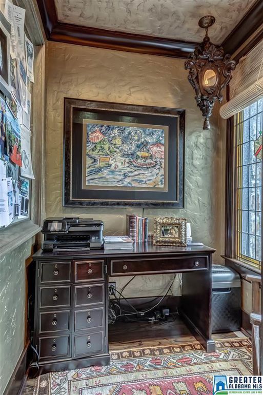
Office nook with textured ceilings, hand carved light fixture, and leaded glass window with crest inlay
Birmingham Alabama artist's home with incredible textures and finishes
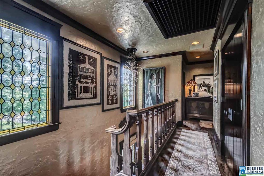
Hallway with textured walls, wooden floors, wooden hand railings, leaded and stained glass windows

What do you think?  Are you ready to ditch those boring white walls for texture and layers of color?

Thanks for checking out our post!  Get more awesomeness on our blog.  Cheers!


*Legal stuff:

I am honest about my experiences with different products and write because I enjoy it.  I do however, have the opportunity to earn money for my writing, also.

Slavetodiy.com is a participant in the Amazon Services LLC Associates Program, an affiliate advertising program designed to provide a means for sites to earn advertising fees by advertising and linking to amazon.com.  Amazon offers a small commission on products sold through their affiliate links.  Each of your purchases via our Amazon affiliation links supports our cause at no additional cost to you.

If a blogger links to an Amazon product (with a special code for affiliates embedded in the link), and a reader places an item in their “shopping cart” through that link within 24 hours of clicking the link, the blogger gets a small percentage of the sale.  Amazon links are not “pay per click.”  If you click on the product link and stay around Amazon and purchase something else, however, I will get a commission on that sale.
Slavetodiy.com is also a VigLink affiliate advertiser which works similarly.

House Porn: Epic Charleston Historic Property on Legare Street

I have a confession to make: I’m addicted to beautiful homes.  I especially love old homes, updated with modern conveniences, but disguised with original charm.  What we’re missing in the United States is the REALLY old world charm you can find in Europe and beyond, but we do have our own type of royalty.  We have areas with wonderful historic districts, and when people list their homes, we get a glimpse of the type of artisanship possible even here, and distinctive in it’s Americana.

*This post may contain affiliate links. Please see full disclosure at the end of the post.

One of my favorite places to stalk Real Estate is in Charleston, SC.  If we ever had royalty, it would’ve been here.  Enter this stunning estate on Legare Street, which, for a cool $15 million dollars (ish), you can live like a baron.  Check out the following photos (photo credits to the listing agent).

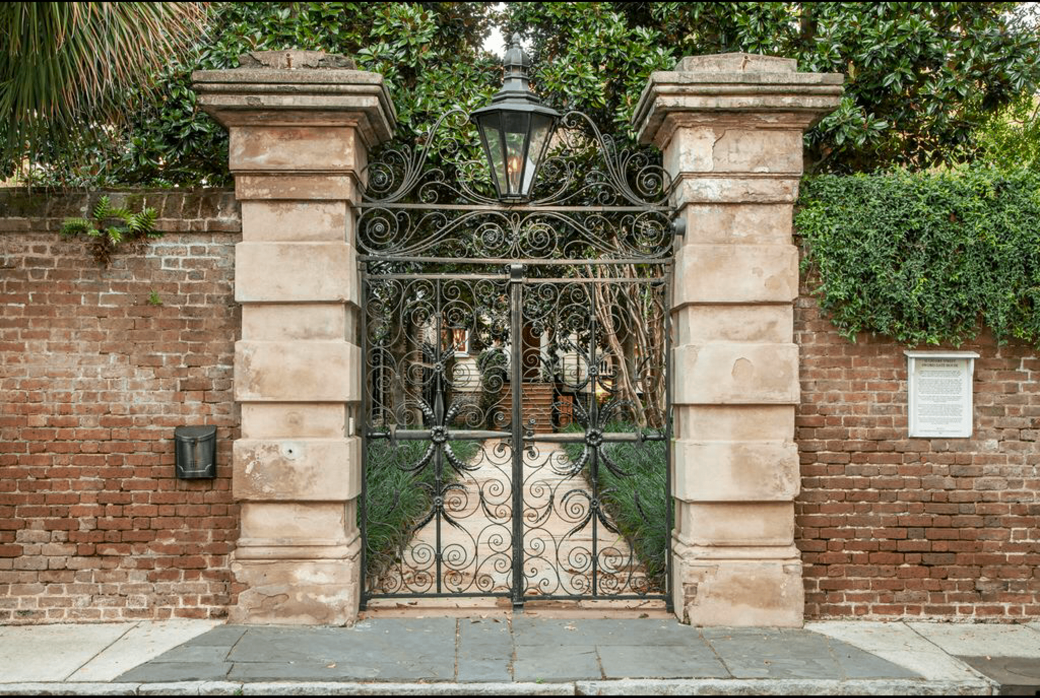
Iron gate with brick wall
House Porn, Legare St, Charleston, SC

Start with the ornate, iron gates, massive gas lantern, and amazing brick privacy walls.


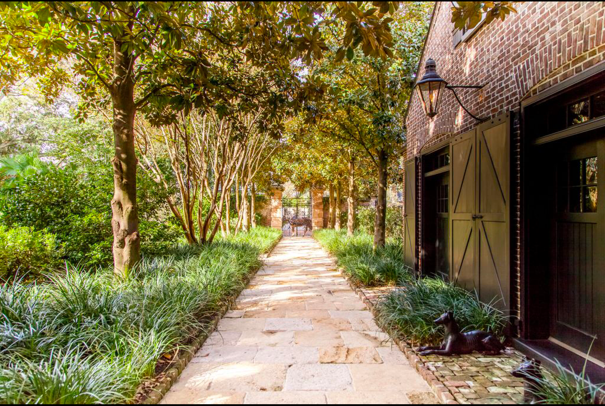
Stone courtyard
House Porn, Legare St, Charleston, SC

Courtyards are an integral part of any palace, and this gorgeous estate is no different.


Brick carriage house with barn doors
House Porn, Legare St, Charleston, SC

Pathway that  leads to the exquisitely redone carriage house.


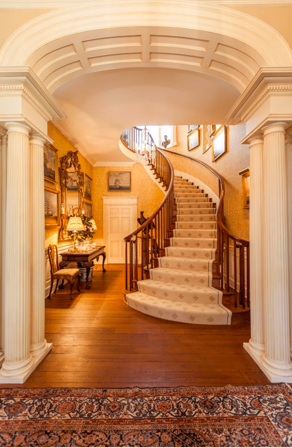
Traditional home staircase
House Porn, Legare St, Charleston, SC

Traditional moldings, columns, and a wedding-portrait ready staircase.


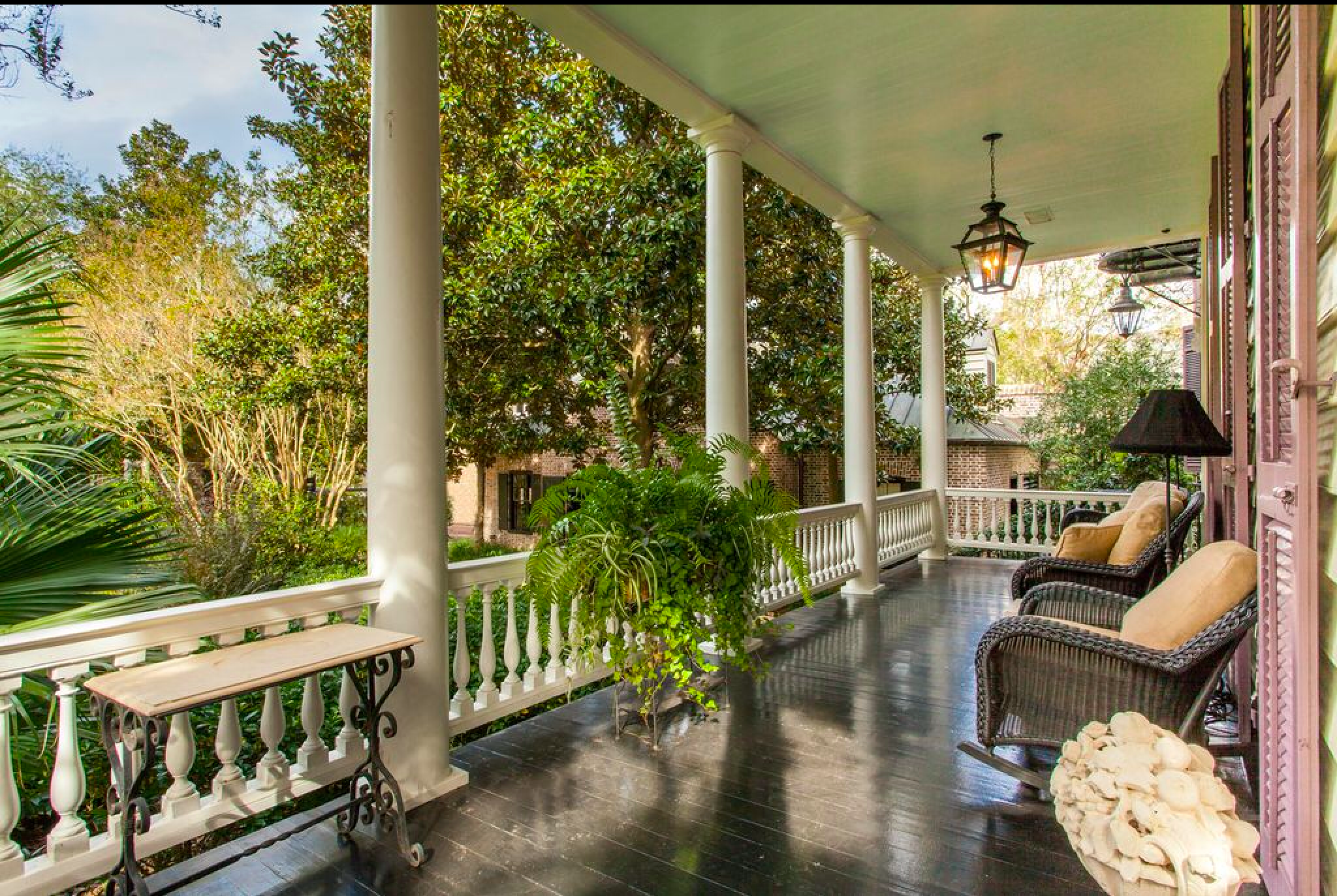
Southern wrap around front porch
House Porn, Legare St, Charleston, SC

Southern front porch style: ready for afternoons with a cold sweet-tea.


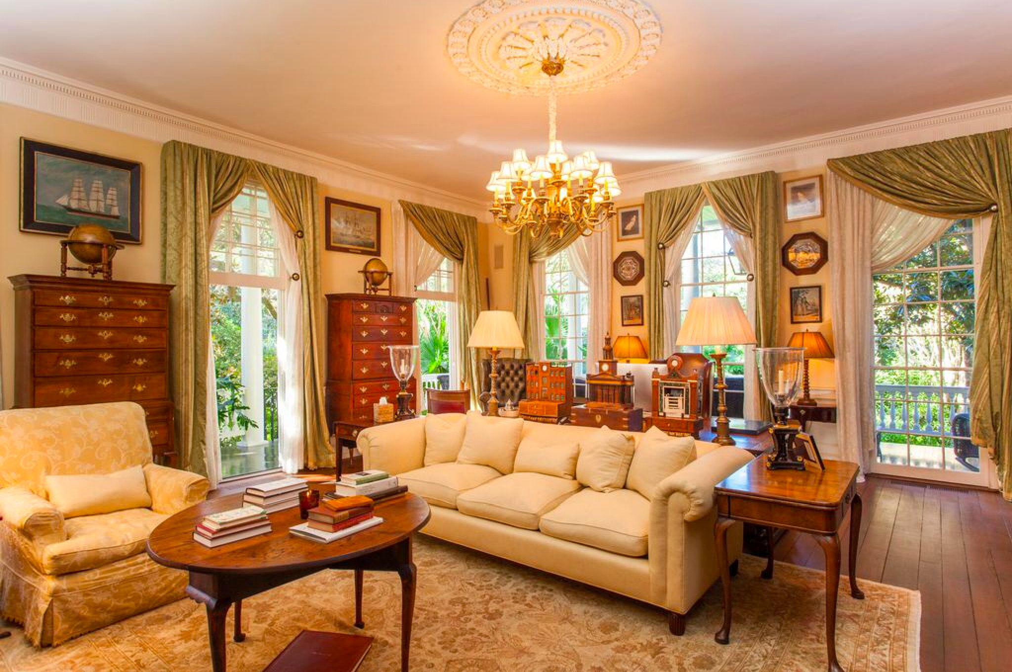
Traditional southern living room
House Porn, Legare St, Charleston, SC

Elegant, nautical-inspired formal spaces.


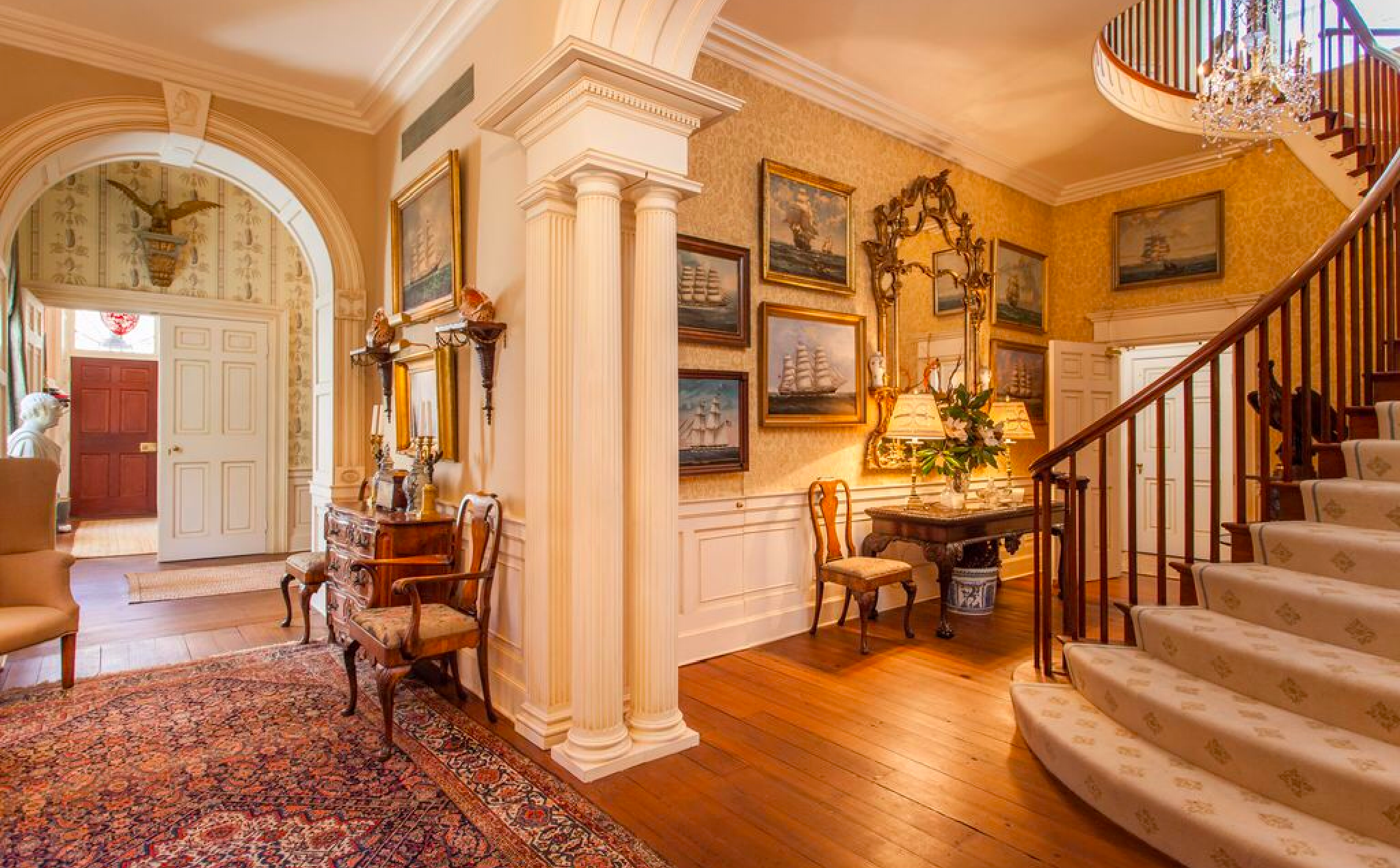
Southern foyer with nautical ship paintings
House Porn, Legare St, Charleston, SC

Another great view of the entrance.  I wonder if you get to keep their collection of ship paintings?


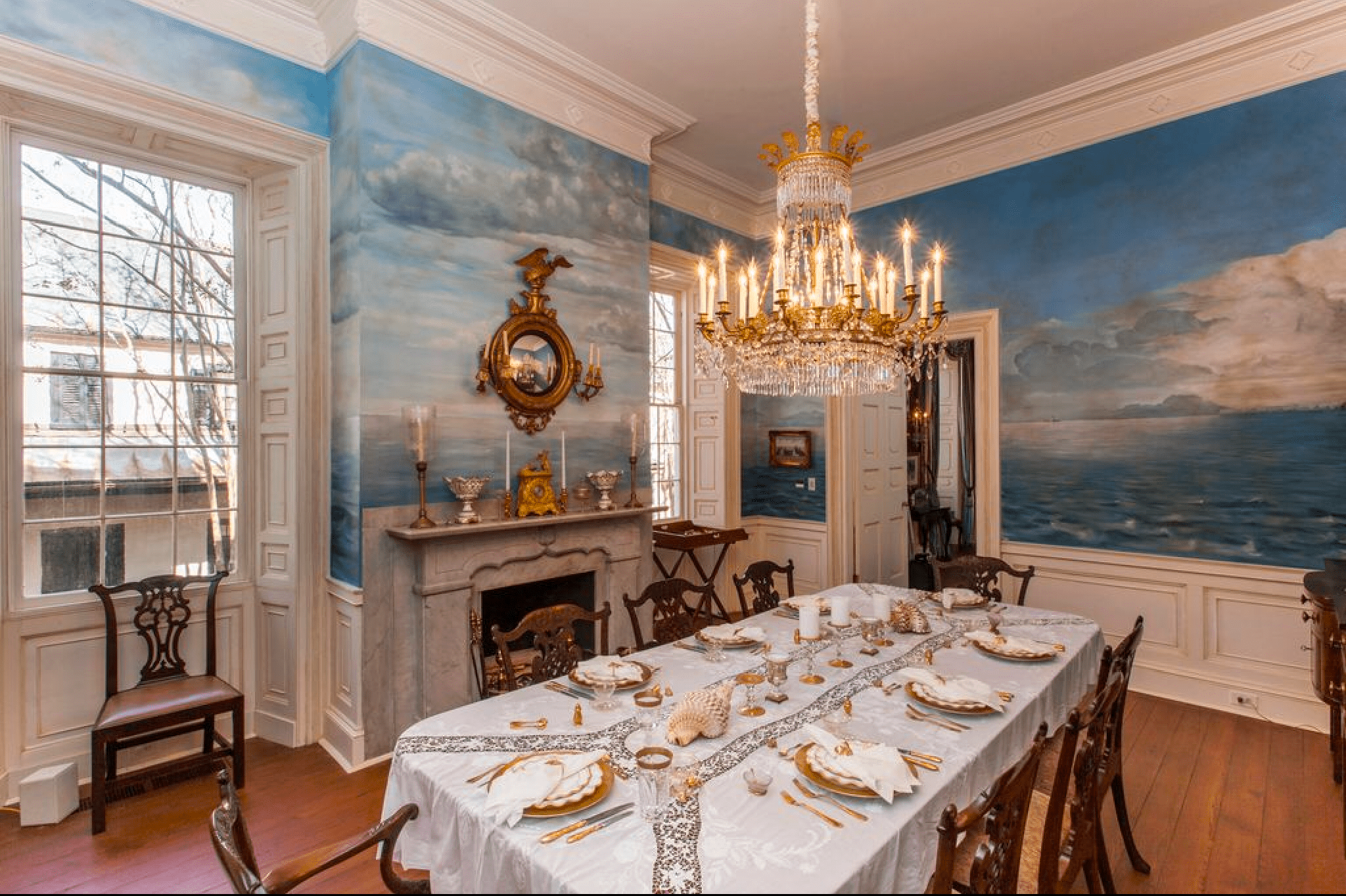
Southern dining room with hand painted mural
House Porn, Legare St, Charleston, SC

I have no idea if the mural is original, but it is amazing and blends seamlessly with the rest of this beautiful home.


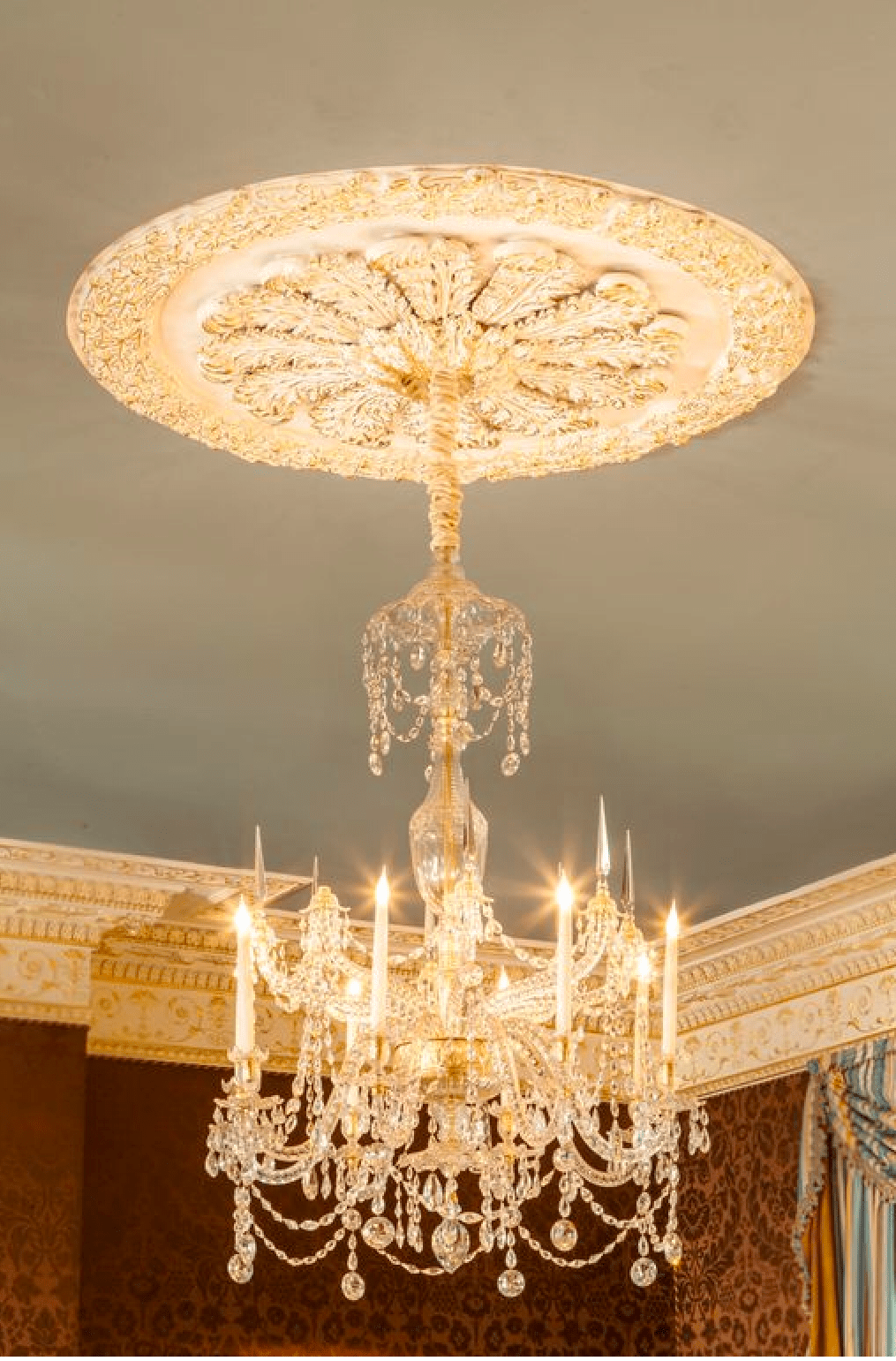
img_2459-1797331452-1562614747812.png
House Porn, Legare St, Charleston, SC

A properly scaled, magnificent chandelier in the main living space.


Traditional southern living room
House Porn, Legare St, Charleston, SC

I’m sure it has been nothing less than an art keeping the moldings repaired and authentic.  I love the floors, kept in original condition.


img_2461-1322762765-1562614782257.png
House Porn, Legare St, Charleston, SC

I would LOVE to see a repro on this as a cast stone replica.  Really nice work and styled professionally.


Historic home with butcher block island
House Porn, Legare St, Charleston, SC

The kitchen is usually where these places lose me… but I sort of adore this one.  It has all the makings of a place where you can prepare incredible meals, professional grade appliances, and a homey feel with plenty of prep space.


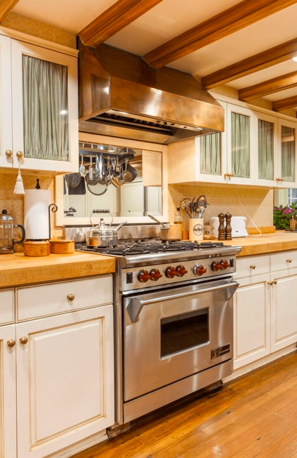
Stove with copper hood in historic home in Charleston
House Porn, Legare St, Charleston, SC


I love that the stove and hood experience wasn’t overlooked… Nothing chaps me more than seeing multi-million dollar properties with chincy kitchen appliances.


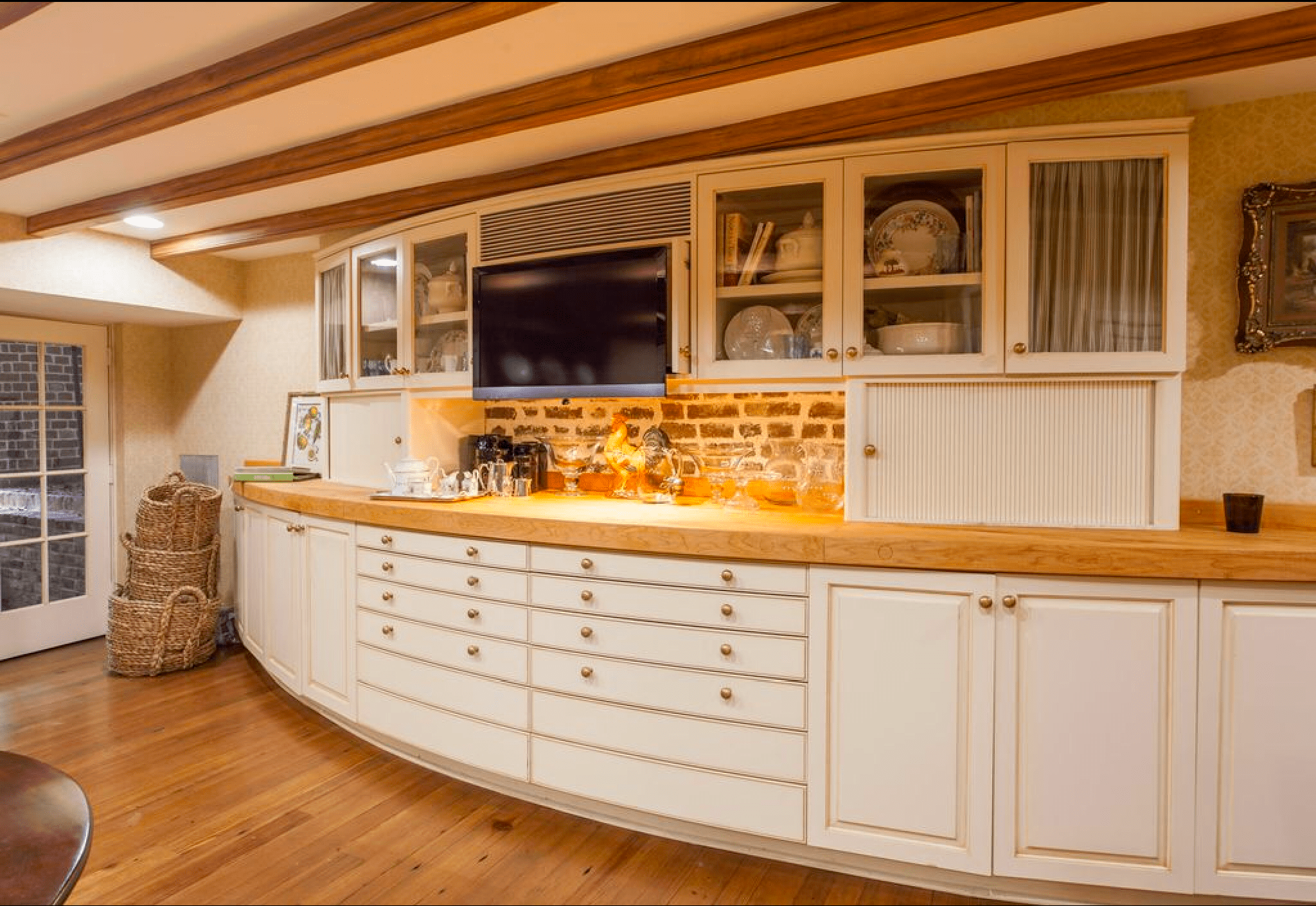
Curved kitchen cabinets in historic home
House Porn, Legare St, Charleston, SC

This is SOOO cool.  Rainman would kill me if I requested curved cabinets.


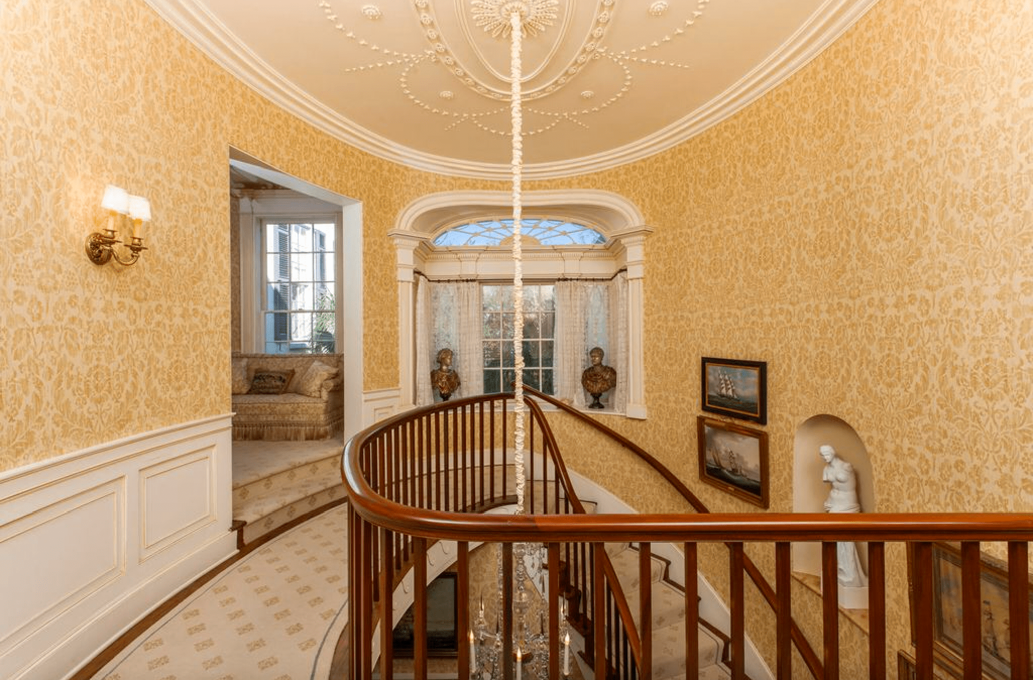
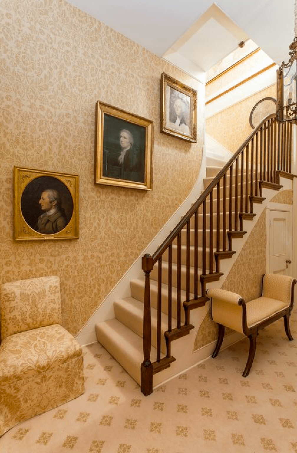
Traditional home hallway and staircase
House Porn, Legare St, Charleston, SC

It’s so weird that I love this, because I generally despise any kind of wallpaper.  But, this is just beautiful.


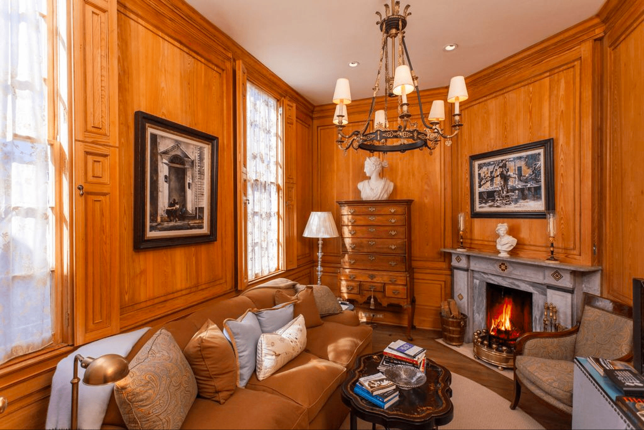
Study and den with traditional wood panel
House Porn, Legare St, Charleston, SC

The ultimate man den with wood panelling.  I can almost smell the cigars.


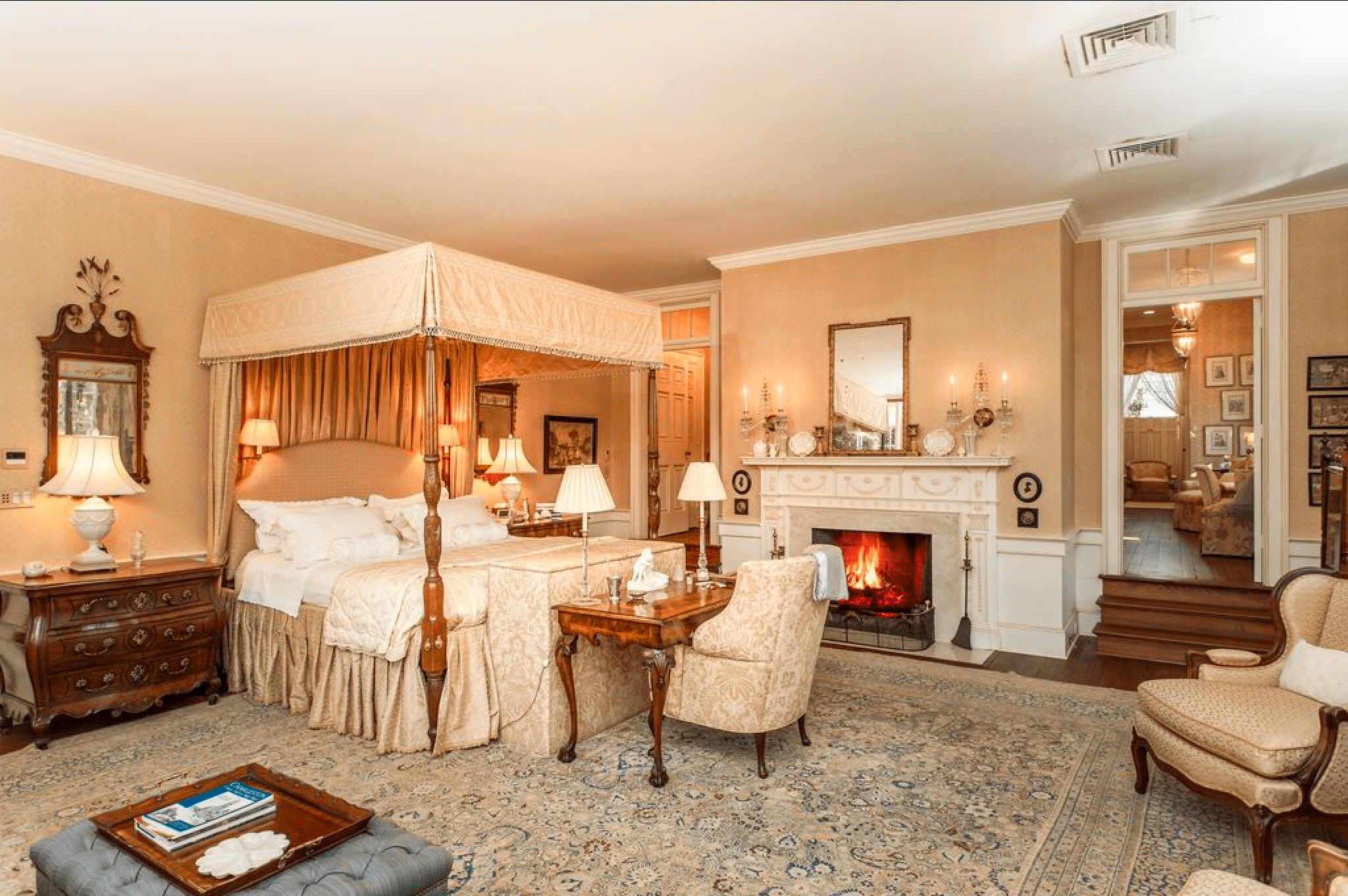
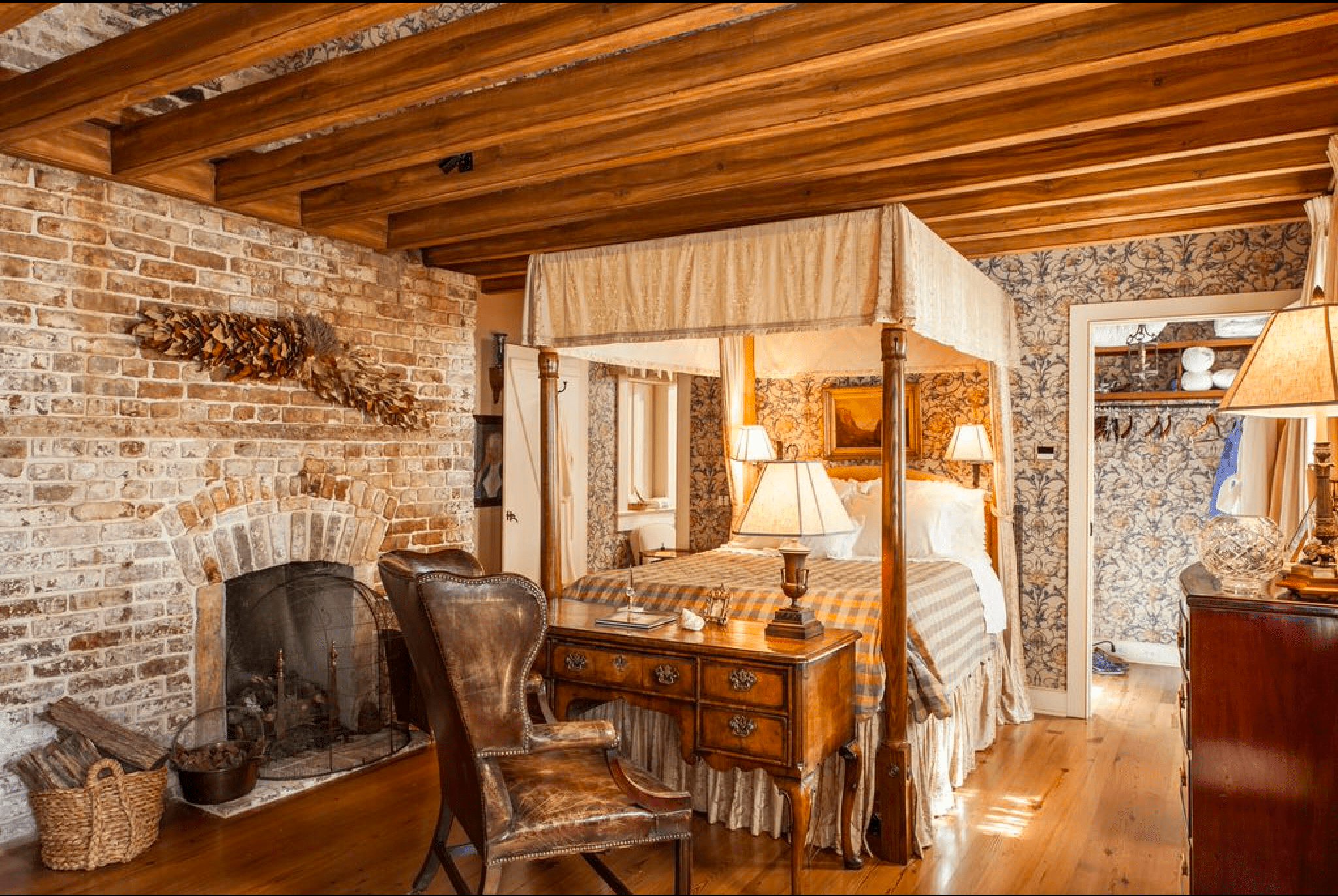
Traditional bedroom with canopy bed and fireplace
House Porn, Legare St, Charleston, SC


That bed is SO awesome and the wood burning fireplace seals the deal.


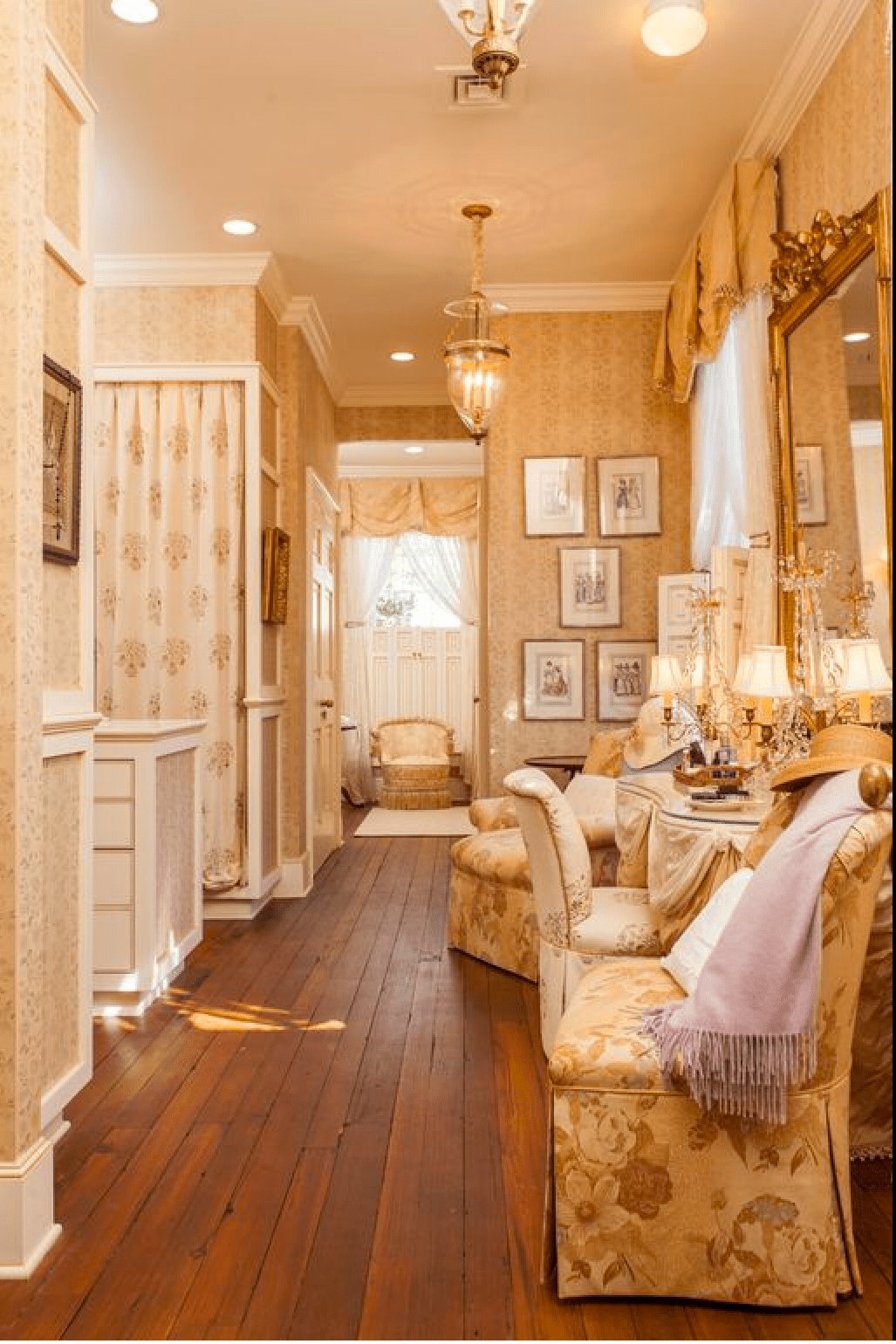
Historic home dressing room
House Porn, Legare St, Charleston, SC

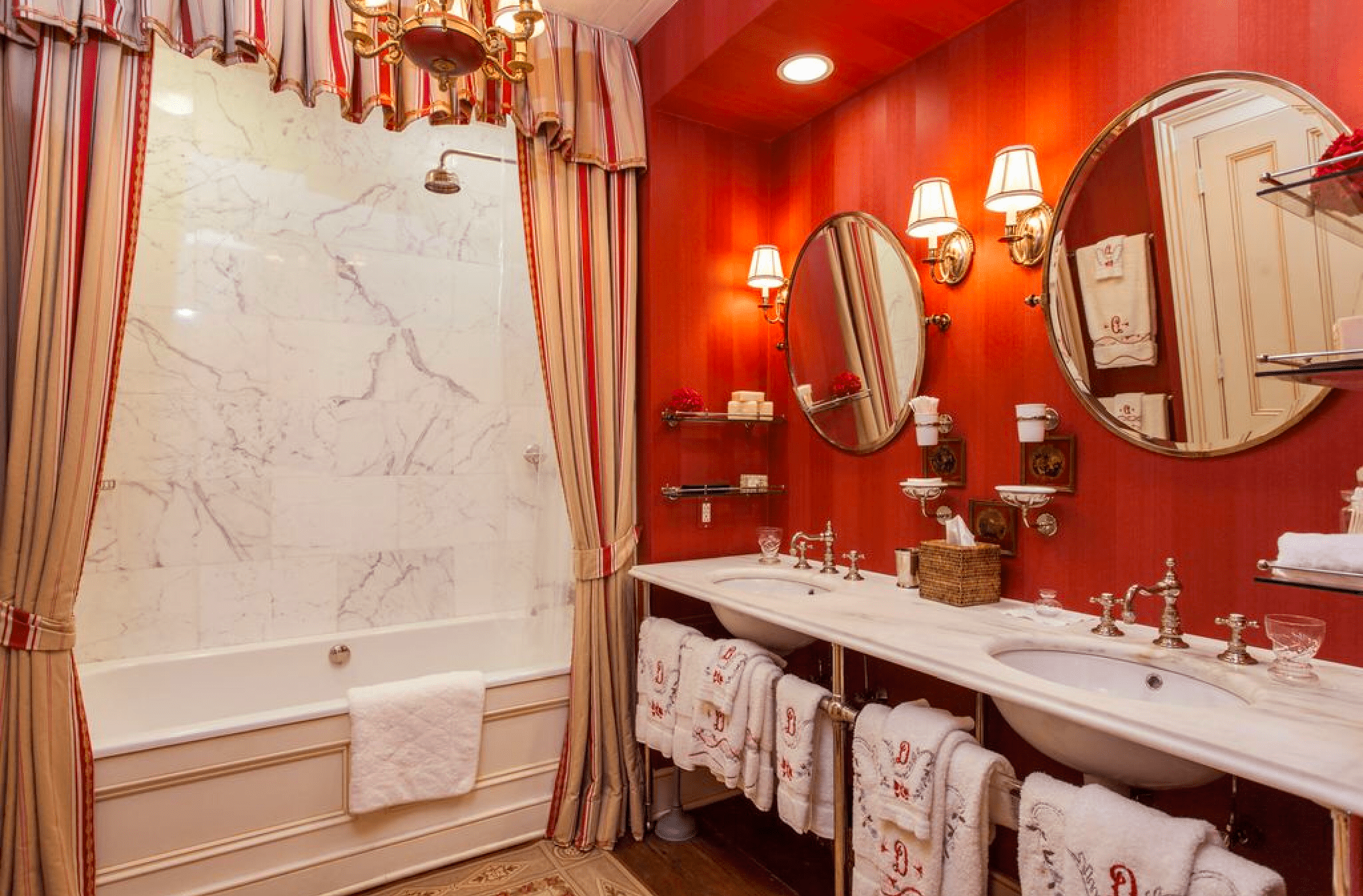
Off the bathroom, the dressing room is absolutely spectacular.


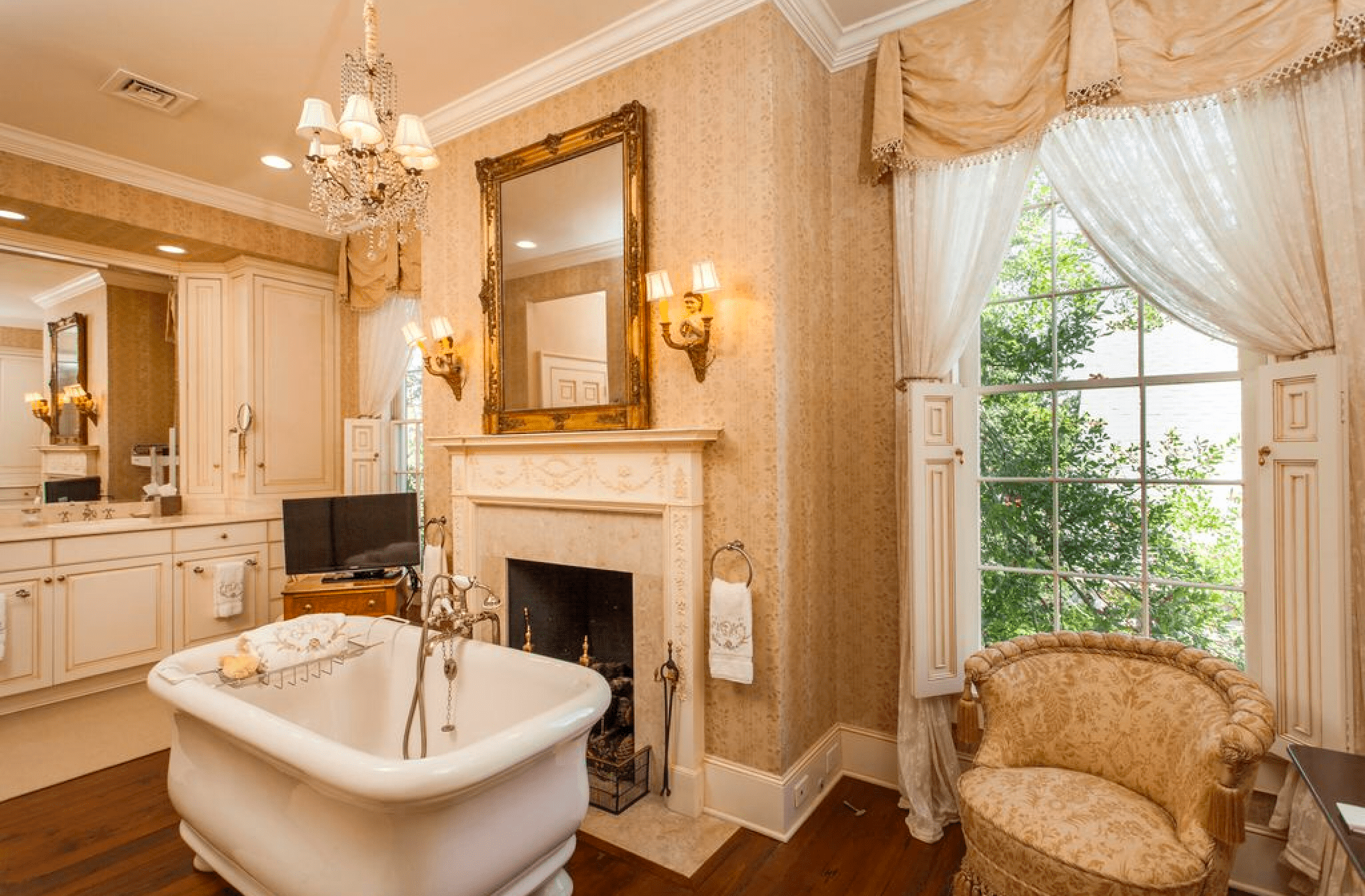
Historic home bathroom with fireplace
House Porn, Legare St, Charleston, SC

And this bathroom is perfect.  I keep arguing with Rainman that we need seating in the bathtub so I don’t have to sit on the sink while we chat.


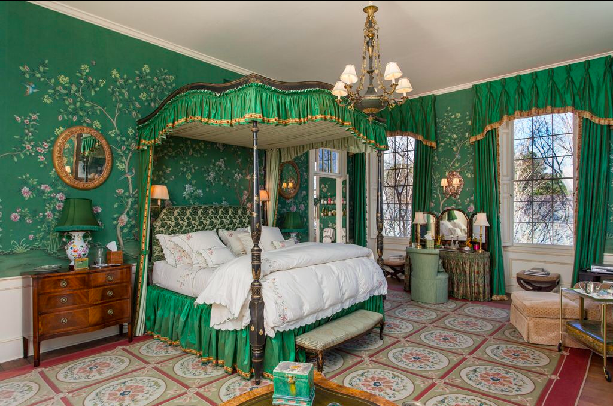
Green bedroom in historic home
House Porn, Legare St, Charleston, SC

This was common to do color themed rooms.  “You’ll be staying in the Green Room while you visit.”  Although I don’t do it now (I find abrupt color changes distracting and uncomfortable, and ultimately lacking in cohesion), I love it in this space.


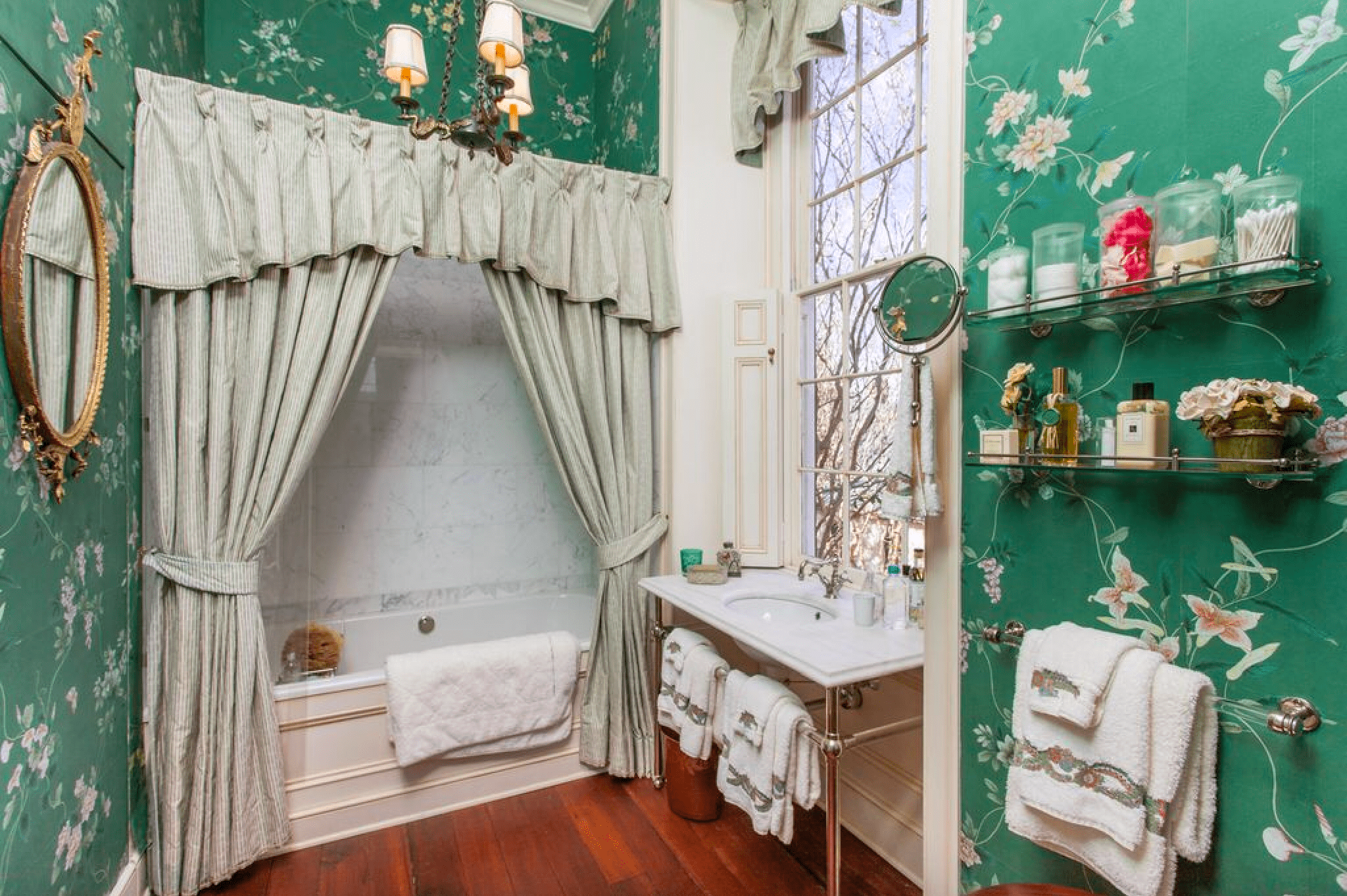
Green wallpaper bathroom
House Porn, Legare St, Charleston, SC

With it’s matching green bathroom.


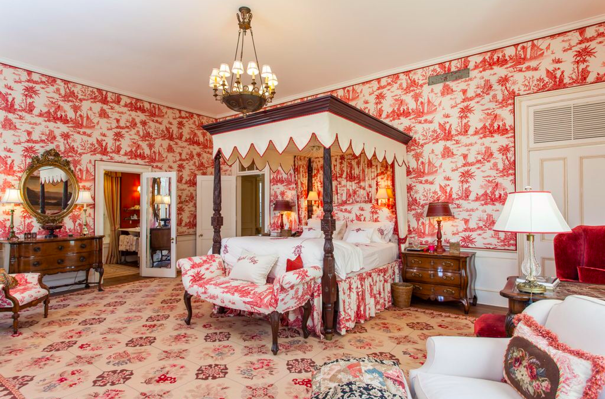
Pink toile
House Porn, Legare St, Charleston, SC

And the pink toile room.  LOVE the toile.


Pink wallpaper in bathroom with marble in historic home
House Porn, Legare St, Charleston, SC

With it’s FANTASTIC matching bathroom.  Looks like a Williams Sonoma style vanity with traditional carrera marble.


Back staircase with ancestor wall
House Porn, Legare St, Charleston, SC

With pictures of ancestors going down the back staircase.


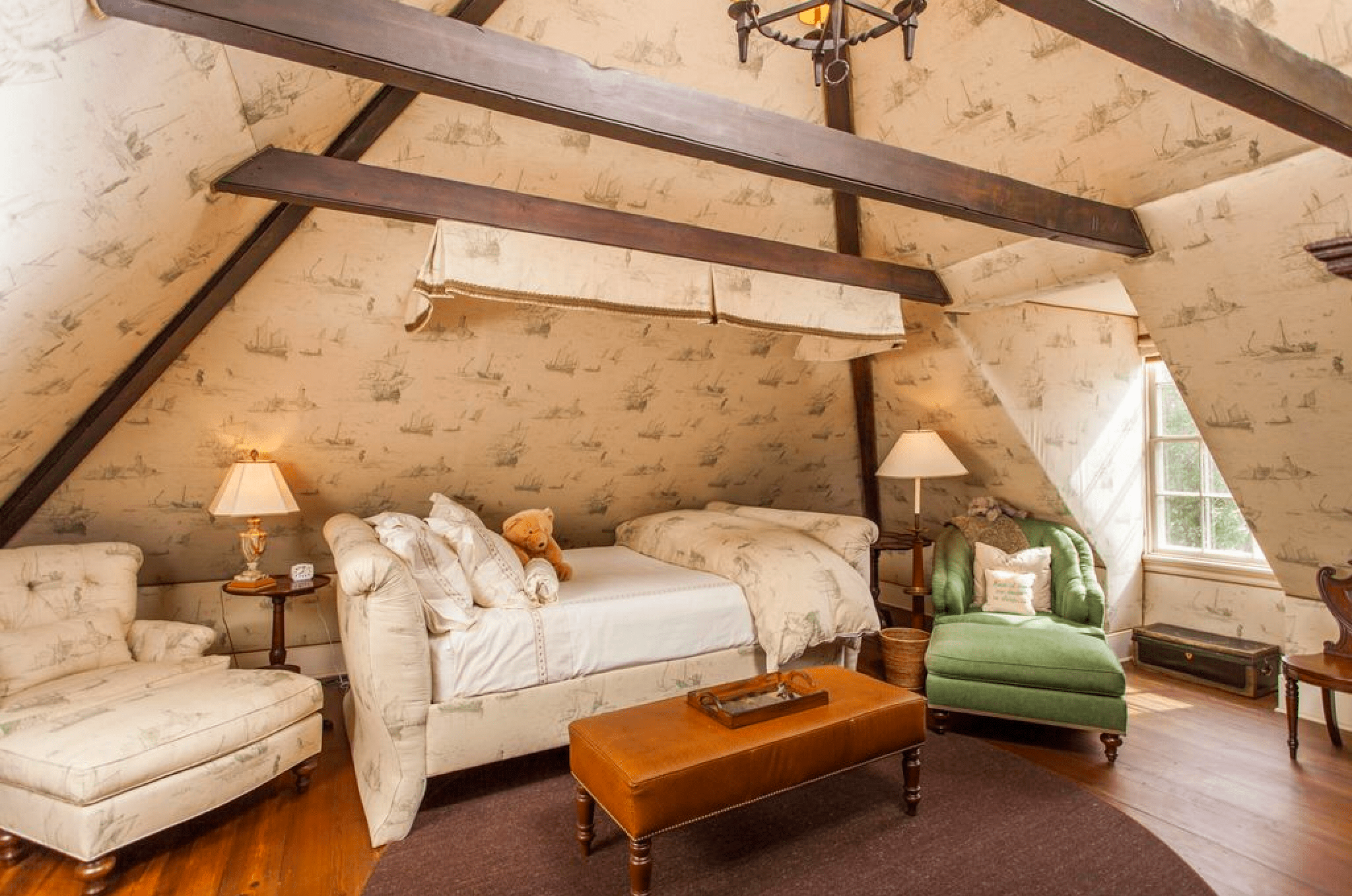
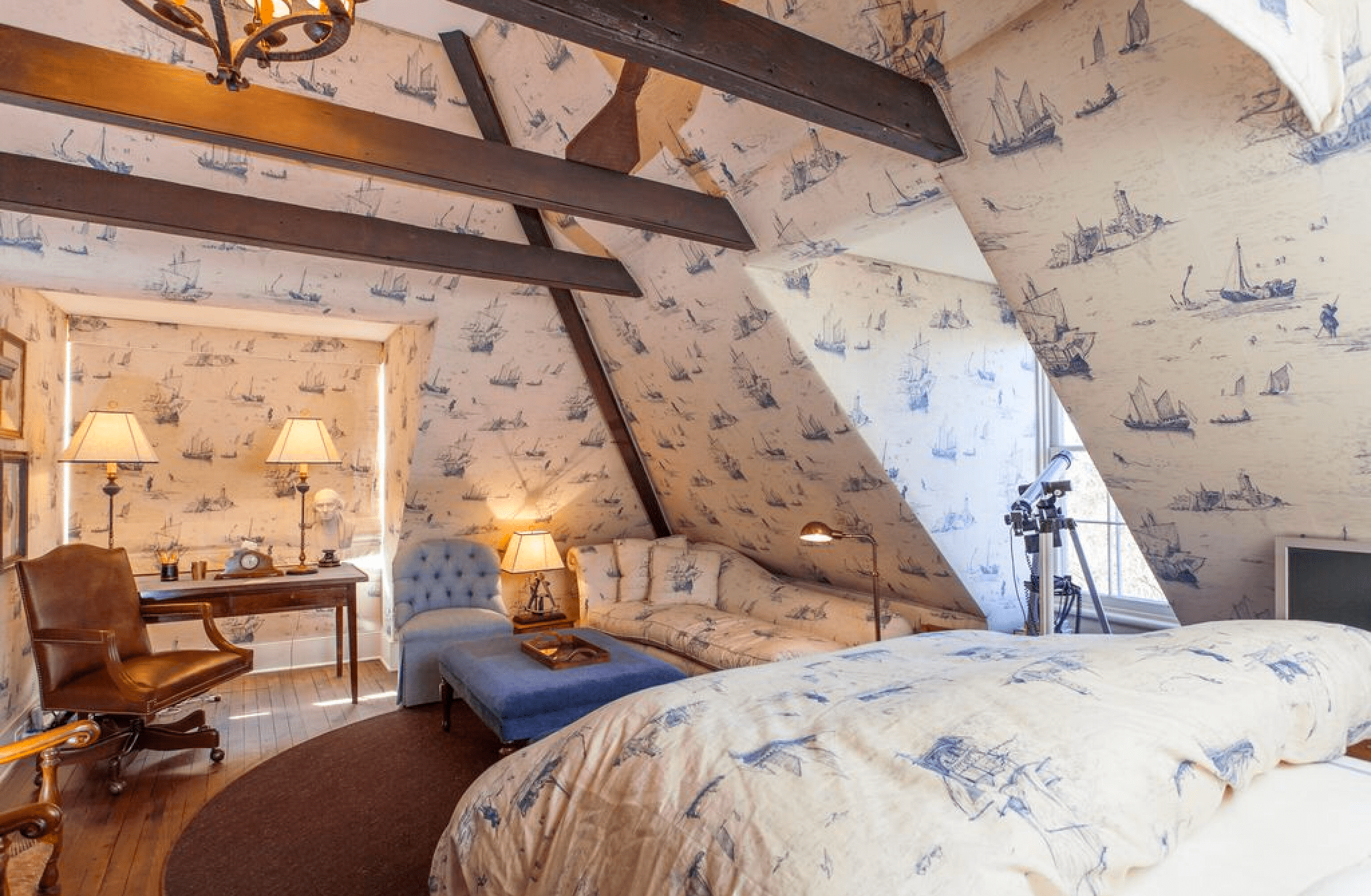
Attic with exposed beams and wallpaper in historic home
House Porn, Legare St, Charleston, SC

I love that the attic was formalized and finished, as I’m sure it was NOT in its hayday.


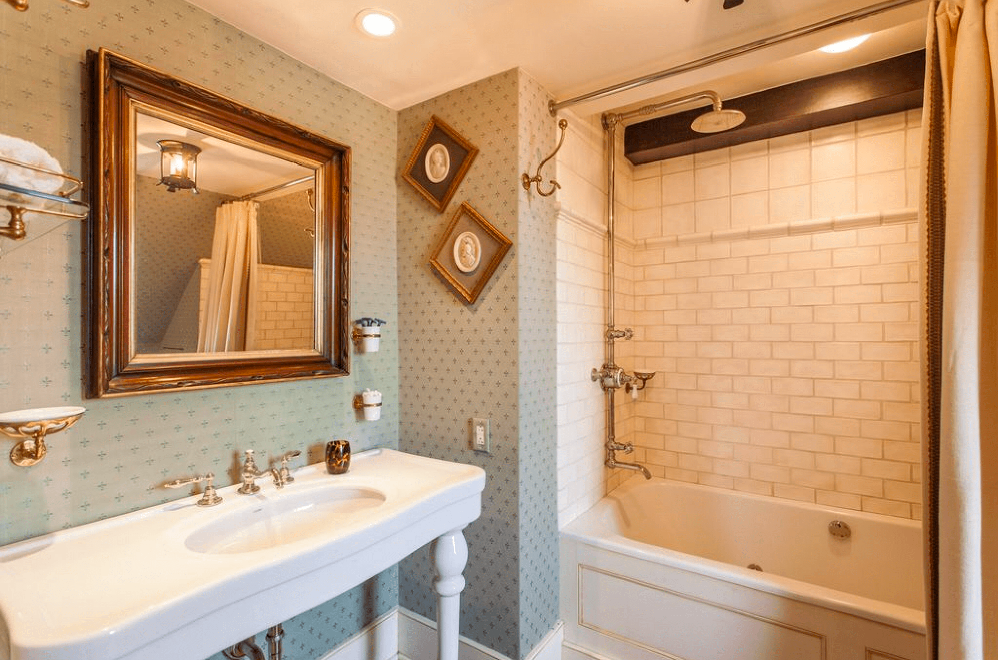
Carriage house bathroom in historic home
House Porn, Legare St, Charleston, SC

The tub tile is great here and I do adore some Victorian Cameos.


Attic in carriage house in historic home
House Porn, Legare St, Charleston, SC

This is a great mini apartment in the attic.  I love the angled walls.


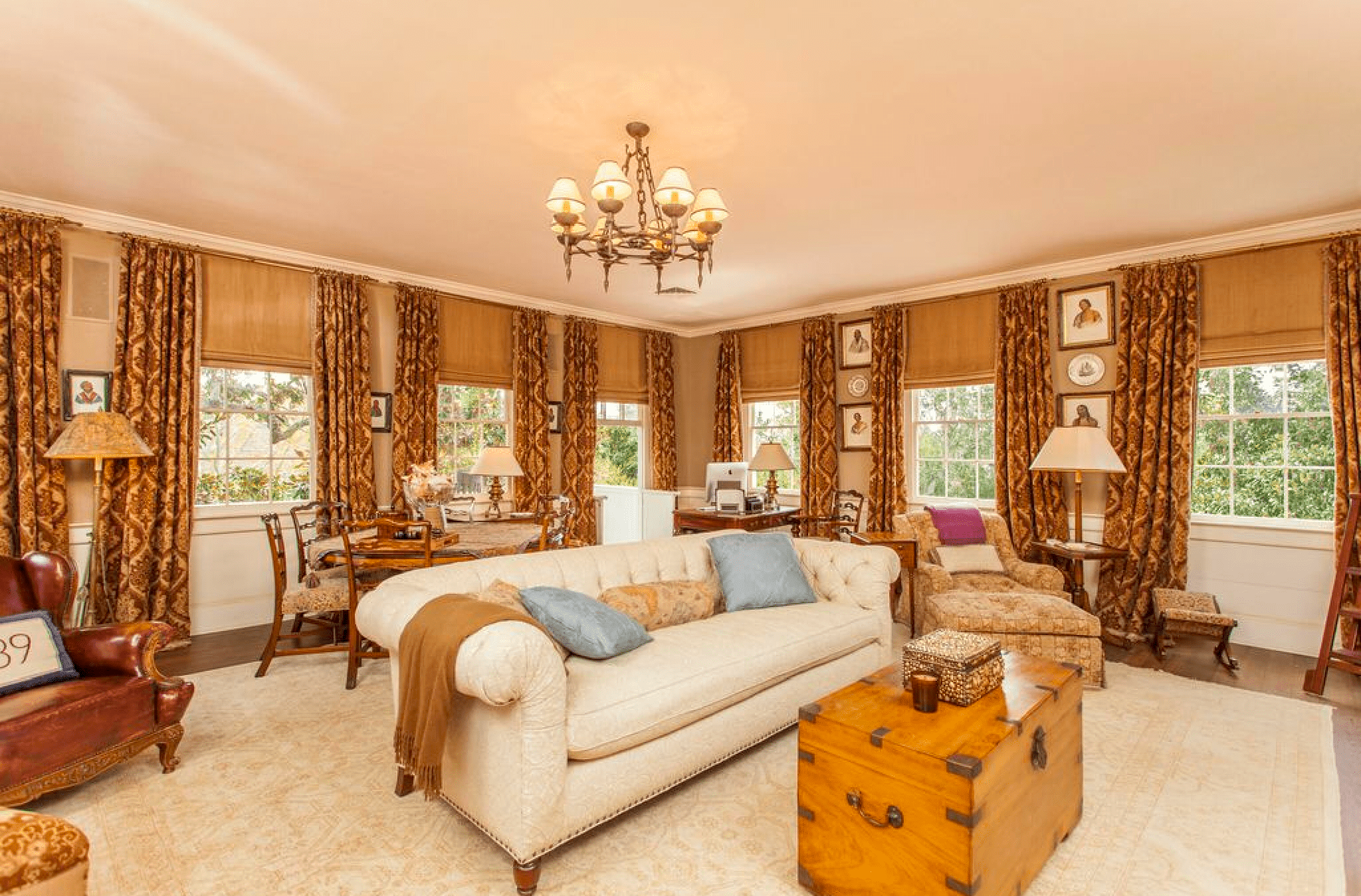
Carriage house formal room in historic home
House Porn, Legare St, Charleston, SC

Of course, I adore the Chesterfield sofa in linen and the trunk.  What a great, cozy space.


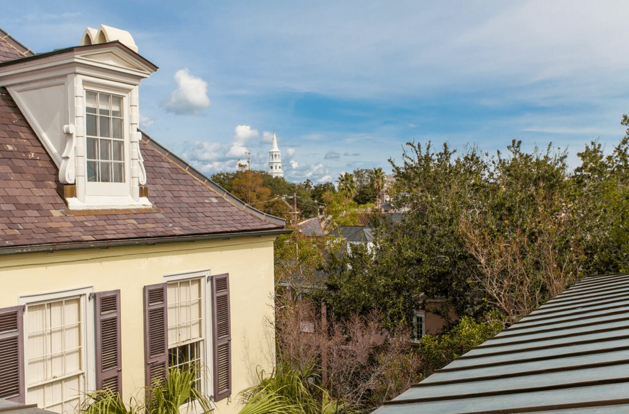
Charleston roofline
House Porn, Legare St, Charleston, SC

Overlooking the Charleston rooftops.


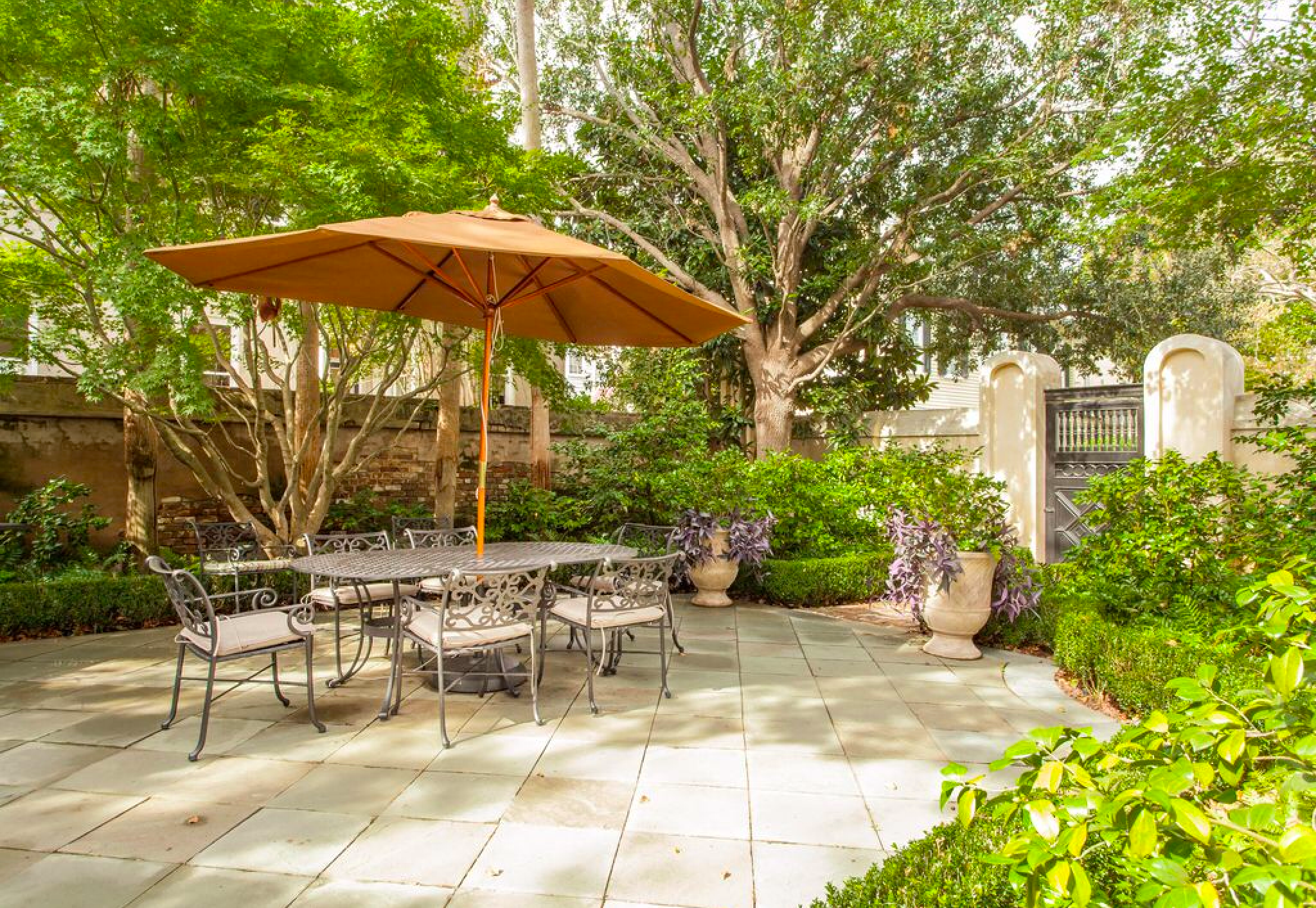
Charleston courtyard in historic home
House Porn, Legare St, Charleston, SC

The value of outdoor space always baffles me.  The incredible, manicured gardens and stone and brick walkways are impossible to put a price tag on.


Outdoor patio with garden wall in Charleston
House Porn, Legare St, Charleston, SC

This is another fantastic outdoor space.  What a great garden wall.


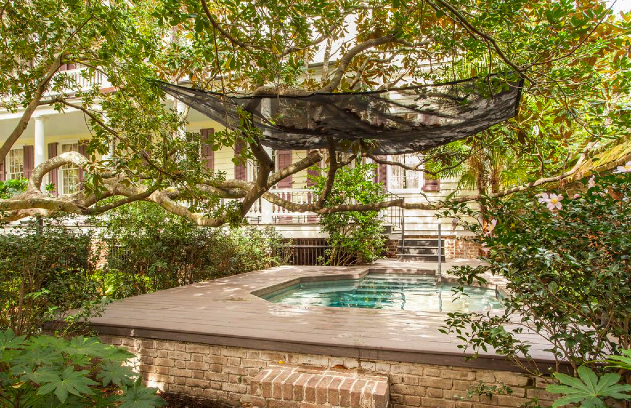
Builtin courtyard hottub in charleston
House Porn, Legare St, Charleston, SC

This is an incredibly disguised hottub.  It fits in seamlessly with the rest of the exterior spaces.


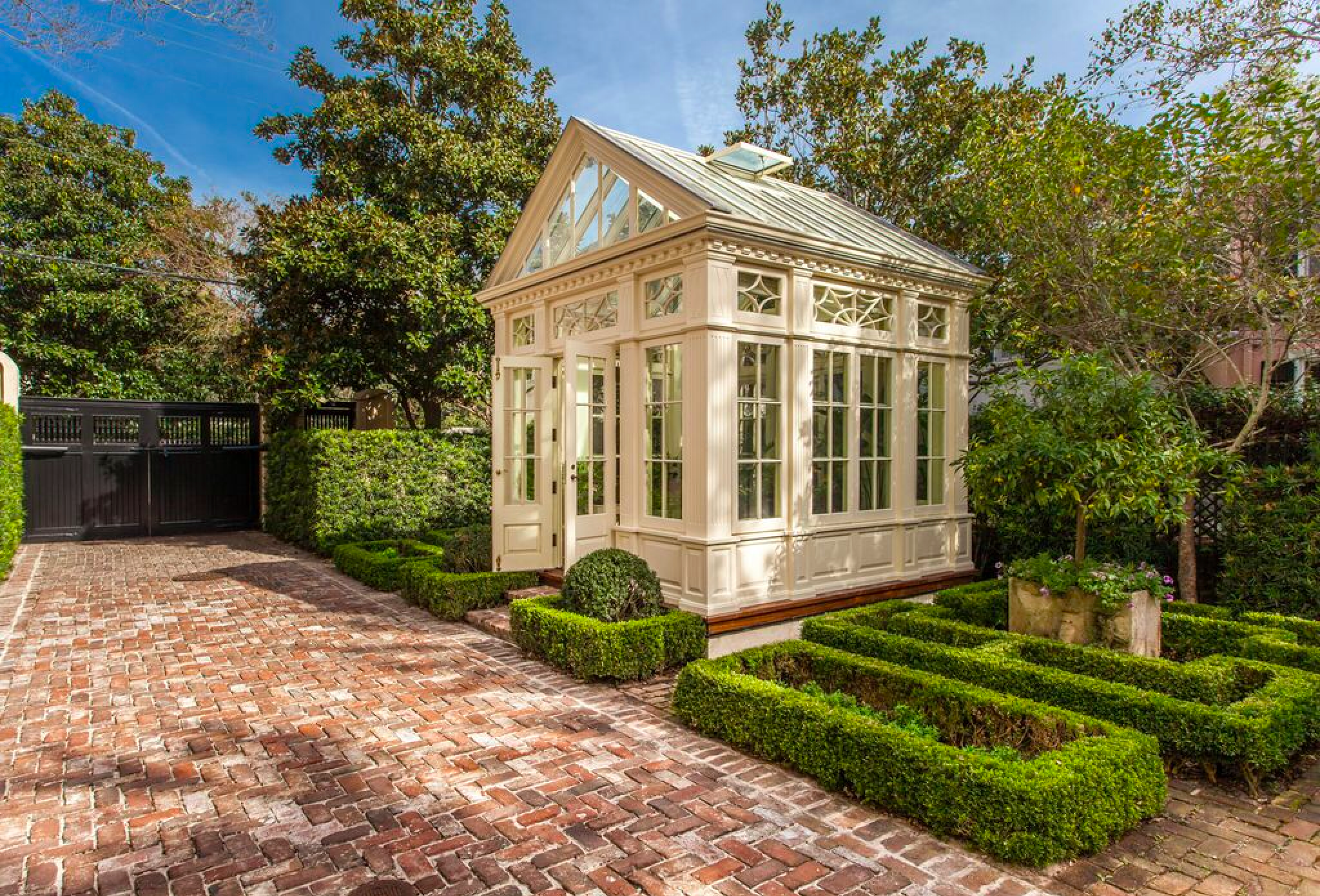
Greenhouse in courtyard Charleston
House Porn, Legare St, Charleston, SC

What an exquisite greenhouse with amazing brickwork and sculptural boxwood hedges.


Reflecting pool in Charleston courtyard
House Porn, Legare St, Charleston, SC

The design of this reflecting pool and the architectural interest is really second to none.


Courtyard in historic Charleston
House Porn, Legare St, Charleston, SC

Of note here is the copper lean to roof that creates a little bit of protected space close to the wall of the house.


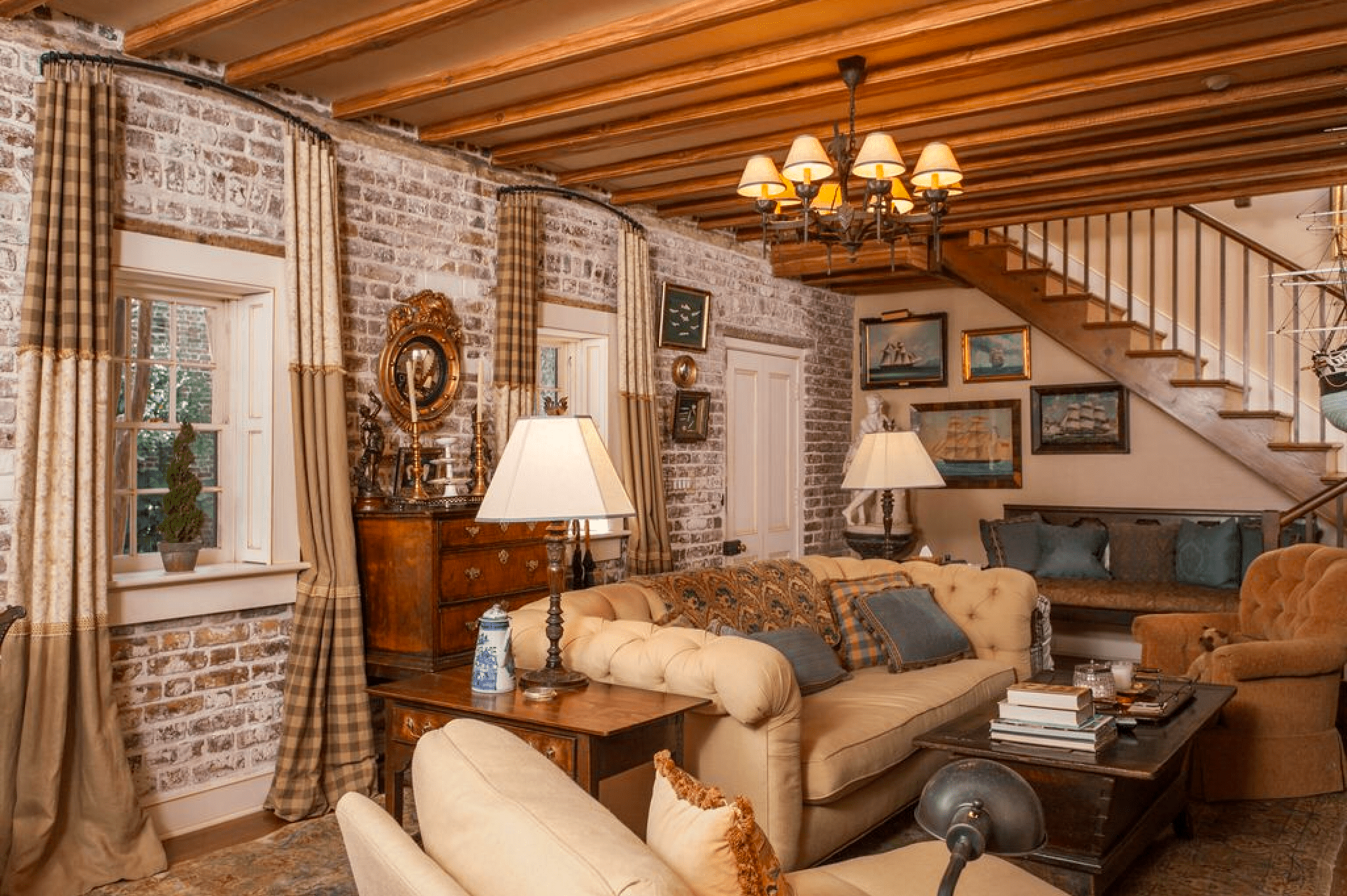
Carriage house with brick walls in historic home
House Porn, Legare St, Charleston, SC

I love that they kept the brick wall in the cariage house.


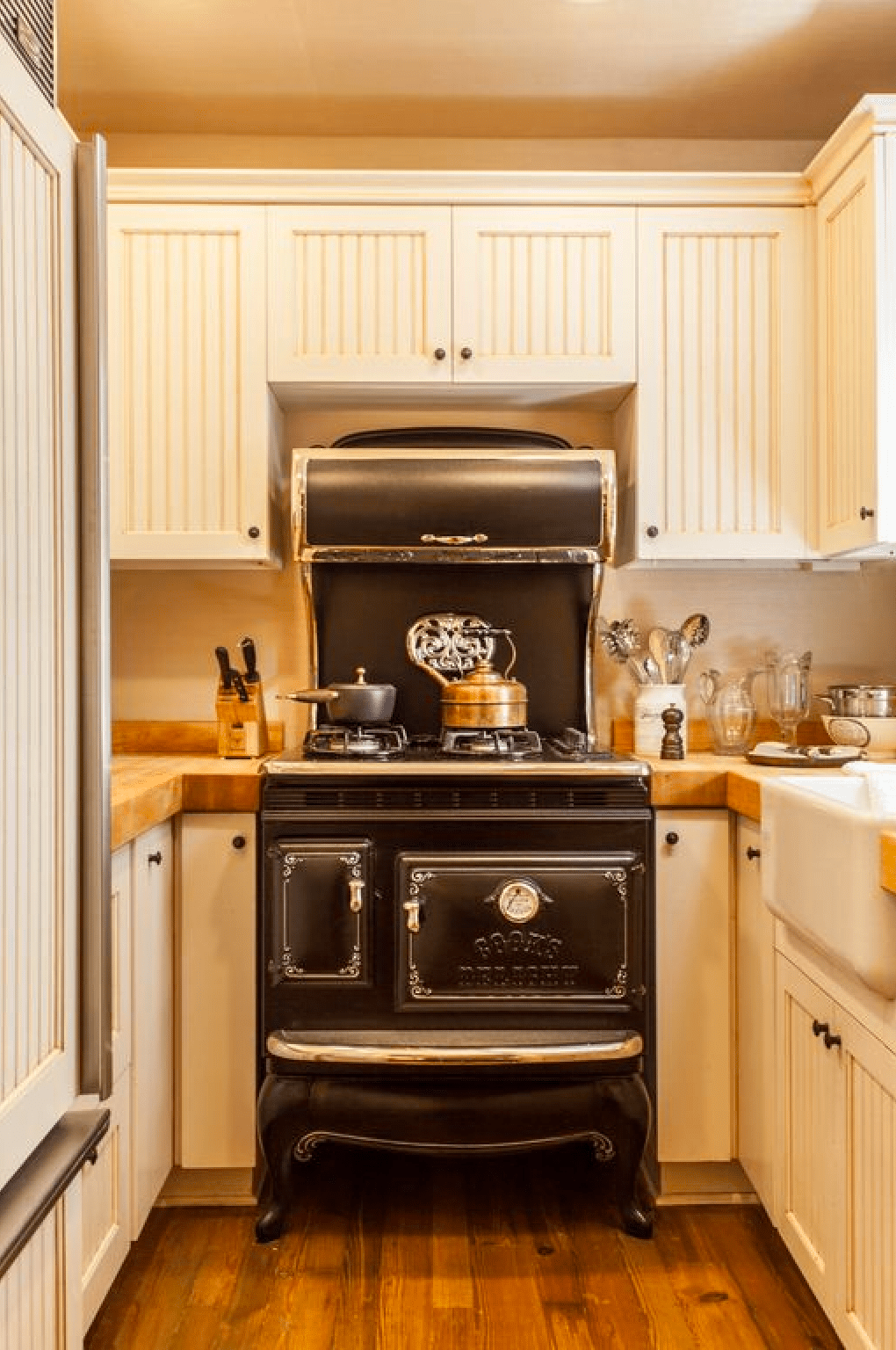
Antique stove in historic home
House Porn, Legare St, Charleston, SC

And the repro antique stove in the carriage house kitchen is a super nice touch.


Carriage house bedroom in historic home
House Porn, Legare St, Charleston, SC

Once again, maintaining the rustic brick really adds a nice touch.


Carriage house bathroom in historic home
House Porn, Legare St, Charleston, SC

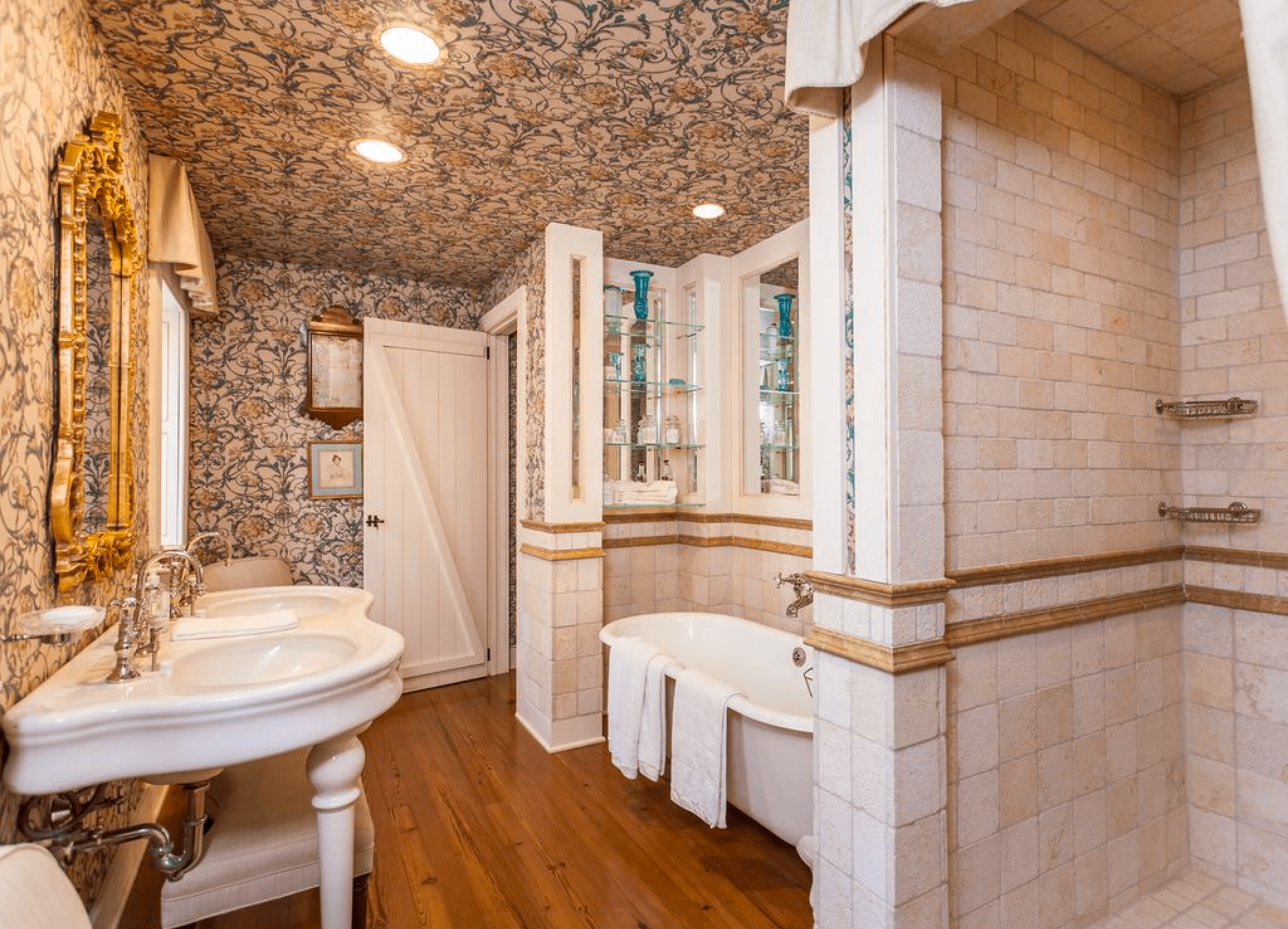
I adore the carriage house bathroom with the gilded mirrors, wallpaper, and especially the travertine tile.


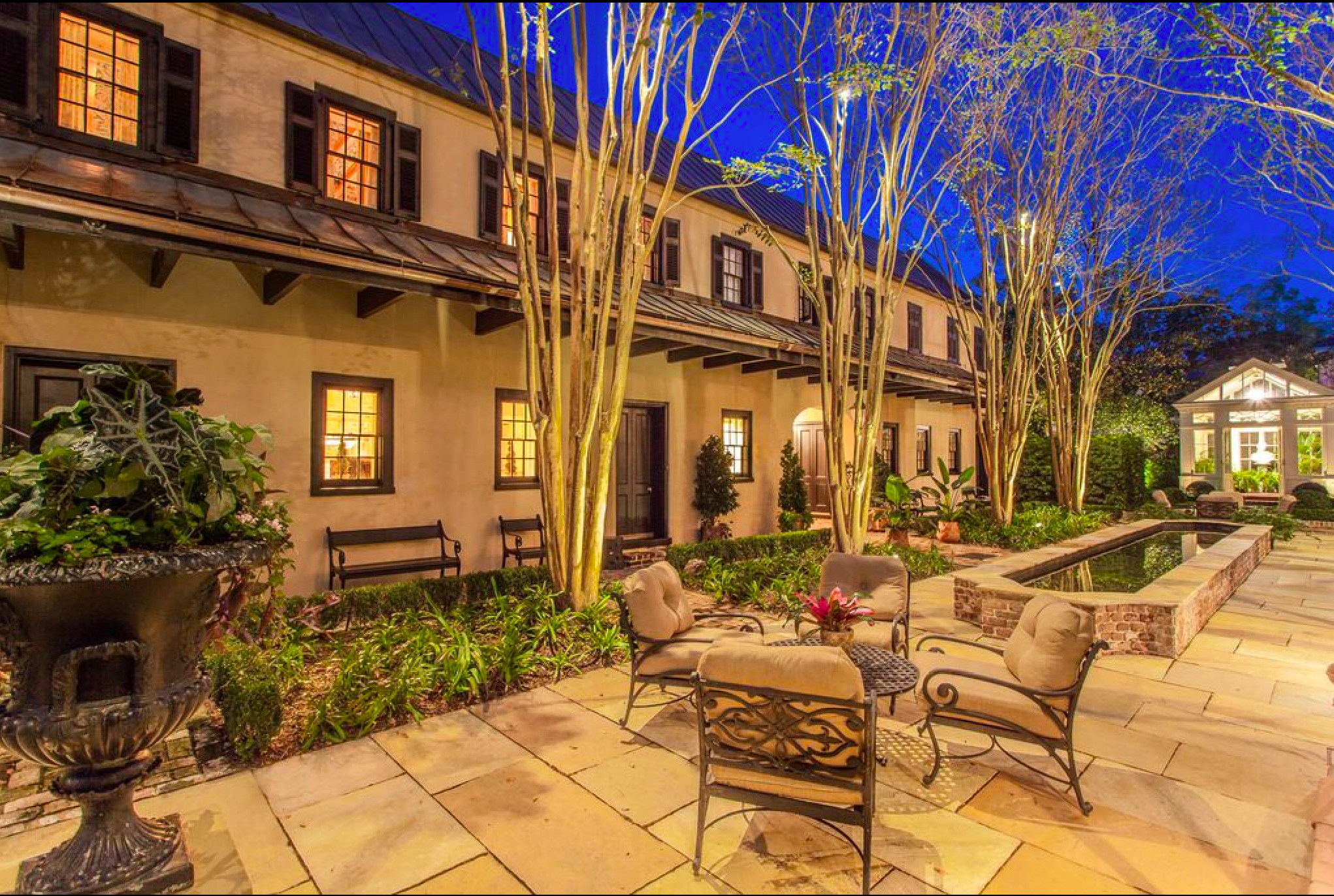
Night exterior historic home
House Porn, Legare St, Charleston, SC

The exterior lighting updates were well done and really make the exterior spaces welcoming in the evening.

If you’re ready to drop some serious cha-ching for a historic favorite in Charleston, this estate is listed by Debbie Fisher at Handsome Properties, Inc in Charleston, SC.  They’ve dropped the price from an initial listing in 2016 at $19,500,000 so I’d guess this is probably bargain pricing for this type of place.

Grab a glass of wine and join us for more house porn and DIY projects on our blog!  Cheers!


*Legal stuff:

I am honest about my experiences with different products and write because I enjoy it.  I do however, have the opportunity to earn money for my writing, also.

Slavetodiy.com is a participant in the Amazon Services LLC Associates Program, an affiliate advertising program designed to provide a means for sites to earn advertising fees by advertising and linking to amazon.com.  Amazon offers a small commission on products sold through their affiliate links.  Each of your purchases via our Amazon affiliation links supports our cause at no additional cost to you.

If a blogger links to an Amazon product (with a special code for affiliates embedded in the link), and a reader places an item in their “shopping cart” through that link within 24 hours of clicking the link, the blogger gets a small percentage of the sale.  Amazon links are not “pay per click.”  If you click on the product link and stay around Amazon and purchase something else, however, I will get a commission on that sale.
Slavetodiy.com is also a VigLink affiliate advertiser which works similarly.

Mashup Monday 3: 17 Inspired Ways To Decorate With Maps In Your Home

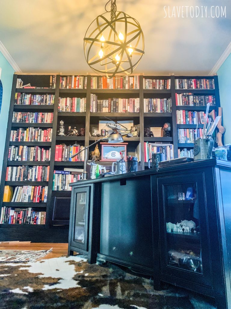
We are underway on a gorgeous home office remodel. The builtins were one of the first projects we tackled in the new house because Rainman’s desk was surrounded by boxes- literally stacked up to the top of the nine foot ceilings. Sorry if that was misleading. They’re not finished. Just waiting on trim, the cap and crown, and hardware. Like everything else here: we got to 90% finished and moved onto the next project.

4f252b48-e052-4499-b71a-0aedac774b39

*This post may contain affiliate links. Please see full disclosure at the end of the post.

We may be the only people in the world that still maintain a library, but that’s a different story. The cool faux cowhide rug is super cool and we had existing office furniture from the old house that works. We got a fantastic Globe Light Fixture from World Market but I feel like the ceiling needs a special treatment. And, of course, hoping that the finishing touches to the builtins will follow the ceiling treatment, I started looking. We both dig maps and of course, the Compass Rose, so I am sorting through ways of using maps as ceiling and wall treatments. I am in love with this inspiration, so here are the best ideas I found.

Map on the ceiling:

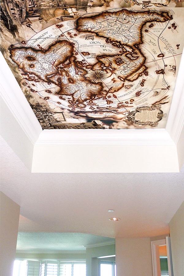
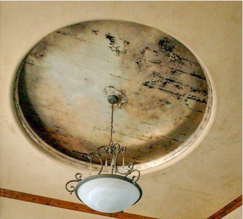
behance.net

Inside tray ceilings. Perfection.


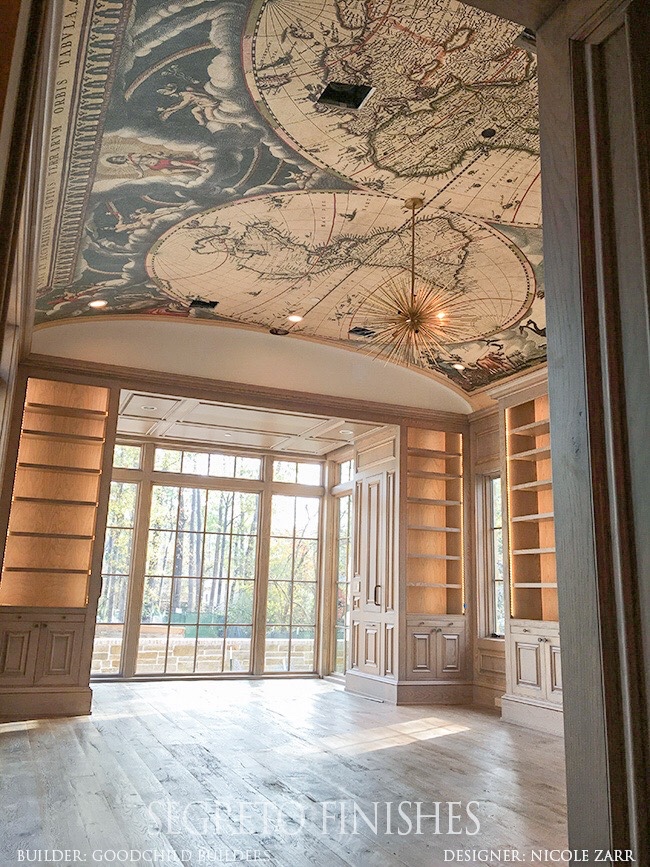
Segretofinishes.com (Goodchild Builders, Designers Rudy Colby and Nicole Zarr)

If you happen to have an office/library the size of a ballroom with an exquisite arched ceiling, this is an excellent treatment. Bravo!


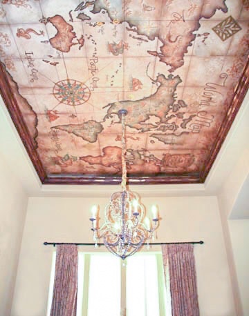
Celadonstudio.com

I love that the crown is incorporated as a frame inside the tray ceiling. Very well done.


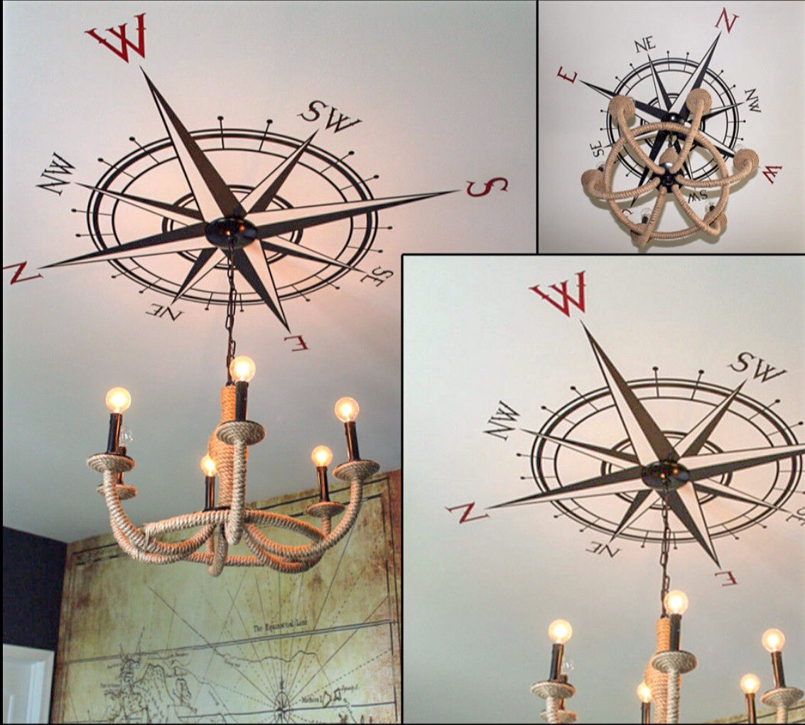
Ebay

So, no, the Compass Rose is not a map, but I was picturing it overlayed on a map. I do love the combination of the map on the wall in the background with the Rose on the ceiling.


aroomsomewhere.net

I realize this isn’t a true map, but it feels like remnants of the map.  I love how antiqued this is.


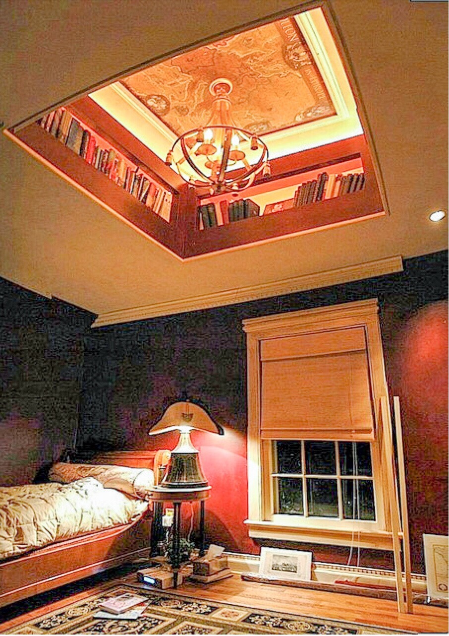
drscott on Flickr

What an awesome design and commitment to book collection and proper display. I ADORE the ceiling nook with the added depth of the map.


5b0142b4-3952-46dd-b980-a5fddd5f330c
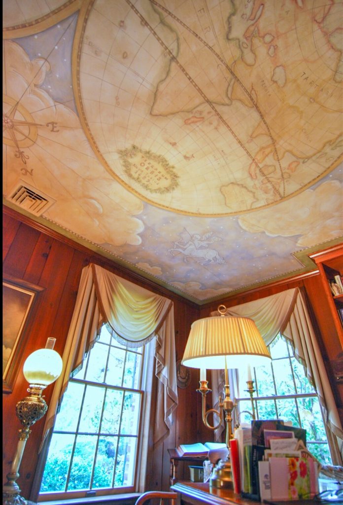
Painted by Hugh Luck

Apparently, this is a painting. Unreal. Stunning.


Source unknown

I adore the texture and colors in this.


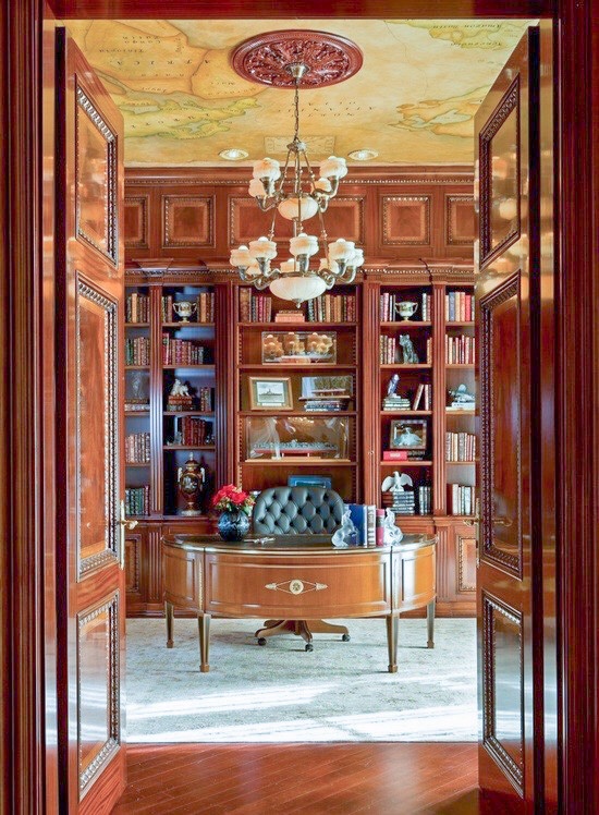
Via thefullerview on Pinterest

What an elegant traditional office. The ceiling map is just the right touch.


Maps on the wall:

Source Unknown

I love this little carved out nook and would love to see some wood shelves in there.


Ebay


Ebay bestdealdepot – com

This vendor on Ebay (for the two above) has a whole bunch of different styles. I love that they’re only around sixty bucks… cheaper even than wallpaper for a comparable wall and WAY cooler!


Source Unknown

This is so great. Rustic finishes and beams. The map really enhances the look.


Ebay

Essener Mural Wallpaper paired with a gorgeous antique leather Chesterfield couch. Half Restoration Hardware, half steam punk. All love.

Here are some more examples I’d put on a wall OR on a ceiling:

Murals Your Way

This may be the one for the office ceiling. It’s perfection.


Source Unknown

If you’re looking for more of a traditional map, but still with beautiful antiquing, this might be the way to go.


Source Unknown

I hope you enjoyed exploring inspiration for decorating with maps with us and I would love to see some of your ideas/projects in the comments! I will share the results as soon as we get that map on the ceiling (here’s to everyone collectively holding their breath)!

Check out other inspiration and DIY posts here!

*Legal stuff:

I am honest about my experiences with different products and write because I enjoy it.  I do however, have the opportunity to earn money for my writing, also.

Slavetodiy.com is a participant in the Amazon Services LLC Associates Program, an affiliate advertising program designed to provide a means for sites to earn advertising fees by advertising and linking to amazon.com.  Amazon offers a small commission on products sold through their affiliate links.  Each of your purchases via our Amazon affiliation links supports our cause at no additional cost to you.

If a blogger links to an Amazon product (with a special code for affiliates embedded in the link), and a reader places an item in their “shopping cart” through that link within 24 hours of clicking the link, the blogger gets a small percentage of the sale.  Amazon links are not “pay per click.”  If you click on the product link and stay around Amazon and purchase something else, however, I will get a commission on that sale.
Slavetodiy.com is also a VigLink affiliate advertiser which works similarly.

16 Ways To Use Brick Veneer Inside Your Home

When I’m perusing Pinterest late at night when I’m supposed to be sleeping (don’t tell me you’re not guilty), I find that I’m always attracted to images of older homes. Beautiful, preserved stone or brick walls that have either been re-exposed in a renovation or have been there the whole time.  Stone mixed with plaster, crumbling/repaired brick, or even painted brick fireplaces… I love them all. One of the things I have chosen as a challenge for myself in transforming various projects is making them feel like they’ve always been there. Even if they’re new and modern, they should feel homey… like there’s history behind them.

*This post may contain affiliate links. Please see full disclosure at the end of the post.

My new obsession is using accent walls of brick veneer to add some age and depth to different projects. It’s smart and it’s classic. Brick has been around in different forms since the dawn of time, and I LOVE it.

49077a92-a0e3-4d49-aa17-b3ec95960311
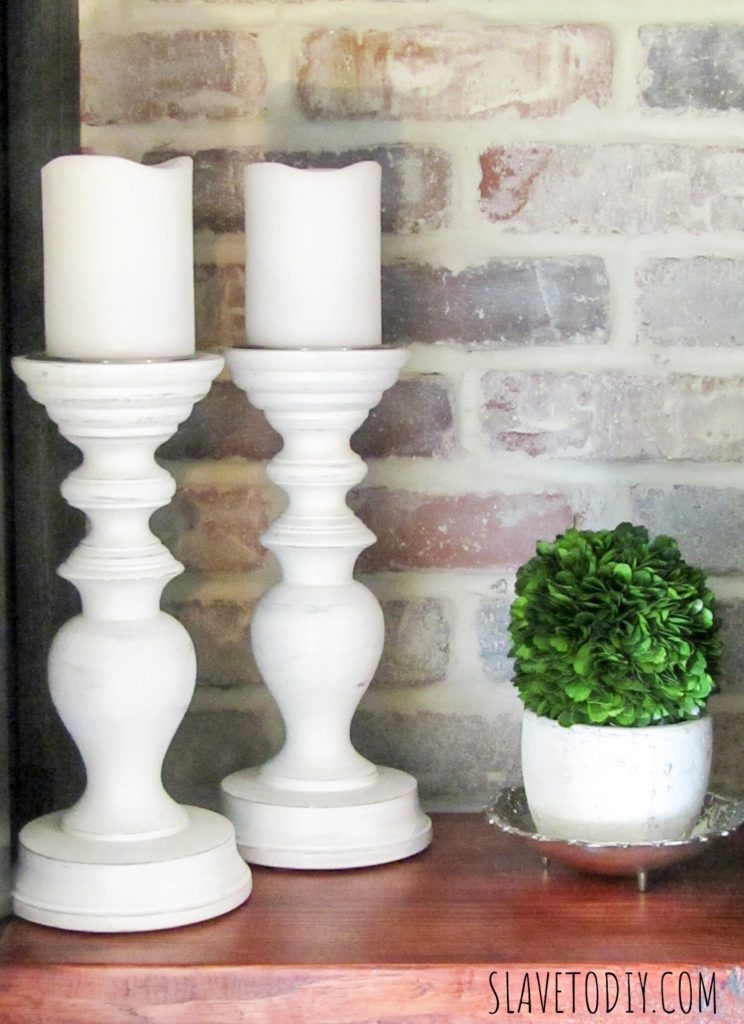
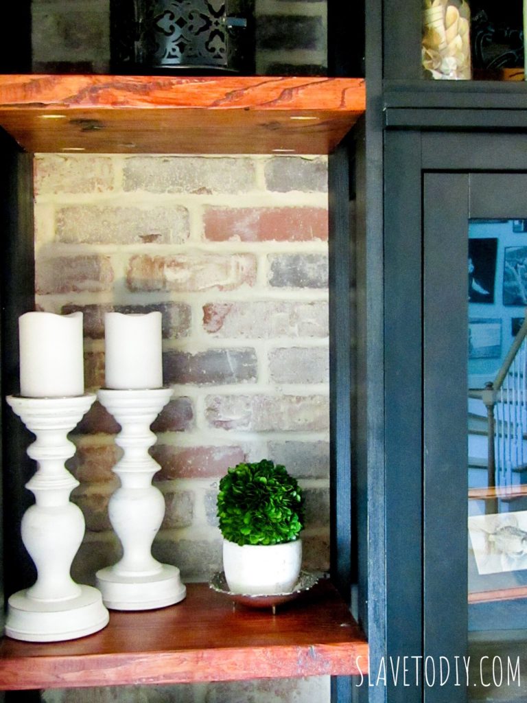
Built in shelves, part of IKEA hack, with Castlegate Old Mill Brick Veneer, dressed with farmhouse candlesticks and preserved boxwood


Our first experiment with brick was a complete and total pain in the tail. I, of course, chose a super narrow space to install it, because I feel like Rainman really needs the additional challenge of working in a tight space on top of doing something he hasn’t done before. I’ll do a project tutorial soon, but I’m just not ready to relive that pain yet, nor do I have enough wine in the house to really delve into it.

Anyway, along the way, as I was researching different looks I found some fantastic applications for brick veneer in the house. I’ll share my favorites with you:

As an accent behind builtins or shelves:

6b89b47e-8f76-468e-af7b-11afbb00f0de
Built in shelves, part of IKEA hack, with Castlegate Old Mill Brick Veneer, dressed with farmhouse candlesticks and preserved boxwood

This is our unfinished builtins project (IKEA hack) with the brick veneer behind the shelves. I love the effect. After researching multiple options, I finally decided on Old Mill, Castle Gate Brick Veneer. I always check a local distributor first, and although he was able to do it for 5 cents cheaper a brick, we had to buy an entire pallet and there was a six-week lead time. In any case, we really love how it turned out, and the Old Mill quality was excellent.

Here are some of the images that inspired me and continue to provide planning inspiration for possible future projects:

As an accent wall in the bathroom:

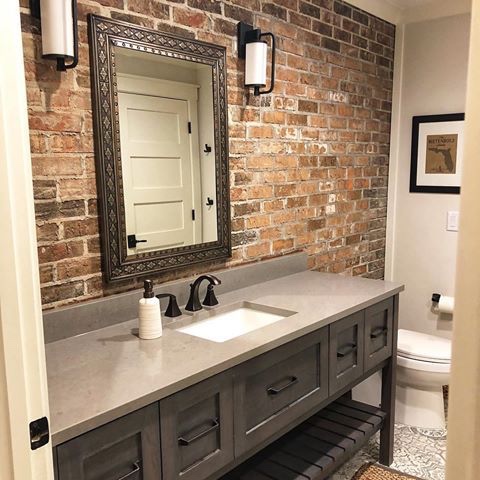
Image Source Unknown (Instagram Account Deleted)

So, this is a great space. I really like the vanity. But, honestly, without the brick accent wall this room would be pretty vanilla, right? It was a fantastic choice in this room.

In the bathroom with antique fireplace:

1e2609f7-9f2e-4283-8b21-ffcac3f66c41-1
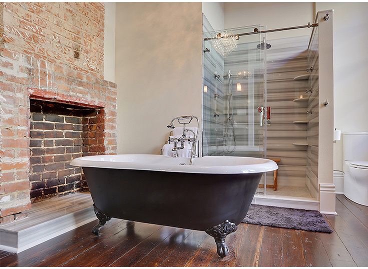
Image from Signature Hardware

There is a lot going on with this bathroom. I honestly don’t LOVE the shower, because I think the “modern” level is overdone and clashes with the other AMAZING elements. The preserved antique brick fireplace is incredible (minus the hearth in the modern tile). The clawfoot tub is equally fantastic. I also love that they refinished what appear to be original wide plank floors. If you look carefully you can see a chandelier in the shower glass reflection…. reinforcing my deep belief that no bathroom is truly complete without a sparkling chandelier. Bravo.

As a foyer accent wall:

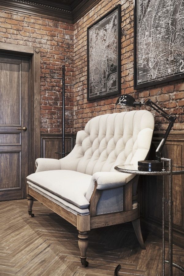
From diyfurnituremaven.com

This is such an amazing space. The combination of herringbone wood floors, the brick, the incredibly detailed wood moldings, the classic settee, and of course, the maps. This person might love Restoration Hardware. It’s a rich, warm, classic look and I just adore it.

As a kitchen accent wall:

img_1325
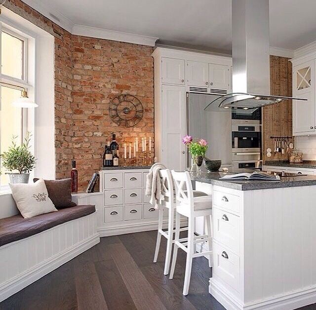
From carmenza.spotlife.se

The antique brick really adds interest to this space. I also dig the bank of apothecary drawers and the banquette seating.

For a more modern take on the kitchen with an antique wall:

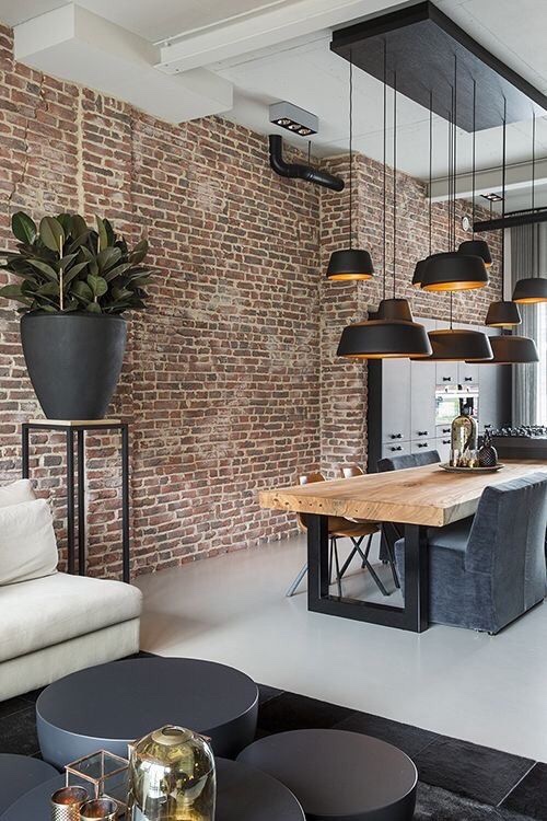
Image from myhouseidea.com

The scale of this room is part of what makes it so cool (did you see how thick that table slab is???). Doing this wall in brick veneer would be a pricey undertaking.

Over the stove:

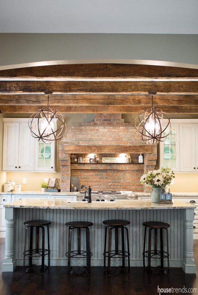
Image from housetrends.com

Sigh. Yes, the antique brick surround for the stove wall is happening and in our future kitchen renovation. For real. Don’t you love the beams and the lighting?

On the fireplace:

Image from designsponge.com

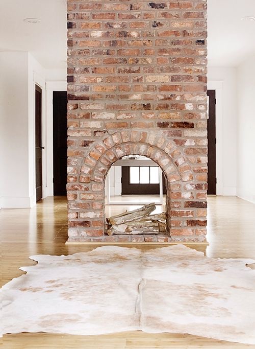
This is one of the coolest two-sided fireplaces ever. And I love the faux skin rug. I would’ve loved to see a wide plank, hand finished hard wood with this. It would have been epic.

A totally different take on a fireplace:

Image from betweennapsontheporch.com

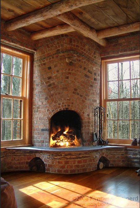
This fireplace inspires my inner Hobbit. So much movement, and paired with what appears to be heart pine… what more could one want?

As an accent on window walls:

img_1326
Image from Pocket.co

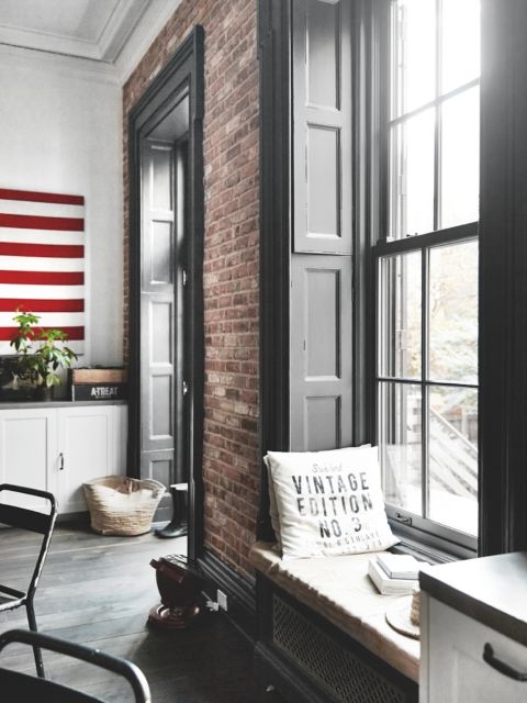
I love brick accents around windows, especially if they are original, or made to appear to be the outer wall of the home. These are uniquely awesome because of their depth- they were able to incorporate a great panelled look on the inside. Really nicely done with superb depth.

Image from Theloftsofgreenville.com

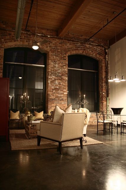
The loft pictured here is incredibly well done all around. They really captured a moody ambiance.

As a column wrap:

img_1328
Centophobe.com

My favorite part of this column wrap is that it appears to actually be an original home element. Very cool that they kept it.

As an archway wrap:

img_1334
Image from Houzz

The difference in materials on the archway does a masterful job of separating living areas. The flow between spaces here is exquisite.

img_1335
Image source unknown

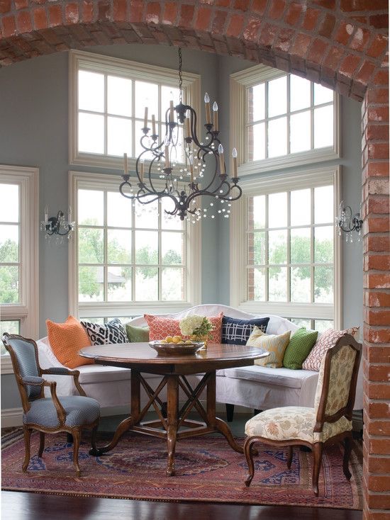
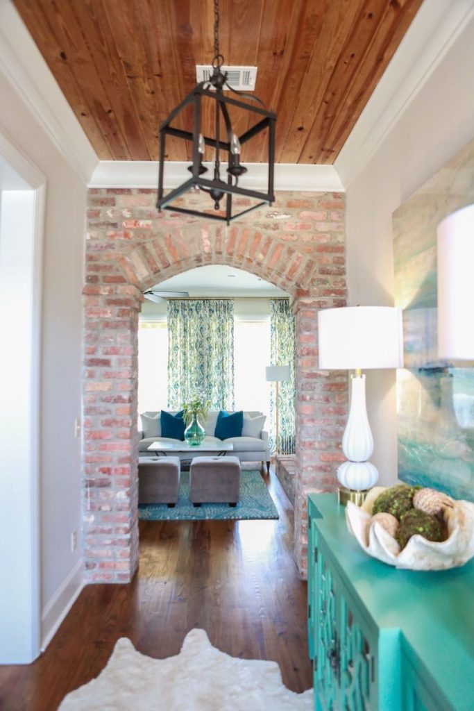
Isn’t this an awesome transition from foyer to living area?

In the dining room:

img_1330
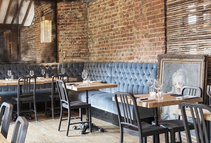
Image from emeco.net

This is obviously a commercial space, but what a perfect combination of gray velvet tufted seating, antique mirrors, rustic wood floors, iron table bases, classic artwork, and of course, the brick.

On the basement wall:

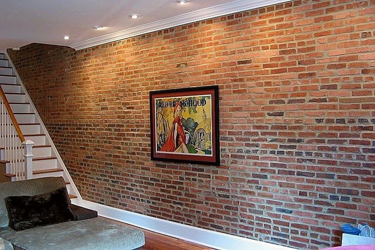
Image from howtobuildahouseblog.com

Once again, realize this would be an expensive undertaking. But, the look is so unique. I love it paired here with medium tones in wood flooring and the bright white baseboards.

As a brick ceiling:

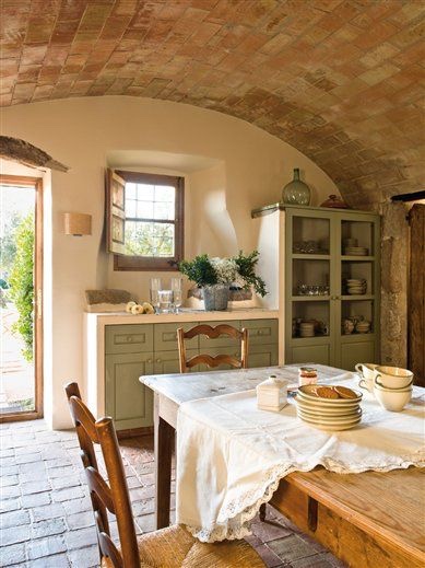
Image from ElMueble.com

After a fairly frustrating installation of brick on a wall, I’m not totally sure how one would accomplish a ceiling installation. Nor do I think I know anyone with a marriage strong enough to survive a joint brick ceiling installation. But, if it was possible, the results are breathtaking.

Brick floor inlay:

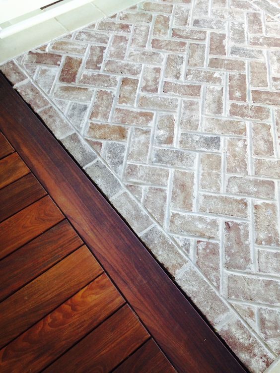
Image from enchantedhome.com

Isn’t this amazing? I love combining the materials of deep wood tones with the whitewashed-look brick. It is really something special. They accomplished something very similar below.

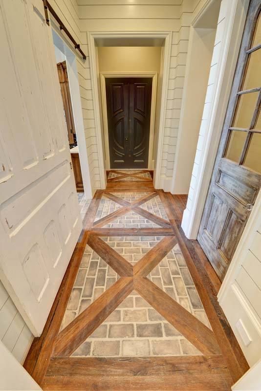
Image from architecturaldesigns.com

Something interesting to note on the image above is that I believe this is new construction. This is varsity level use of different depths, textures, and finishes to make the house feel homey and not too new. There are three different styles of doors in one hallway and the mixed use of wood floors and brick is cool (though I’ll admit the antique-size brick would have been a visual and authentic improvement). Overall, really well done.

Master bedroom accent wall:

Image from Magnolia Realty, Instagram

I really like the style of this entire space (it’s new/old), classic/eclectic, well done and homey. The heavy grout is very popular right now.

As a staircase brick accent wall:

Image from seabelle.tumblr.com

If I ever walked into this space, it is truly “gasp” worthy. Unbelievably elegant and warm.

Have you used brick veneer interior applications?

Using brick inside offers an opportunity to completely transform the feel of a space. It creates warmth, texture, and depth. Are there other interior brick applications you love? I would love to see pictures in the comments section!

Thanks for joining us and check out more of our fabulous DIY and project blog here!

*Legal stuff:

I am honest about my experiences with different products and write because I enjoy it.  I do however, have the opportunity to earn money for my writing, also.

Slavetodiy.com is a participant in the Amazon Services LLC Associates Program, an affiliate advertising program designed to provide a means for sites to earn advertising fees by advertising and linking to amazon.com.  Amazon offers a small commission on products sold through their affiliate links.  Each of your purchases via our Amazon affiliation links supports our cause at no additional cost to you.

If a blogger links to an Amazon product (with a special code for affiliates embedded in the link), and a reader places an item in their “shopping cart” through that link within 24 hours of clicking the link, the blogger gets a small percentage of the sale.  Amazon links are not “pay per click.”  If you click on the product link and stay around Amazon and purchase something else, however, I will get a commission on that sale.
Slavetodiy.com is also a VigLink affiliate advertiser which works similarly.

Transform Your Front Porch: Take Down the Railings!

So, here’s the deal.  Sometimes it’s super expensive to create a breathtaking transformation to your house, and sometimes it’s FREE.  Sometimes all you need is a little elbow grease (and maybe some basic supplies you already had on hand) to make a huge impact.

*This post may contain affiliate links.  Please see the full disclosure at the bottom of the post.

This is the second time I have taken down the railings at a home that we own.  The first time the porch was basically at ground level and it was a no-brainer.  The impact was immediate- INSTANT curb appeal.  I loved it.  See the complete “after” transformation on the old house we sold in 2016 here.

Okay, it’s a little hard to see the LACK of railing there because of the out of control hydrangea. Trust me. The railings were removed. Details on that crazy garden you can see here.

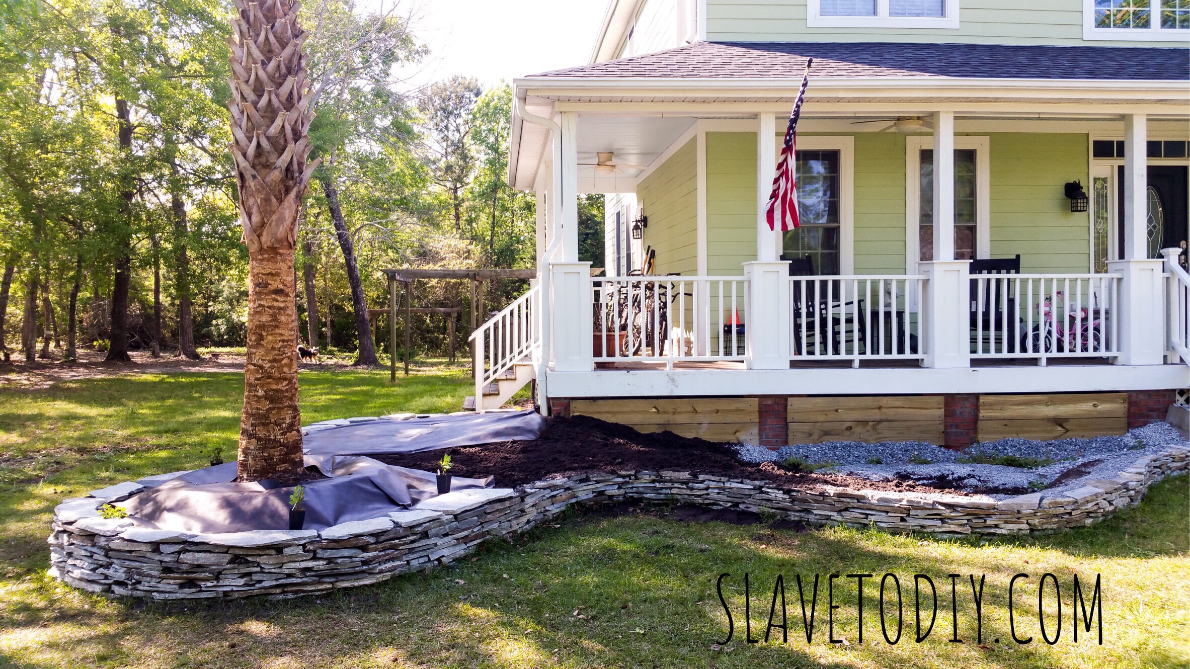
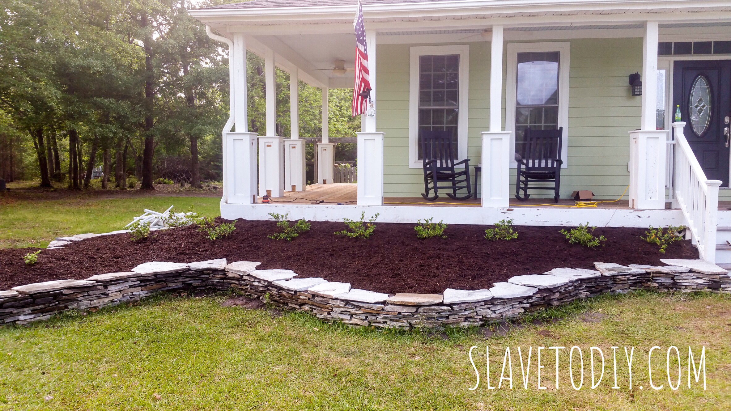
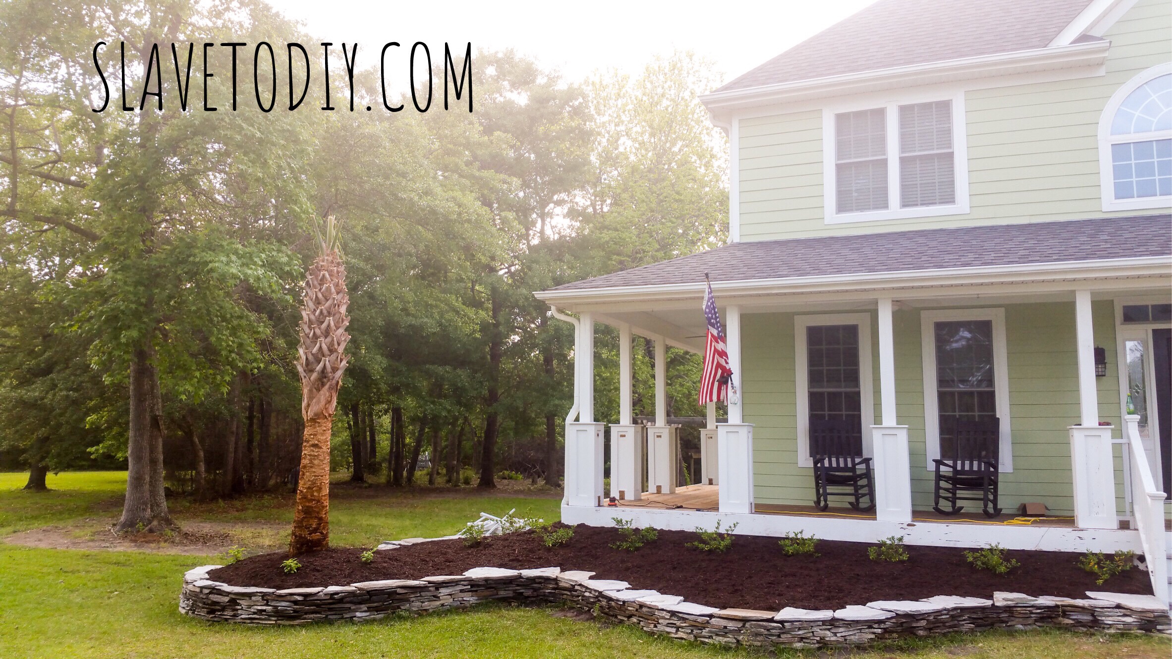
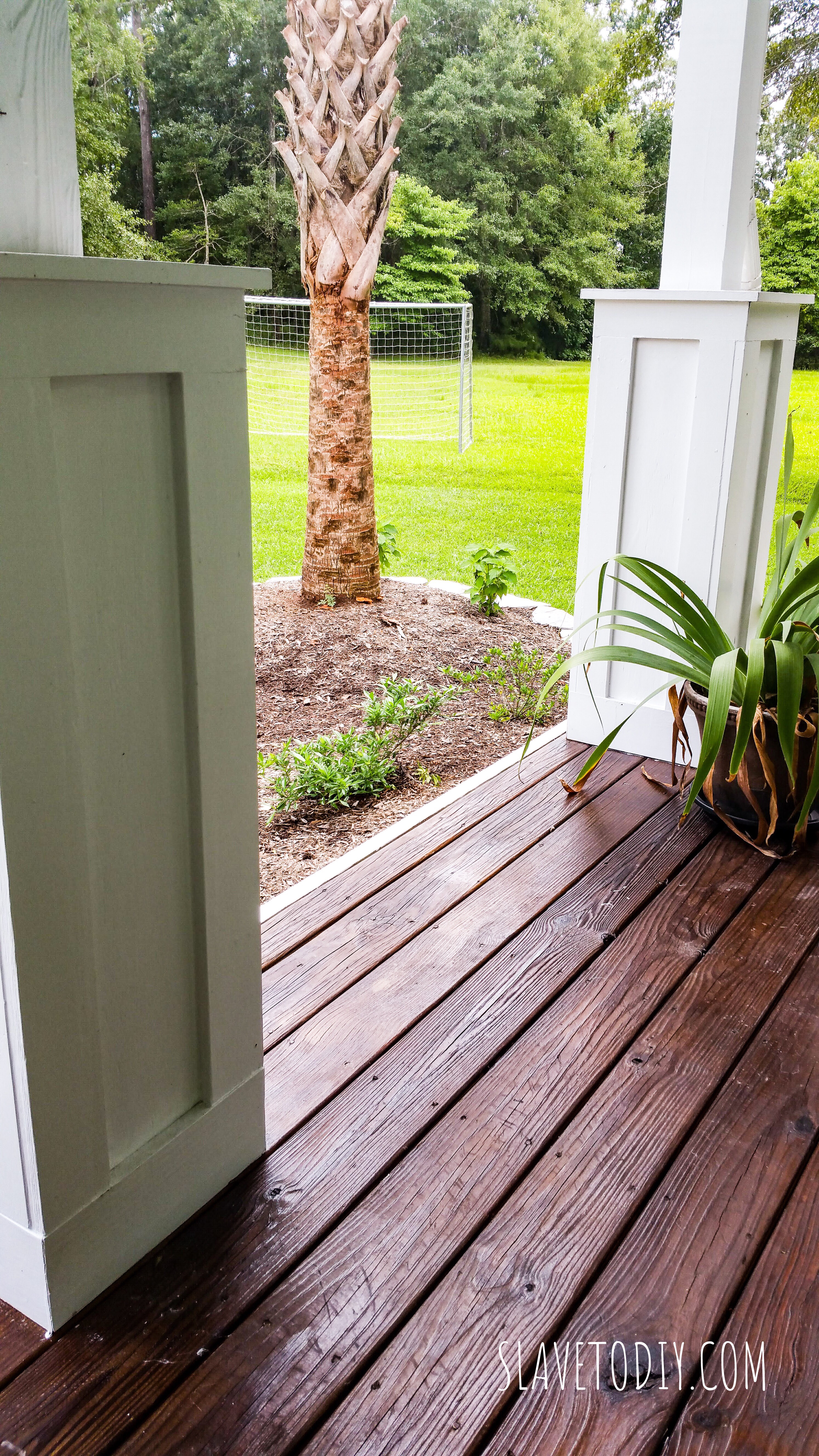
When we moved in to our current home it had those same railings, but they were serving an entirely different purpose- safety.  The porch is a few feet off the ground.  In the middle of our epic and back-breaking front garden project (which you can check out here) I decided to rip them out.  I knew that the dirt would end about a foot below the front porch/deck so it would be safe to take them down.  I feel the need to say, “I’m not telling you to take your front railings down.  I haven’t seen your house.  It could pose a safety hazard.” Please consider safety: toddlers, old people, clumsy people, etc. as you make the decision to keep your railings or not.  We may eventually put in black, wrought iron railings, but for now I like it just like it is.

Here’s a picture before my project A.D.D. took hold:

7de4a12e-4860-4a58-881f-760357210f4d

So, I seriously stopped mid project, stole one of Rainman’s hammers, and started swinging away.  As I suspected, the sellers had covered up rot with white paint (pretty typical) and the railings came down in about 30 minutes.  Of course, this made me realize the bicycles and miscellaneous crap all over the front porch would need to find a new home (not exactly HGTV ready).

Tip: Painting and caulking front porch columns and railings is an ANNUAL MAINTENANCE ITEM.  It should be on your list.  Otherwise they rot.  Case in point.

And here’s the front porch immediately after taking the railings down: Sigh. I’m in love.

3774c223-3c54-4294-81fe-d158964812fd

Above you can see the pile of railings (dry/rotted wood is excellent for starting bonfires) to the left there and the bare wood on the columns where the railings used to be.

5cd786aa-80db-4df0-9b5a-d2e04c05a272

While I was having A.D.D. and happened to have a nephew visiting (can I get an AMEN for cheap, available labor???) I decided to get some painting and staining done.

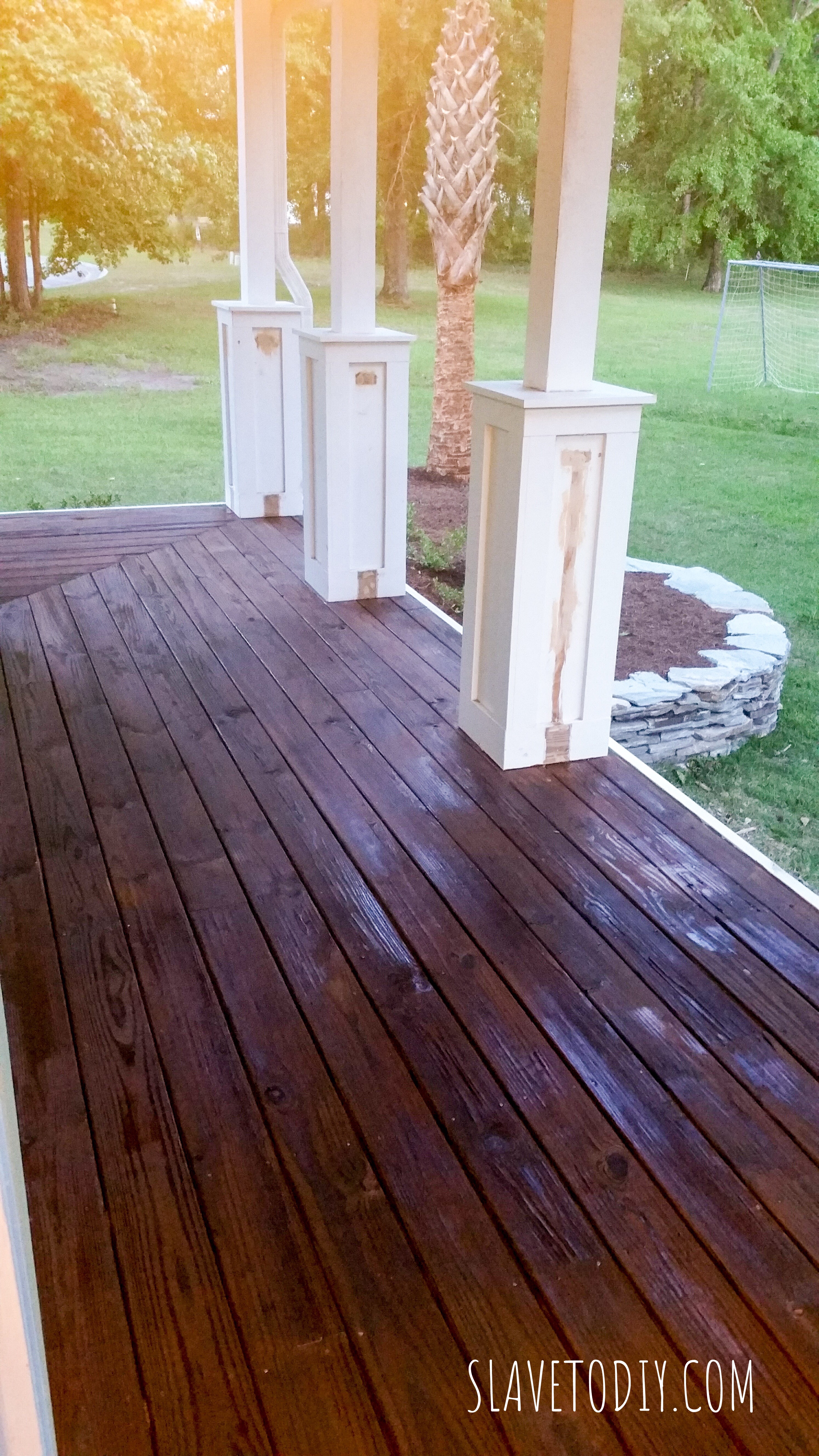
I had him sand the front deck and get any loose deck screws back in. If you don’t have a good sander, I have several of these. I have one I keep for just drywall finishing, then others for miscellaneous sanding projects. They’re cheap enough it doesn’t break my heart to burn them up or buy a new one, but they’re surprisingly hardy.

I also had him sand around where the railings had been on the posts so we could get a fresh FLAT coat of white and the seam would be invisible.

I splurged on some good deck stain and sealant and we did two coats.  For stain, I recommend throw away brushes, which you can get pretty cheap at Lowe’s. True story: in seventh grade my son did a science project on which of three deck stains offered the best moisture protection (based upon water absorption and weight).  I used that brand.  I love the color and it’s amazing the difference it makes. It ended up being a smaller splurge than I expected because that huge front deck took less than a gallon for two coats.

So here we were, working along and I noticed those damn builder grade lights. Project A.D.D. strikes again. Yeah, those definitely had to go. I hadn’t even noticed them delaminating until I fixed all the other stuff.

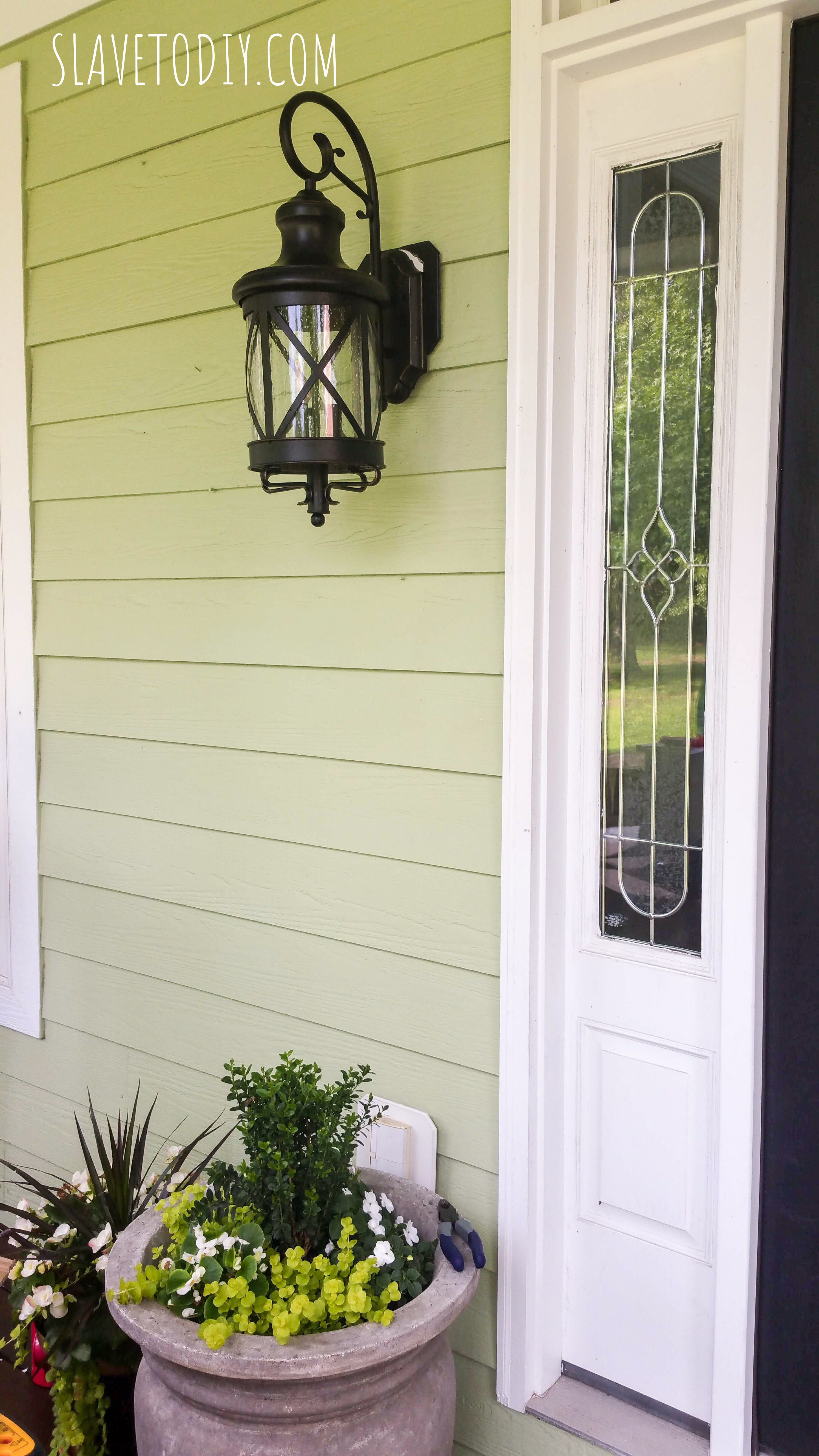
So, we took the opportunity to change out the porch lights and found a great deal on really nice looking lights.

While we were out there I handed Rainman black spray paint to put a fresh coat on our 10 year old rocking chairs and little black table. He hit the rough spots with sand paper, cleaned and dried them, tightened the hardware, then spray painted. TADA! Good as new.

We will be doing another update soon (cough* cough*) on working shutters for the windows.  We are currently doing price comparisons on shutters and hardware.  After the hurricane we realized we can’t spend two days putting up plywood every time we evacuate.  Also coming soon, the tutorial on how to put up plywood over your windows before you evacuate for a hurricane.

Anyway, drum roll please…

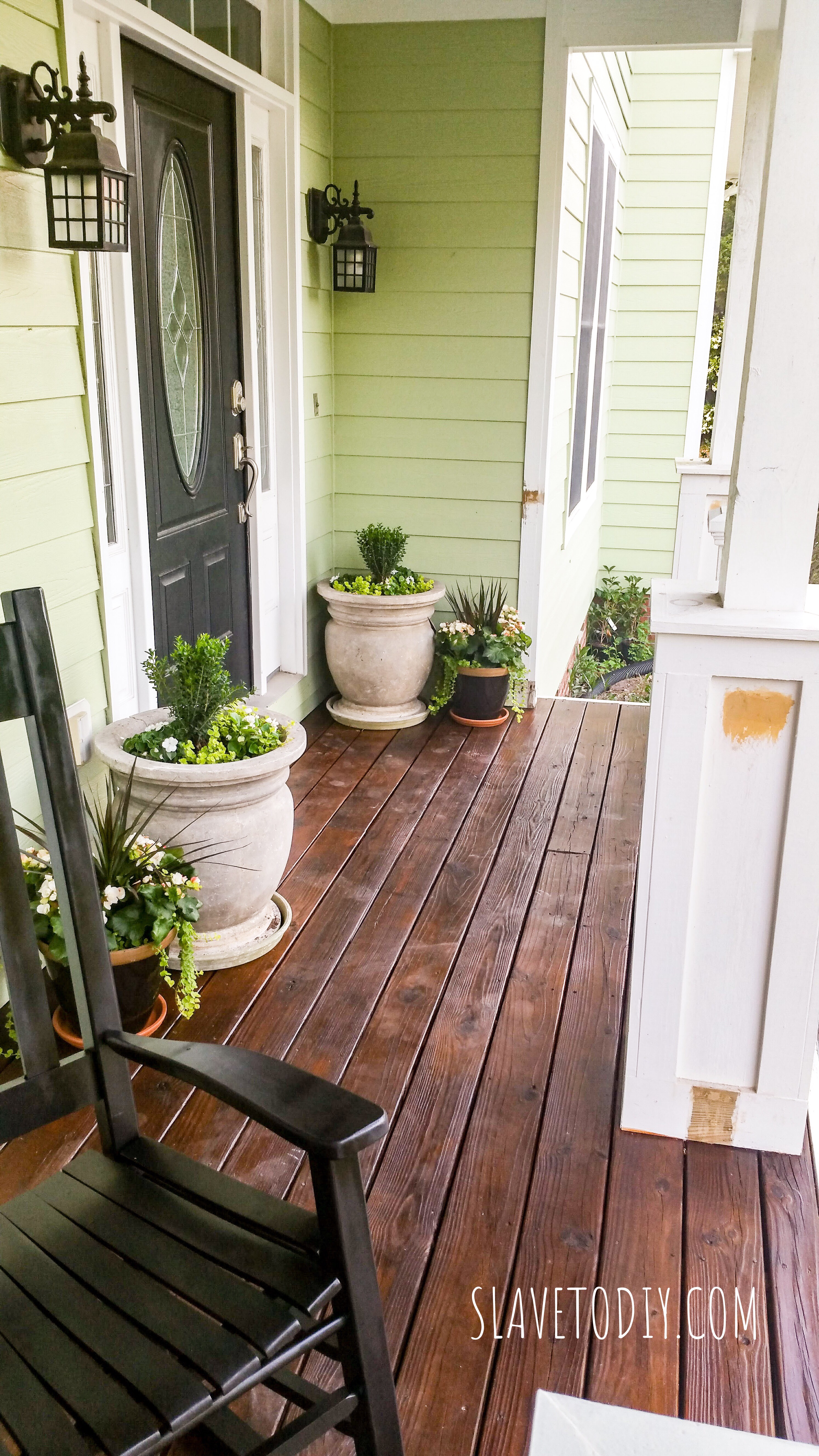
Doesn’t it look AWESOME??? Bear with me.  The right side over by the staircase is still in need of rework.  Here’s another view from the rocker:

Everything’s all nice and painted, stained, and ready to move on to the next thing! I just love how our mini-flip on the front porch turned out.  Big impact for minimal cost!

Check out our other projects and wins and fails here.  Thanks for stopping by!

*Legal stuff:

I am honest about my experiences with different products and write because I enjoy it.  I do however, have the opportunity to earn money for my writing, also.

Slavetodiy.com is a participant in the Amazon Services LLC Associates Program, an affiliate advertising program designed to provide a means for sites to earn advertising fees by advertising and linking to amazon.com.  Amazon offers a small commission on products sold through their affiliate links.  Each of your purchases via our Amazon affiliation links supports our cause at no additional cost to you.

If a blogger links to an Amazon product (with a special code for affiliates embedded in the link), and a reader places an item in their “shopping cart” through that link within 24 hours of clicking the link, the blogger gets a small percentage of the sale.  Amazon links are not “pay per click.”  If you click on the product link and stay around Amazon and purchase something else, however, I will get a commission on that sale.
Slavetodiy.com is also a VigLink affiliate advertiser which works similarly.