I stumbled across Tom Howley sort of by accident. I kept pinning these gorgeous kitchens to my Kitchen Crush board on Pinterest, and then I started noticing that the ones I really loved were from just a few different cabinet makers. There’s a catch, though, Tom doesn’t make cabinets in the US, which is probably why I’d never heard of them before. But, maybe if we spam him with requests, he’ll open a cabinet design store here just for me. Check out the awesomeness they put into every detail and design.
*This post may contain affiliate links (I am not a Tom Howley affiliate). Please see full disclosure at the end of the post.
All photos are from tomhowley.co.uk
I’m just showing you these, so you too, can dream of a fantastic English kitchen. One of the details I love most is that the cabinets are all installed like builtins. I ADORE this detail. There is no recessed toe kick like American designed kitchens. Doesn’t it look clean and wonderful? (Imagine not needing to sweep out from underneath the cabinets every time you cook). The other main difference seems to be that there is nearly as much attention paid to the surfaces that you don’t immediately see as the exterior finish on the cabinets.
The inside of every drawer and cabinet is beautiful. Underneath the cabinet. The toe kick. Everything. Gorgeous.
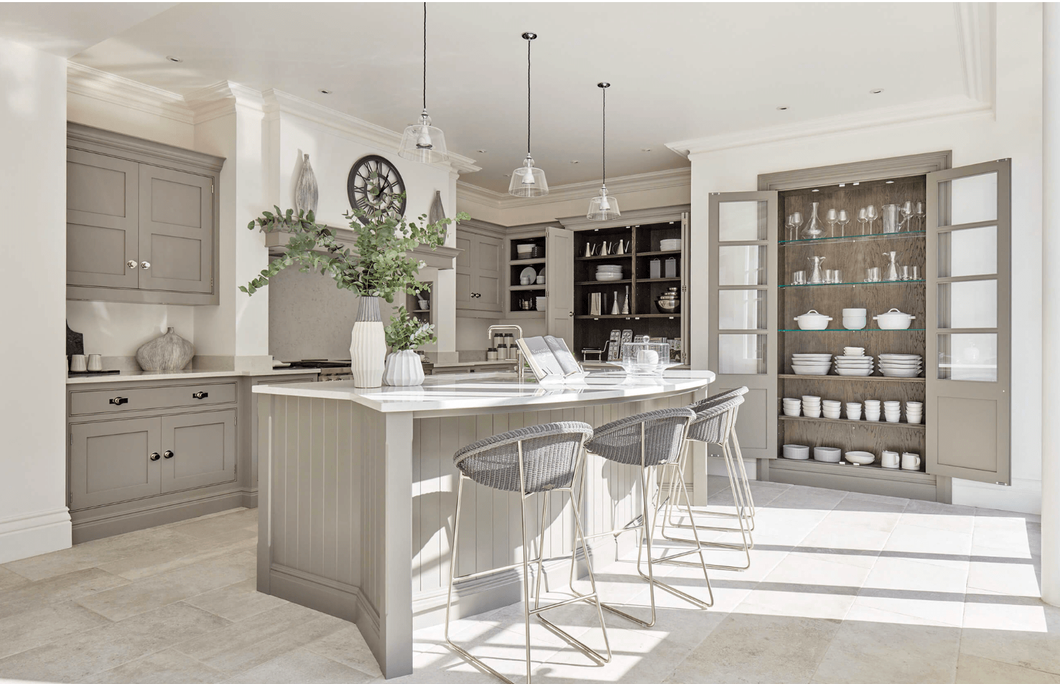
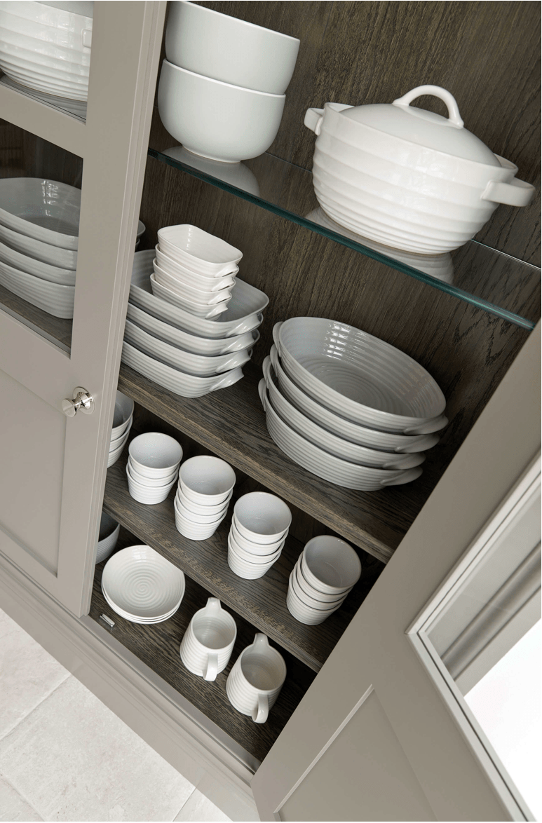
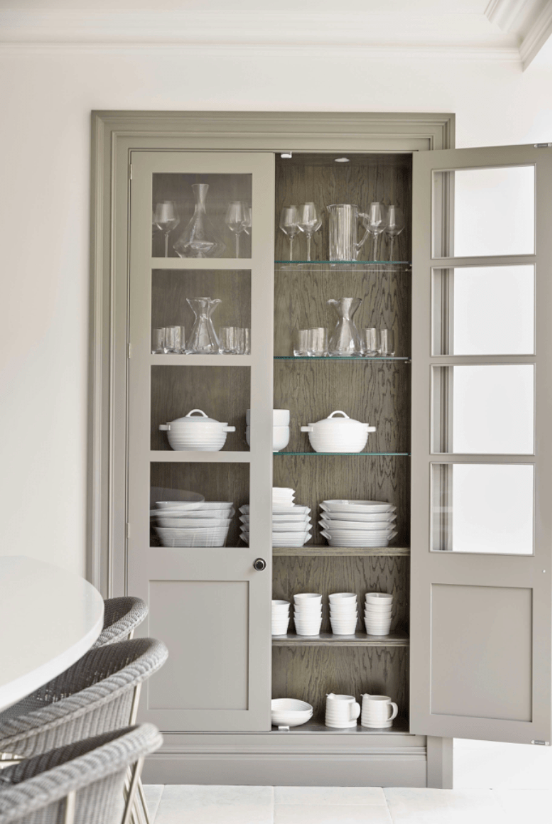
Below you can see the builtin dish pantry that is just gorgeous. Real wood liner, interior lighting, and glass shelves highlight serving ware. The knobs are gorgeous and the glass is perfect. How perfect is the curve on the island seating (in the foreground)???
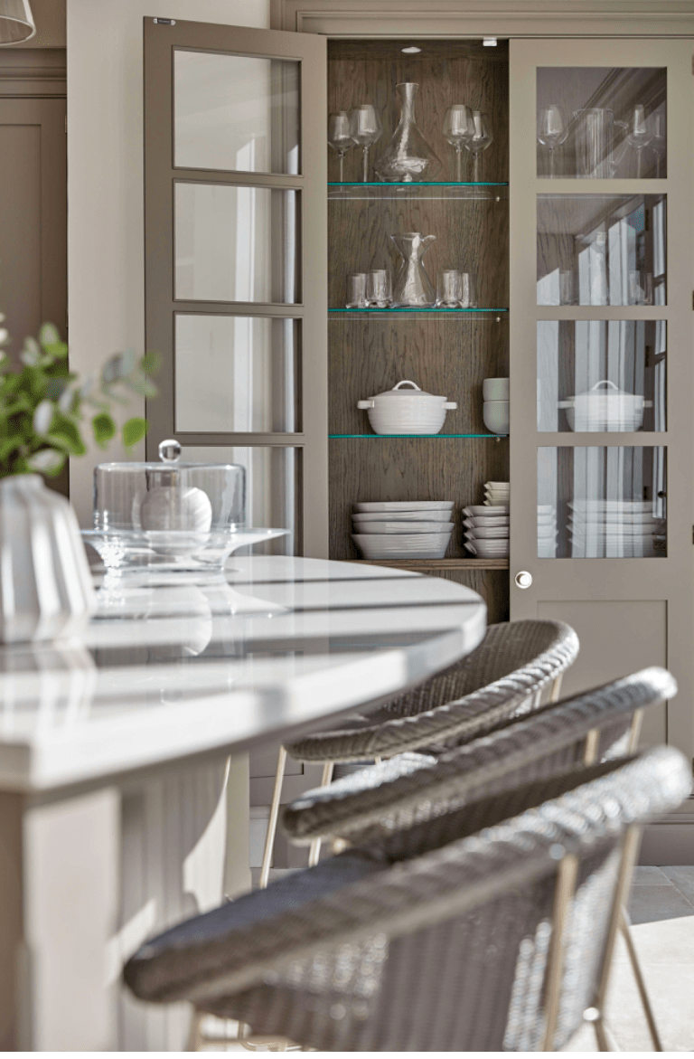
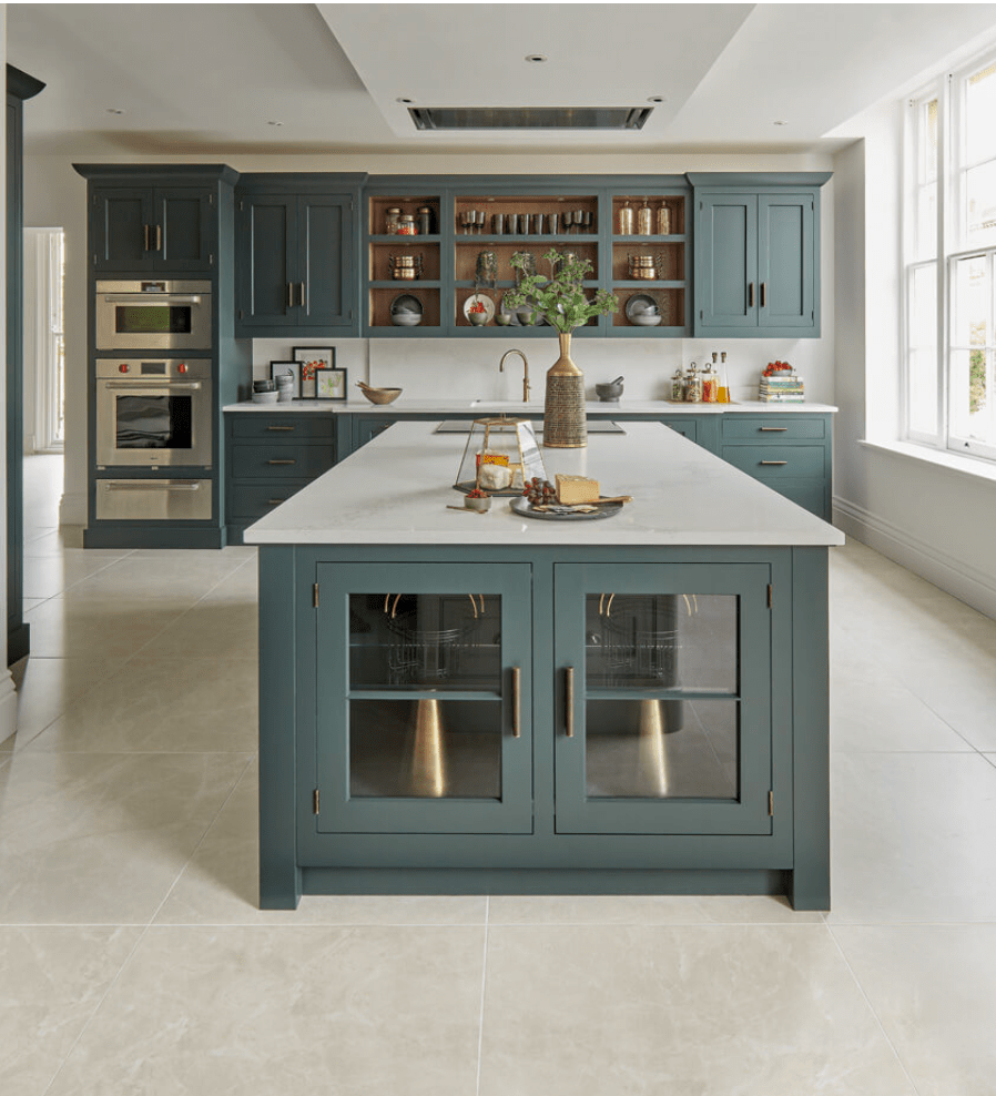
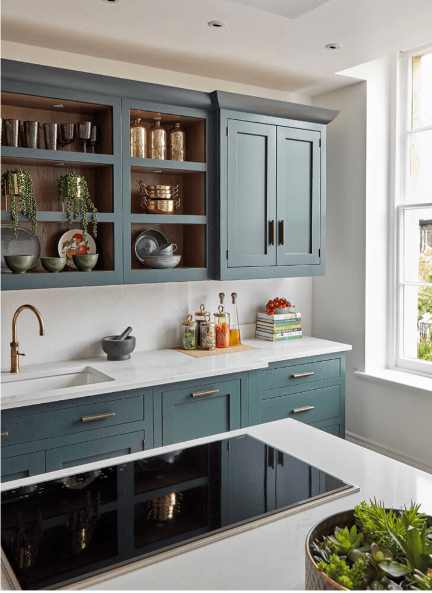
The combination of open shelving (cabinets without doors) and pantry style hidden storage in different depths really gives the kitchen character. You’ll notice with all of the designs that they alternate the depths of the cabinets, not just the height, to add interest. Even in one color, this kitchen is far from uniform and totally stunning.
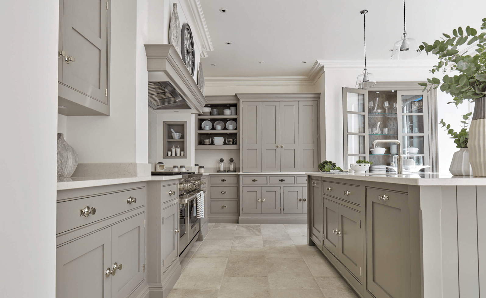
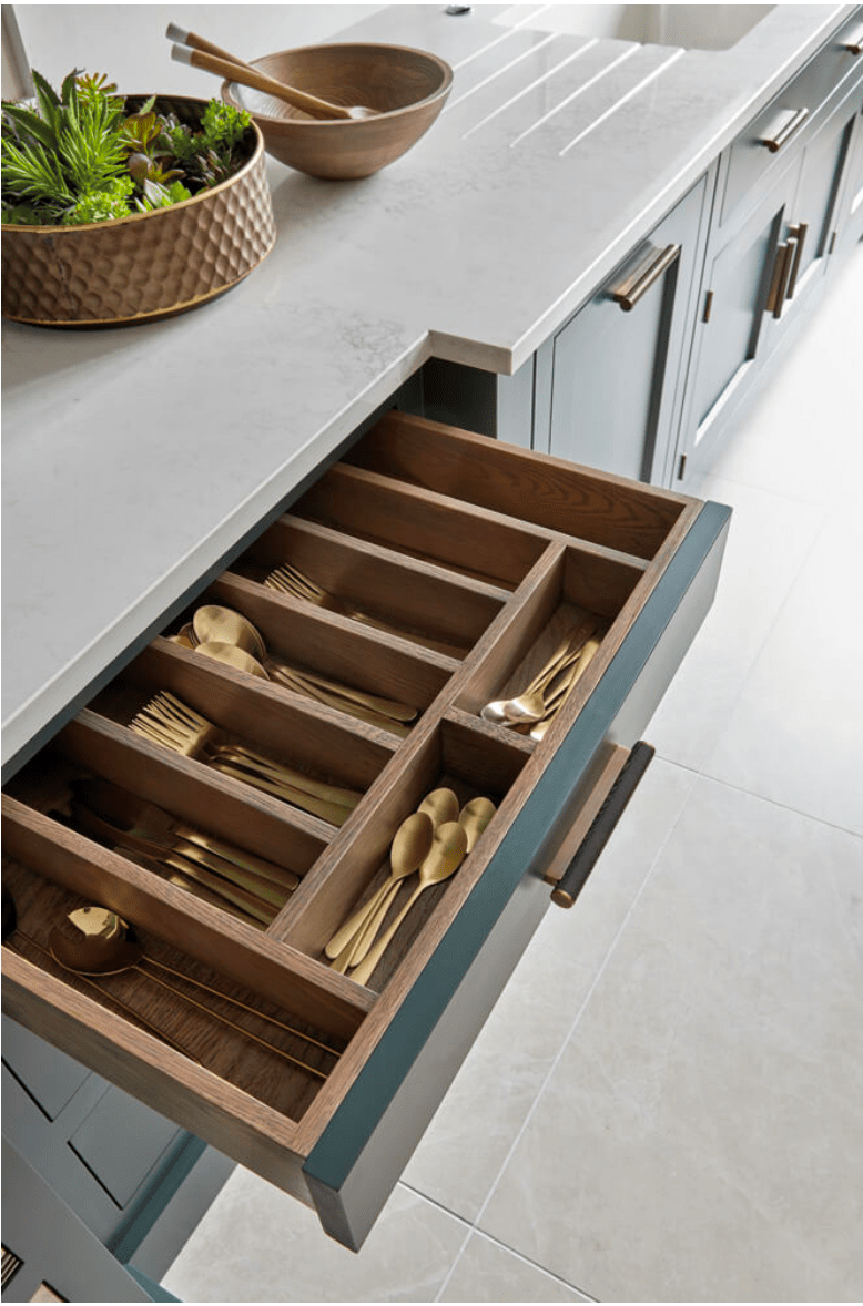
Built in drawer organizers are just exquisite. No IKEA here, just perfectly crafted organized kitchen-ness.
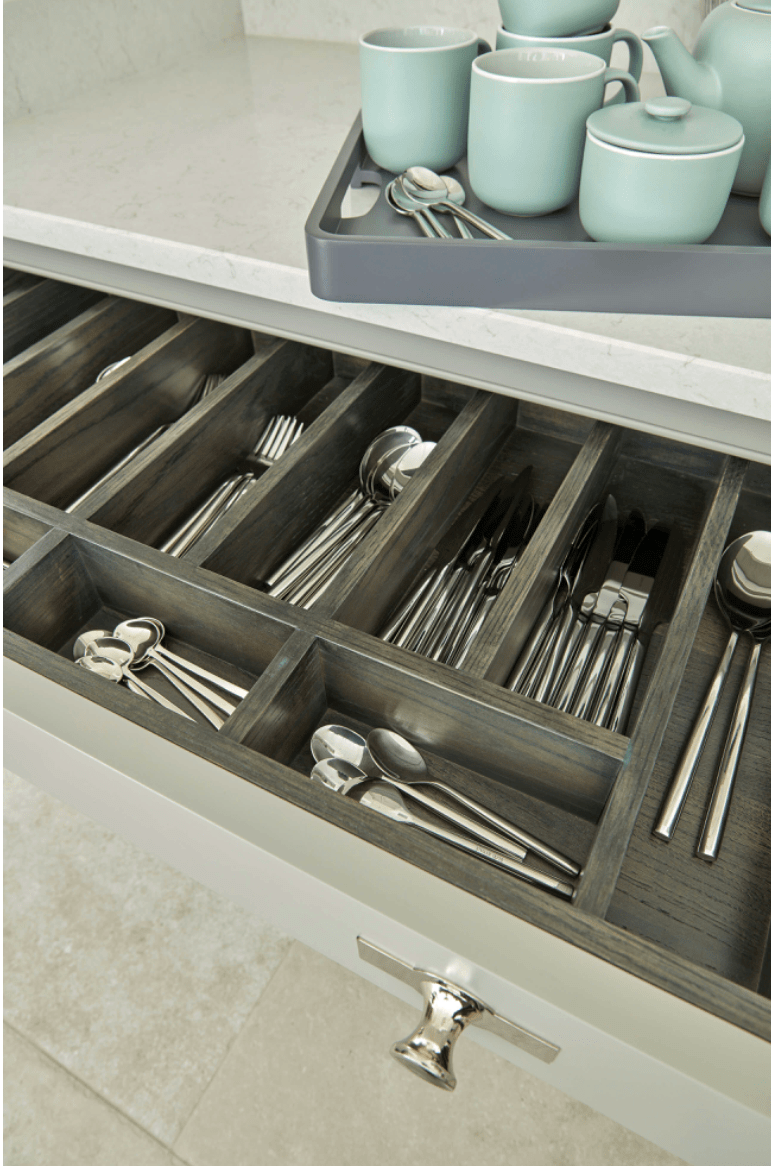
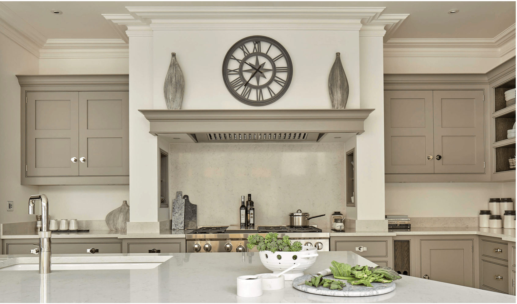
Spice nooks built into the range alcove in the same color as the cabinetry, protected from heat, but handy while cooking. Sigh. That’s definitely on my list.
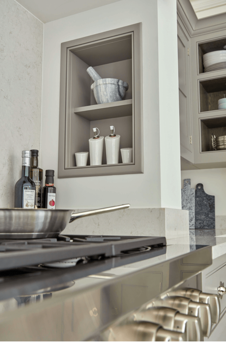
Top notch, professional cooktops, in an easy to clean finish: check.
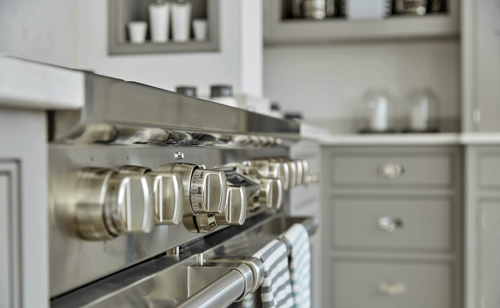
You can see the quality and craftsmanship of the drawers and the detail in the finish and design. I also love that they added a mini backsplash in the same quartz. It’s all incredibly clean.
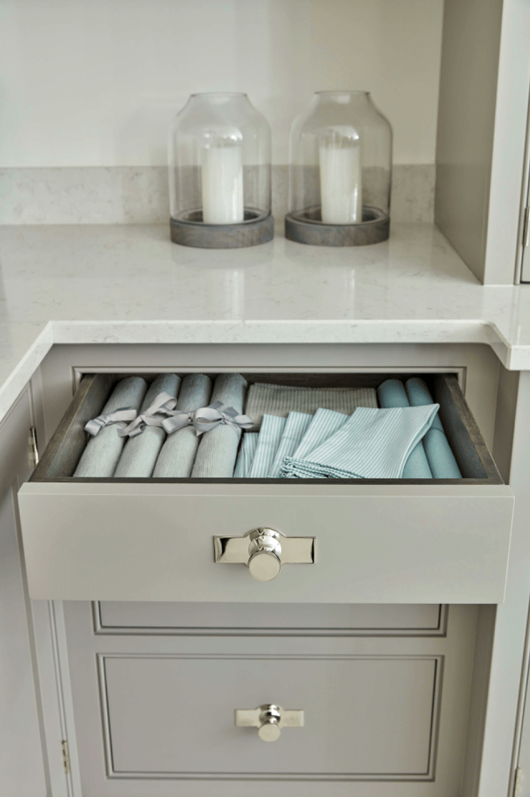
The mantel top look is very classic, and it’s a beautiful blend in the same hue.
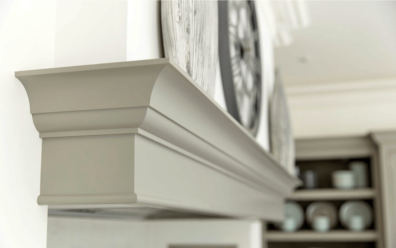
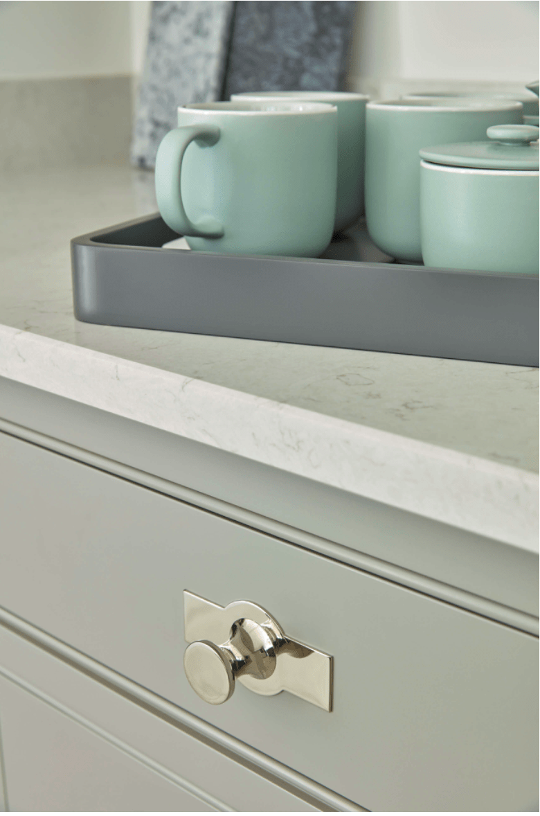
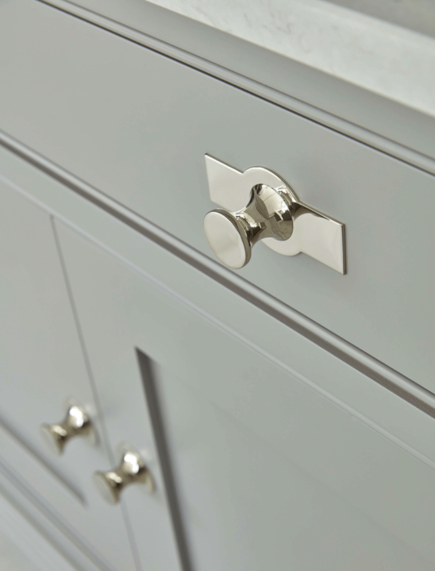
Close up of the details around the inset drawers and awesome hardware.
Not only is the built in beautiful, but it has strong wooden shelves on the bottom (the lower part without glass doors) for everyday dishware and use.
One of my favorite things about Tom Howley kitchens is that they’re designed for real, actual cooking. I don’t think I’ve seen one without this very functional design that ensures cabinets are not exposed to the cooktop heat. The cooktops are fully enclosed with well vented hoods. I LOVE it. It makes so much sense.
Close up of hardware details.
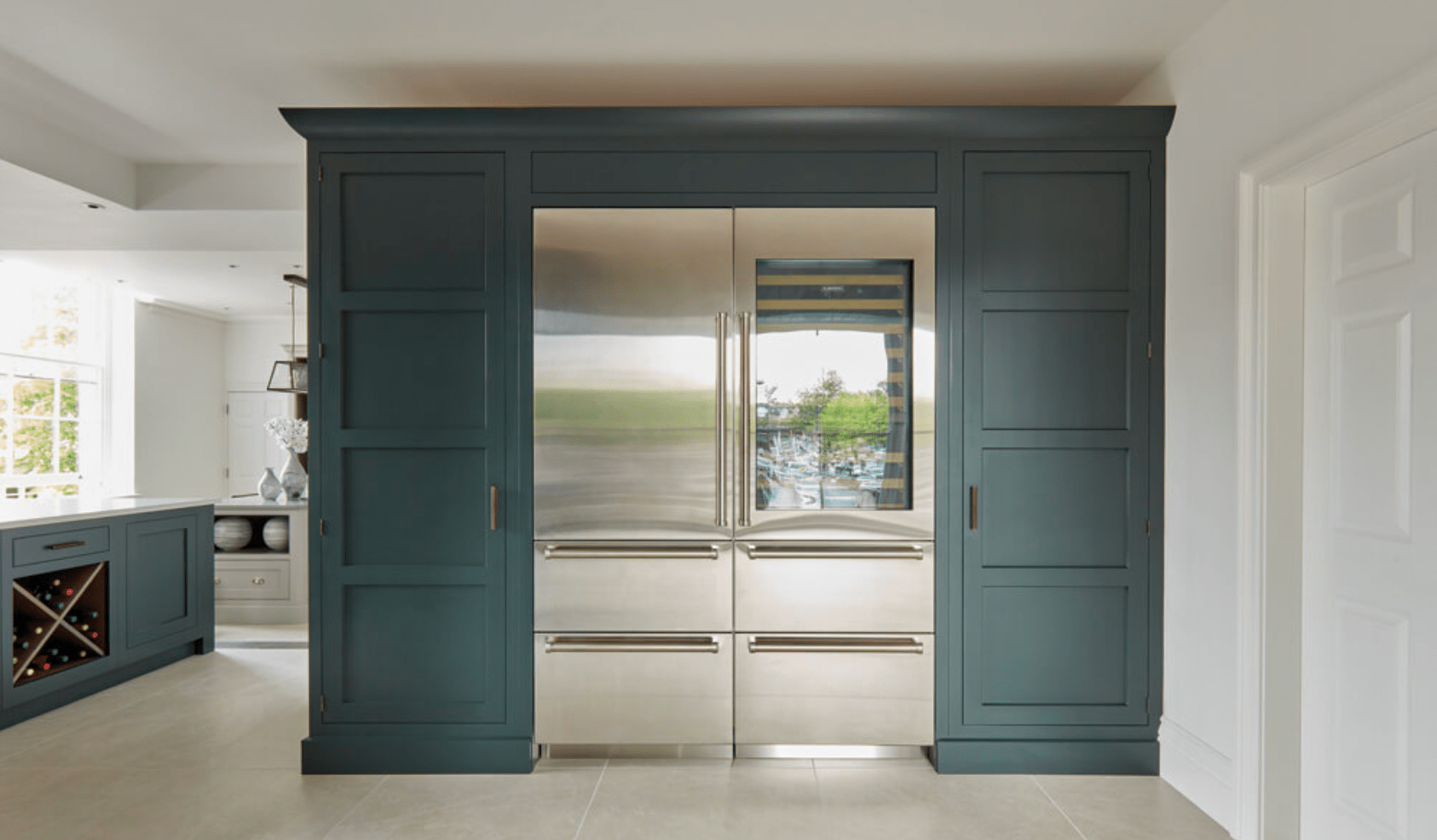
This is such an amazing shot. The built in pantry/dish cabinet is completely framed in and just appears to have always been there, on that wall. Beautiful. And I love the color against the light floor.
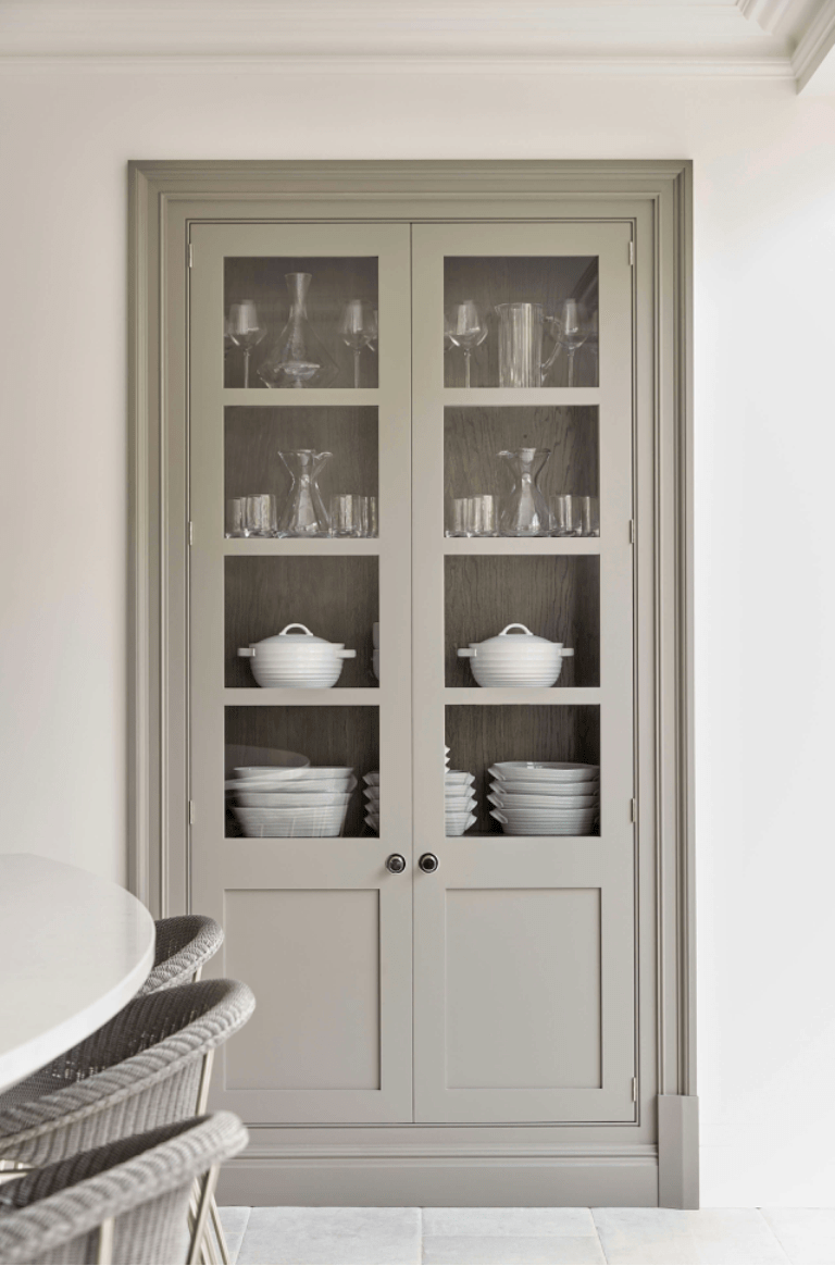
Another shot of total dish pantry awesomeness.
What I really dig here, again, is the variation while it’s still uniform in color. There is molding variation, missing doors, glass doors, depth changes… but all still cohesive and lovely. Did you happen to notice that even with the cooktop on the island, there is still a vent above, flush with the ceiling?
Exquisite details in the drawer for organization and integrated dish drain on the countertop.
The finish doesn’t get much better than this, does it?
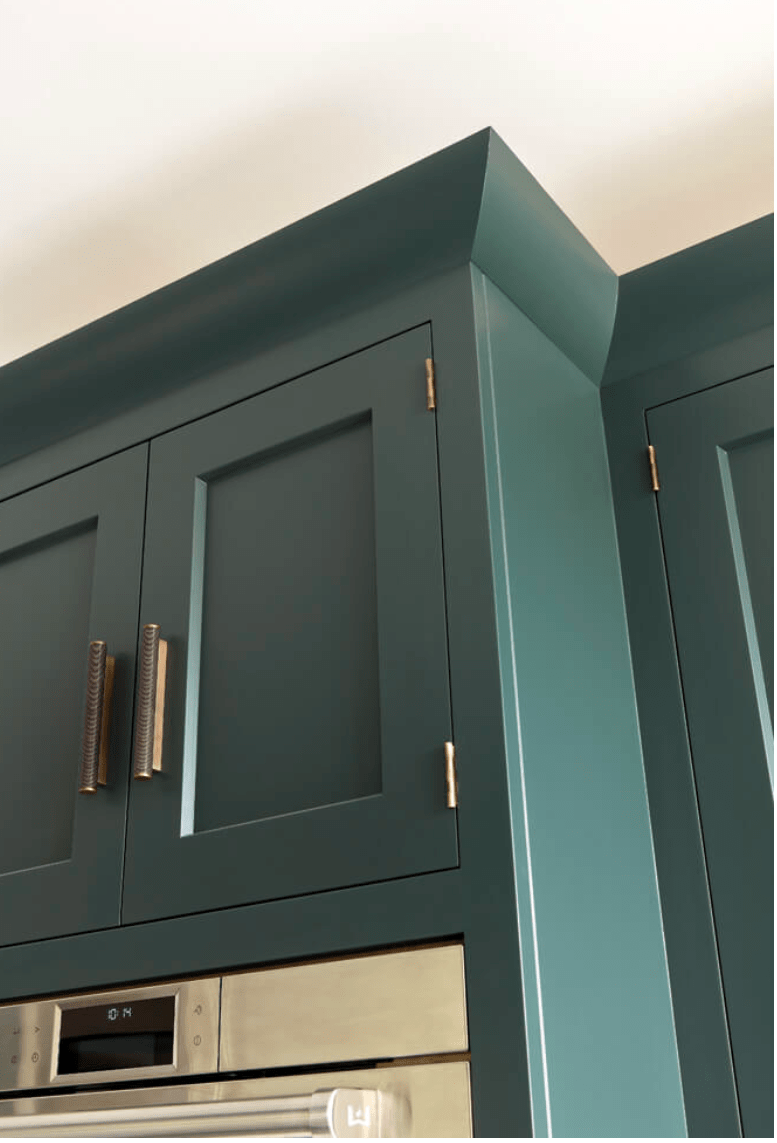
These open shelves achieve the same look as open shelves, except I’m betting this is way more usable space as there’s less concern about falling dishes and they’re a bit more protected from dust build up.
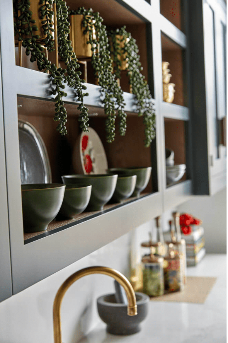
Open shelving at a different depth integrated into bank of wall cabinets.
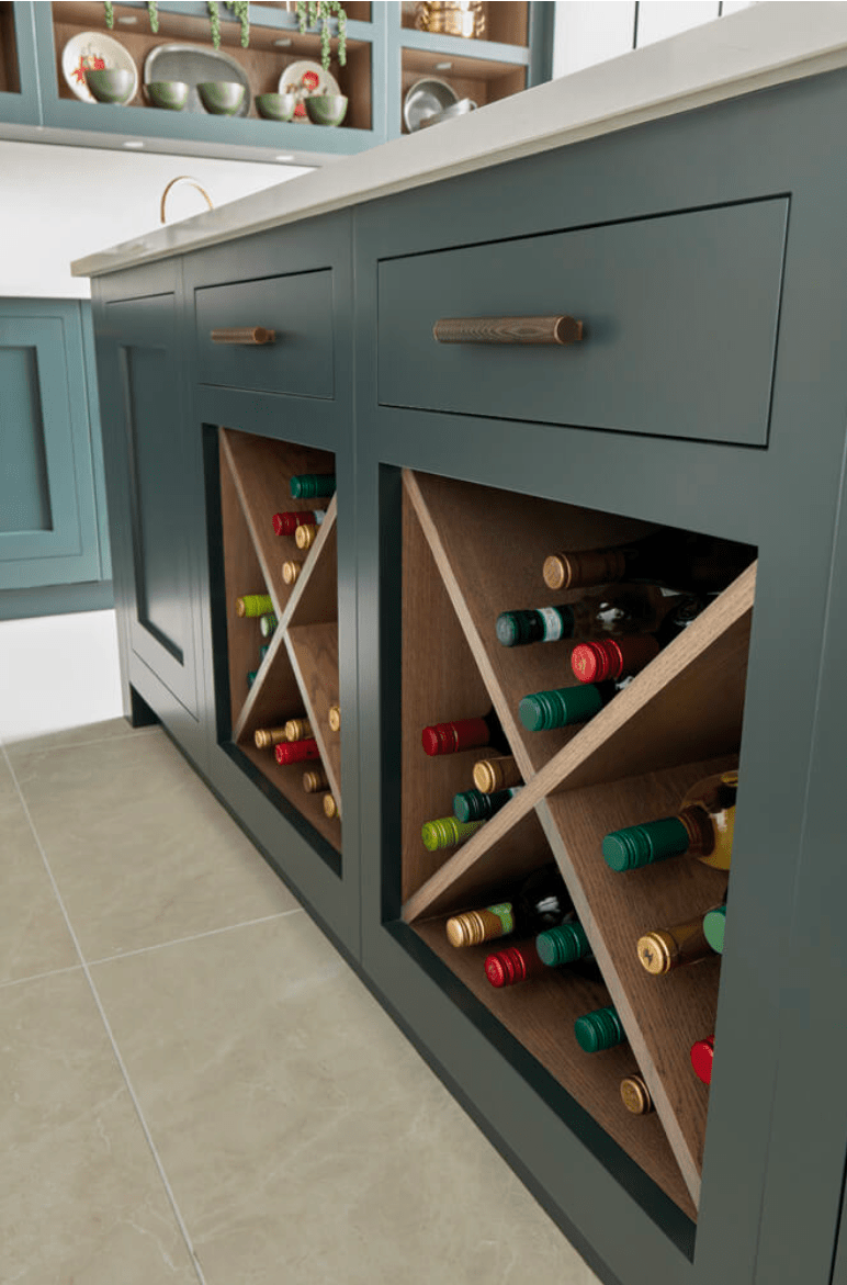
Even the wine rack integrated into the island is awesome.
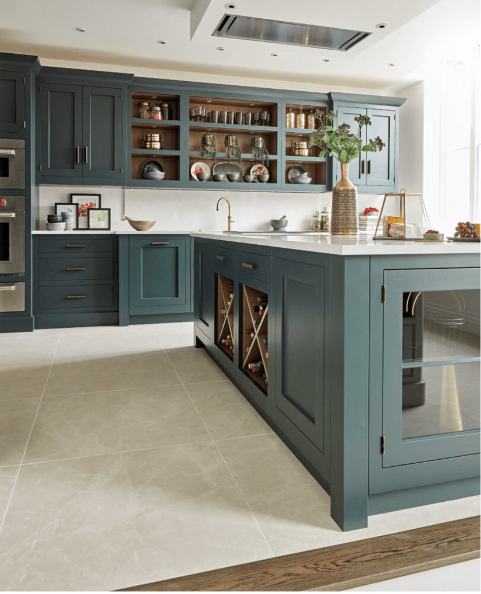
It just so happens, this is totally our plan for building in our fridge and freezer, except we’re going to take it all the way to the ceiling. But, yes, fridge and freezer flanked by pantries. It’s gorgeous.
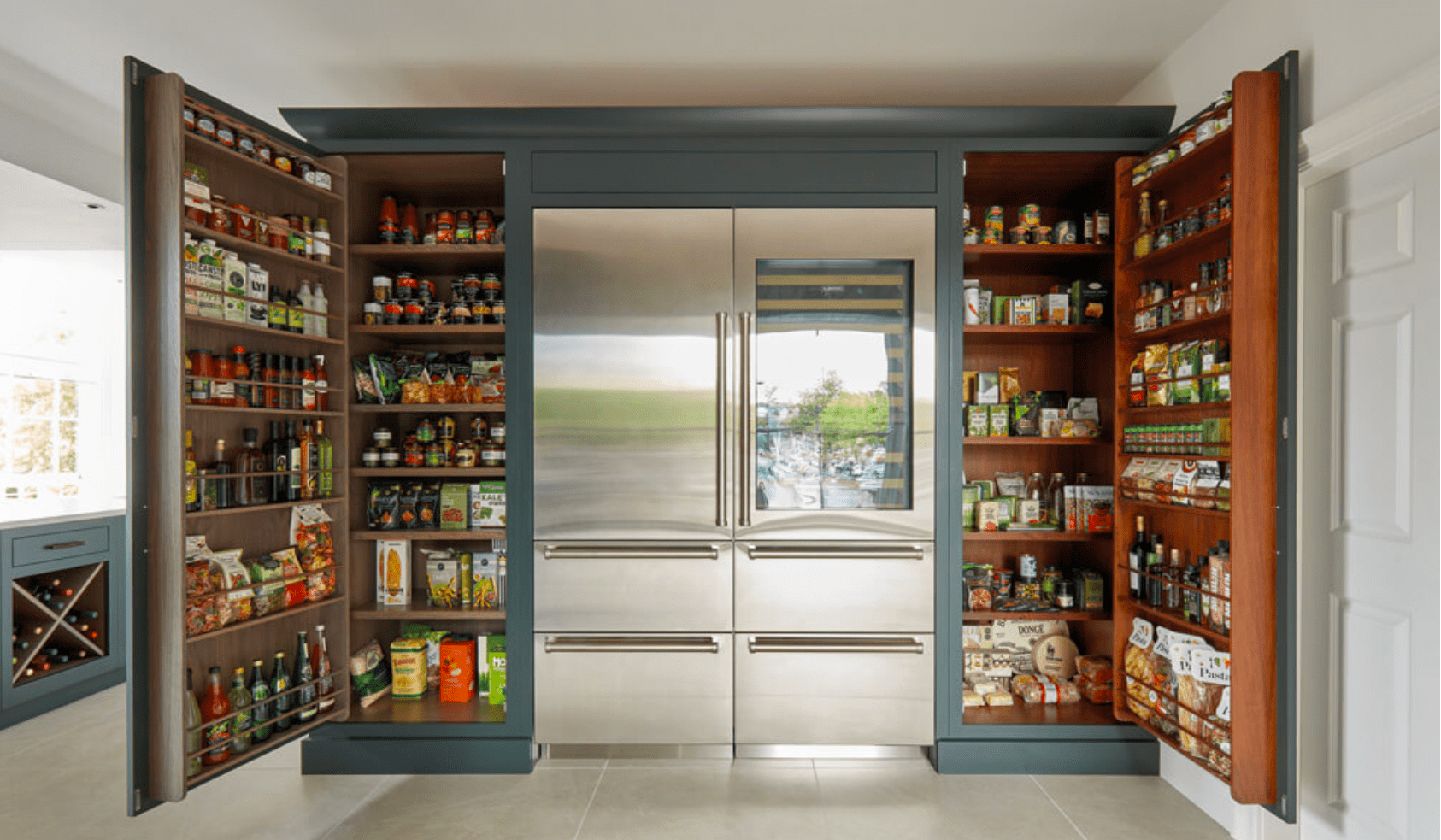
But, I’ll bet your pantries aren’t this beautiful inside. Know what I’m saying? There’s no beautiful wood finish with built in organizers on the doors. Tom, are you listening?
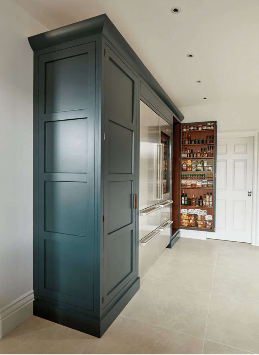
No detail is overlooked. Seriously? Check out the side of the pantry. Also, don’t miss the string of task lighting perfect for this work area.
But, the details just get better. Carved labels inside your pantry??? Yes, I mean it. And, oh yeah, I can have a usable workspace, with the stupid toaster and crumbs, that can be closed off from view the rest of the time? Yaaaaaaas.
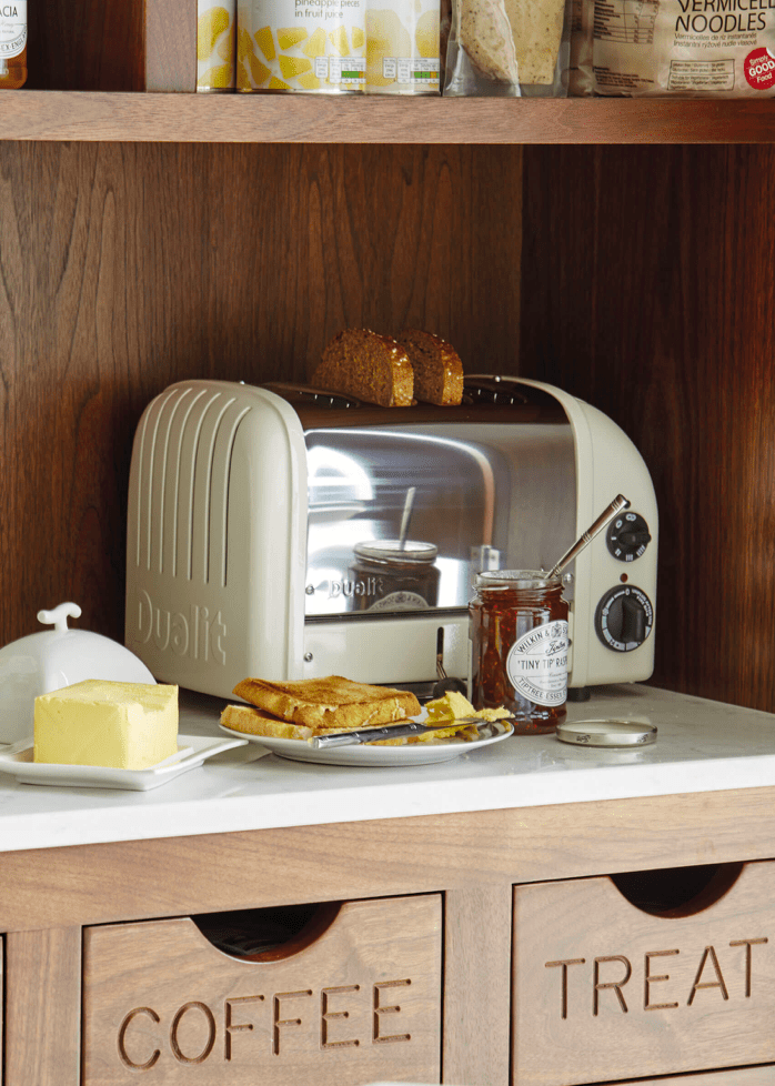
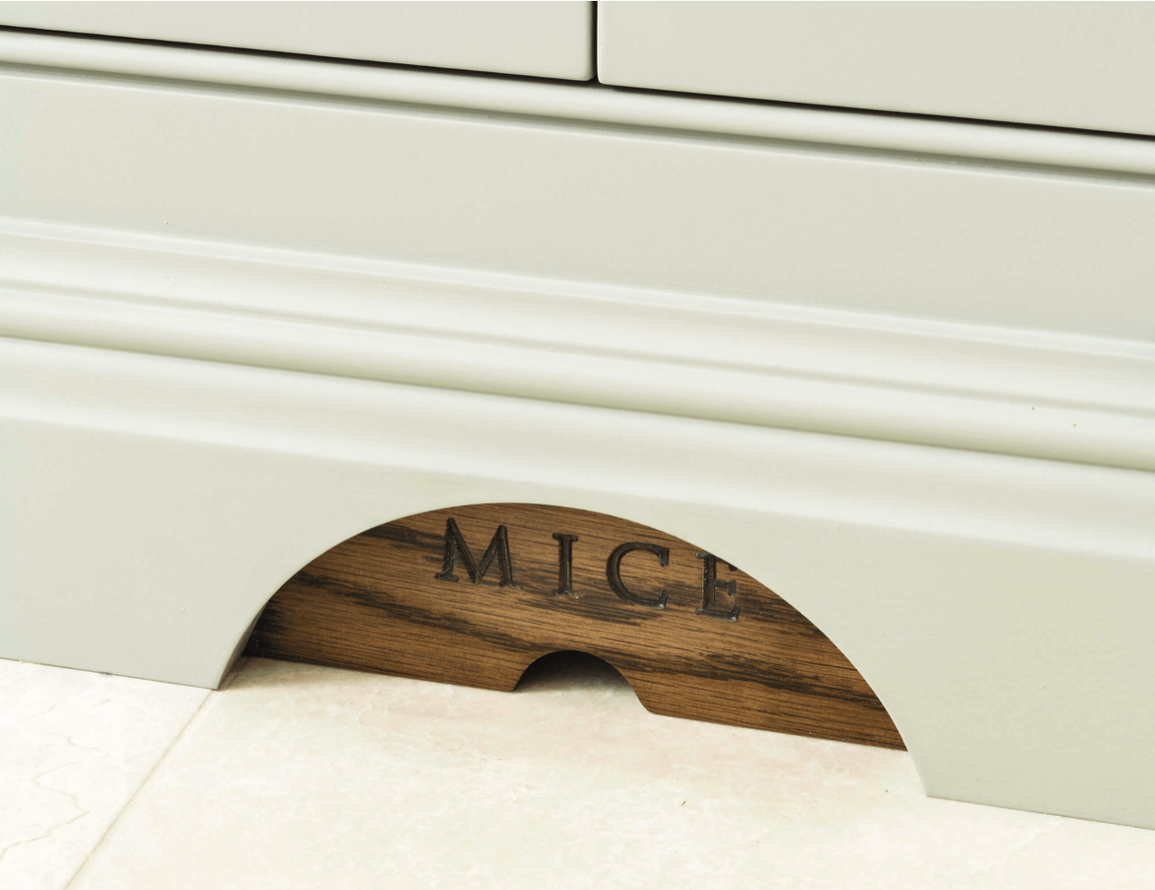
Favorite. Kitchen. Detail. Ever. Tom, you had me at mouse door.
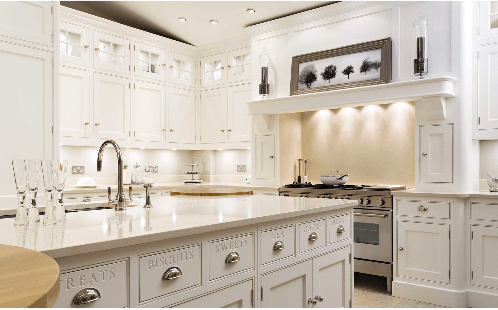
You can see more labels here (I don’t know that I’d go this far, because I like to move things around so other people in my family can’t find them). But, I love the idea. and that it’s an available option.
Okay, so the next few are just to show you how amazing the interiors of the pantries are. I’m just blown away because we just don’t do this here. It’s next level.
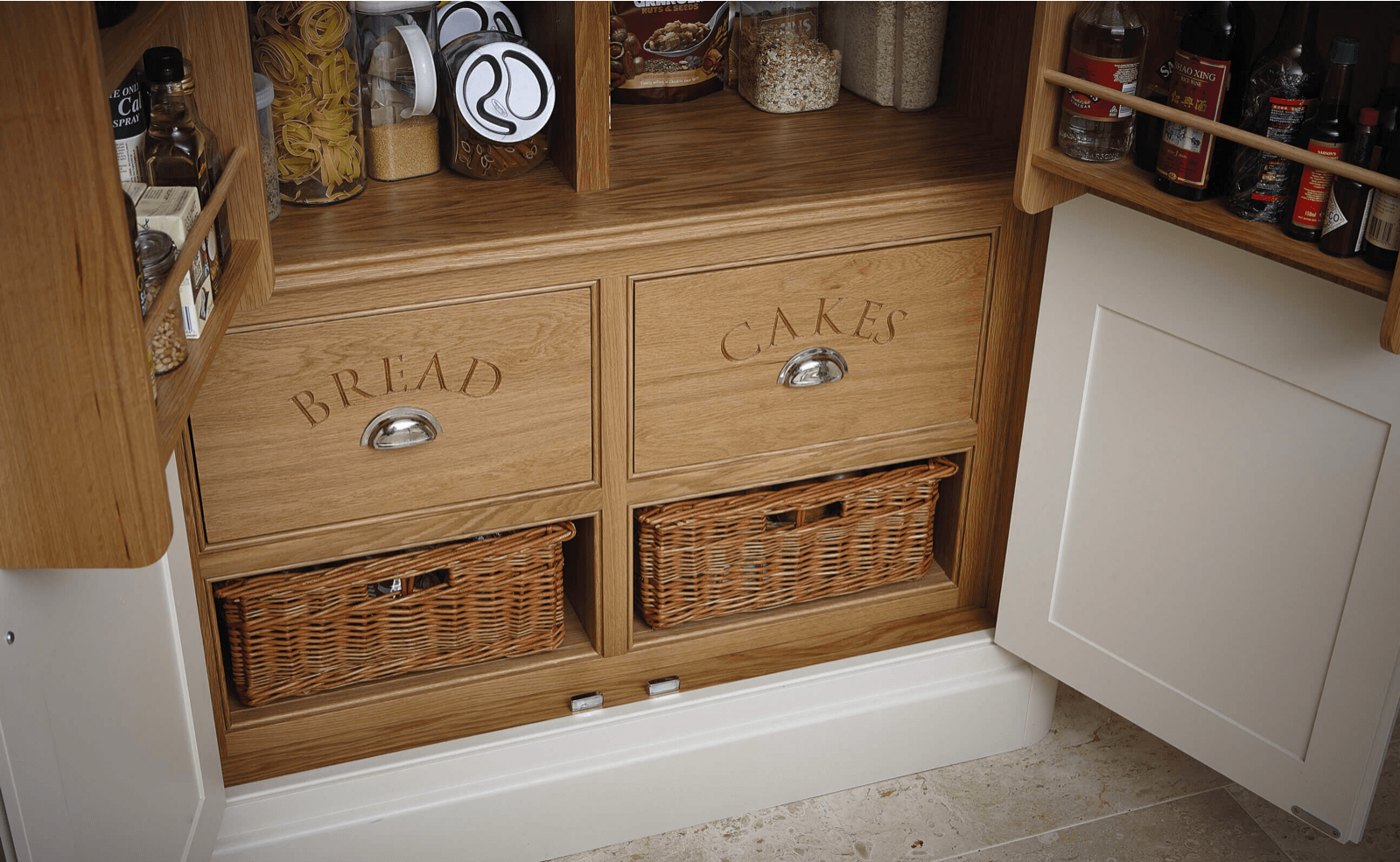
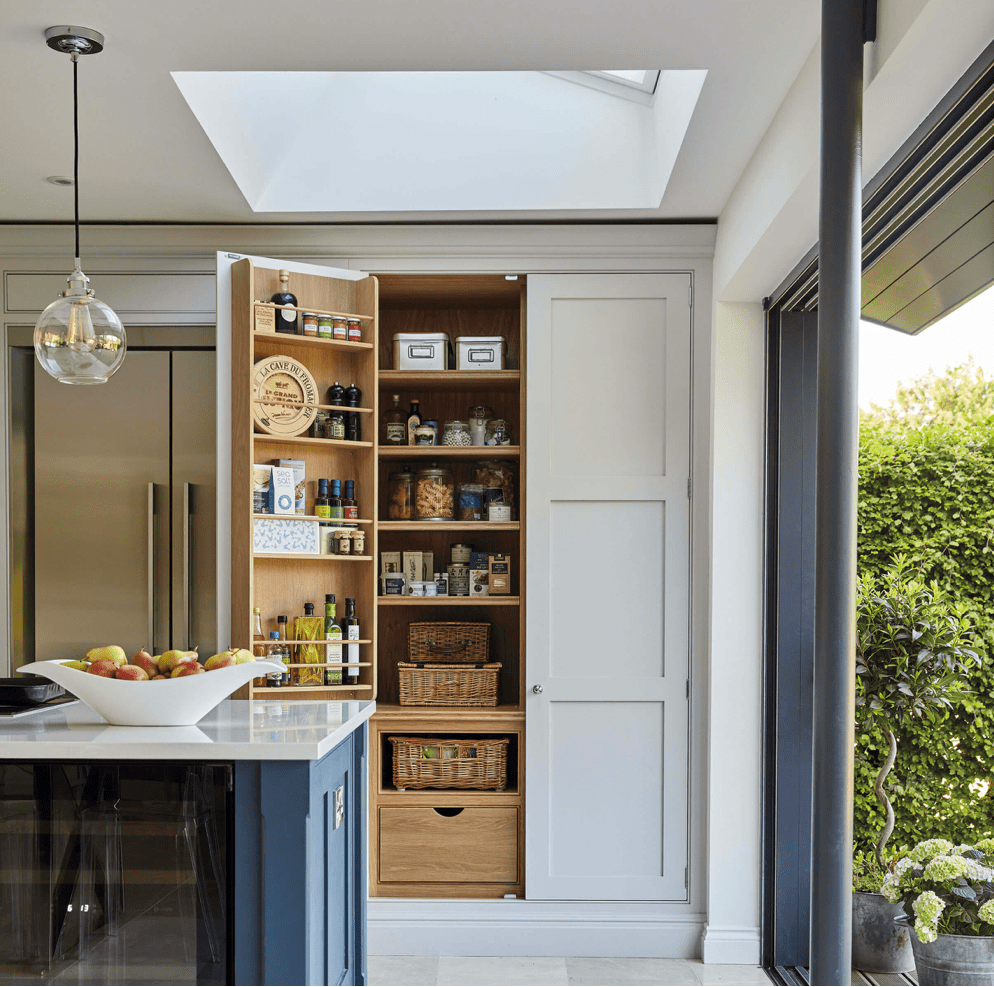
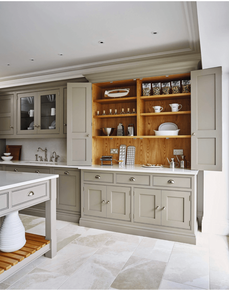
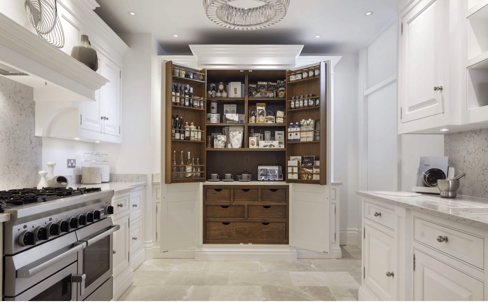
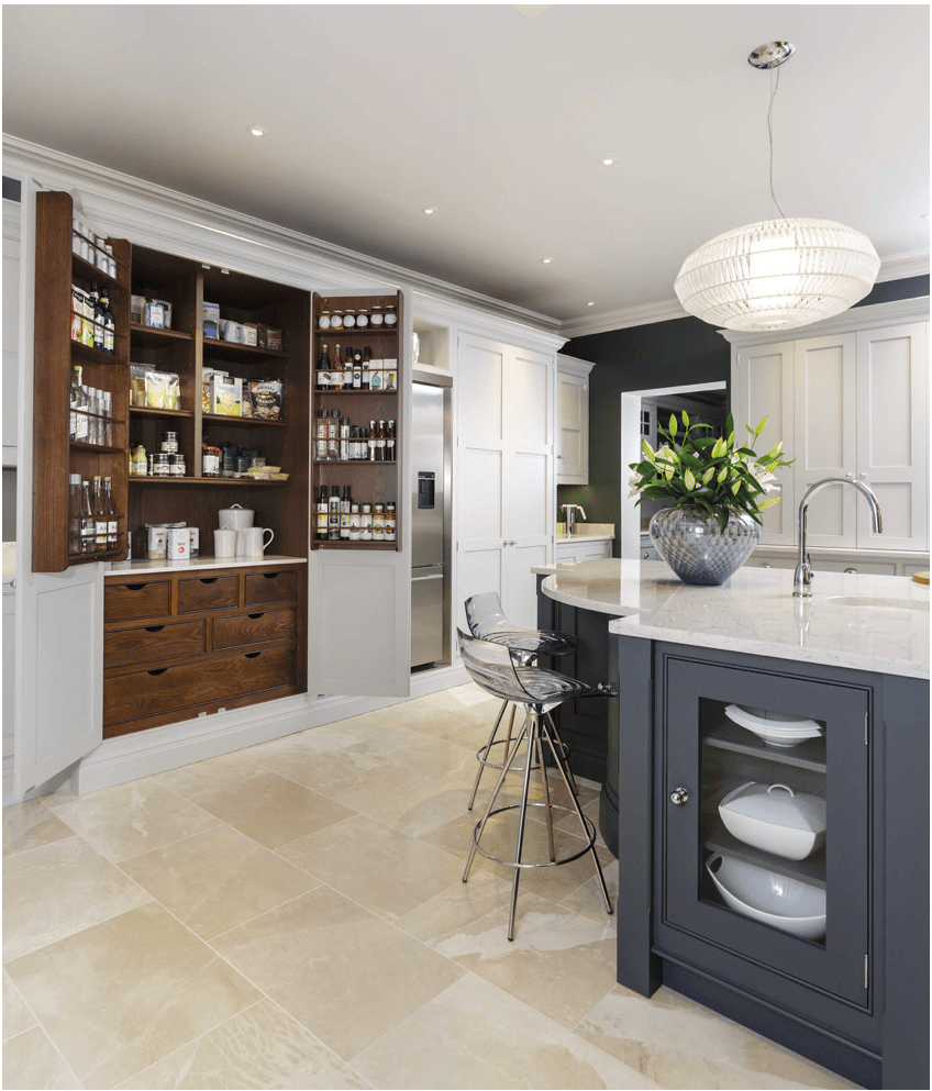
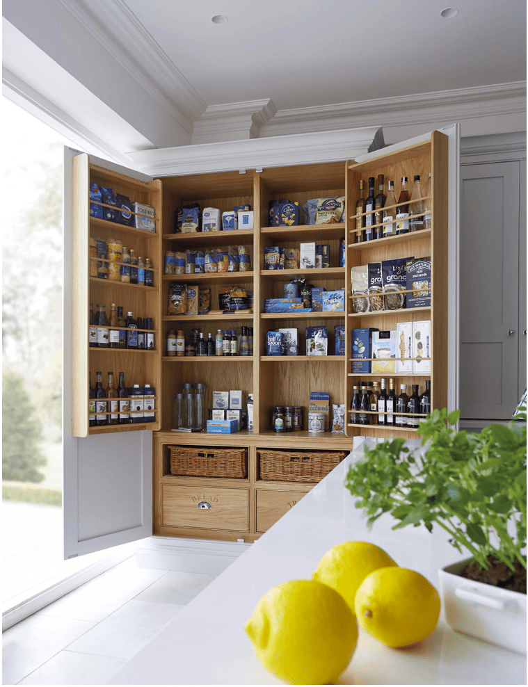
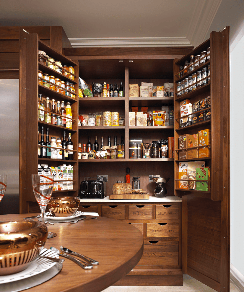
Aren’t they just amazing??? I’ve considered a trip to the UK just so I can visit a showroom.
Tom, if you’re reading this, please come to America. We love you.
As for the rest of you, read more of our awesome blog here. Cheers!
*Legal stuff:
I am honest about my experiences with different products and write because I enjoy it. I do however, have the opportunity to earn money for my writing, also.
Slavetodiy.com is a participant in the Amazon Services LLC Associates Program, an affiliate advertising program designed to provide a means for sites to earn advertising fees by advertising and linking to amazon.com. Amazon offers a small commission on products sold through their affiliate links. Each of your purchases via our Amazon affiliation links supports our cause at no additional cost to you.
If a blogger links to an Amazon product (with a special code for affiliates embedded in the link), and a reader places an item in their “shopping cart” through that link within 24 hours of clicking the link, the blogger gets a small percentage of the sale. Amazon links are not “pay per click.” If you click on the product link and stay around Amazon and purchase something else, however, I will get a commission on that sale.
Slavetodiy.com is also a VigLink affiliate advertiser which works similarly.