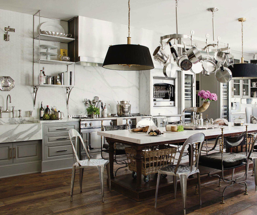
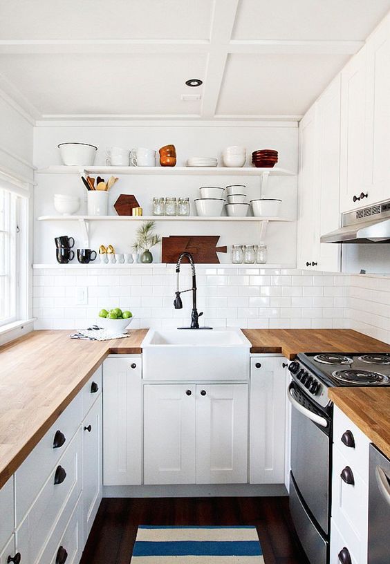
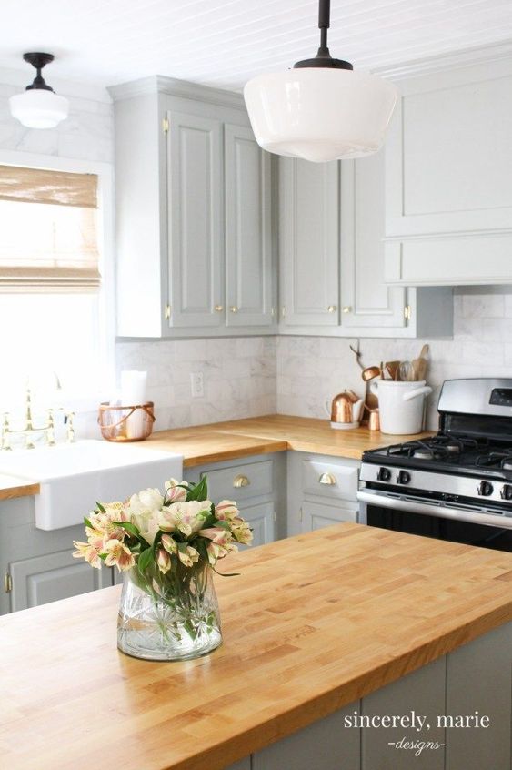
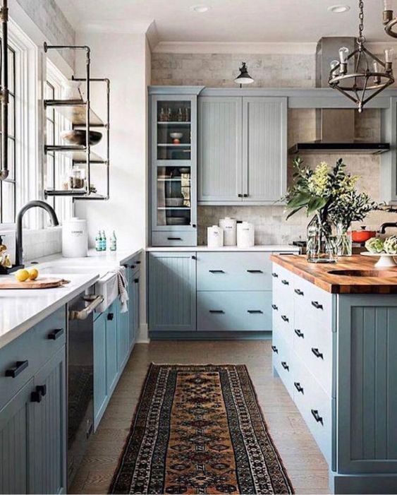
Kitchen Crush: Things That Will Make Your Kitchen Feel Dated in 5 Years Or Less

Are you planning a kitchen renovation? One of the fears many people have when they’re planning a big renovation is the concern that the kitchen will feel dated soon after they complete the renovation. It can be very daunting to lay out the money for an extensive renovation and then consider that you might be doing it again in just a few years.

*This post may contain affiliate links. Please see full disclosure at the end of the post.
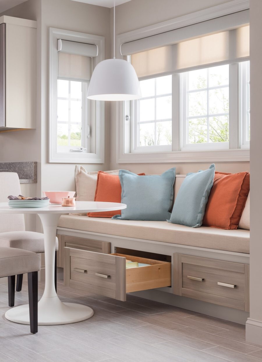
ikea hack (1)

To help you in your planning and design process: Here are the top things that date your kitchen:

  1. A Trendy/Patterned Backsplash: Don’t follow backsplash trends (trust me here… this is THE FASTEST way to date your kitchen). Both material and pattern date the backsplash. Unless you’re flipping a house, skip the trendy stuff. Plain white subway tile is a safe choice, as is brick. Ignore me at your peril: if you do something trendy, you’ll be updating this every couple of years.
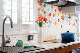
Kitchen Backsplash from Hawaiihomemag.com
Kitchen Crush: Things That Will Make Your Kitchen Feel Dated in 5 Years Or Less, Backsplash from Hawaiihomemag.com

2. Arches and Busy Woodwork. If your thick, wood doors have an awful 80s/90s era arch on them, there is simply no fixing that. If there’s an arch/bridge over the kitchen sink, just take the whole thing down. As for the cabinets themselves: If you stick with basic rectangular doors you can always update those, but you can’t undo an arch. Also, if you MUST have fancy woodwork on your cabinets, adding appliques that can be removed later is your best bet (anyone who has those grape inlaid cabinets is giving me a silent high five right now).
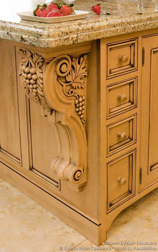
Inlaid Grapes
Kitchen Crush: Things That Will Make Your Kitchen Feel Dated in 5 Years Or Less grapes from Kitchen-Design-Ideas.org

3. Trendy/Patterned Floors: You’ve seen it: The vinyl planks, the wood-look-alike tiles, etc. None of them stay in style very long. Instead, think of classic materials: travertine, limestone, brick, wideplank wood floors, terra cotta tiles. Any of these are classic choices that last! Try them in herringbone or antique formations (travertine) that will make them look as if they’ve always been there and are forever chic. As a rule of thumb, I avoid anything that has the word “faux” in front of it (remember the original Corian? It cracks and melts under abuse). If you go with authentic materials and shapes, you’ll be happier in the long run.
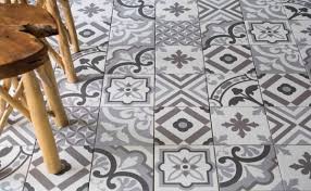
Busy Patterned Floors
Kitchen Crush: Things That Will Make Your Kitchen Feel Dated in 5 Years Or Less, Patterned Floors from Tileoutlets

4. Shiplap. Skip it. (Trust me here, there are going to be oodles of ladies cursing Joanna Gaines in a few years when they have to undo all that faux shiplap they put up). Don’t get me wrong, even though we have VERY different design styles, Joanna Gaines is a design superstar, and if she’s anywhere close to as cool as she appears on her media, I’m a big fan of her as a person. I’m a little bummed that she singlehandedly ruined shiplap. Shiplap was a classic element in coastal homes (especially on the East Coast), with a white wash or watery white wash… it was beautiful. Now it is faux farmhouse and COMPLETELY overdone. It is dying a slow death from over-popularity. It’s going to be the 2010s equivalent of seventies porn panelling in a few years. Just trust me!
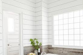
Shiplap from "This Old House"
Kitchen Crush: Things That Will Make Your Kitchen Feel Dated in 5 Years Or Less from “This Old House”

5. Trendy Appliance Finishes: This can be tricky, because we all remember when white appliances were the ONLY thing, then black came along, then stainless, dark stainless, copper, etc. If you can’t decide on a finish, choose a commercial-kitchen-looking option (stainless, stainless, stainless). Stainless was introduced to the residential arena a LONG time ago and the most expensive brands are still sporting the look. Why? It’s what commercial kitchens use, and when we’re designing kitchens, everyone’s a wannabe chef/foodie. We want what the pros use. (The exception: If you have a retro or mid-century house, the sky’s the limit… you can do colorful or plain, and it all works).
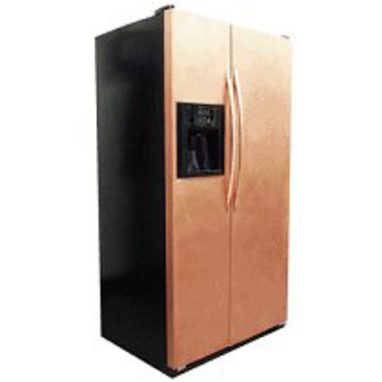
Copper finish from Kitchensource.com
Kitchen Crush: Things That Will Make Your Kitchen Feel Dated in 5 Years Or Less, Copper finish from Kitchensource.com

6. MDF Painted Cabinets. Do you remember when painted cabinets weren’t a thing? Solid wood cabinetry was very popular once (it was sort of the only game in town) and is still around. It’s very versatile… if you don’t like it you can paint it. Want it to be stained again? Strip the paint and stain it again. I know they’re cheaper, but, if you opt for MDF painted cabinets those can’t be stripped and stained. You’re going to have to replace the cabinets, or at least the doors if you tire of painted cabinets.
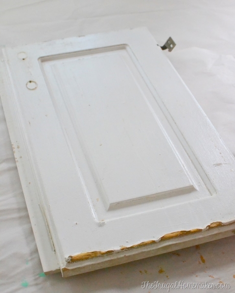
MDF Doors from Thefrugalhomemaker.com
Kitchen Crush: Things That Will Make Your Kitchen Feel Dated in 5 Years Or Less, MDF Doors from Thefrugalhomemaker.com

7. Any cabinet style that is not inset or full overlay. For all of you that painted your 80s or 90s cabinets, the appraiser can tell that you did a very “mini” flip on your kitchen. How? The cabinet style. If you can see the frame around the outside of the cabinet doors, the cabinets are old. Full overlay is the cheaper of the two timeless choices and you can get away with it… probably forever. For a pricier option: Inset cabinets were found in historic homes and have stayed in style for cottages and period homes for the duration. This is my choice for something that may NEVER be dated. Less expensive that completely replacing your cabinetry? Try a cabinet door company. With careful measurements they can help you build a full overlay look that will look like you’ve done a complete gut on your kitchen.
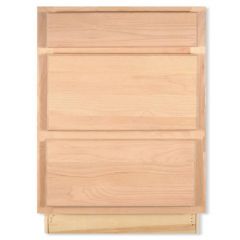
Traditional overlay from secondsandsurplus.com
Kitchen Crush: Things That Will Make Your Kitchen Feel Dated in 5 Years Or Less, Traditional overlay from secondsandsurplus.com

8. The Wall and Cabinet Colors. Seriously. Just paint it!  Is your kitchen still stuck in a deep red faux Tuscany phase? It’s time. Go on Pinterest and search for kitchen paint colors. There are some really talented ladies that will tell you which wall colors best complement your cabinetry (if you’re planning on painting your cabinets, skip the paint brush and check out our article on How To Use An Inexpensive Paint Sprayer For Painting Cabinets or Furniture).
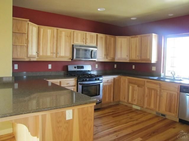
Red walls in the kitchen from pinterest.com
Kitchen Crush: Things That Will Make Your Kitchen Feel Dated in 5 Years Or Less, Red walls in the kitchen from pinterest.com

9. Your window treatments. If you’re looking at them right now and pondering, chances are they need to come down. Heavy, dark window treatments, broken blinds, vertical blinds, and valances (unless you live in a multi-million dollar home, take it down) need to come down. You can thank me later. Every one of your windows is better off naked than with outdated window dressings.
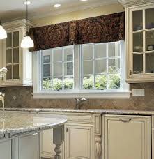
Dark Valance from Prioritywindowvalances.com
Kitchen Crush: Things That Will Make Your Kitchen Feel Dated in 5 Years Or Less, Dark Valance from Prioritywindowvalances.com

10. That weird soffit over the cabinets that serves no purpose whatsoever. First, please check to make sure that it’s not housing plumbing, venting, or electrical. Then, rip it out! For some great ideas of what to do in that newly opened up space, check out our post on The Best Ways To Transform An Outdated Kitchen On A Tiny Budget.
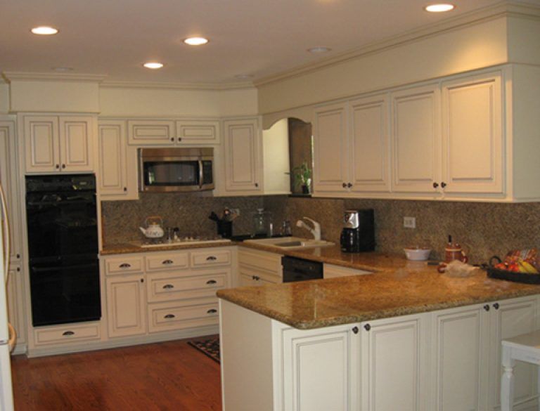
Soffit over cabinets from Pinterest.com
Kitchen Crush: Things That Will Make Your Kitchen Feel Dated in 5 Years Or Less, Soffit over cabinets from Pinterest.com

That doesn’t mean that your new kitchen has to be boring, it’s just that if you keep the bones of your kitchen neutral-ish and classic, you’ll avoid design mistakes that will end up costing you money again.

Trendy things you can purchase for your new kitchen (that are easier and inexpensive to swap out later):

  1. Kitchen faucets and fixtures
  2. Hardware
  3. Pendants/lighting

But, as for the rest of it… keep it classic, keep it in historic home color families, and you’ll never have to do a full renovation again.

What are some kitchen elements that date your kitchen?

Cheers and check out more of our great content over on the blog!


*Legal stuff:

I am honest about my experiences with different products and write because I enjoy it.  I do however, have the opportunity to earn money for my writing, also.

Slavetodiy.com is a participant in the Amazon Services LLC Associates Program, an affiliate advertising program designed to provide a means for sites to earn advertising fees by advertising and linking to amazon.com.  Amazon offers a small commission on products sold through their affiliate links.  Each of your purchases via our Amazon affiliation links supports our cause at no additional cost to you.

If a blogger links to an Amazon product (with a special code for affiliates embedded in the link), and a reader places an item in their “shopping cart” through that link within 24 hours of clicking the link, the blogger gets a small percentage of the sale.  Amazon links are not “pay per click.”  If you click on the product link and stay around Amazon and purchase something else, however, I will get a commission on that sale.

Slavetodiy.com is also a VigLink affiliate advertiser which works similarly.
Mashup Monday 13: Kitchen Islands Out of Repurposed Furniture and Materials

I’ve been super focused on kitchens lately because I am perpetually in designing-my- forever-kitchen mode and I just finished designing my mom’s new kitchen. One of my favorite inexpensive, quick updates in kitchens is adding either a permanent or rolling island to the existing kitchen layout. My favorite way to do this? Thrifted finds that you can pick up super cheap on Craigslist!

*This post may contain affiliate links. Please see full disclosure at the end of the post.

You may not realize it, but some of the most loved images on Pinterest for kitchen islands are repurposed, and relatively inexpensive, thrifted finds. I just did a massive kitchen island out of cabinets for my mother (I’m not co-located so I was unable to do a repurposed island) and even with my blogging discount the cabinets were $1500, and that doesn’t include the top.

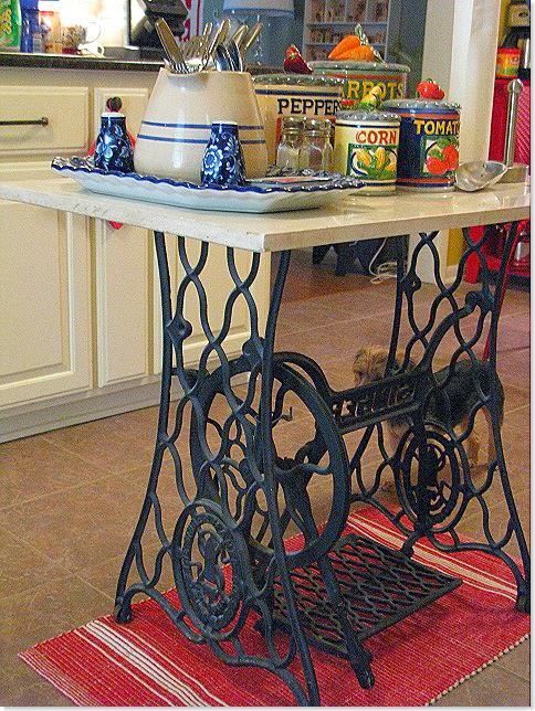
Some repurposed islands are great if you’re strictly looking for additional counter/prep space and don’t need more storage, others provide both. This antique sewing machine base is a really cool idea for one with no storage. They’re sturdy and you can find these pretty cheap if you wait for a good deal (stalking Craig’s list is a hobby of mine).


Mashup Monday: Kitchen Islands Out of Repurposed Furniture and Materials
Mashup Monday: Kitchen Islands Out of Repurposed Furniture and Materials: Source Unknown


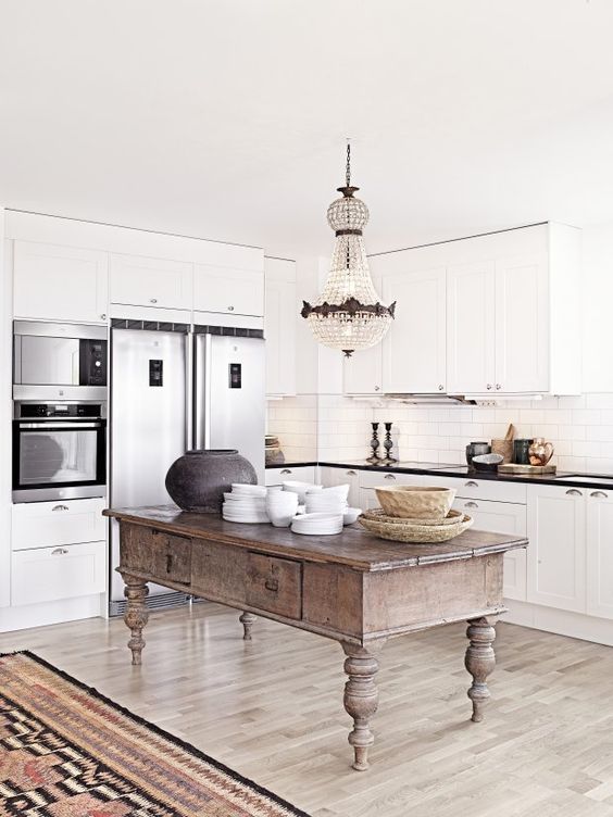
Although I have no idea where it came from, I’ve seen this image about a million times of Pinterest and it’s one of my favorites. It has limited storage plus lots of counter space.


Mashup Monday: Kitchen Islands Out of Repurposed Furniture and Materials
Mashup Monday: Kitchen Islands Out of Repurposed Furniture and Materials: Source Unknown


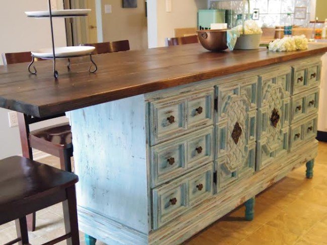
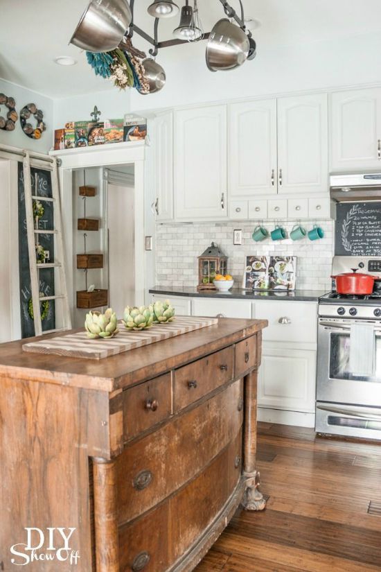
I know a lot of people that don’t love antique dressers that they are handed down from relatives… but they are absolutely LOVELY and functional repurposed as islands! Storage and counter space, win win! And, oh by the way, pretty cost effective, right?


Mashup Monday: Kitchen Islands Out of Repurposed Furniture and Materials
Mashup Monday: Kitchen Islands Out of Repurposed Furniture and Materials: From diyshowoff.com “Eclectic Vintage Modern Farmhouse Kitchen”


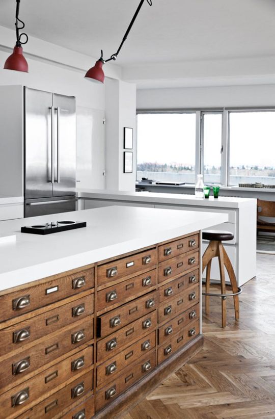
I ADORE these architects cabinets! They are perfect for a wide variety of kitchen storage items and I have saved searches for these in my local area. I wish I knew where to find them!


Mashup Monday: Kitchen Islands Out of Repurposed Furniture and Materials
Mashup Monday: Kitchen Islands Out of Repurposed Furniture and Materials: From Nordicdesign.ca “Unique Home Iceland Mid Century Modern Flair”


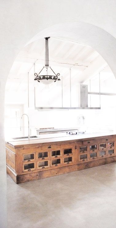
This is another image I’ve seen a million times but have yet to find a source for. It is the PERFECT island, produce storage bins and I’m pretty sure it is a reclaimed General Store Counter. I’ve seen these for sale online upward of $10k but I’m sure there are some hiding in barns in different places. Keep your eyes open and you might accidentally stumble across one!


Mashup Monday: Kitchen Islands Out of Repurposed Furniture and Materials
Mashup Monday: Kitchen Islands Out of Repurposed Furniture and Materials: Source Unknown


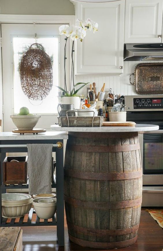
This wine barrel island is super cute if you’re looking for a small countertop space. You could cut out a door and put a shelf in if you wanted to include storage (or if you’re really handy put in some wine storage cubes)!


Mashup Monday: Kitchen Islands Out of Repurposed Furniture and Materials
Mashup Monday: Kitchen Islands Out of Repurposed Furniture and Materials: Source Unknown


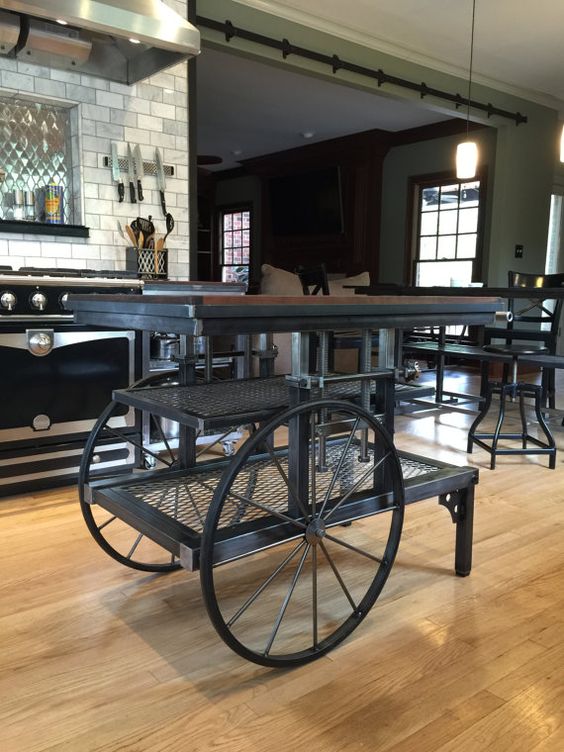
If you’re looking for something a little edgier, this industrial cart is about as cool as it gets and offers lots of styling opportunities.


Mashup Monday: Kitchen Islands Out of Repurposed Furniture and Materials
Mashup Monday: Kitchen Islands Out of Repurposed Furniture and Materials: Source Unknown


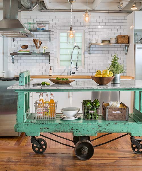
Here’s another cart that came out very cool!


Mashup Monday: Kitchen Islands Out of Repurposed Furniture and Materials
Mashup Monday: Kitchen Islands Out of Repurposed Furniture and Materials: From This Old House “Salvage Projects You’ve Got To See”


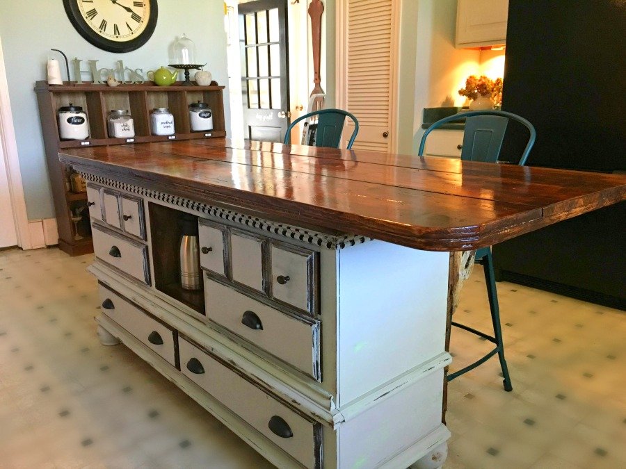
Here are two more great examples of dresser conversions: Inexpensive, lots of storage, and the opportunity for ample counter space!


Mashup Monday: Kitchen Islands Out of Repurposed Furniture and Materials
Mashup Monday: Kitchen Islands Out of Repurposed Furniture and Materials: From gullycreekcottage.com “How I Got My Very Own Island And You Can Too”


Mashup Monday: Kitchen Islands Out of Repurposed Furniture and Materials
Mashup Monday: Kitchen Islands Out of Repurposed Furniture and Materials: Hometalk.com


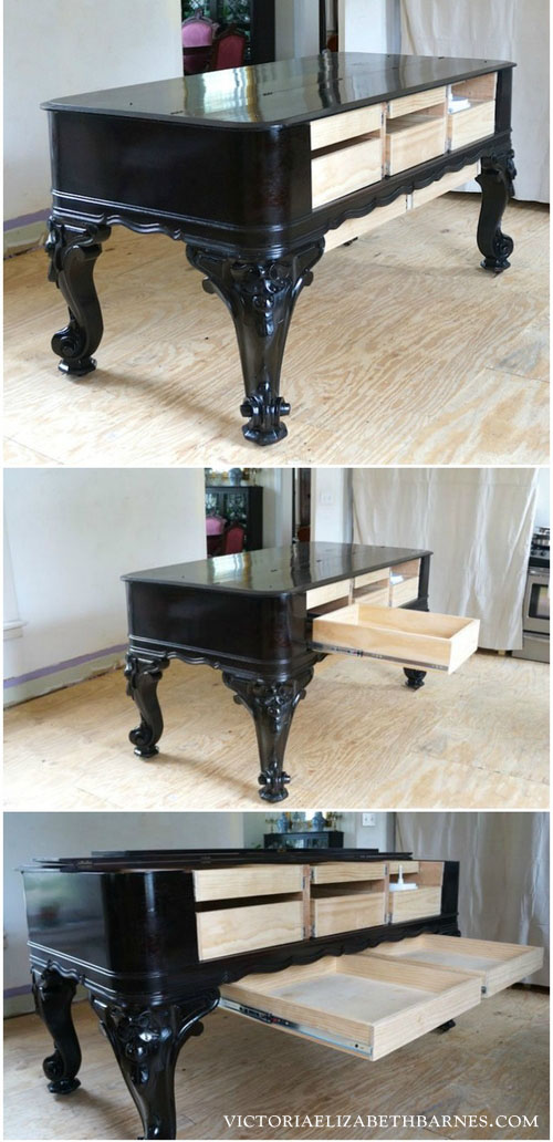
This next one is my MOST FAVORITE ISLAND EVER and has me on a perpetual search for antique pianos (under a million dollars). This is on victoriaelizabethbarnes.com: She is my FAVORITE BLOGGER EVER and I recommend checking her out. She shares my passion for all things old and fancy and making her husband repurpose impossible projects: see the incredible piano re-work below!

Mashup Monday: Kitchen Islands Out of Repurposed Furniture and Materials
Mashup Monday: Kitchen Islands Out of Repurposed Furniture and Materials: From Elizabethvictoriabarnes.com “Antique Piano Into Kitchen Island


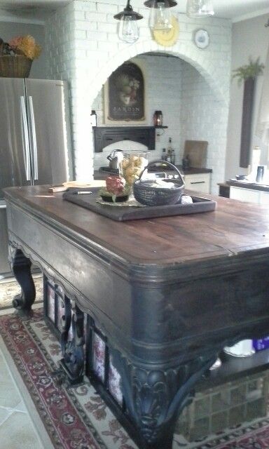
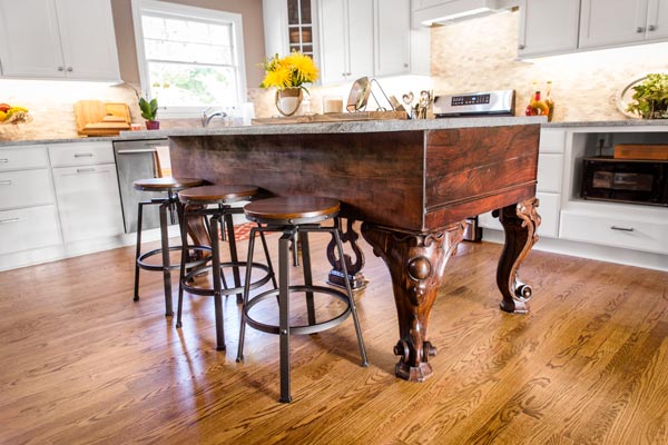
Below are two additional piano/island conversions that are also awesome (where in the world are they finding these pianos???).


Mashup Monday: Kitchen Islands Out of Repurposed Furniture and Materials
Mashup Monday: Kitchen Islands Out of Repurposed Furniture and Materials: Source Unknown


Mashup Monday: Kitchen Islands Out of Repurposed Furniture and Materials
Mashup Monday: Kitchen Islands Out of Repurposed Furniture and Materials: From This Old House “Salvage Projects You’ve Got To See”


Have you done any cool repurposed island projects?  We’d love to hear about them in the comments below!

Thanks for hanging out with us and check out more of our design inspiration and projects over on the blog.

Cheers!

*Legal stuff:

I am honest about my experiences with different products and write because I enjoy it.  I do however, have the opportunity to earn money for my writing, also.

Slavetodiy.com is a participant in the Amazon Services LLC Associates Program, an affiliate advertising program designed to provide a means for sites to earn advertising fees by advertising and linking to amazon.com.  Amazon offers a small commission on products sold through their affiliate links.  Each of your purchases via our Amazon affiliation links supports our cause at no additional cost to you.

If a blogger links to an Amazon product (with a special code for affiliates embedded in the link), and a reader places an item in their “shopping cart” through that link within 24 hours of clicking the link, the blogger gets a small percentage of the sale.  Amazon links are not “pay per click.”  If you click on the product link and stay around Amazon and purchase something else, however, I will get a commission on that sale.

Slavetodiy.com is also a VigLink affiliate advertiser which works similarly.
Kitchen Crush: Old World Dine In Kitchens

Welcome to the first installment of our kitchen inspiration and design series: Kitchen Crush! I am working on an impossibly difficult and involved task: simplifying kitchen design. I soon realized that although I could probably get the design guide down into a bite-sized checklist that people could use without a designer, I really wanted to provide an explanation for a lot of the recommendations and ideas I offer as kitchen options so there are visual aids for each section.

*This post may contain affiliate links. Please see full disclosure at the end of the post.

Watch for our free printable kitchen design guide/checklist, coming soon!

One of the concerns I hear from every client is being afraid that an investment in a shiny new kitchen will result in a dated kitchen in less than ten years (ten years used to be the guideline for remodeling dated kitchens). That is a legitimate concern! I usually point out that it happens a lot faster than that now, because of platforms like Pinterest and easy visual access to what the pros are currently doing. It’s easy to feel sad when you sink a fortune into a beautiful kitchen and then start seeing that the pros are doing something new, something cooler, and you’re already regretting your design choices just a matter of months into the process.

We have a simple solution for that: don’t chase trends. Period. (Watch for our design post on trend chasing, coming soon!)

Pro tip: if you MUST chase trends (we know, you can’t help it that Pinterest keeps showing you that new cool tile shape for backsplashes), follow trends in areas that are cheaper and easier to replace than the bones of your kitchen, including: cabinet color, hardware, counter stools, light fixtures, and, yes, backsplashes. I promise that if you like your existing layout, cabinet style, flooring, etc, with the mini changes I just listed, you can have a whole brand new kitchen for a relatively miniscule investment if you’re itching for a trend change later.

However, back to my point. I advise against trend following. What does that mean? That means use authentic materials, they never go out of style. Rethink what the cabinet companies are telling you that you need to have a beautiful kitchen, and design a kitchen you’ll love forever.

One of the items I talk to my clients at length about is the concept of how they really live, how they really cook, and how they interact from the kitchen on a day to day basis. Do they entertain a lot? Do their kids do homework at the kitchen island while they cook dinner? Do they have multiple family members cooking together on a regular basis?

One of the biggest laments I have regarding the modern kitchen is that the family kitchen table went away, and the table was moved either to a corner or to a completely different room. So, mom cooks in a space far away from everyone and doesn’t get to join in the fun.

So, to start: rethink your space.

What if you had a long space that was an eat in kitchen, plus kitchen, plus dining room? Get out some graph paper and draw the footprint of your kitchen AND dining spaces. What would it look like if the family table was in the middle of the kitchen and the surrounding space held kitchen furniture and cabinetry that holds the things you need for that area?

Think outside of the box, and I don’t just mean the cabinet box.

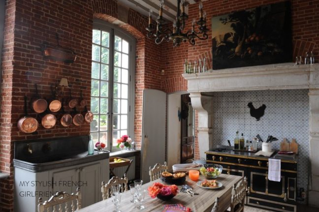
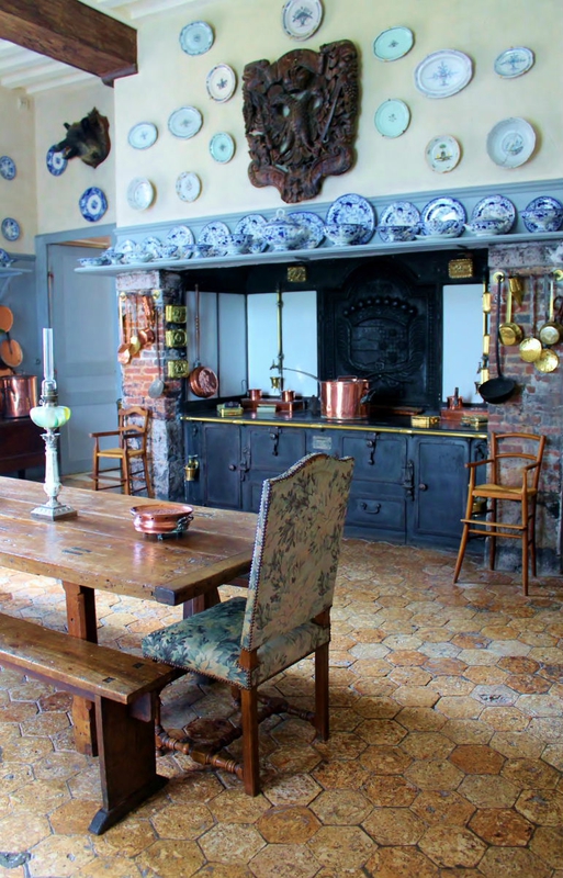
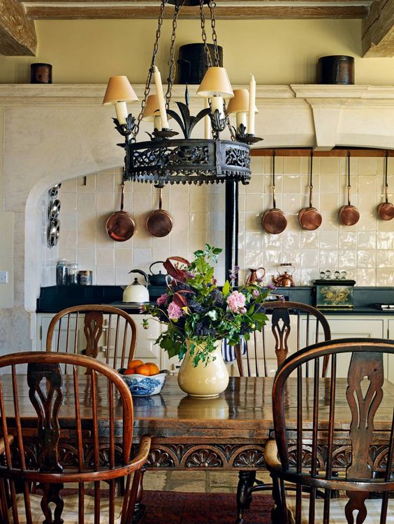
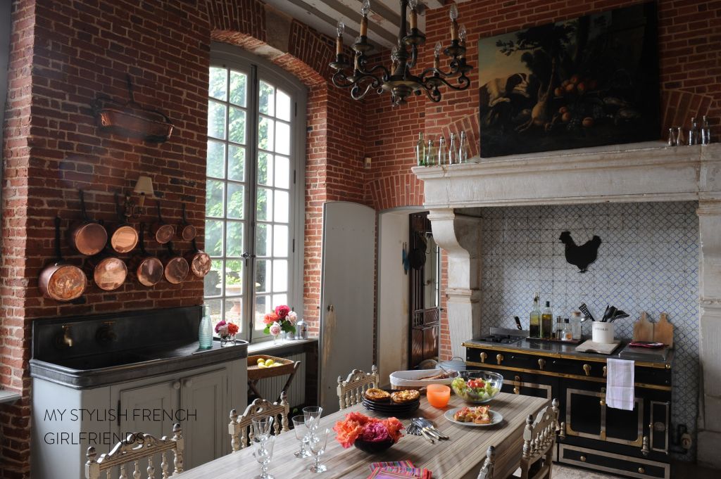
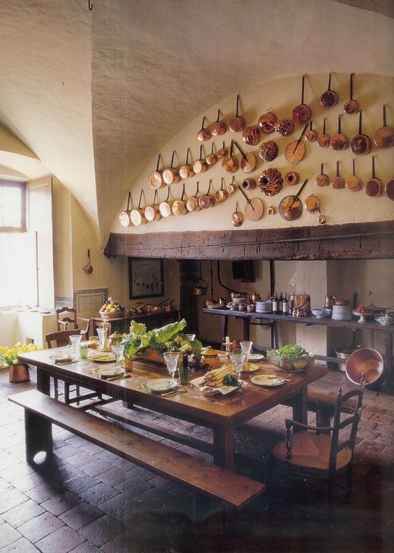
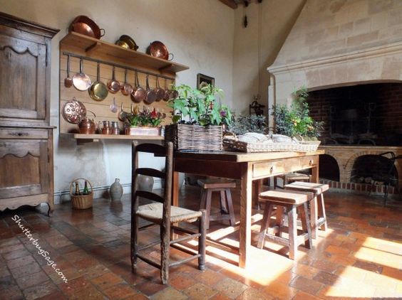
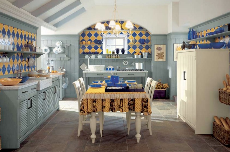
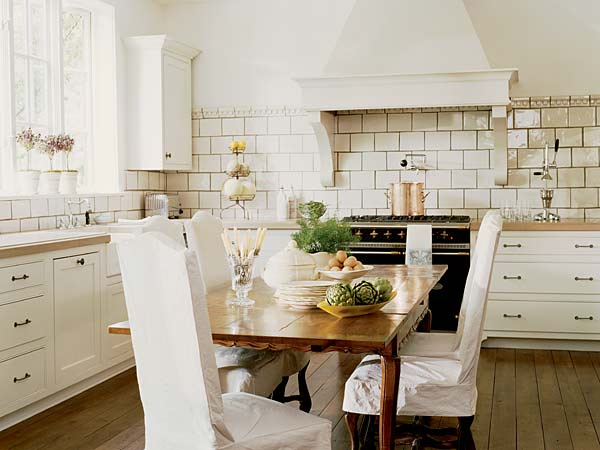
The kitchen table is just ONE timeless component of your kitchen design, but check out these inspiration images that feature the dining table as the central hub of the kitchen, and tell me what you think!


Kitchen Crush: Old World Dine In Kitchens
Kitchen Crush: Old World Dine In Kitchens: From lameredelamule.canalblog.com


Kitchen Crush: Old World Dine In Kitchens
Kitchen Crush: Old World Dine In Kitchens: From the_essense_of_frenchness.blogspot.com


Kitchen Crush: Old World Dine In Kitchens
Kitchen Crush: Old World Dine In Kitchens, From: My Stylish French Girlfriend


Kitchen Crush: Old World Dine In Kitchens
Kitchen Crush: Old World Dine In Kitchens. Source Unknown


Kitchen Crush: Old World Dine In Kitchens
Kitchen Crush: Old World Dine In Kitchens. From Shutterbugsage.com


Minacciolo Country Kitchens with Italian Style
Kitchen Crush: Old World Dine In Kitchens: From Minacciolo Kitchens: Minacciolo Country Kitchens with Italian Style


Black French Range, Mary Evelyn Interiors
Kitchen Crush: Old World Dine In Kitchens: From Mary Evelyn Interiors (Black French Range)


French Industrial Country Kitchen Kathy Kuo Blog
Kitchen Crush: Old World Dine In Kitchens: From Kathy Kuo Blog (French Industrial Country Kitchen)


What do you think? Could you see your family living with an informal, in-kitchen table? Are you casual or formal when dining? We’d love to hear about it in the comments!

Thanks for hanging out with us in DIY land and check out more great DIY and design inspiration over on our blog.


*Legal stuff:

I am honest about my experiences with different products and write because I enjoy it.  I do however, have the opportunity to earn money for my writing, also.

Slavetodiy.com is a participant in the Amazon Services LLC Associates Program, an affiliate advertising program designed to provide a means for sites to earn advertising fees by advertising and linking to amazon.com.  Amazon offers a small commission on products sold through their affiliate links.  Each of your purchases via our Amazon affiliation links supports our cause at no additional cost to you.

If a blogger links to an Amazon product (with a special code for affiliates embedded in the link), and a reader places an item in their “shopping cart” through that link within 24 hours of clicking the link, the blogger gets a small percentage of the sale.  Amazon links are not “pay per click.”  If you click on the product link and stay around Amazon and purchase something else, however, I will get a commission on that sale.

Slavetodiy.com is also a VigLink affiliate advertiser which works similarly.
Mashup Monday 12: Where To Find The Best Deals On Butcher Block Countertops

We are in the middle of a super exciting project! My sister purchased a fixer upper for our mother’s forever home and I get to design her kitchen! The thing is, my mom watches way too much HGTV and is a perpetual renovator (I come by it honestly), so I know she will be bummed if it doesn’t look like a designer kitchen. So, no pressure, right?

*This post may contain affiliate links. Please see full disclosure at the end of the post.

One of the reasons I’m designing it is that I’ve done kitchens before and have done a lot of research on it (read: obsessively planning our current kitchen reno)… plus, I’m generally good at bargain hunting and finding cost efficient ways to do things.

Any kind of high end countertops are a MAJOR expense in the kitchen planning process and I need to find ways to make it cost less. So, the first thing I’m looking at is alternatives to solid surface. Guess what I super, duper love? Butcher block.

Here’s a quick look at some of my favorite blogger kitchens and their awesome butcher block:

Butcher Block Countertops, via Remodelista
Remodelista.com, From: Remodeling 101- All About Butcher Block Countertops


Via sincerelymariedesigns.com our butcher block counter top review - one year later
Sincerelymariedesigns.com: Our Butcher Block Counter Top Review – One Year Later


Via beckiowens.com Best of Pinterest BECKI OWENS
Beckiowens.com, Best of Pinterest : Becki Owens


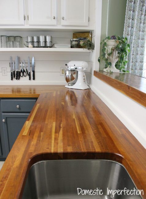
domesticimperfection.com My Butcher Block Countertops, Two Years Later
Domesticimperfection.com


The first place to ALWAYS look is for places that carry off-the-shelf sizes. Producers offer standard sizes to consumers much more cheaply than semi custom or custom sizes. The best way to save yourself money is to find inexpensive products and sizes that will work and plan the design around that.  I found a few places that have reasonable offerings. I looked for four foot lengths for purposes of comparison, but several stores only had longer lengths.

*Please note that prices are current in February 2020 and are subject to change.

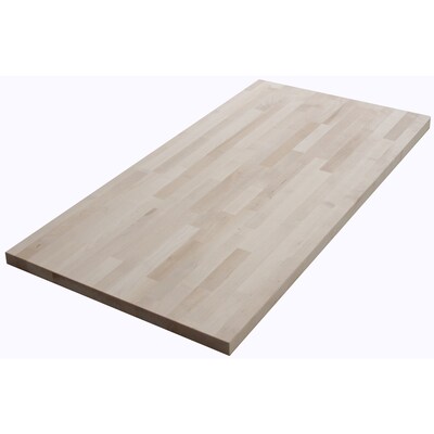
Lowes Home Improvement

The Baltic Butcher Block, Natural Straight Butcher Block Birch Kitchen Countertop:  4 feet long (48 inches), About 25 inches deep, and 1.75 inches thick. Baltic burch. Unfinished. $119.98.

Lowe's Butcher Block
Lowe’s Home Improvement Warehouse: Butcher Block


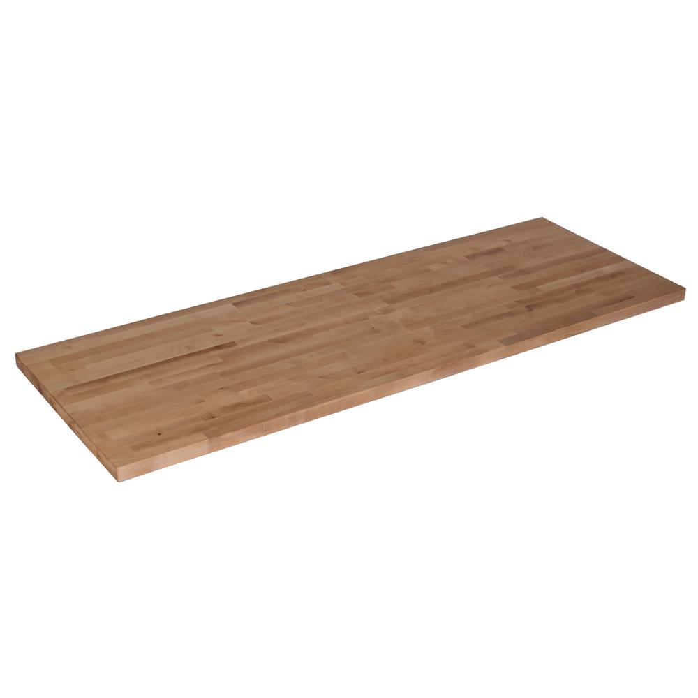
The Home Depot

Hardwood Reflections Butcher Block Countertop in Unfinished Birch:  4 feet 2 inches long (50 inches), 25 inches deep, 1.5 inches thick. Birch. Unfinished. $109.00.

Home Depot Butcher Block


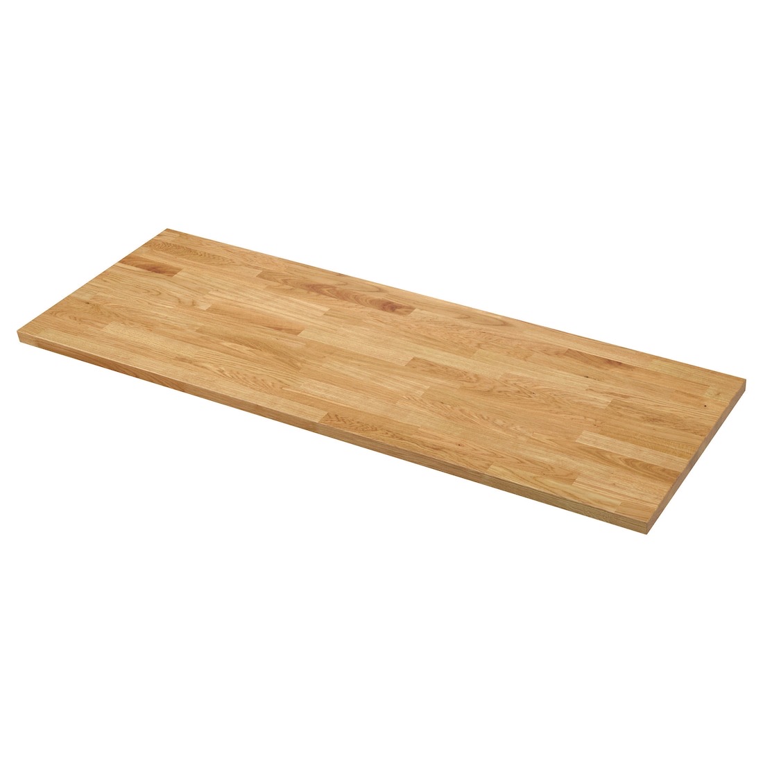
IKEA 

Karlby Countertop, Oak, Veneer:  Veneer thickness : 1/8 inch, 6 feet 2 inches long (74 inches), 25 5/8 inches deep, 1.5 inches thick. Oak veneer, foil, and particleboard. $149.

IKEA Karlby Butcher Block
IKEA Karlsby Butcher Block


Overstock

Forever Joint Hard Maple Butcher Block Top:  4 feet 2 inches long (50 inches), 26 inches deep, 1.5 inches thick. Maple. $252.89.

Forever Joint Hard Maple 26 x 50 Butcher Block Top 2
Overstock, Maple Butcher Block


Lumber Liquidators

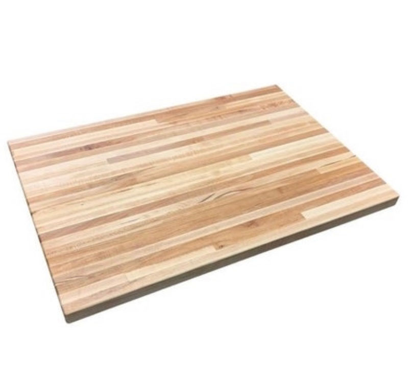
Williamsburg Butcher Block Company, Maple Butcher Block Countertop:  12 feet long (144 inches), 25 inches deep, 1.5 inches thick. Maple. Unfinished. $399.99.

lumberliquidators
Lumber Liquidators Maple Butcher Block


Obviously, what size the sections are that you are working with are important. I will let you know what we decide and definitely show you the finished product!

Have you used butcher block from any of these stores? Have you found them in precut sizes elsewhere? We’d love to hear about it in the comments!

Thanks for hanging out with us in DIY land and check out more great DIY and design inspiration over on our blog.

Cheers!

*Legal stuff:

I am honest about my experiences with different products and write because I enjoy it.  I do however, have the opportunity to earn money for my writing, also.

Slavetodiy.com is a participant in the Amazon Services LLC Associates Program, an affiliate advertising program designed to provide a means for sites to earn advertising fees by advertising and linking to amazon.com.  Amazon offers a small commission on products sold through their affiliate links.  Each of your purchases via our Amazon affiliation links supports our cause at no additional cost to you.

If a blogger links to an Amazon product (with a special code for affiliates embedded in the link), and a reader places an item in their “shopping cart” through that link within 24 hours of clicking the link, the blogger gets a small percentage of the sale.  Amazon links are not “pay per click.”  If you click on the product link and stay around Amazon and purchase something else, however, I will get a commission on that sale.

Slavetodiy.com is also a VigLink affiliate advertiser which works similarly.
Mashup Monday 7: Inspired English Kitchen Details from Tom Howley

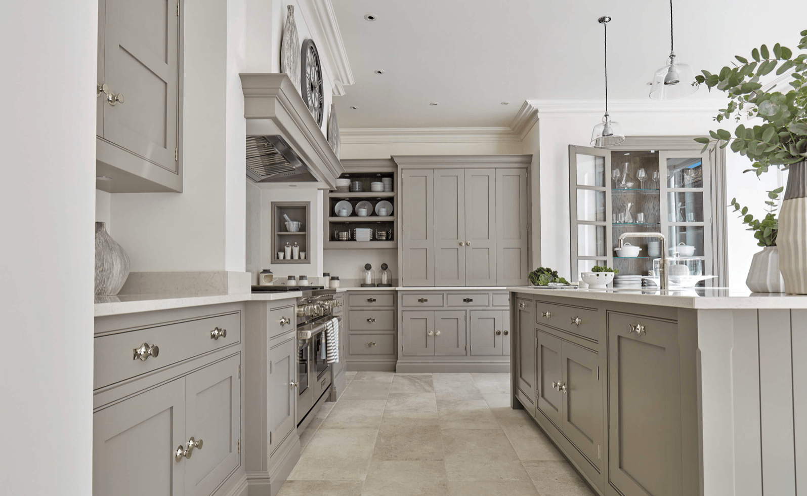
I stumbled across Tom Howley sort of by accident.  I kept pinning these gorgeous kitchens to my Kitchen Crush board on Pinterest, and then I started noticing that the ones I really loved were from just a few different cabinet makers.  There’s a catch, though, Tom doesn’t make cabinets in the US, which is probably why I’d never heard of them before.  But, maybe if we spam him with requests, he’ll open a cabinet design store here just for me.  Check out the awesomeness they put into every detail and design.

*This post may contain affiliate links (I am not a Tom Howley affiliate). Please see full disclosure at the end of the post.

All photos are from tomhowley.co.uk

I’m just showing you these, so you too, can dream of a fantastic English kitchen.  One of the details I love most is that the cabinets are all installed like builtins.  I ADORE this detail.  There is no recessed toe kick like American designed kitchens.  Doesn’t it look clean and wonderful?  (Imagine not needing to sweep out from underneath the cabinets every time you cook).  The other main difference seems to be that there is nearly as much attention paid to the surfaces that you don’t immediately see as the exterior finish on the cabinets.

The inside of every drawer and cabinet is beautiful.  Underneath the cabinet.  The toe kick.  Everything.  Gorgeous.

Tom Howley Kitchens
Tom Howley Kitchens, Base Molding in lieu of recessed toe kick


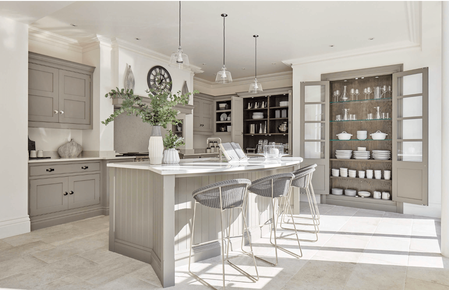
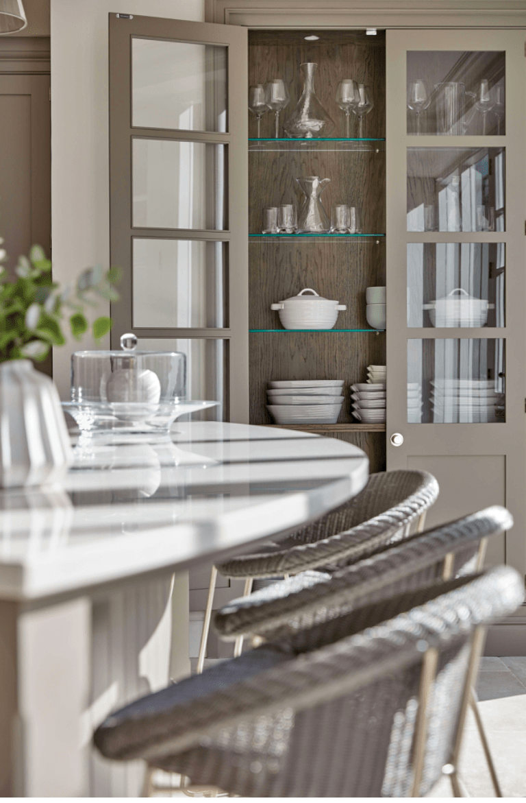
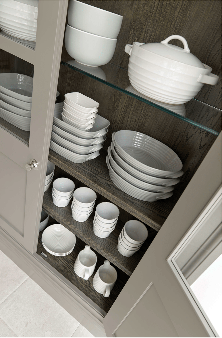
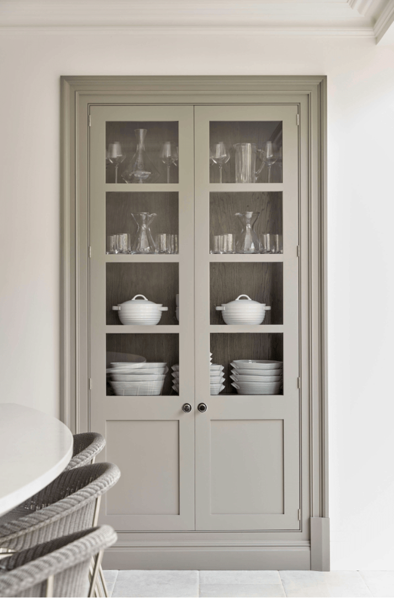
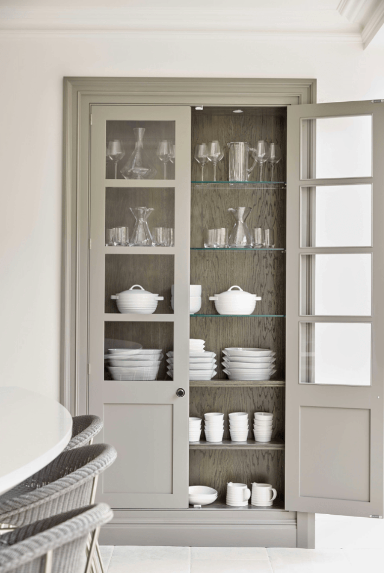
Below you can see the builtin dish pantry that is just gorgeous.  Real wood liner, interior lighting, and glass shelves highlight serving ware.  The knobs are gorgeous and the glass is perfect.  How perfect is the curve on the island seating (in the foreground)???

Tom Howley Kitchens
Tom Howley Kitchens, built in pantry with interior lighting and glass doors


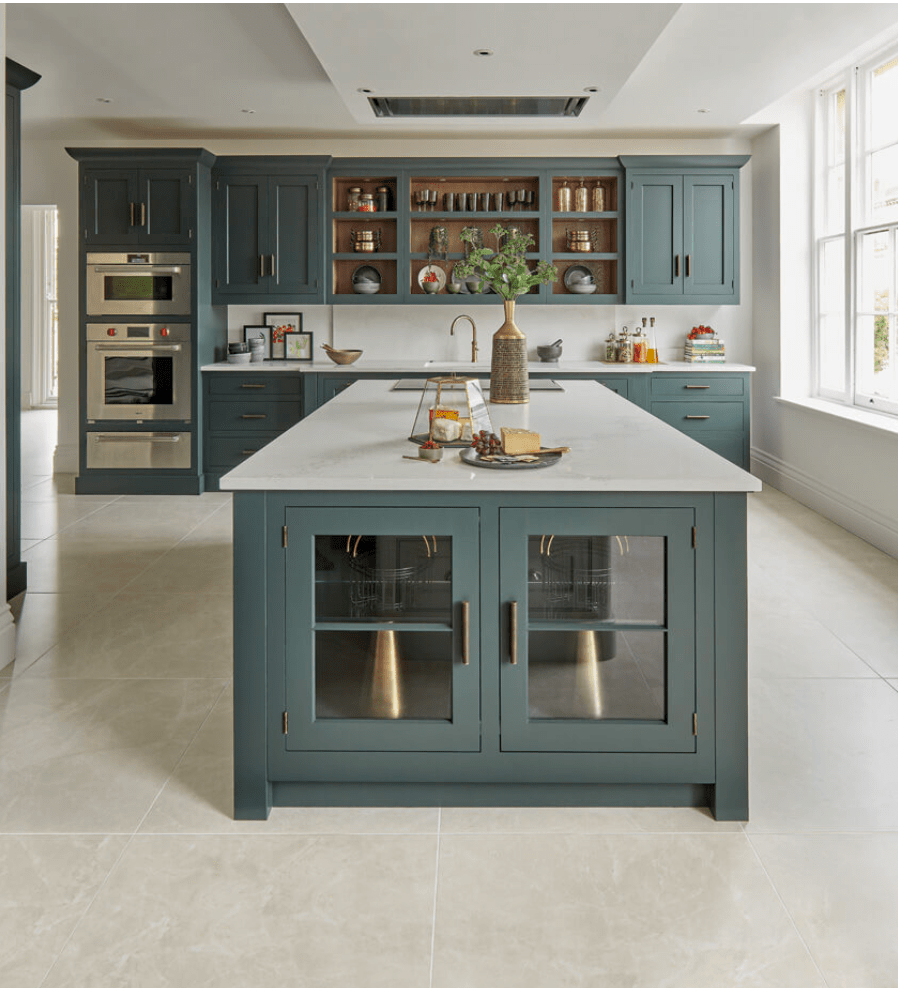
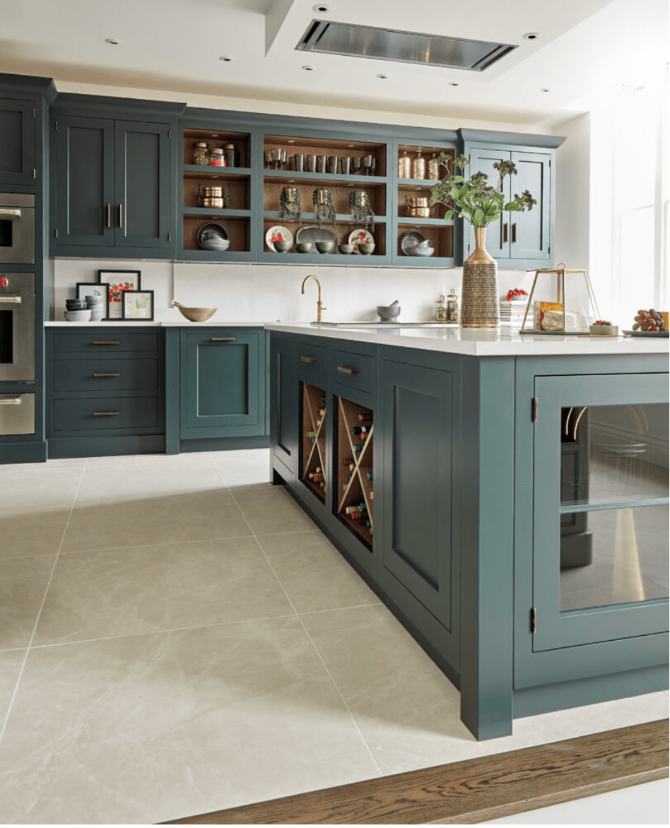
The combination of open shelving (cabinets without doors) and pantry style hidden storage in different depths really gives the kitchen character.  You’ll notice with all of the designs that they alternate the depths of the cabinets, not just the height, to add interest.  Even in one color, this kitchen is far from uniform and totally stunning.

Tom Howley Kitchens
Tom Howley Kitchens, Varying cabinet depths with uniform hardware and


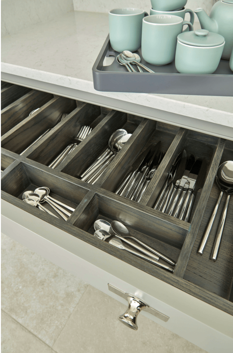
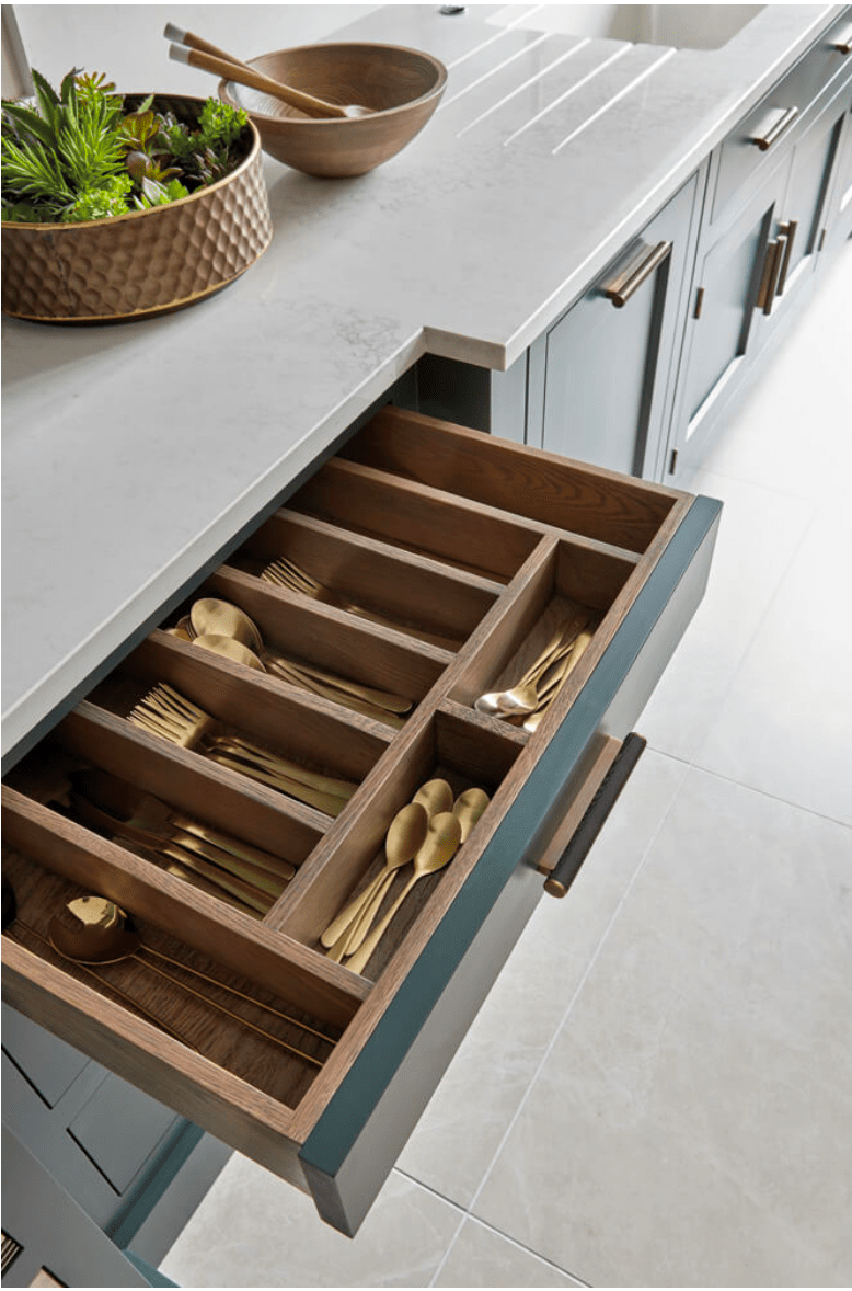
Built in drawer organizers are just exquisite.  No IKEA here, just perfectly crafted organized kitchen-ness.

Tom Howley Kitchens
Tom Howley Kitchens, built in drawer organizers


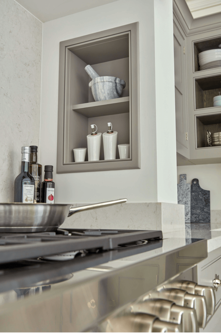
Spice nooks built into the range alcove in the same color as the cabinetry, protected from heat, but handy while cooking.  Sigh.  That’s definitely on my list.

Tom Howley Kitchens
Tom Howley Kitchens, recessed spice nook next to range


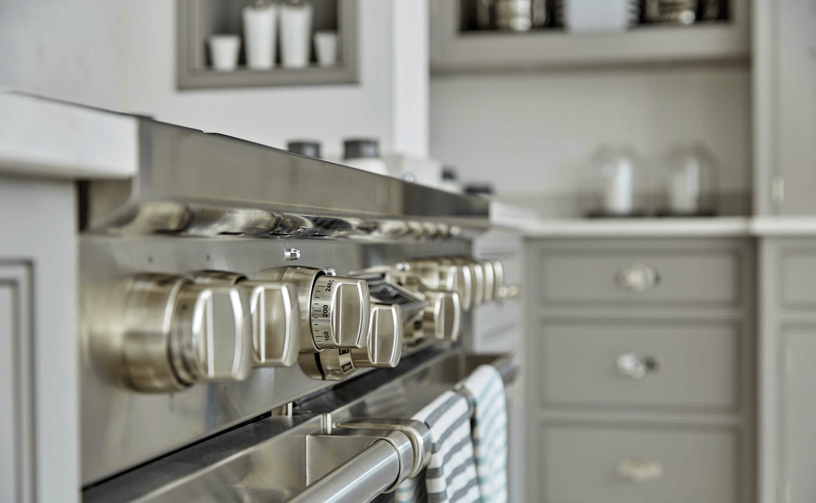
Top notch, professional cooktops, in an easy to clean finish: check.

Tom Howley Kitchens
Tom Howley Kitchens, professional, easy to clean range


You can see the quality and craftsmanship of the drawers and the detail in the finish and design.  I also love that they added a mini backsplash in the same quartz.  It’s all incredibly clean.

Tom Howley Kitchens
Tom Howley Kitchens, drawer craftsmanship


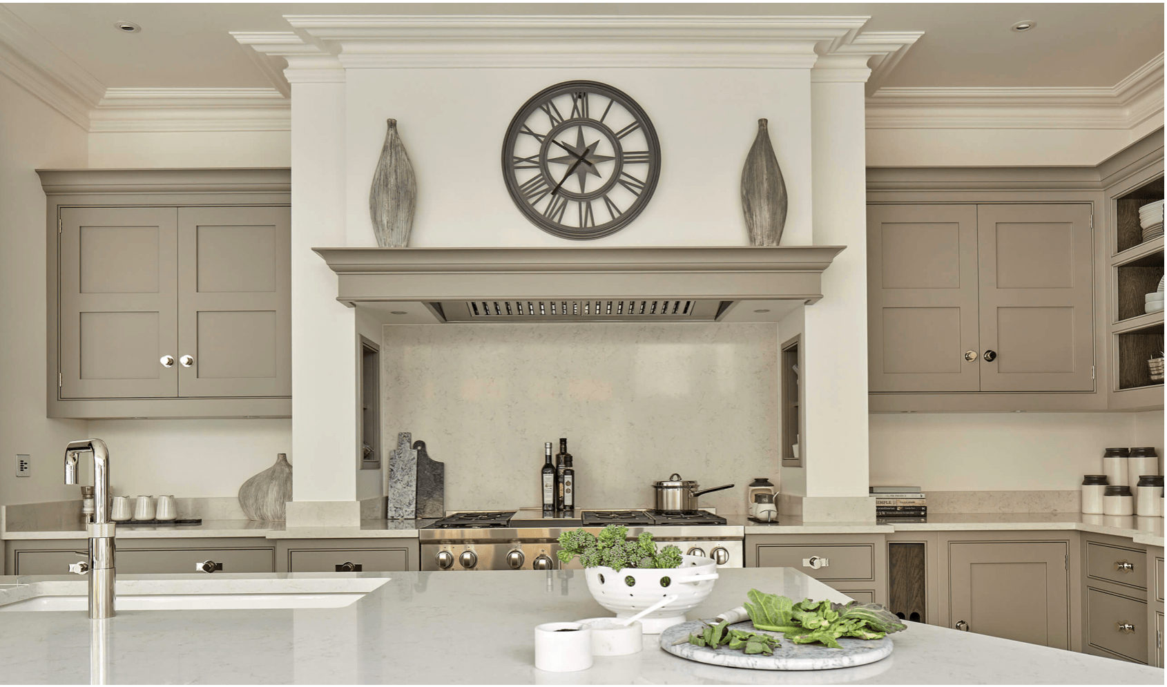
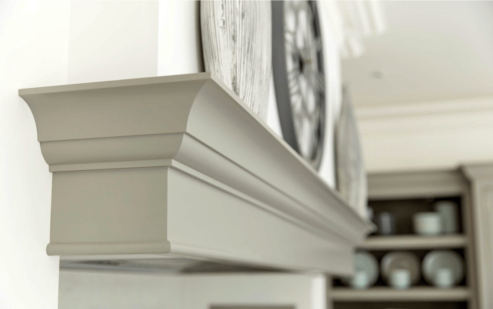
The mantel top look is very classic, and it’s a beautiful blend in the same hue.

Tom Howley Kitchens
Tom Howley Kitchens, mantel detail over range


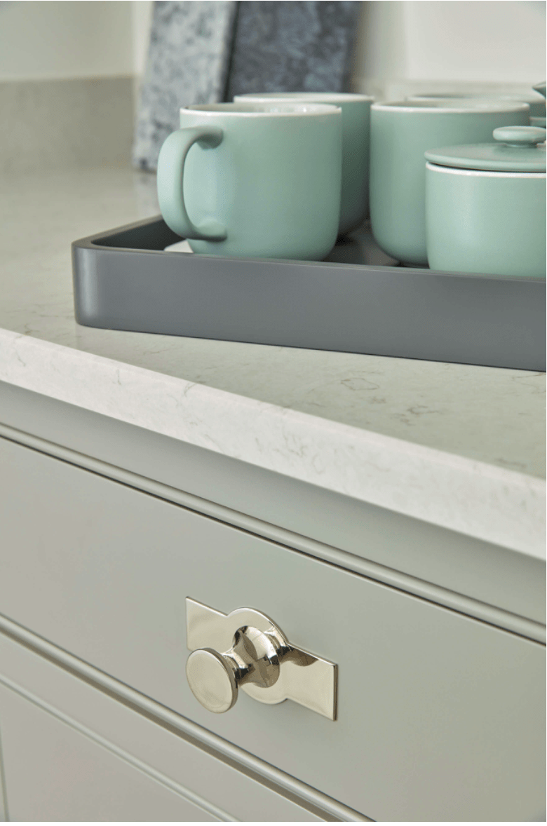
Close up of the details around the inset drawers and awesome hardware.

Tom Howley Kitchens
Tom Howley Kitchens, hardware


Not only is the built in beautiful, but it has strong wooden shelves on the bottom (the lower part without glass doors) for everyday dishware and use.

Tom Howley Kitchens
Tom Howley Kitchens, Strong wood shelves for everyday dishware


One of my favorite things about Tom Howley kitchens is that they’re designed for real, actual cooking.  I don’t think I’ve seen one without this very functional design that ensures cabinets are not exposed to the cooktop heat.  The cooktops are fully enclosed with well vented hoods.  I LOVE it.  It makes so much sense.

Tom Howley Kitchens
Tom Howley Kitchens, Enclosed range hood with matching mantel


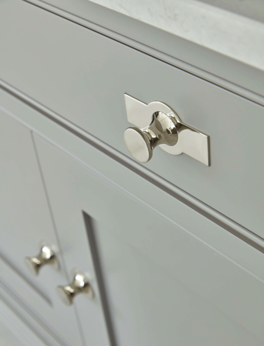
Close up of hardware details.

Tom Howley Kitchens
Tom Howley Kitchens, close up of hardware details


This is such an amazing shot.  The built in pantry/dish cabinet is completely framed in and just appears to have always been there, on that wall.  Beautiful.  And I love the color against the light floor.

Tom Howley Kitchens
Tom Howley Kitchens, builtin dish pantry


Another shot of total dish pantry awesomeness.

Tom Howley Kitchens
Tom Howley Kitchens, built in.


What I really dig here, again, is the variation while it’s still uniform in color.  There is molding variation, missing doors, glass doors, depth changes… but all still cohesive and lovely.  Did you happen to notice that even with the cooktop on the island, there is still a vent above, flush with the ceiling?

Tom Howley Kitchens
Tom Howley Kitchens


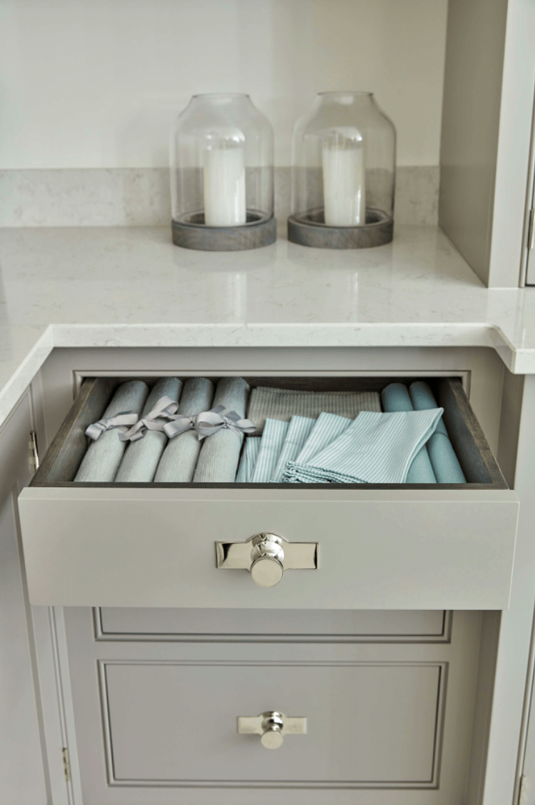
Exquisite details in the drawer for organization and integrated dish drain on the countertop.

Tom Howley Kitchens
Tom Howley Kitchens, drawer and countertop details


The finish doesn’t get much better than this, does it?

Tom Howley Kitchens
Tom Howley Kitchens, cabinet finish detail


These open shelves achieve the same look as open shelves, except I’m betting this is way more usable space as there’s less concern about falling dishes and they’re a bit more protected from dust build up.

Tom Howley Kitchens
Tom Howley Kitchens, open shelving


Open shelving at a different depth integrated into bank of wall cabinets.

Tom Howley Kitchens
Tom Howley Kitchens, integrated bank of cabinets


Even the wine rack integrated into the island is awesome.

Tom Howley Kitchens
Tom Howley Kitchens, integrated wine rack in island


Tom Howley Kitchens
Tom Howley Kitchens


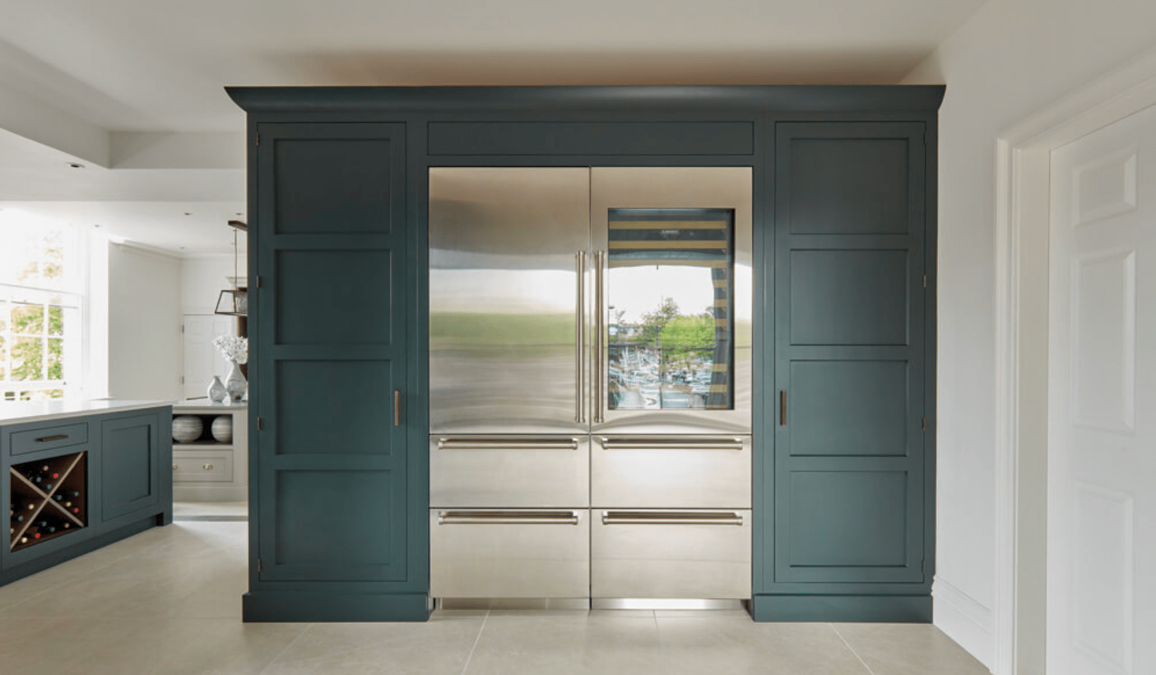
It just so happens, this is totally our plan for building in our fridge and freezer, except we’re going to take it all the way to the ceiling.  But, yes, fridge and freezer flanked by pantries.  It’s gorgeous.

Tom Howley Kitchens
Tom Howley Kitchens, fridge and freezer built in between pantries


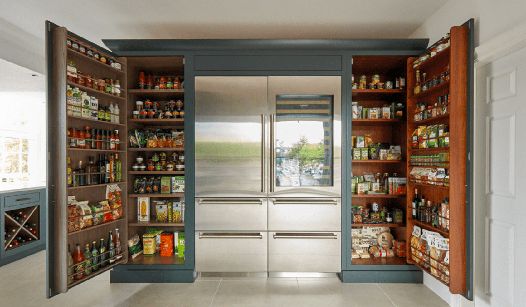
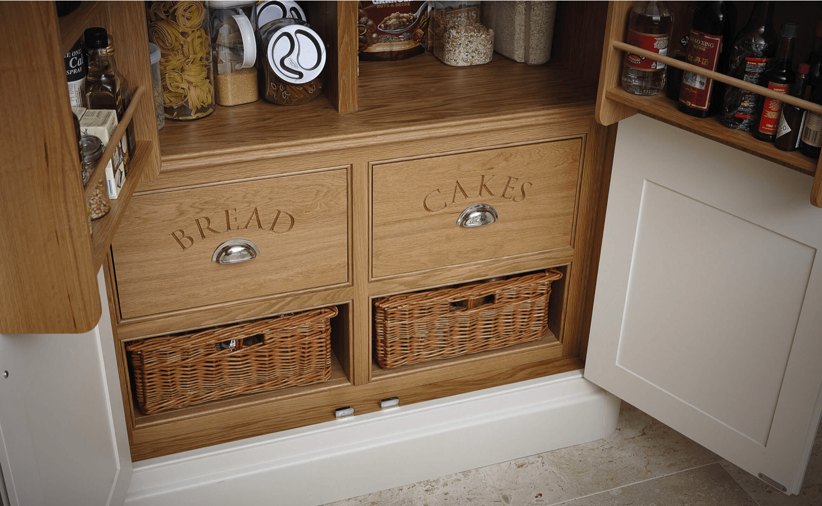
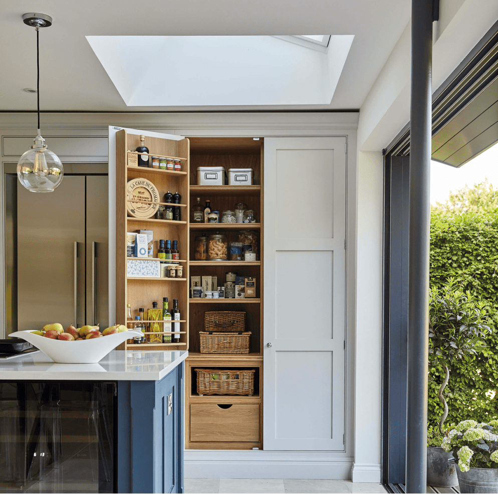
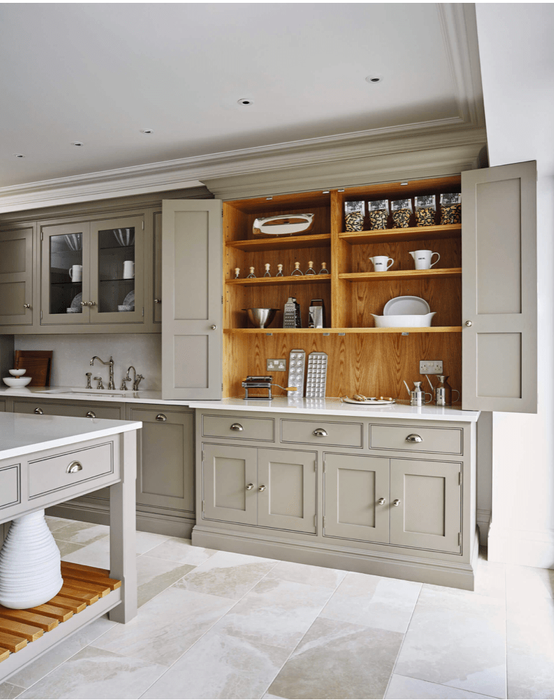
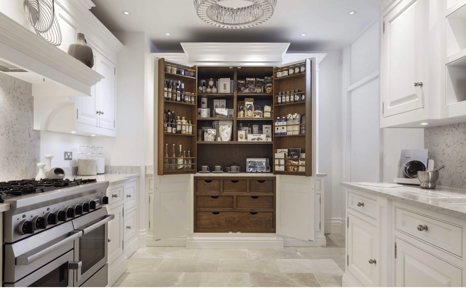
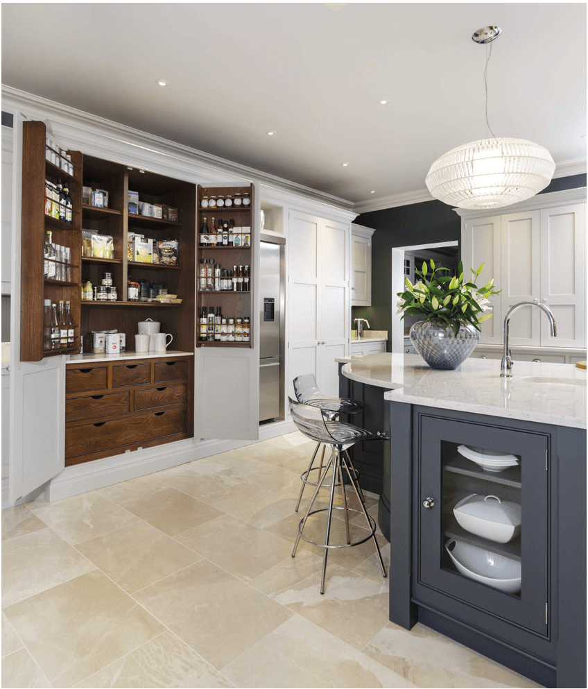
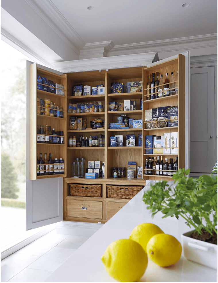
But, I’ll bet your pantries aren’t this beautiful inside.  Know what I’m saying?  There’s no beautiful wood finish with built in organizers on the doors.  Tom, are you listening?

Tom Howley Kitchens
Tom Howley Kitchens, pantries with builtin organizers


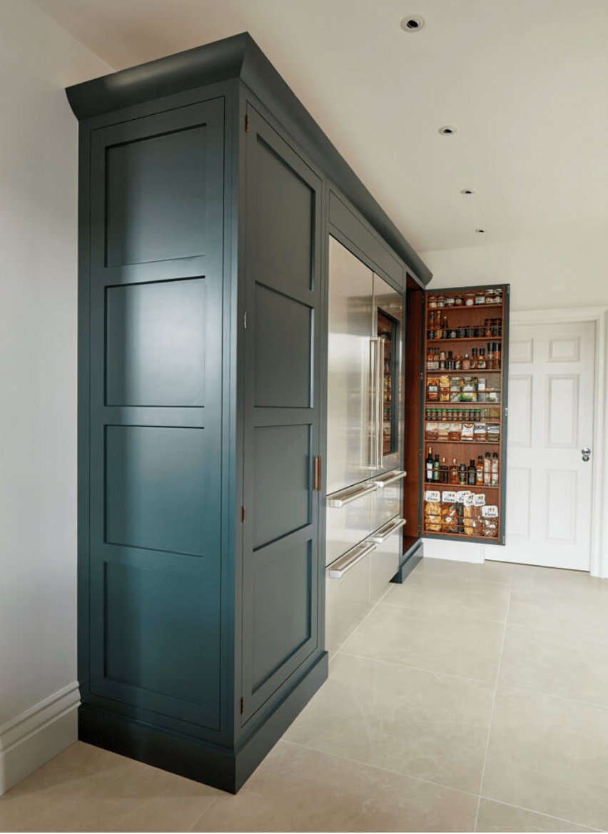
No detail is overlooked.  Seriously?  Check out the side of the pantry.  Also, don’t miss the string of task lighting perfect for this work area.

Tom Howley Kitchens
Tom Howley Kitchens Exquisite, furniture quality pantry sides.


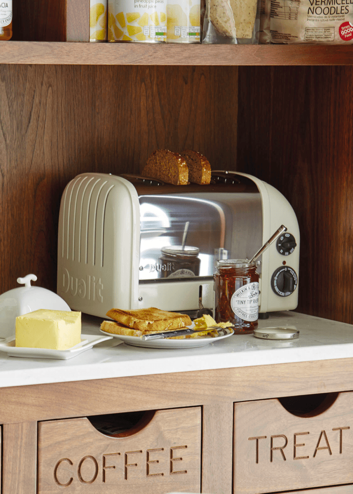
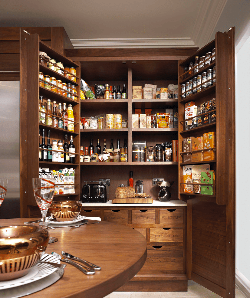
But, the details just get better.  Carved labels inside your pantry???  Yes, I mean it.  And, oh yeah, I can have a usable workspace, with the stupid toaster and crumbs, that can be closed off from view the rest of the time?  Yaaaaaaas.

Tom Howley Kitchens
Tom Howley Kitchens, drawer labels carved into wood


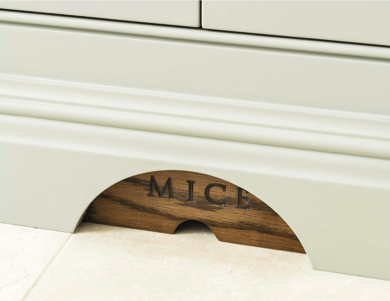
Favorite.  Kitchen.  Detail.  Ever.  Tom, you had me at mouse door.

Tom Howley Kitchens
Tom Howley Kitchens, mouse door


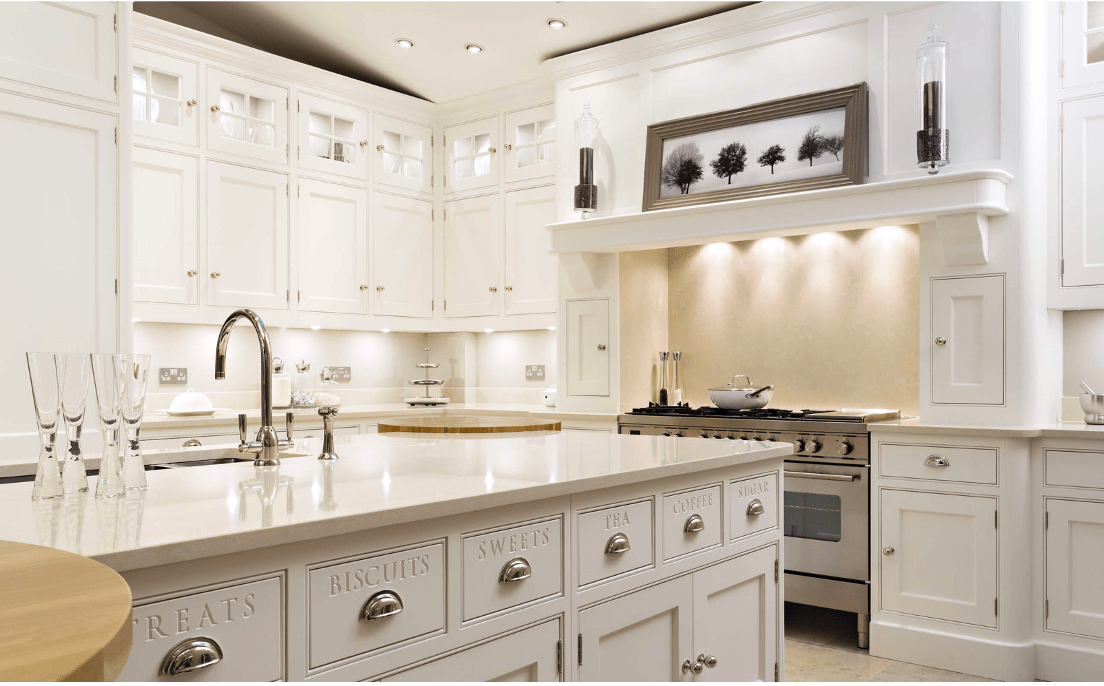
You can see more labels here (I don’t know that I’d go this far, because I like to move things around so other people in my family can’t find them).  But, I love the idea. and that it’s an available option.

Tom Howley Kitchens
Tom Howley Kitchens, carved kitchen label details


Okay, so the next few are just to show you how amazing the interiors of the pantries are.  I’m just blown away because we just don’t do this here.  It’s next level.

Tom Howley Kitchens
Tom Howley Kitchens, pantry detail


Tom Howley Kitchens
Tom Howley Kitchens, pantry detail


Tom Howley Kitchens
Tom Howley Kitchens, pantry/workspace detail


Tom Howley Kitchens
Tom Howley Kitchens, pantry/workspace detail


Tom Howley Kitchens
Tom Howley Kitchens, pantry detail


Tom Howley Kitchens
Tom Howley Kitchens, Pantry detail


Tom Howley Kitchens
Tom Howley Kitchens, pantry details

Aren’t they just amazing???  I’ve considered a trip to the UK just so I can visit a showroom.

Tom, if you’re reading this, please come to America.  We love you.

As for the rest of you, read more of our awesome blog here.  Cheers!

*Legal stuff:

I am honest about my experiences with different products and write because I enjoy it.  I do however, have the opportunity to earn money for my writing, also.

Slavetodiy.com is a participant in the Amazon Services LLC Associates Program, an affiliate advertising program designed to provide a means for sites to earn advertising fees by advertising and linking to amazon.com.  Amazon offers a small commission on products sold through their affiliate links.  Each of your purchases via our Amazon affiliation links supports our cause at no additional cost to you.

If a blogger links to an Amazon product (with a special code for affiliates embedded in the link), and a reader places an item in their “shopping cart” through that link within 24 hours of clicking the link, the blogger gets a small percentage of the sale.  Amazon links are not “pay per click.”  If you click on the product link and stay around Amazon and purchase something else, however, I will get a commission on that sale.

Slavetodiy.com is also a VigLink affiliate advertiser which works similarly.
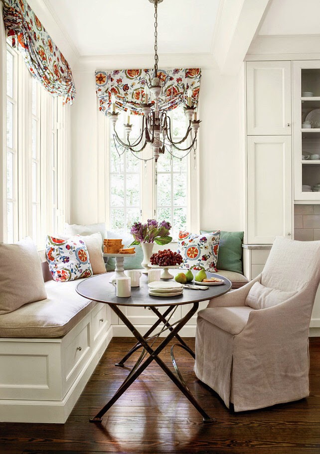
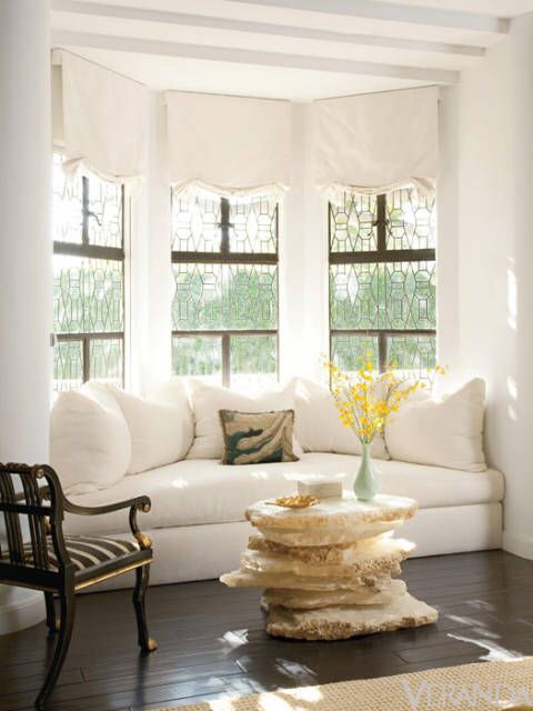
Mashup Monday 2: 14 Inspired Kitchen Banquette Benches

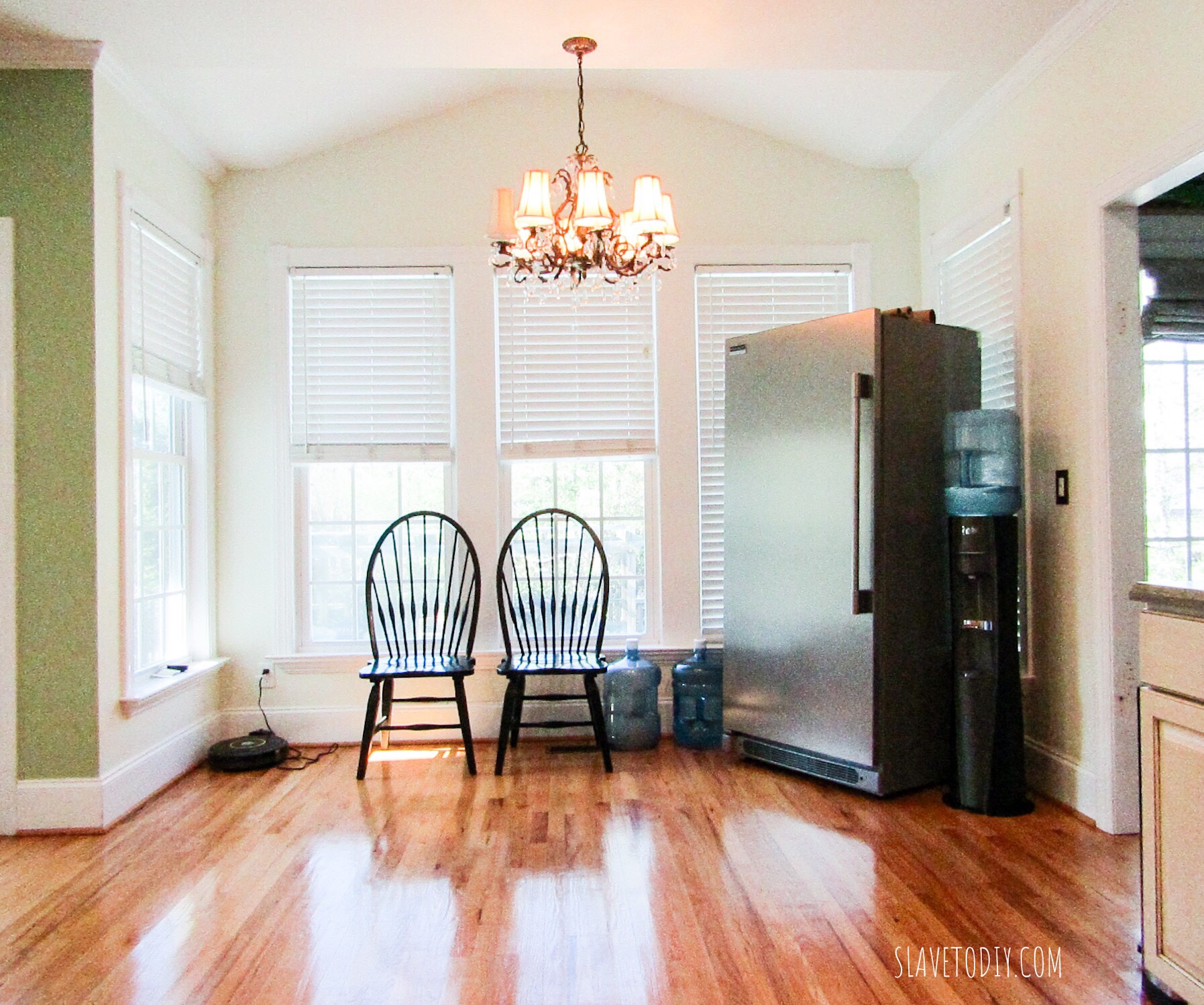
Our current “breakfast nook”

Over the Holidays, Specifically in time for the annual sale, I have requested a trip to the magical land of Restoration Hardware. For those of us who don’t live anywhere near one, this is a big deal, so don’t judge me. We are going so I can touch and feel a sideboard that I’m planning on using as a base for our breakfast nook/island with banquette seating. So, of course, in anticipation of my big purchase, I am trying to decide which type of banquette seating I really want to do that will serve the look and functionality I’m trying to achieve.

*This post may contain affiliate links. Please see full disclosure at the end of the post.

*Update: soul-crushing disappointment: the sideboard is not on sale. We’ll still go at some point so I know if I like it, for when it DOES go on sale. I will take LOTS of pictures to share.

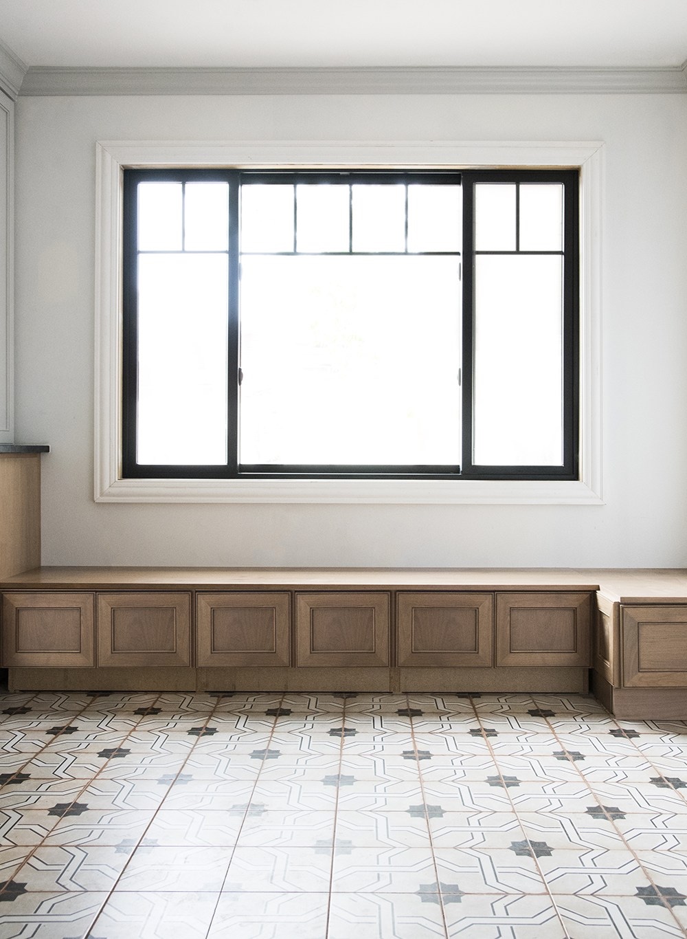
In case you haven’t figured it out, this is how I passive aggressively start projects. I buy the pieces I want to use, then leave them in the middle of the room until Rainman reluctantly asks what’s supposed to happen with them. The bench will need to run the length of the wall under the windows (backless so we don’t limit visibility to the pool and backyard) and have the ability to house small appliances that will be homeless when Rainman reclaims the pantry for an office closet.

Here are some ideas for banquette seating:

RoomforTuesday.com

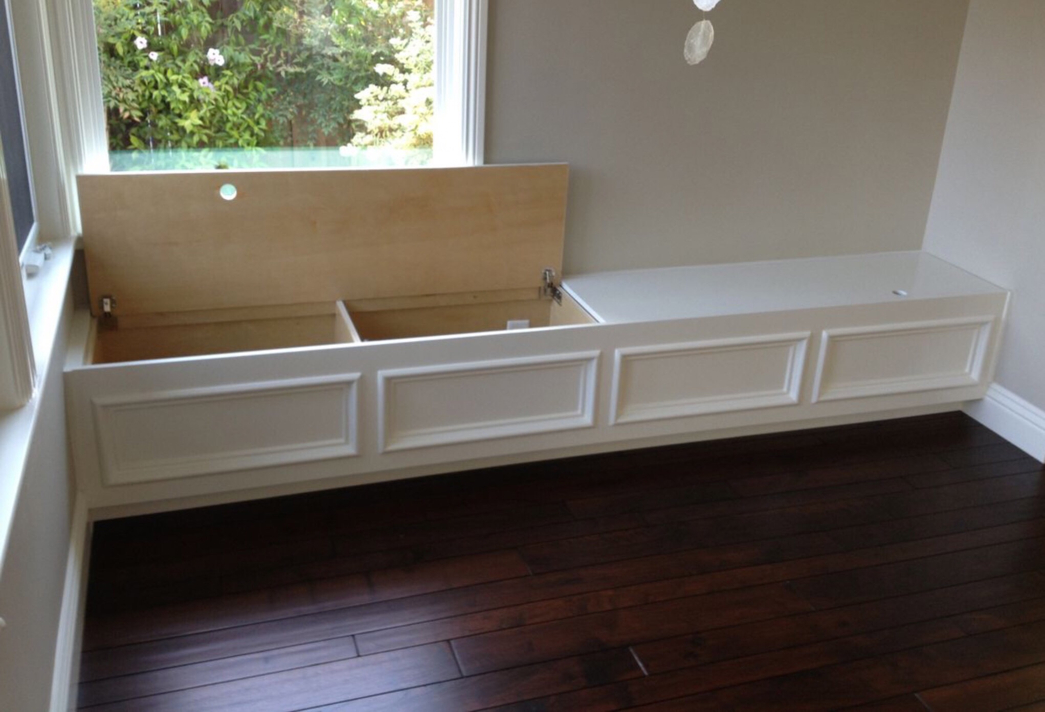
The banquette above is a very nicely done seat. I would definitely do cushions, but this is a solid concept. Unfortunately, I don’t think using premade cabinets will work for us as they open from the front and we’ll have an island in the way, making it more difficult to get things in and out. I love the stained finish, though.

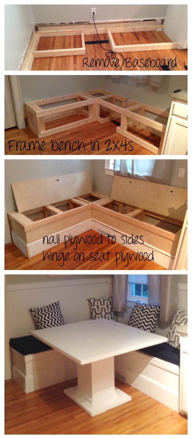
Ana-white.com

The DIY one above is a very clean look and I love that it has the flip-up bench seats. I think we may want more detail than this one, however. It is fantastic for the nook it’s in and I love their heat register solution. We also have one to contend with in our future bench seat.

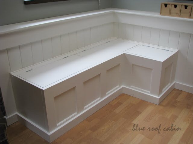
Blueroofcabin.com

The blue roof cabin banquette is a super simple and attractive design. I really like it but I would want to have the squares centered vertically whereas here the base molding covers much of the bottom.

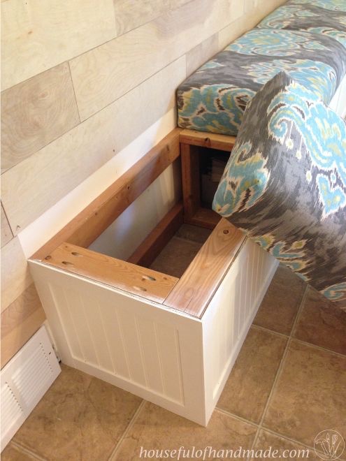
Housefulofhandmade.com

This is a neat idea also, but I want a solid flip top instead of the cushions mounted on wood.

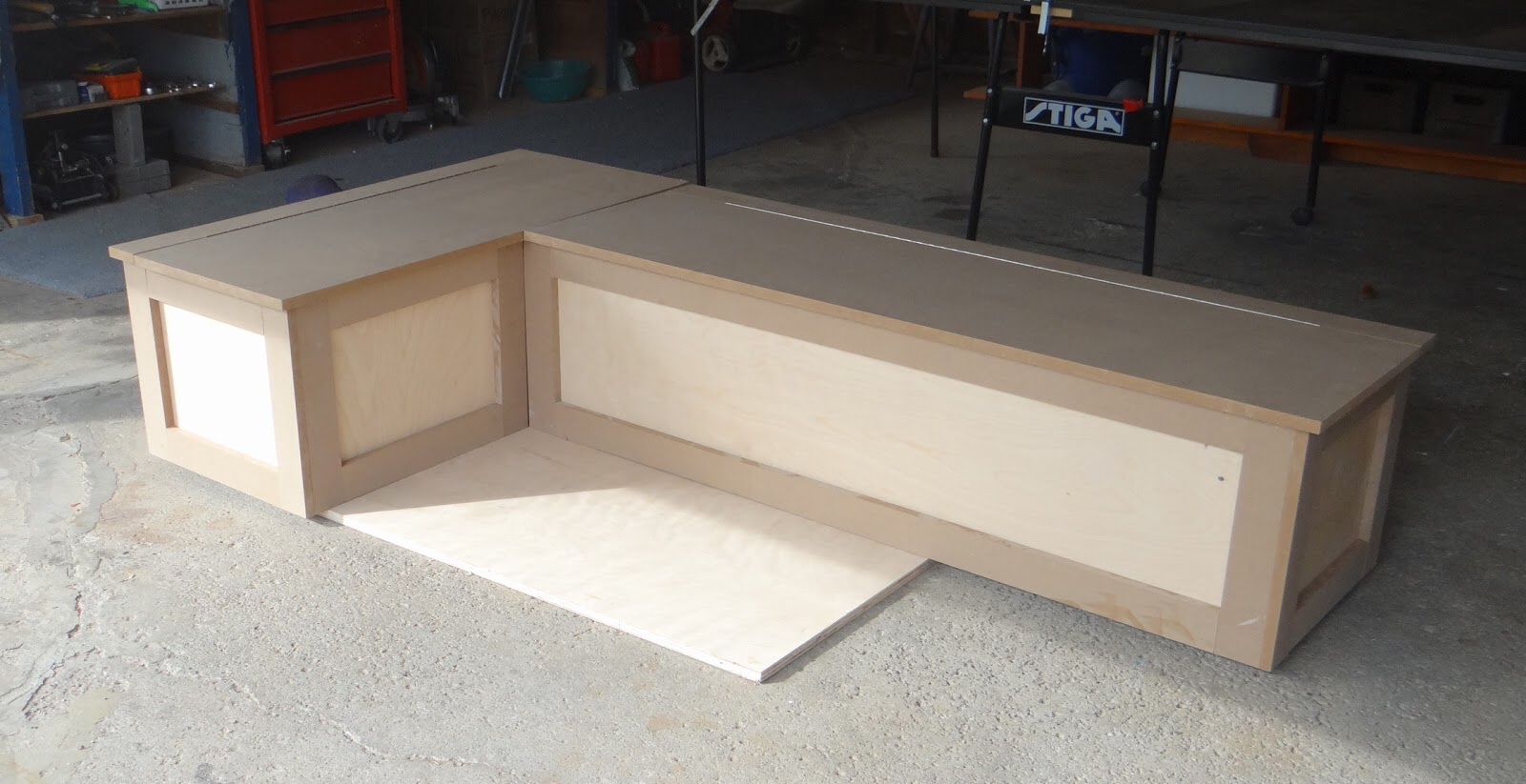
Louannedeco.blogspot.com

With some caulk and paint this could be a very nice bench. If your plan is to have a painted piece, MDF really makes anything more affordable.

Home craft builders

This is very nicely done, although aesthetically I think I prefer the base bumped out instead of recessed as it is here- especially since I have some small appliances that are wider at the base.

Placeofmytaste.com

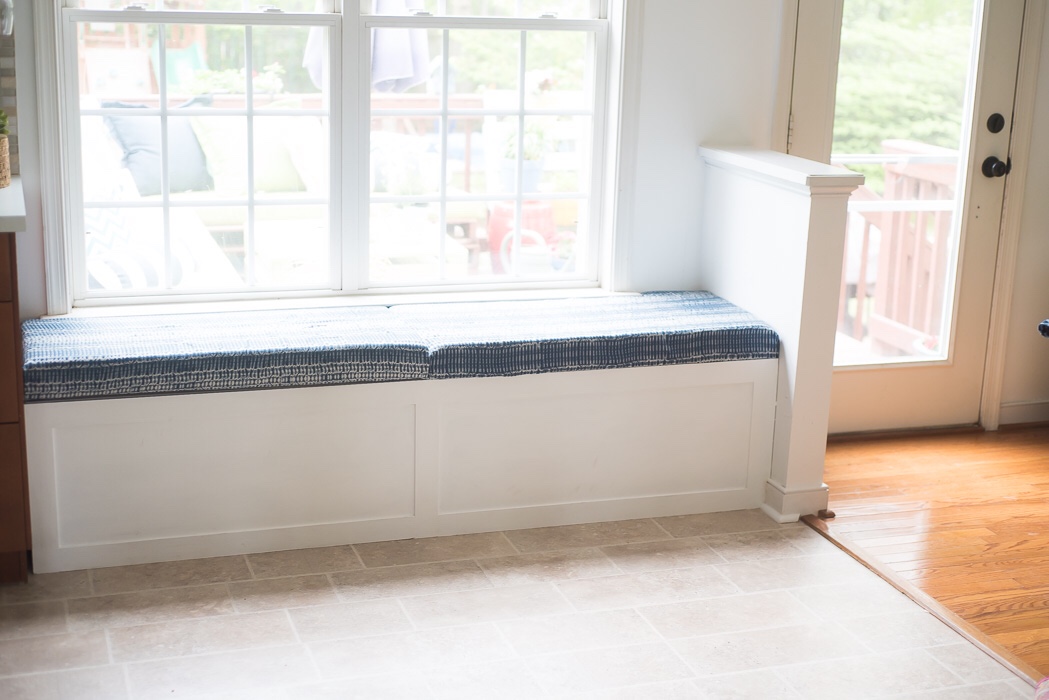
This is a very basic, clean design. Once again, I think these are pop off cushions, and I would really prefer a hinged lid.

Marthastewart.com

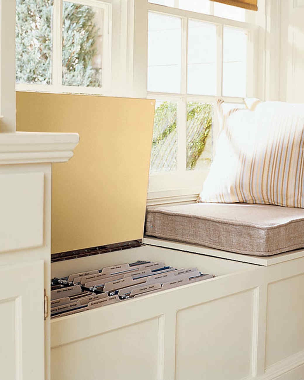
Here’s that beautifully crafted hinged lid. I love that the cushions are separate for wash-ability.
Utahrealestate.com

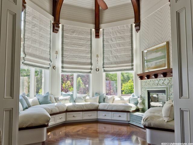
I love the thickness on these cushions though I question their longevity on a kitchen banquette. If they are washable slip covers that would be awesome. I can’t imagine trying to cut the base molding on these angles. Ugh.
Jurnaldedesigninterior.com

Like most things in Veranda magazine, the next one is impractical, but breathtaking. They should just rename it “shit-you’ll-never-have-because-you-have-kids magazine”. I’m telling myself, willing myself to walk away. (My sister asked me why this is impractical: the pretty little knobs will become footrests and get ripped out. The light-colored fabric will become immediately stained.)

Veranda.com

Once again, Veranda, I admire you for your optimism. Breathtaking and unrealistic.

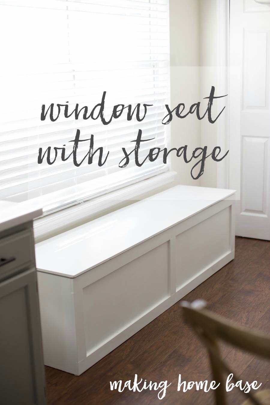
Makinghomebase.com

Any DIYer could be proud of this simple, little build. Add some quarter round and cushions, and voila, you have yourself a pro level bench.

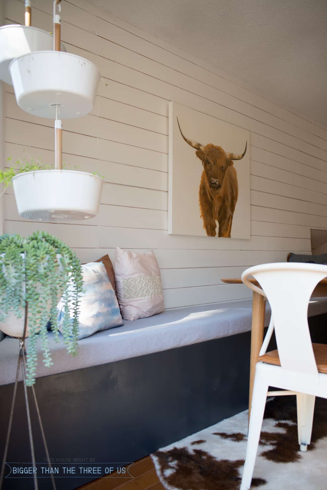
Biggerthanthethreeofus.com

I love this whole space, except the face of the bench. Just a few pieces of trim will make this space varsity level.

Trendir.com

Once again, if you’re using stock cabinets and want drawers, these are very nice.

I think we’ll eventually settle for a basic board and batten style, with a hinged top, and removable, leather cushions (for easy cleanup).

Thanks for joining us on our adventures! For more inspiration check out our blog.

*Legal stuff:

I am honest about my experiences with different products and write because I enjoy it.  I do however, have the opportunity to earn money for my writing, also.

Slavetodiy.com is a participant in the Amazon Services LLC Associates Program, an affiliate advertising program designed to provide a means for sites to earn advertising fees by advertising and linking to amazon.com.  Amazon offers a small commission on products sold through their affiliate links.  Each of your purchases via our Amazon affiliation links supports our cause at no additional cost to you.

If a blogger links to an Amazon product (with a special code for affiliates embedded in the link), and a reader places an item in their “shopping cart” through that link within 24 hours of clicking the link, the blogger gets a small percentage of the sale.  Amazon links are not “pay per click.”  If you click on the product link and stay around Amazon and purchase something else, however, I will get a commission on that sale.

Slavetodiy.com is also a VigLink affiliate advertiser which works similarly.